
I have been using Form since Google acquired them. The video above is my 2nd prototype built with Form. And I’m writing my first Medium article to share the knowledge I learned while making it. But it’s not a follow me then you’ll get it tutorial. I’m just going to give a brief overview of how my patches consist of, in order to help you understand the source code. Even though my source code is still messy, I think you can get a sense of how powerful Form is. (It’s less complicated than it looks like. ☺)
Like my first prototype, I made this concept to improve emotional attachment to the product. I receive a number of emails everyday and compose at least one or two per day. But every time I write an email I feel like I’m talking to a machine rather than person. I felt there was something missing in the digital communication. When I write a letter, I carefully choose nicely designed letter paper and my expectation is at the highest peak when I put it in a postbox. But did I ever feel the same when sending emails? No. But should emails be always like that? I don’t think so. That’s why I started to build this prototype.
At the same time, I was wondering if I could make something like material transition in Form. Masking patch or overflow-hidden effect is not supported at the moment (Christmas of 2014 ☹) but I believe that the team is working on it. So I came up with a makeshift solution that mimics masking effect.
I assume that you already know some basics of Form or patch-based prototyping tools. For introduction of Form, you can refer to@makeshowlearn’s article or learning centre. Otherwise, feel free to ask me.
I actually had an experience with Max/Msp which has similar approach to Form in terms of wiring patches but it emphasises the connection with physical sensors and audio visualisation. I made this prototype long ago with Max/Msp. Maybe I chose Form to be my first prototyping tool because I was already familiar with patch-based tool.
To be honest, I started with QC + Origami but there were too many patches to know for beginners. So the next day I switched to Form which is more specialised in mobile interaction design. The thing I liked the most with Form was that the ability to directly interact on my phone. It feels totally different from testing on the screen with a mouse… It’s all about interaction.
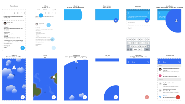
The Figure 1 shows the key screen shots. By making this, I can imagine how the final interaction would be. Since they are only still images I put some notes about interaction. (e.g. paper plane: rot(y) 180(ccw) -> x-)
This is the root view. Let’s quickly go through from 1 to 8 (layer numbers).
- Background: The colour view fills the whole screen with white. (Default background is black)
- Main Screen: It’s the main screen that will appear at the and of the interaction. (The interaction starts from reading an email.)
- Reply Button Transition: The reply button at the bottom right corner jumps up to the top when touched and magnified until it fills the upper screen. (so called material interaction)
- Send Button Transition: When send button is touched, it is magnified until it fills the whole screen. As clouds animation goes on, the center of the button moves (not visible to users) to the place where the cancel button will appear and then shrinks. At the same time, the little send icon is flipped into a paper plane and moves to the middle of the screen.
- Sending Animation (Clouds): Touch of the send button triggers off-screen clouds to come down.
- Cancel/New Button: When send button is touched, cancel button appears. At the end of the animation, it turns into a red button with nice rotation transition.
- Resetter: It rewinds all interactions so that you can start from the beginning.
- Status Bar: on/off, and changes of brightness
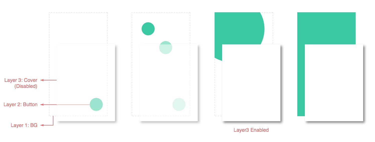
Reply Button Transition (Masking Effect)
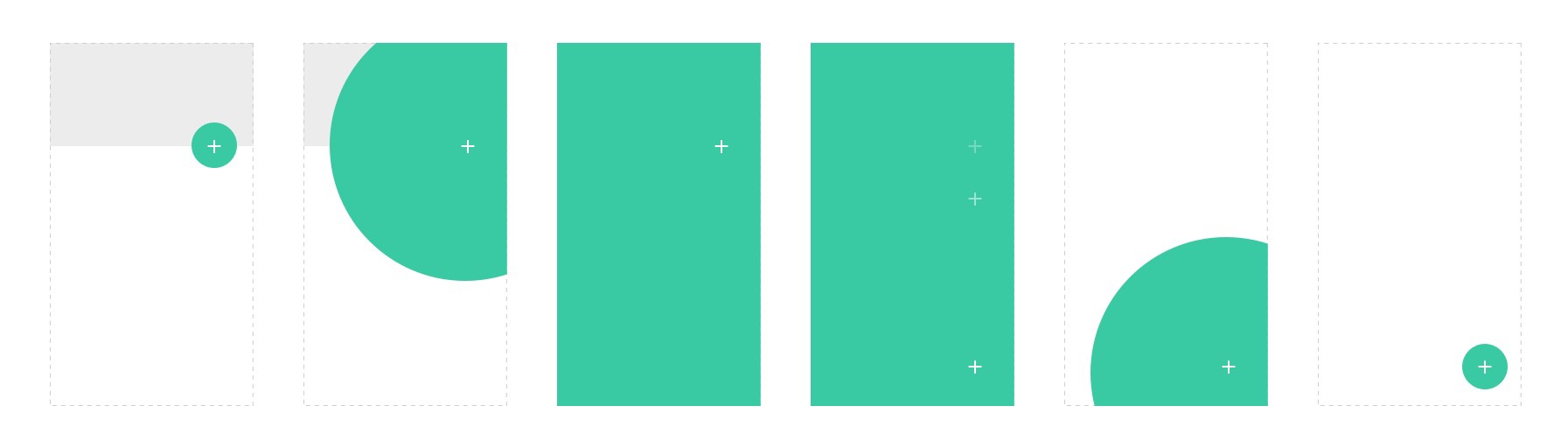
Let’s first see how I tricked masking effect in Form. In a typical(?) material transition, small ellipse blows within a rectangle until it fills the whole box (video, source code). I needed two layers for that (except for the background layer). One for blowing effect (Layer 2) and one for covering (Layer 3).
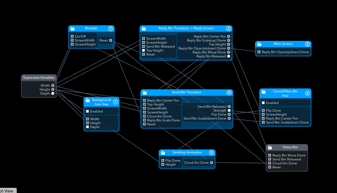
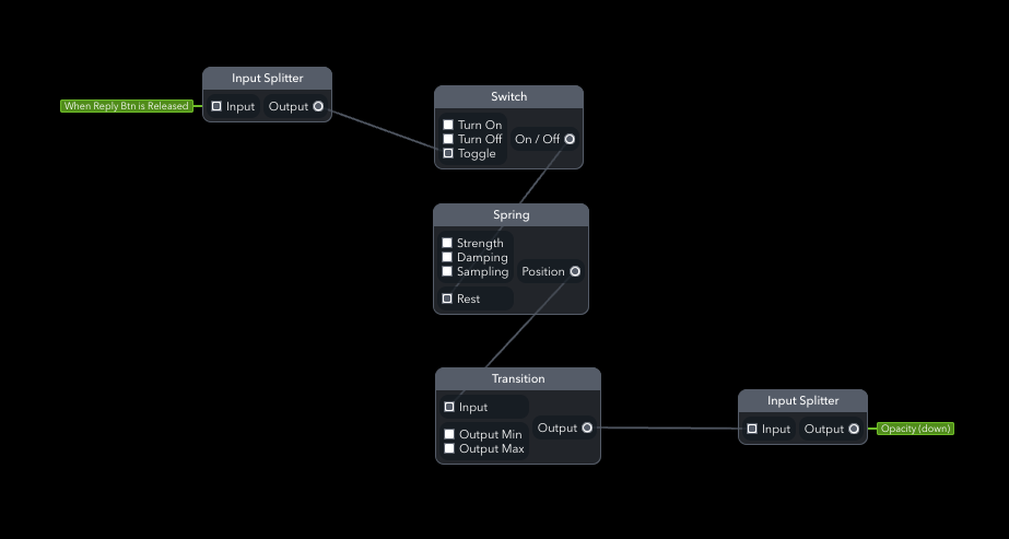
One of the most frequently used patches in this prototype was Spring Transition patch (It’s a group of patches I made). If you see figure 4, there are two groups. They are spring transition patches. Inside, it looks like below (Figure 5). I used this patch ‘a lot’. It gets on/off or index signal and outputs a range value with a nice spring physics effect. You can adjust strength and damping(friction) values in Spring patch, and minimum and maximum values in Transition patch. You can see the tutorial here.
Upon touch, the send button increases in size until it fills the whole screen. Then it moves to the bottom (not visible to users) and then shrink down to a button. (Figure 6) That’s bascally what Send Button Transition patch (Layer 4 in Figure 2) does.
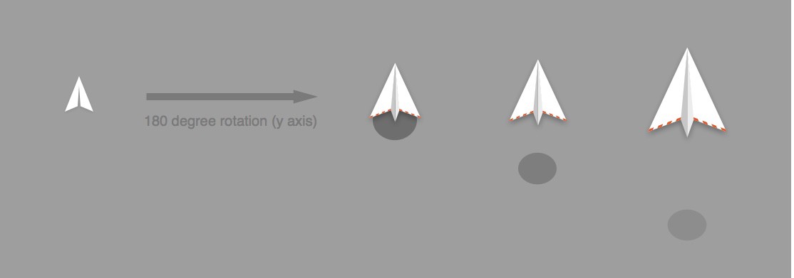
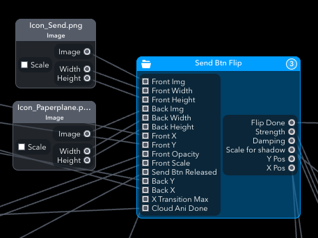
The send icon is flipped and turns into a paper plane (Figure 7). Then it’s going up while clouds start to pass by. For flip action of the paper plane, I modified Card Flip Patch by Eli.
I think iteration is one of the most important aspect of design process. So rather than re-connecting the device to reset every time, I created a Resetterpatch to quickly iterate. (Is there a better way?)
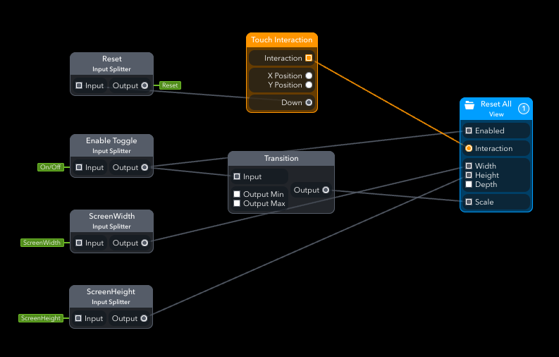
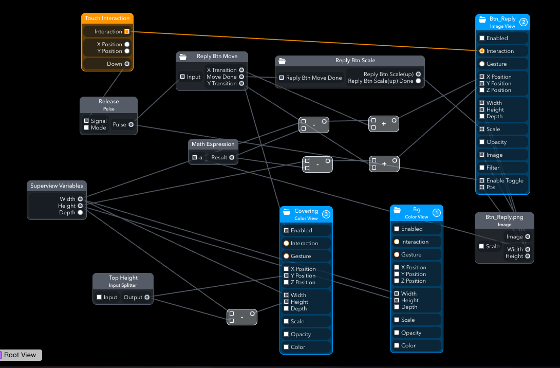
When sending animation is almost done, it pings to Resetter patch (Enable Toggle Patch in Figure 9). Resetter patch consists of a View patch with Touch Interaction that covers the entire screen so that you can touch anywhere at the end of animation to reset.
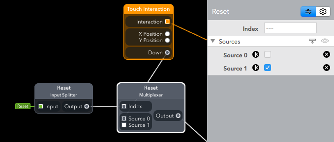
To apply resetter in other patches, I added a Multiplexerpatch (I think it’s one of the most important patches to know.). It receives true signal when the screen is touched (pressed) which means it goes to Source 1. And it switched back to Source 0 when released. Otherwise Source 0 is always passed onto other patches.
I think Form is a great tool to show your creativity to the world. I can do Java and Android, but when on earth can I make what I want? Form will help you quickly explore and experiment your ideas. I haven’t used Framer or Pixate yet, but I think Form is a good starting point as a designer. No coding knowledge required while embracing the ease of “well, let’s try to wire this”.
I learned like that. There weren’t many tutorials so I had to explore each patch giving a try to connect here and there. I mean it’s that easy that you can try and make something without tutorial (of course better with tutorials though). If Form community grows larger, there will be many user-made patches available. It means you can just copy and paste others’ patches to your project which will give you the same result. Or you can make them better and then share again.
There’s still room for improvements. In this project, I couldn’t fully apply material design principles. It lacks some basic design effect like shadow (because of performance issue?) or real-time value adjustment for filters. I also experienced some trivial issues that impair work flows.
But overall, I think it’s a good place to start for non-coders. It’s relatively easy, flexible, and fully interactive. Get one and join in FB community! (I also made Korean community ☺)