In this new tutorial, we’ll use previous knowledge and learn how to build a light/dark mode toggle switch component. This is a handy feature available in many sites and apps nowadays because it can help reduce eye strain and therefore improves accessibility.


It’s also worth noting that more and more CSS frameworks have started providing this functionality by default.


What we’re building
Here’s an introductory video to give you a taste of the functionality that we want to achieve:
And, of course, there’s the CodePen demo for you to fork and play with:
To speed up the development process, we’ll heavily use markup and styles from a previous tutorial. In that tutorial, we developed a toggle switch component using the old-school CSS Checkbox hack technique.
1. Begin with the page markup
Our page will support light and dark modes. By default, the light mode will be active.
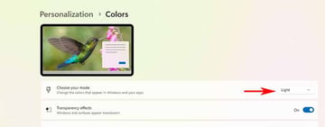
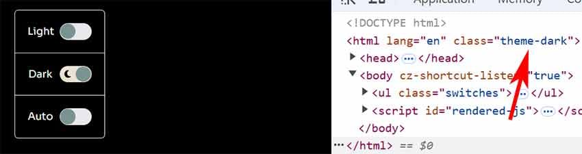
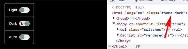
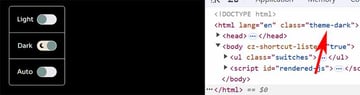
Regarding the markup, we’ll need three radio buttons in total. When the third radio button (Auto) is active, the page colors will depend on the color scheme set in our OS settings.


Here’s the required structure:
1 |
<ul class="switches"> |
2 |
<li>
|
3 |
<input type="radio" id="light" name="theme-mode" checked> |
4 |
<label for="light"> |
5 |
<span>Light</span> |
6 |
<span></span>
|
7 |
</label>
|
8 |
</li>
|
9 |
<li>
|
10 |
<input type="radio" id="dark" name="theme-mode"> |
11 |
<label for="dark"> |
12 |
<span>Dark</span> |
13 |
<span></span>
|
14 |
</label>
|
15 |
</li>
|
16 |
<li>
|
17 |
<input type="radio" id="auto" name="theme-mode"> |
18 |
<label for="auto"> |
19 |
<span>System</span> |
20 |
<span></span>
|
21 |
</label>
|
22 |
</li>
|
23 |
</ul>
|
2. Add the CSS
We’ll define the initial page colors using CSS variables.
1 |
:root { |
2 |
...
|
3 |
--white: #fff; |
4 |
--black: black; |
5 |
--text-color: var(--black); |
6 |
--bg-color: var(--white); |
7 |
...
|
8 |
}
|
Then, as soon as the dark mode is enabled, we’ll override the values of these variables.
1 |
.theme-dark { |
2 |
color-scheme: dark; |
3 |
--text-color: #fff; |
4 |
--bg-color: black; |
5 |
...
|
6 |
}
|
Notice the color-scheme: dark property value that allows browsers to render native elements in dark mode (e.g. form controls).
Of course, we can go even further from here. For example, we can have different image filters depending on the active mode, etc.
Below you can see the styles responsible for creating the look and feel of our toggle switches.
1 |
/*CUSTOM VARIABLES HERE*/
|
2 |
|
3 |
.switches { |
4 |
display: inline-block; |
5 |
padding: 0; |
6 |
border: 1px solid var(--gray); |
7 |
margin: 10px 0 0; |
8 |
border-radius: 6px; |
9 |
}
|
10 |
|
11 |
.switches li { |
12 |
position: relative; |
13 |
}
|
14 |
|
15 |
.switches li:not(:last-child) { |
16 |
border-bottom: 1px solid var(--gray); |
17 |
}
|
18 |
|
19 |
.switches li [type="radio"] { |
20 |
position: absolute; |
21 |
left: -9999px; |
22 |
}
|
23 |
|
24 |
.switches label { |
25 |
display: grid; |
26 |
grid-template-columns: 40px auto; |
27 |
align-items: center; |
28 |
gap: 10px; |
29 |
padding: 20px; |
30 |
cursor: pointer; |
31 |
}
|
32 |
|
33 |
.switches span { |
34 |
flex-shrink: 0; |
35 |
}
|
36 |
|
37 |
.switches span:empty { |
38 |
position: relative; |
39 |
width: 50px; |
40 |
height: 26px; |
41 |
border-radius: 15px; |
42 |
background: var(--gray); |
43 |
transition: all 0.3s; |
44 |
}
|
45 |
|
46 |
.switches span:empty::before, |
47 |
.switches span:empty::after { |
48 |
content: ""; |
49 |
position: absolute; |
50 |
}
|
51 |
|
52 |
.switches span:empty::before { |
53 |
top: 1px; |
54 |
left: 1px; |
55 |
width: 24px; |
56 |
height: 24px; |
57 |
background: var(--slate-gray); |
58 |
border-radius: 50%; |
59 |
z-index: 1; |
60 |
transition: transform 0.3s; |
61 |
}
|
62 |
|
63 |
.switches span:empty::after { |
64 |
top: 50%; |
65 |
transform: translateY(-50%); |
66 |
width: 14px; |
67 |
height: 14px; |
68 |
left: 6px; |
69 |
background-size: 14px 14px; |
70 |
}
|
71 |
|
72 |
.switches [type="radio"]:checked + label span:empty { |
73 |
background: var(--white-pearl); |
74 |
}
|
75 |
|
76 |
.switches [type="radio"]:checked + label span:empty::before { |
77 |
transform: translateX(24px); |
78 |
}
|
79 |
|
80 |
.switches li:nth-child(1) [type="radio"]:checked + label span:empty::after { |
81 |
background-image: url("data:image/svg+xml;base64,PHN2ZyB4bWxucz0iaHR0cDovL3d3dy53My5vcmcvMjAwMC9zdmciIHZpZXdCb3g9IjAgMCA1MTIgNTEyIj48IS0tIUZvbnQgQXdlc29tZSBGcmVlIDYuNy4yIGJ5IEBmb250YXdlc29tZSAtIGh0dHBzOi8vZm9udGF3ZXNvbWUuY29tIExpY2Vuc2UgLSBodHRwczovL2ZvbnRhd2Vzb21lLmNvbS9saWNlbnNlL2ZyZWUgQ29weXJpZ2h0IDIwMjQgRm9udGljb25zLCBJbmMuLS0+PHBhdGggZD0iTTM2MS41IDEuMmM1IDIuMSA4LjYgNi42IDkuNiAxMS45TDM5MSAxMjFsMTA3LjkgMTkuOGM1LjMgMSA5LjggNC42IDExLjkgOS42czEuNSAxMC43LTEuNiAxNS4yTDQ0Ni45IDI1Nmw2Mi4zIDkwLjNjMy4xIDQuNSAzLjcgMTAuMiAxLjYgMTUuMnMtNi42IDguNi0xMS45IDkuNkwzOTEgMzkxIDM3MS4xIDQ5OC45Yy0xIDUuMy00LjYgOS44LTkuNiAxMS45cy0xMC43IDEuNS0xNS4yLTEuNkwyNTYgNDQ2LjlsLTkwLjMgNjIuM2MtNC41IDMuMS0xMC4yIDMuNy0xNS4yIDEuNnMtOC42LTYuNi05LjYtMTEuOUwxMjEgMzkxIDEzLjEgMzcxLjFjLTUuMy0xLTkuOC00LjYtMTEuOS05LjZzLTEuNS0xMC43IDEuNi0xNS4yTDY1LjEgMjU2IDIuOCAxNjUuN2MtMy4xLTQuNS0zLjctMTAuMi0xLjYtMTUuMnM2LjYtOC42IDExLjktOS42TDEyMSAxMjEgMTQwLjkgMTMuMWMxLTUuMyA0LjYtOS44IDkuNi0xMS45czEwLjctMS41IDE1LjIgMS42TDI1NiA2NS4xIDM0Ni4zIDIuOGM0LjUtMy4xIDEwLjItMy43IDE1LjItMS42ek0xNjAgMjU2YTk2IDk2IDAgMSAxIDE5MiAwIDk2IDk2IDAgMSAxIC0xOTIgMHptMjI0IDBhMTI4IDEyOCAwIDEgMCAtMjU2IDAgMTI4IDEyOCAwIDEgMCAyNTYgMHoiLz48L3N2Zz4="); |
82 |
}
|
83 |
|
84 |
.switches li:nth-child(2) [type="radio"]:checked + label span:empty::after { |
85 |
background-image: url("data:image/svg+xml;base64,PHN2ZyB4bWxucz0iaHR0cDovL3d3dy53My5vcmcvMjAwMC9zdmciIHZpZXdCb3g9IjAgMCAzODQgNTEyIj48IS0tIUZvbnQgQXdlc29tZSBGcmVlIDYuNy4yIGJ5IEBmb250YXdlc29tZSAtIGh0dHBzOi8vZm9udGF3ZXNvbWUuY29tIExpY2Vuc2UgLSBodHRwczovL2ZvbnRhd2Vzb21lLmNvbS9saWNlbnNlL2ZyZWUgQ29weXJpZ2h0IDIwMjQgRm9udGljb25zLCBJbmMuLS0+PHBhdGggZD0iTTIyMy41IDMyQzEwMCAzMiAwIDEzMi4zIDAgMjU2UzEwMCA0ODAgMjIzLjUgNDgwYzYwLjYgMCAxMTUuNS0yNC4yIDE1NS44LTYzLjRjNS00LjkgNi4zLTEyLjUgMy4xLTE4LjdzLTEwLjEtOS43LTE3LTguNWMtOS44IDEuNy0xOS44IDIuNi0zMC4xIDIuNmMtOTYuOSAwLTE3NS41LTc4LjgtMTc1LjUtMTc2YzAtNjUuOCAzNi0xMjMuMSA4OS4zLTE1My4zYzYuMS0zLjUgOS4yLTEwLjUgNy43LTE3LjNzLTcuMy0xMS45LTE0LjMtMTIuNWMtNi4zLS41LTEyLjYtLjgtMTktLjh6Ii8+PC9zdmc+"); |
86 |
}
|
87 |
|
88 |
.switches li:nth-child(3) [type="radio"]:checked + label span:empty::after { |
89 |
background-image: url("data:image/svg+xml;base64,PHN2ZyB4bWxucz0iaHR0cDovL3d3dy53My5vcmcvMjAwMC9zdmciIHZpZXdCb3g9IjAgMCA1MTIgNTEyIj48IS0tIUZvbnQgQXdlc29tZSBGcmVlIDYuNy4yIGJ5IEBmb250YXdlc29tZSAtIGh0dHBzOi8vZm9udGF3ZXNvbWUuY29tIExpY2Vuc2UgLSBodHRwczovL2ZvbnRhd2Vzb21lLmNvbS9saWNlbnNlL2ZyZWUgQ29weXJpZ2h0IDIwMjQgRm9udGljb25zLCBJbmMuLS0+PHBhdGggZD0iTTQ0OCAyNTZjMC0xMDYtODYtMTkyLTE5Mi0xOTJsMCAzODRjMTA2IDAgMTkyLTg2IDE5Mi0xOTJ6TTAgMjU2YTI1NiAyNTYgMCAxIDEgNTEyIDBBMjU2IDI1NiAwIDEgMSAwIDI1NnoiLz48L3N2Zz4="); |
90 |
}
|
3. Add the JavaScript
To set up the functionality for our toggle switch component, we’ll take advantage of the local storage and the prefers-color-scheme CSS media feature. This useful media query takes as value the user’s preferred selection as defined in their OS settings.
The presence of the theme-dark class in the html element will denote that we’ve requested the dark mode manually or through the system settings.
At that point, we’ll store in local storage, the dark-mode="true" key value that will help us keep the user’s color scheme selection on page reload.

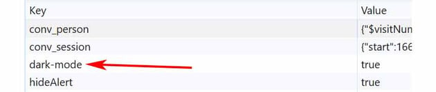
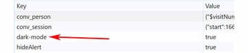
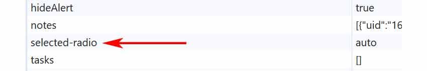
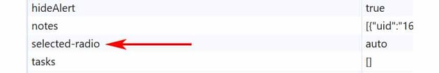
We’ll also store a second key value for identifying the active toggle switch.

With all these in mind, here’s all the required JavaScript—use your browser to check how it works:
1 |
const html = document.documentElement; |
2 |
const switches = document.querySelector(".switches"); |
3 |
const inputs = switches.querySelectorAll("input"); |
4 |
|
5 |
if (localStorage.getItem("dark-mode")) { |
6 |
html.classList.add("theme-dark"); |
7 |
}
|
8 |
|
9 |
if (localStorage.getItem("selected-radio")) { |
10 |
switches.querySelector(`#${localStorage.getItem("selected-radio")}`).checked = |
11 |
"true"; |
12 |
}
|
13 |
|
14 |
const setTheme = (theme) => { |
15 |
if (theme === "dark") { |
16 |
html.classList.add("theme-dark"); |
17 |
localStorage.setItem("dark-mode", "true"); |
18 |
} else { |
19 |
html.classList.remove("theme-dark"); |
20 |
localStorage.removeItem("dark-mode"); |
21 |
}
|
22 |
};
|
23 |
|
24 |
const handleMediaChange = (e) => { |
25 |
if (switches.querySelector('[type="radio"]:checked').id === "auto") { |
26 |
setTheme(e.matches ? "dark" : "light"); |
27 |
}
|
28 |
};
|
29 |
|
30 |
const handleInputChange = (e) => { |
31 |
const themeMode = e.target.id; |
32 |
if ( |
33 |
themeMode === "dark" || |
34 |
(themeMode === "auto" && |
35 |
window.matchMedia("(prefers-color-scheme: dark)").matches) |
36 |
) { |
37 |
setTheme("dark"); |
38 |
} else { |
39 |
setTheme("light"); |
40 |
}
|
41 |
localStorage.setItem("selected-radio", themeMode); |
42 |
};
|
43 |
|
44 |
window
|
45 |
.matchMedia("(prefers-color-scheme: dark)") |
46 |
.addEventListener("change", handleMediaChange); |
47 |
|
48 |
inputs.forEach((input) => input.addEventListener("input", handleInputChange)); |
Conclusion
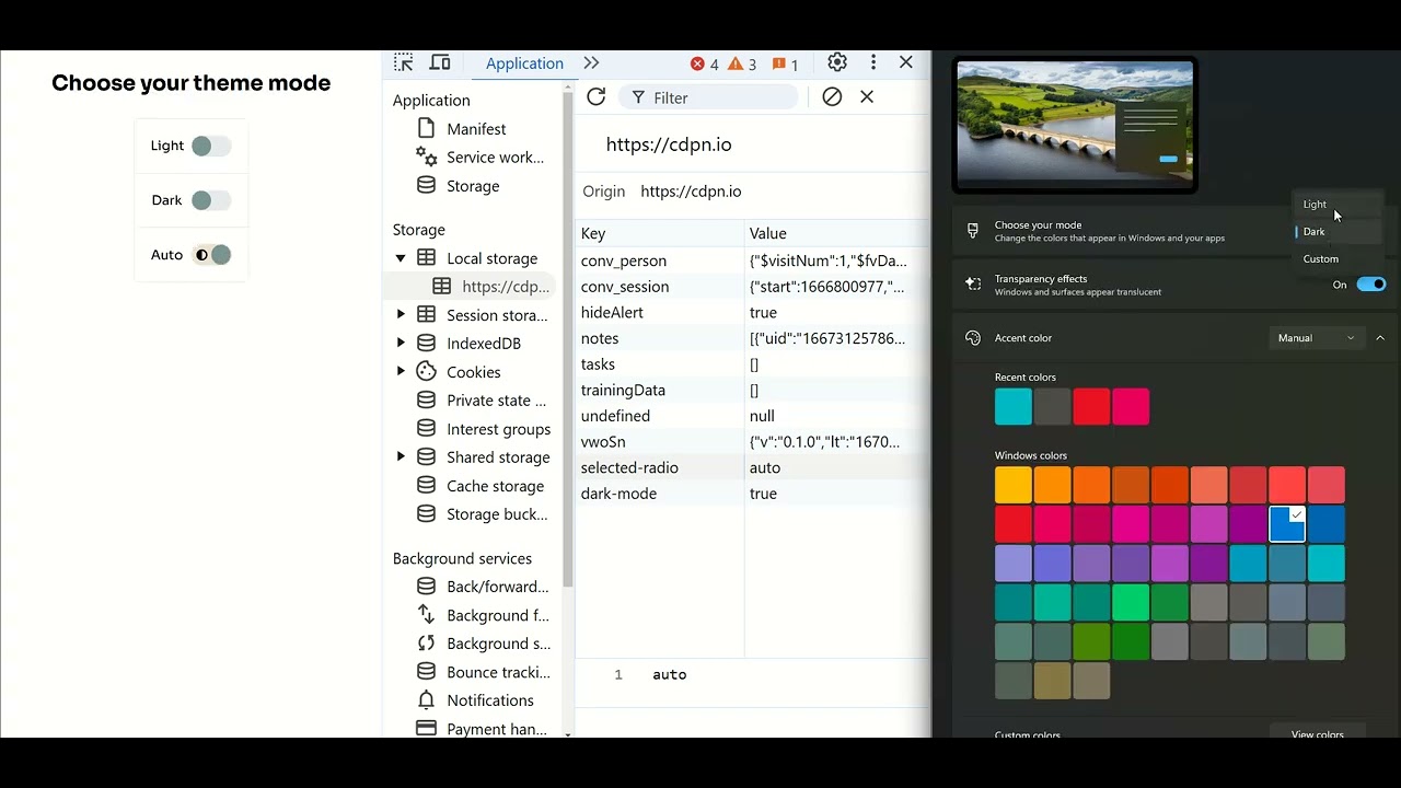
Done! I hope you had some fun with this exercise and will consider this component whenever you need a light/dark theme toggle functionality.
Let’s remind ourselves of our creation:
As always, thanks a lot for reading!
More color modes tutorials
Need more color scheme tutorials? Check out the tutorials below: