If you’re learning web design from zero and want to significantly improve your typography chops, then this article is written for you. We will cover typefaces, fonts, typographic anatomy, hierarchy and how to choose typefaces. You will learn enough to become dangerous in no time.
Topics
As is usual for these comprehensive guides, we’ll be covering a significant amount, including:
- The famous 95%
- Typefaces vs. fonts
- Typographic Classifications
- Typographic Anatomy
- Spacings
- Punctuations
- Hierarchy
- Choosing Typefaces
The Famous 95%
Web design is 95% typography! There is no web design without type. So why not improve your web design skills by applying solid typography? There is a rich world full of letters to explore, a world which has been handed down by generations of creative people working with graphic and type design. Another amazing rabbit hole to dive into.
In the early days of web design it tried to follow ideas of graphic design, especially how books, magazines and newspapers were laid out and designed. These days, designing for the web has matured and does not follow these concepts as closely as it once did. Responsive web design is one example where design clearly matured beyond the print world in many, many ways. The flip side is that this also led to more complexity—something which seems to be ever-increasing. Far from being threatening, this is very exciting and the possibilities are not only growing, but the options today are already vast and cool. The web has grown up—quite a bit—and the future seems bright!
Communication
Type is more effective than anything else when conveying your message on the web. Sure, graphics can support and enhance it, icons too, but communicating to your users happens mostly via the written word—in contrast to the advertising world, where images and graphics can convey whole stories a lot easier, even without using much written language at all.
On the web, we are talking about pages, websites, and most of all interfaces. Dealing with mostly graphical elements for these has proved difficult, often ineffective, ambiguous and not fit for the mass market.

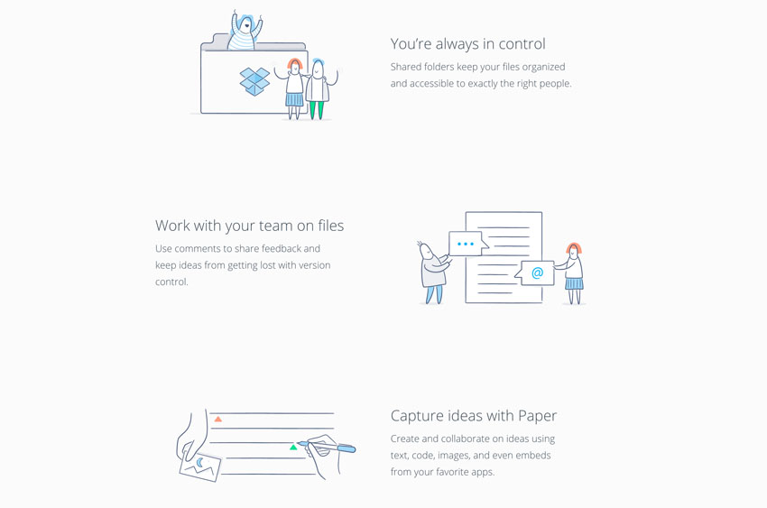
This example from Dropbox shows that the graphics alone don’t achieve the same level of communication and when alone are ambiguous at best.
Typefaces vs. Fonts
“Typefaces” are collections of letters, numbers and punctuation marks that form sets of styles for an alphabet. Think of typefaces as being a family of type whose members share common design choices but can vary in weight and styles. Bodoni or Gotham, for example, are typefaces.
You design a typeface.
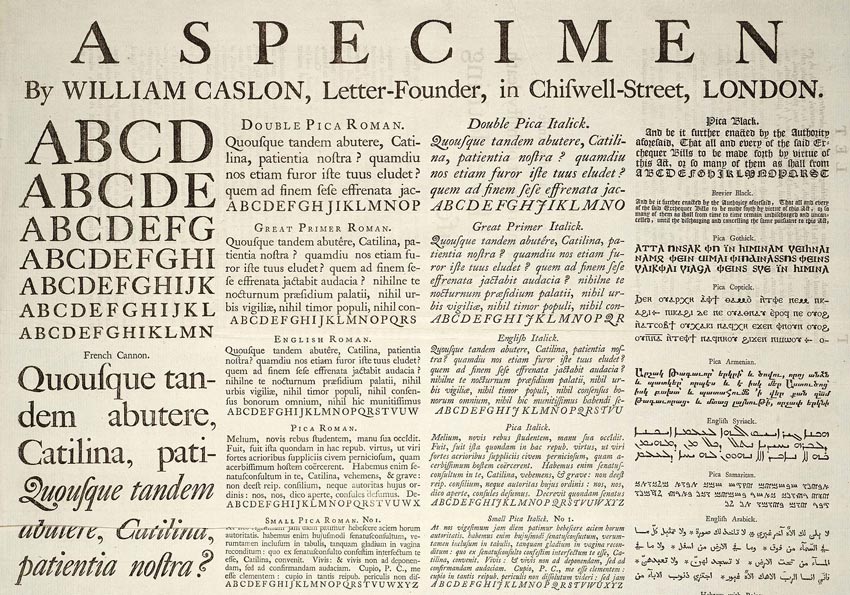
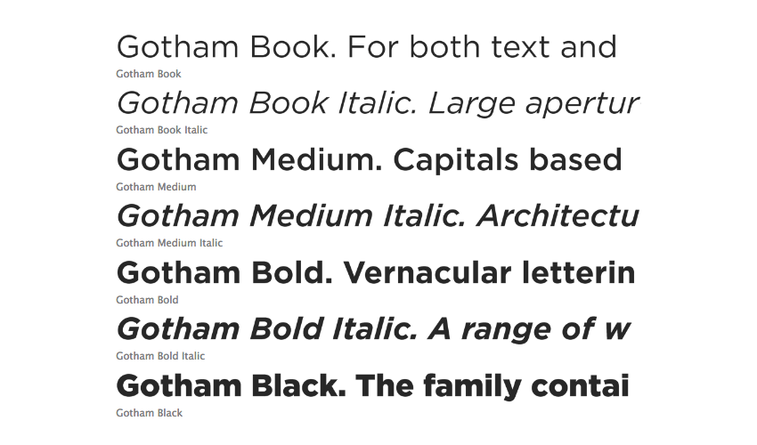
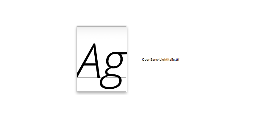
“Fonts” are considered to be a subset of a typeface. They are the physical (or digital) character sets of a particular typeface in one particular weight and style. Open Sans Light is a font; a file you use on your system.
You make a font.
Typographic Classifications
The subject of classification for typefaces is much vaster than one might think at first—especially the subclassifications. The essentials to start out with are quick to get a grip on though, let’s look at a few classifications that you absolutely need to know.
Serif Typefaces
Serif typefaces are named after the little extensions, decorative details, at the end of some strokes: serifs.

Serif typefaces are the oldest we will discuss in this article. This isn’t an exact science but arguments can be made that they go back as early as Romans carving letters into stones, using the Latin alphabet. There is also one interesting theory that says that they are a result of using chisels when carving stones and were an artistic choice due to the tools used to create a better end result.

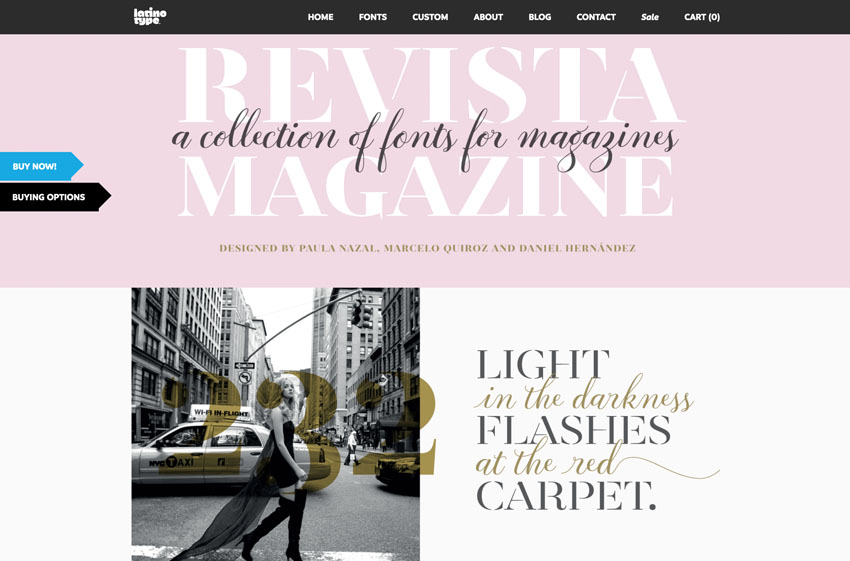

Serifs are often used for longer pieces of text like body copy. The evidence on their being “easier to read” is inconclusive, nevertheless, this argument often comes up. They work well in an old school and classic environment, but can equally work well in a modern setting if used properly.
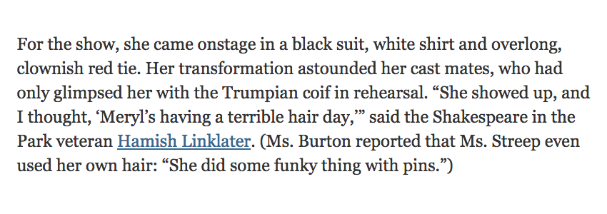
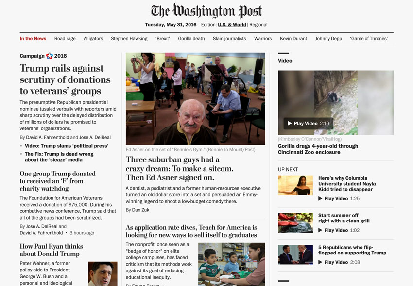
Serifs are nevertheless an excellent choice for headers as well. The headers used by The Washington Post are a perfect example of using a serif to convey a certain style of tradition and quality, while the sans-serif body copy makes it look modern whilst remaining highly readable.
Sans Serif Typefaces
“Sans-serif” typefaces lack the serif extensions.
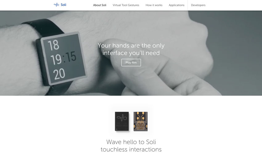
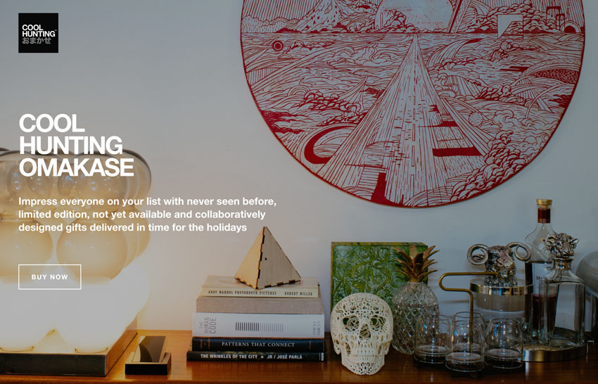
Sans serifs rose to popularity in the 1920’s. They were designed to look modern, industrial and machine-made; ideal for the advertising industry and the Art Deco movement of the time.
Semi Serif Typefaces
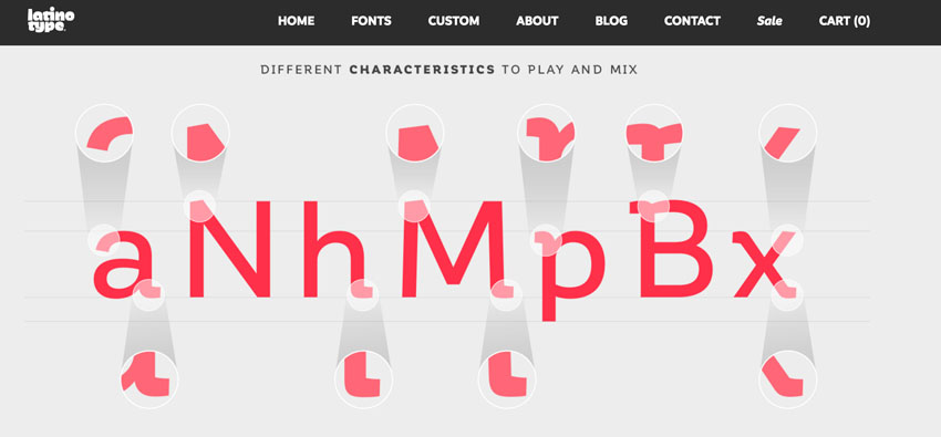
“Semi serifs” incorporate both characteristics of serif and sans serif typefaces.
Slab Serif Typefaces
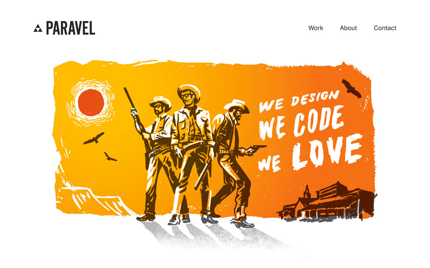
“Slab serifs” are similar to serifs, but are much thicker and more attention-grabbing in nature.
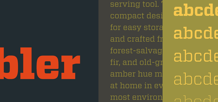
In the past, they were often used for typewriters to make sure enough contrast was created on the page. In the early days, typewriters had a harder time displaying printing letters consistently on a page; doing so was dependant on the pressure and the freshness of the ink and such. A slimmer serif was less effective for machine typesetting. The early advertising industry also needed something new and attention-grabbing, so made heavy use of slabs.


Script Typefaces
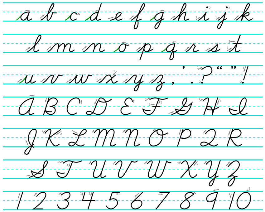
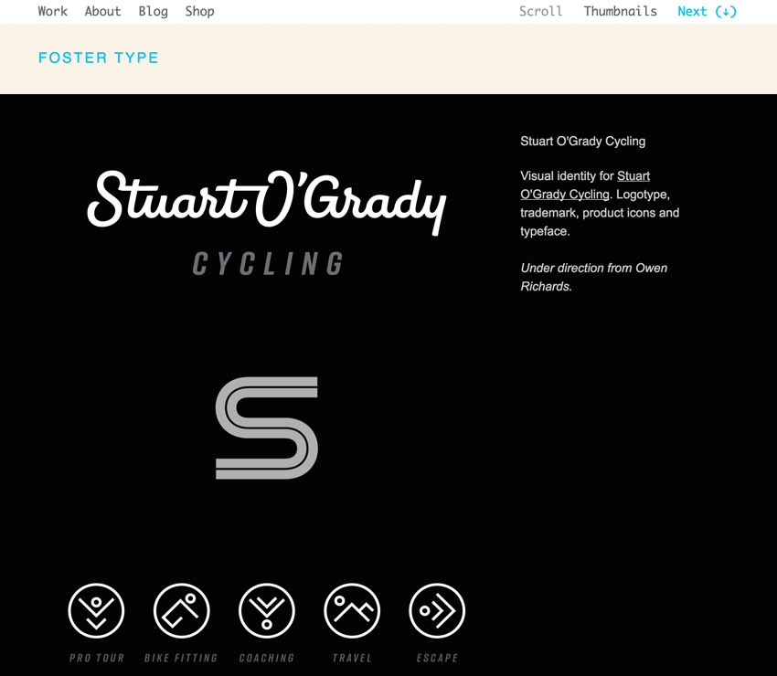
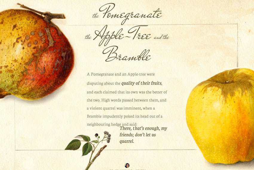
“Script” typefaces often emulate the look of hand-written text, imitating varying thickness and fluidity. Their appearance is more casual and informal, often giving the feel of something hand-crafted and personal. Scripts are typically very decorative and rarely used for longer paragraphs of text (hopefully).
Monospace Typefaces
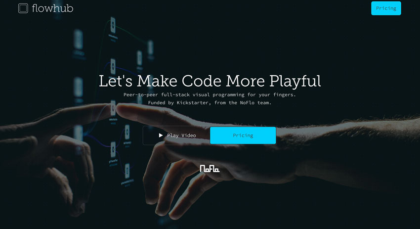
As the name suggests, each letter and punctuation character of “monospace” type occupies the same horizontal width. The other typefaces we’ve covered so far all have characters of variable widths; these are known as proportional typefaces.
Typewriters, early computers, and terminals heavily used monospaced type. Hardware of the time did not accommodate the needs for the variable widths of other type families. Today’s text editors for writing code still offer monospaced fonts by default. Nothing speaks “hacker” more clearly than code written in monospace. In the last few years it has also become a lot more popular among designers.
Typographic Anatomy
Now let’s go over some of the most important anatomic features of type.
We won’t worry too much about the minutiae here, your job as a designer is to get creative with the typefaces themselves, not recite every tiny detail of how they are composed. It’s all about what you do, what you achieve when you put typefaces to “work”. So my advice is simple, understand and memorize the basics, have fun, play around with the typefaces and soak it in over time. There is nothing wrong with not knowing every single detail about type anatomy! On the other hand, maybe I’m overly pragmatic about this. You decide!
Baseline

The baseline is the line upon which most characters are placed.
Median

The median on the other hand is the ceiling for most lowercase letters.
X-Height

The space between the baseline and the median is what we call the x-height. This can be seen as being equal to the height of the lowercase letter “x”, hence its name. The greater the x-height a typeface offers, the more readable it will be at lower sizes. Most of the text we read in the western world is comprised of lowercase letters, and as most of the distinctive characteristics which allow us to recognize letters and, therefore, words, can be found in this region, x-height heavily influences readability.
This extra space gives a font a bit more opportunity to let its character shine through. We tend to read in jumps and consume letters quickly and subconsciously. So more x-height is good for body copy because long paragraphs of text can get tiresome if the eyes have to work harder to decipher the alphabet. Sections like titles where you will generally use larger font sizes and shorter amounts of text anyway, can get away with less than optimal x-heights. You have more room for artistic choices that imply a certain mood or character without affecting the reading experience of your users too badly.
Ascender and Descender
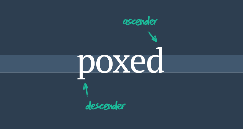
The ascender is that part that stretches above the median, whereas the descender is the part of a character which extends below the baseline:
Counter
Counters are areas that are partially or fully enclosed. Think of an “o” or an “a”. The “a” for example has two counters: one that is partially, and one that is fully enclosed. Typefaces with larger counters are usually also good for readability because the details have more room to be explicitly shown. So look for typefaces with large x-heights and larger counters if you are interested in giving users a good reading experience.

Spacings
Let’s now examine a few different types of spacing when dealing with typography.
Line Height

Line height is the space between two consequent baselines. In print, it’s very important to create a consistent vertical rhythm—the baseline grid—a mini grid system for type on a page. On the web, this kind of precision is notoriously difficult to achieve.
Baseline Grid
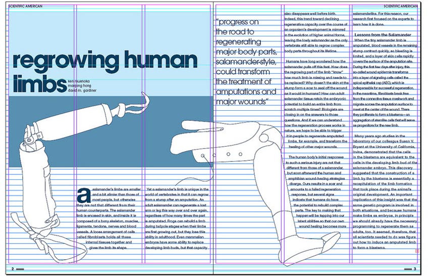
Responsive environments make applying baseline grids even less appealing, so arguably your time might be better invested in more pragmatic matters.
A good line height for paragraphs on the web usually lies between 1.3–1.6 (which is proportional to the font size). Titles can and should be a bit tighter. A good benchmark to keep in mind is that readers should be able to jump to the start of the next line easily. You don’t want to burden users with some sort of mental overhead, needing to look concentrate as to where they should continue to read when they reach the end of a line of text.
Varying degrees of line height can also (bizarrely) impact the color of your text. Tighter line heights appear darker since the micro whitespace between lines of text is reduced—and vice versa of course. Finding a balance so that text that looks coherent, light and readable is your goal while adjusting this spacing. Read the text, use real text not dummy ipsum and see how it feels. Is it a good reading experience? This should be at the forefront of your mind—always!
Line Length / Measure
Both these terms mean the same thing: the number of characters on a single line of text. A good measure for designs on the web lies between 60–85 characters. Line length and line height are somewhat symbiotic and depend on each other. The more line length a paragraph needs, the more line height should be incorporated.
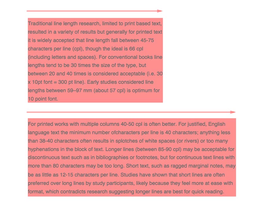
If it looks too cramped or too stretchy, adjust it until it’s readable and “feels” right.
Kerning
Kerning referred to adjusting the varying micro whitespace between individual letters. This is differently conceived by every type design, complying with the needs of each letter. A lowercase “o” might occupy less space than a lowercase “t’ for example. On the web this is tedious to adjust while the practice of kerning is very prevalent in the print industry.
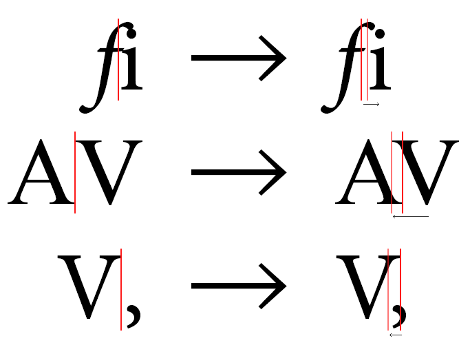
On the web it is possible to apply kerning by relying on the data baked into the fonts themselves. This is a feature which can be triggered with the CSS text-rendering or font-feature-settings properties. Bear in mind that support is far from widespread at this point.
Letter Spacing / Tracking
This refers to the consistent spacing between all of the letters in a group. It does not target individual letters like kerning, but is instead a uniform adjustment that spans across the entire affected text passage, resulting in more or less density and texture.
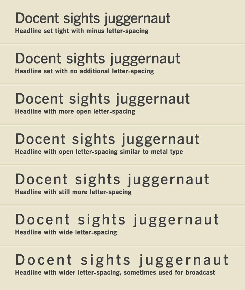
When you use larger pieces of text, for titles for example, a little bit of negative letter spacing can go a long way. You don’t want to create the impression that the text is drifting apart. As with kerning, when typefaces are designed to be consumed at smaller font sizes, the letter spacing might need these little nudges since the original kerning was considered differently.
Punctuation
Quotation Marks
Use real quotes. Period!
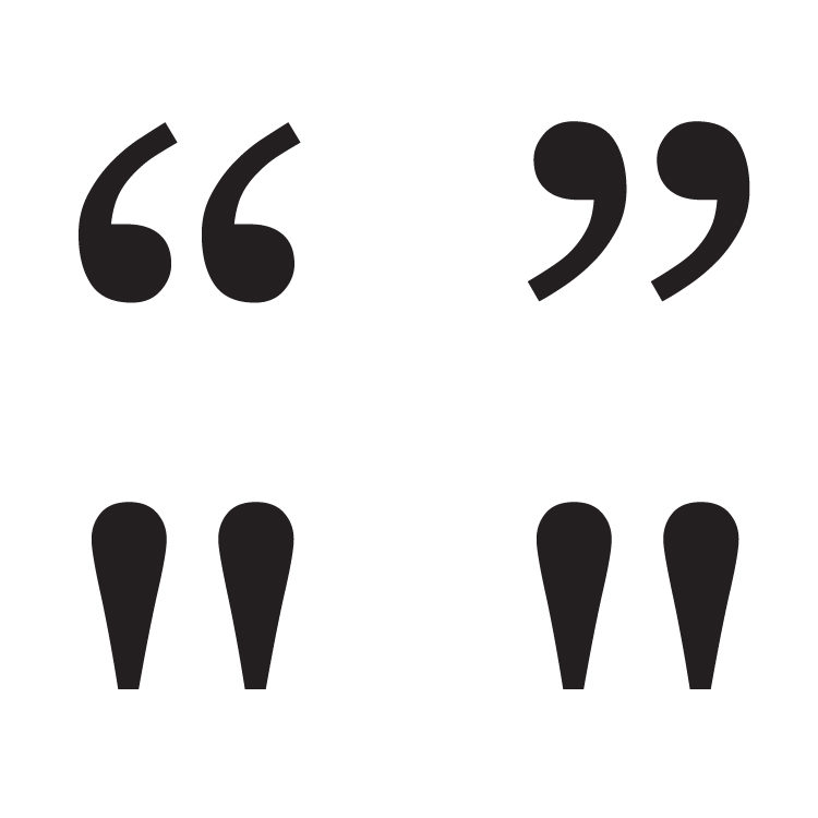
The other “quotes” that are often used are actually straight quotes—which should be used for inches and feet. Apostrophes and single quotes also have their real counterpart. Yes, you need to do some finger kung-fu on your keyboard to get them, but the end result is worth the effort. Read more:
Ellipsis
An ellipsis refers to the three dots that can easily be mistaken as three single periods. The difference is that they have more spacing between each period. You can use extra space to the left and right, it’s up to you to decide.
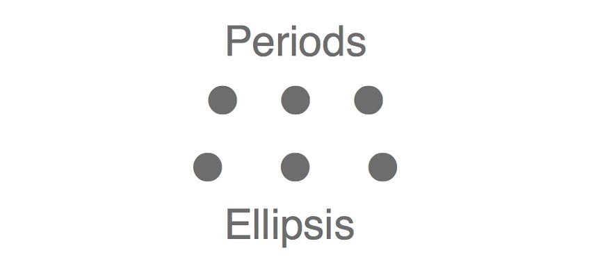
Use this when you want to omit content—words, phrases,lines, paragraphs or parts of quotes. It’s a placeholder to indicate that you left out some text.
Hyphen
There is no need for extra spaces around hyphens. Their main purpose is to link words together, like fine-art, 8-year-old and such.

They are your only choice for prefixes and suffixes as well. You should also use them if you need spell out a word: T-U-T-S-P-L-U-S. Spanning time and distance is also part of their repository:
- 03:45-04:00 p.m.
- 1938-1945
For these ranges you can also use the en dash.
En Dash
The en dash takes its name from the length of the lower-case letter “n”. It is a little bit longer than a hyphen and is used for ranges of values as well as for implying relationships like master–student. Or for emphasis.
Em Dash
The em dash is again a little bit longer, the size of the upper-case letter “m”. They should be used to emphasise a pause of thought and indicate that a sentence is unfinished. Both dashes can appear a little bit thinner than a hyphen—usually. Please don’t use two hyphens in cases where en or em dashes are more suited. Neither version of dashes requires an extra space around it.
I know, these punctuation details don’t sound all too dashing, but this basic knowledge of how to use them properly should be important for you if you like designing with good typography in mind. It also might seem trivial to have three sorts of dashes you can choose from because they look really similar, but on the other hand, a lot of care and consideration has been poured into these over the years and we should respect the work of designers who came long before us. It is their hard work and pioneering that makes it so easy to build upon today. Paying attention to these details is a small price to pay for standing on the shoulders of giants.
Hierarchy
It is important that you convey a strong hierarchy within your typography. Why? Because as we established at the beginning of this piece, the type on the page make for roughly 95% percent of your design. If you have weak hierarchy within your text, you won’t have a snowball’s chance in hell of creating strong hierarchy in your overall design.
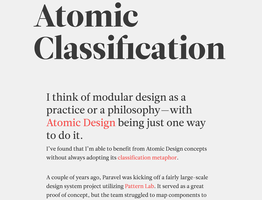
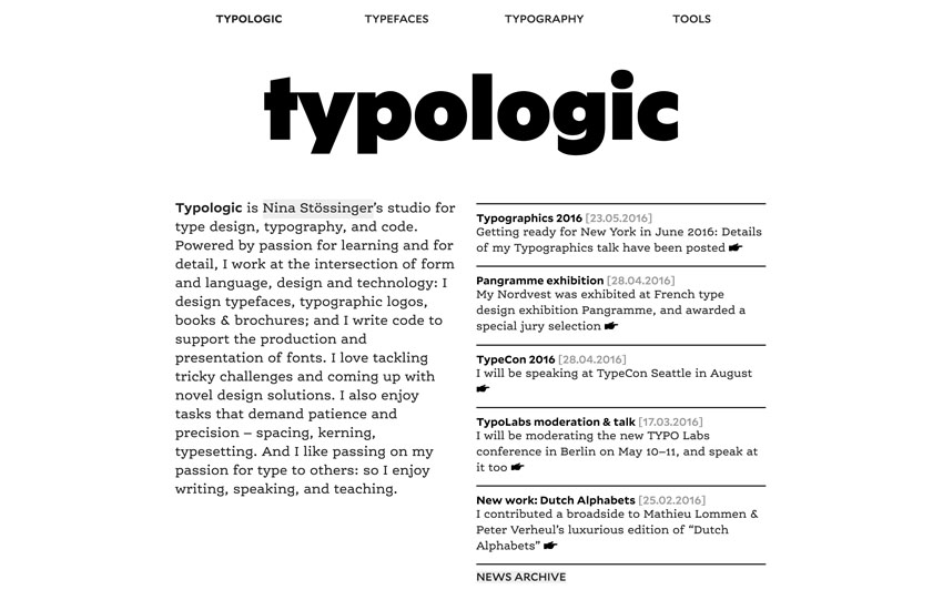
Typography offers you multiple ways to give your users visual anchors to navigate your site the way you want them to. Through emphasis you can let them know what is most important and what they should pay attention to first. Here are a few ways to strengthen your work in that department:
Color
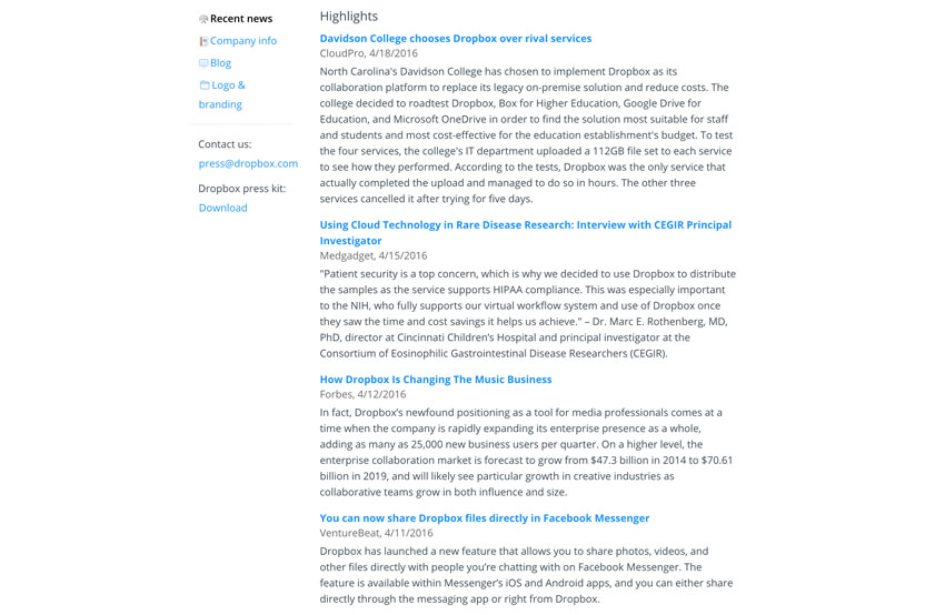
If you don’t have much color on a page, elements which do have color really stand out. As always, less is more. As the examples below only use color sparingly the effect is very strong—even without increasing the size or additional white space.
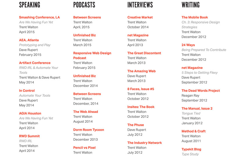
Size
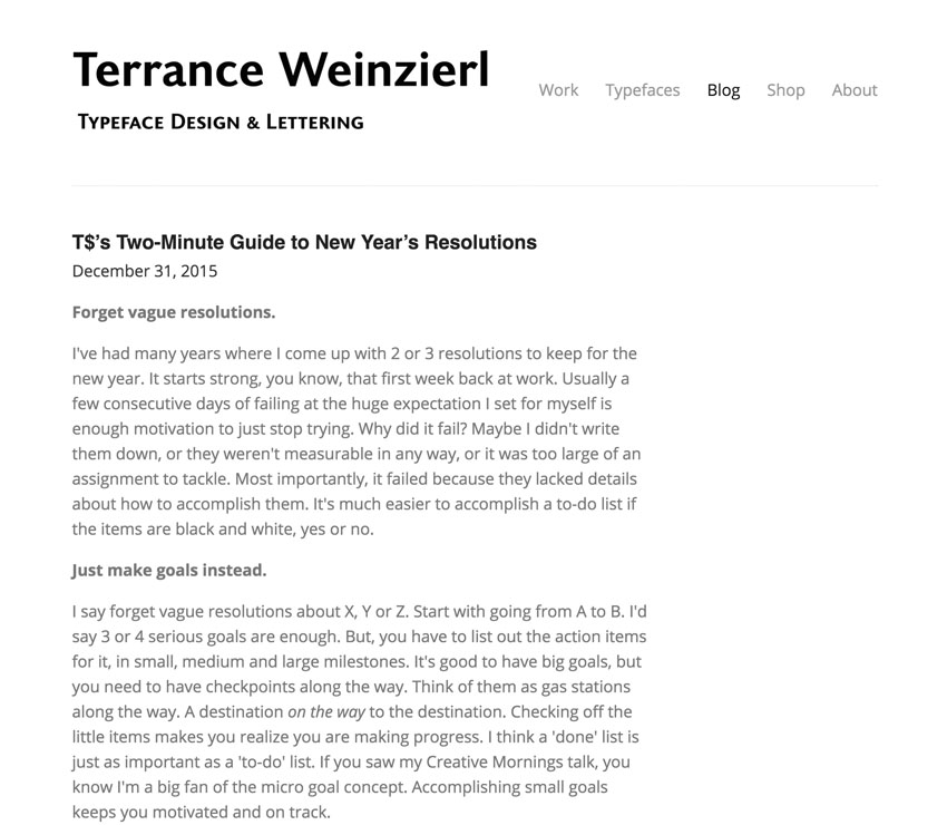
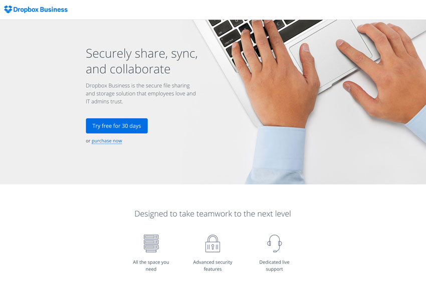
Increased relative font-size will always draw attention to certain elements. The thing I like about varying font sizes is that you can easily create visual “anchors” the reader can use to jump around on a page. The only caveat is that you really need to be consistent with the use of font sizes for particular elements. You can’t change it up at will all over the place. That would most likely weaken your designs much more than having uniform sized text.
Whitespace
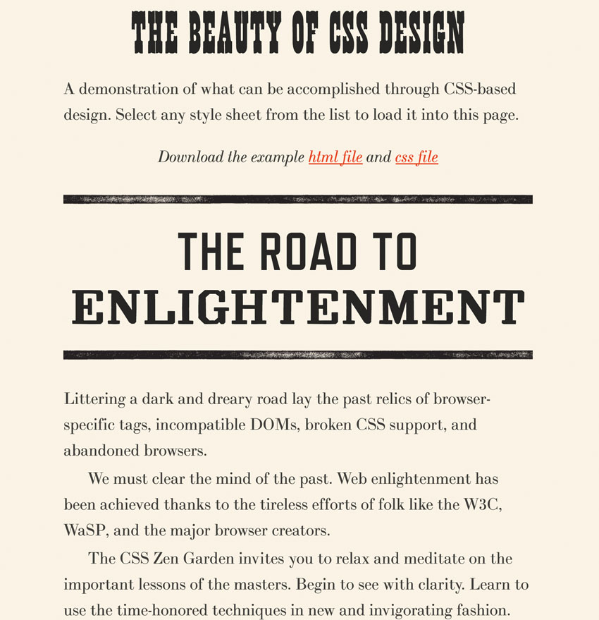
Give important typographical elements room to breath. If they are surrounded by empty space they are emphasised simply by that. Newcomers seem to shy away a bit from using much space between elements. In print this can be costly, but on the web you get this stuff for free. Play around, watch out what other designers come up with and steal on occasion. No magic and no rocket science though. Just a little experience is all you need—eventually you will develop a good gut measure.
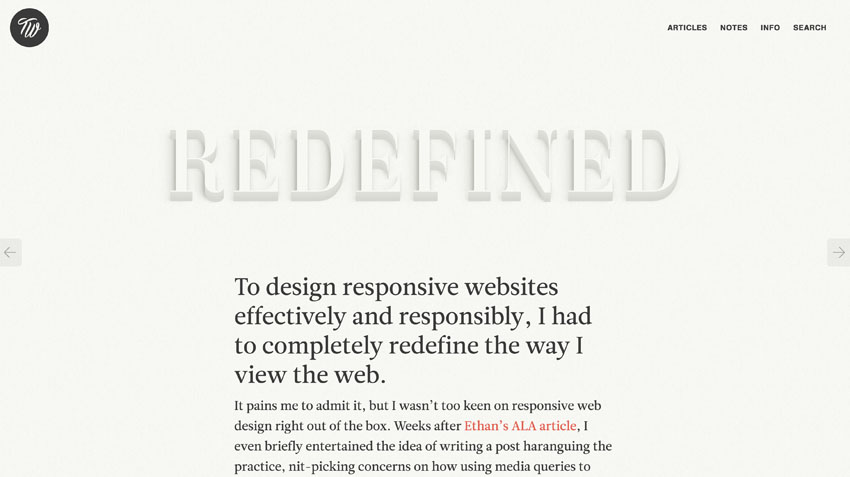
Weight
An extensive typeface family will give you plenty of weights to choose from. In many of the examples above you can see various weights for different purposes at work. For me, this is not something I jump to right away and usually try the other tools to create hierarchy first. But this is a matter of taste, whatever works best for you and your designs.
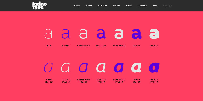
Screenshot

In the screenshot from the Dropbox “about” page you can see that the names have a different weight than their titles. A very basic technique for creating emphasis.
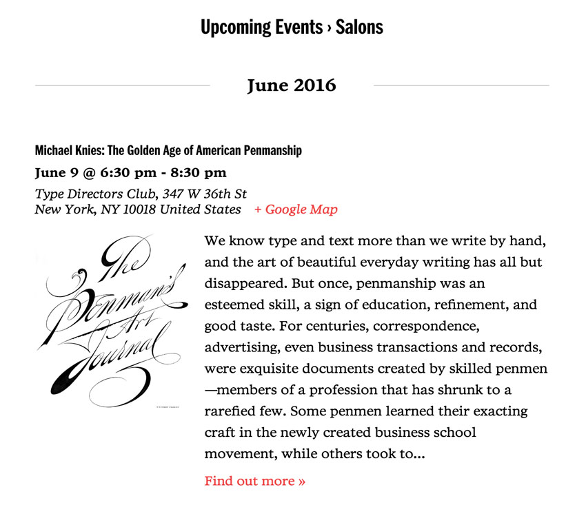
Italics
Italics are great for secondary or tertiary information in running text (or emphasis, of course). The example below makes good use of them for displaying an address.
Strong Contrast Within Paired Typefaces
When you choose more than one typeface for your work (best to avoid choosing more than two) it becomes critical that these typefaces themselves create some sort of hierarchy through their contrast. On the one hand they should be easily distinguishable from each other, and on the other hand not too unrelated. There are a few good guidelines for selecting typefaces; the next chapter will bring you up to speed on that one.
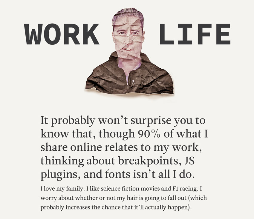
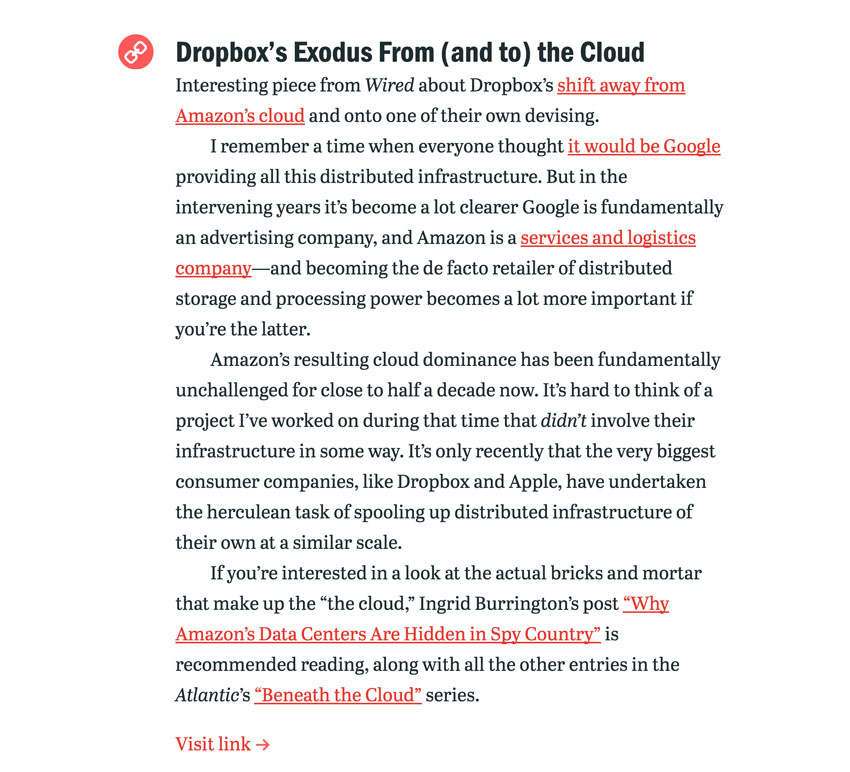
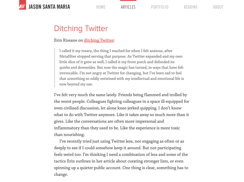
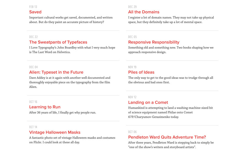
Keep in mind that all of the above rules only shine if you use them consistently. If you change things up too much, your hierarchy will be weakened significantly. If all of this is completely new to you, head over to my article about visual design principles to get you up to speed. All of the aforementioned will make a lot more sense after that.
Choosing Typefaces
We have tons of typefaces to choose from these days. And not only that, we have tons of services that want to help us with that. It can take a while to get a sense what’s out there actually. But to me, that is entirely a good thing. Web typography has come a long way, not only in terms of the ecosystem, but in terms of what browsers let you do these days.
When deciding which typefaces you want to use, I’d recommend that you first of all focus on the readability and style that you want to convey in your designs. The tone and the message are also important since type has a huge influence on this through its various characteristics. If you can manage to do all that, you will set yourself apart from the rest of the herd pretty significantly.
Pairing Typefaces
Make sure that you create good contrast between the paired choices. Typefaces that look too similar can end up looking confusing and affect your visual hierarchy negatively. Bigger typeface families also have the benefit of having tons of options to vary the one example. That way you can only use one typeface without looking boring.
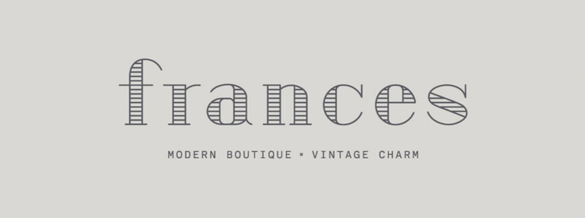
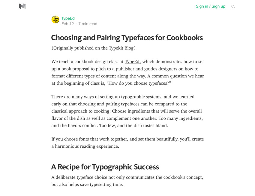
If you want to go further than that then pairing a sans serif with a serif typeface is the best place to start—the most reasonable actually. This can lead to a stronger and more interesting contrast that you can use to your advantage—stylistically.
Use your choices consistently. Avoid switching the typefaces for body copy and headers all over the place. Decide which one is best for readability and which one is best for conveying a style, while grabbing the readers attention, and stick to that.
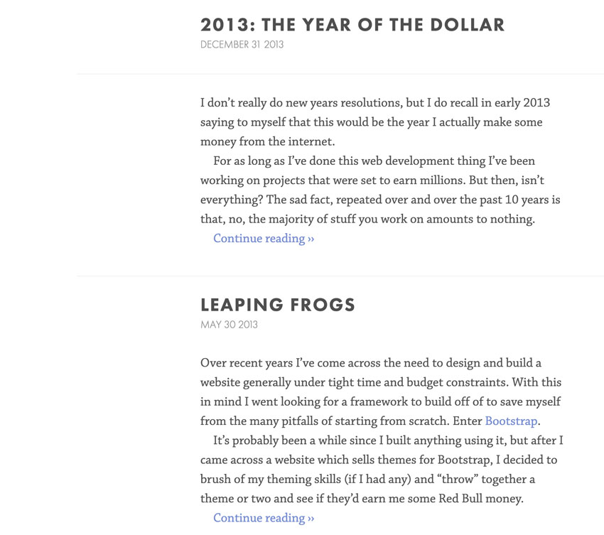
Some type designers have created serif and sans serif versions of the same typeface. These are supposed to work together neatly. When your typeface has a matching sibling you might find a fitting contrast baked in from the start.
If you pair two typefaces, aim for strong visual differences between the two. Keep it subtle if you want, but it should be at least noticeable—even to the fast eye. In that regard, pairing two sans serifs or two serifs can be tricky.

While you look for visual distinctions, you also want to watch out for some sort of common trait. Something that can bind the two different typefaces together. Their visual structure, the way their letters are designed could share common ideas. Similar counters and similar skeletons of their overall letters, for example. That ties them together even more skilfully. A similar structure or geometric design will help with that for sure.
On occasion, steal! When you find combinations that you like, try them out yourself and see what you can do with them. Learning through imitating the work of others is fine.
Final Thoughts
Typography lacks hard laws to guide your decisions. To me that is a good thing. In many regards, typography is subjective, but readability might be the one constant you should always focus on first and foremost. Take all the ideas and concepts we’ve covered with a grain of salt and see them as starting points for your own creative explorations.
There is a lot of room to infuse the web with better typography. It is such a great tool to enhance communication and I feel it is culturally precious knowledge that was handed down to us over many generations of hard work and exploration. It’s fantastic how you can influence the tone of written language with it.

