When working as a web designer, it’s totally expected that you might develop tunnel vision after some time. That is, you only listen to other web designers for tips and tricks of the trade.
But you can seriously up your game by peeking into the toolbox of mobile app developers. You see, it’s not just about making sure your site looks good on a phone. These app creators have been nailing user experience – making apps that folks love to use because they’re smooth, intuitive, and downright handy.
Ready to get into it? Let’s take a look at what you can learn from the app developers’ playbook to make your site designs pop.
Lesson 1: Embrace Simplicity and User-Centric Design
Taking cues from mobile app developers about simplicity and user-centric design could make all the difference in your designs. “Less is more” isn’t just a catchy phrase. It’s often a guideline to live by.
Simplicity speeds up development, simplifies maintenance, and reduces costs. It’s about focusing on what users really need, delivered in the clearest way possible. This mindset avoids overwhelming users with unnecessary features or information.
Not to mention, attention spans are shorter than ever. Site visitors expect fast, straightforward interactions. A study by Etsy showed that even slight slowdowns could significantly increase bounce rates. So, you need intuitive and quick-loading designs like what mobile apps offer more than ever.
This extends to how you present your content as well.
“Mobile apps understand users have short attention spans,” says Vikas Kaushik, CEO of mobile app development company, TechAhead. “Web designers can create scannable content with bite-sized information and visuals for easier user consumption,”
Similarly, adding too many features can muddle your site’s purpose and confuse people. Keeping designs straightforward ensures users find and use the features they need without distraction.
Lesson 2: Prioritize Performance and Optimization
Prioritizing performance and optimization in web design is akin to fine-tuning an engine for optimal speed and efficiency.
Just as mobile developers concentrate on responsive design, loading times, and memory usage to ensure smooth, efficient apps, web designers must apply similar focus. Performance optimization directly influences user engagement, expenses, and revenue.
Websites that load quickly and smoothly create a better user experience, which in turn can lead to higher customer retention and conversion rates.
Responsive web design also plays a key role in performance optimization. It ensures that a site is accessible and performs well across all devices, from desktops to smartphones. Performance metrics like Time to First Byte (TTFB), Total Blocking Time (TBT), and Largest Contentful Paint (LCP) are key indicators of a site’s health and user experience.
Strategies for optimization include:
- Optimizing image files
- Leveraging browser caching
- Using content delivery networks (CDNs)
- Minifying code
These efforts not only enhance UX but also contribute to better search engine rankings and overall success.
Lesson 3: Use Consistent UI Elements and Feedback
Consistency in UI elements that provide equally consistent feedback is another key factor you can learn from mobile app design. They maintain that people can navigate and interact with your website intuitively.


When UI elements like buttons, icons, typography, and color schemes are consistent across a platform, people develop a sense of familiarity. This familiarity makes it easier for people to understand and predict how the app or site works. This predictability then builds user satisfaction over time. And that means people are more likely to keep using an app – or in this case – visit your website again.
Immediate and clear feedback – whether it’s visual cues after a button click, haptic feedback on mobile devices, or error messages – helps people understand the outcome of their actions. Digital feedback like this reassures people that their actions have been recognized and processed by the system. This continuous loop of action and feedback is essential for maintaining user engagement and maintaining a reliable UX.
Lesson 4: Use Personalization and Push Notifications
Another thing web designers can learn from mobile app developers is how to properly lean into personalization and push notifications.
Engaging users through personalization and push notifications requires a thoughtful balance between providing value and respecting user preferences. Personalization, when done right, tailors the user experience to individual needs and interests, making interactions with the app or website more relevant and engaging.
Push notifications, on the other hand, keep people informed and engaged. But they have to be used sparingly to avoid overwhelming or annoying anyone. The effectiveness of push notifications depends largely on their relevance and timing. Notifications should be timely, contextually relevant, and offer genuine value to the recipient.
Lesson 5: Incorporate Advanced Features Thoughtfully
Incorporating advanced features like camera integration, Bluetooth, and augmented reality into mobile apps opens up a ton of possibilities for enhancing UX and engagement. AR, in particular, has shown transformative potential across many businesses, blending digital elements with the real world to offer immersive experiences.
For example, retail applications like IKEA Place make solid use of AR to let customers visualize how furniture would look in their homes.


For web designers looking to integrate similar features, you’ll need to approach these technologies thoughtfully, ensuring that they add value to the user experience without compromising performance. The goal is to create meaningful interactions that resonate with users on a personal level.
Lesson 6: Continuously Test
Continuous testing is a key part of delivering high-quality apps. It involves integrating testing throughout the software development lifecycle and providing immediate feedback on the quality and reliability of the code at every stage.
You often find this sort of iterative testing used in DevOps. But you can easily use it in web design, too. And doing so can offer many benefits like a quicker development schedule, improved collaboration, and reduced costs (since bugs are addressed as they arise).


The key is to use a system that allows for multiple people to be working on a project at once. Github is great for this. But any system with proper forking can ensure no changes are pushed live without a) testing and b) confirmation that it’s the final version.
Selecting the right tools as a mobile app developer matters a lot. This decision influences how an app performs, engages users, and scales. So similarly, in web design, aligning with the appropriate tech stack is a must. You’ll need to consider project needs, audience, and desired features.
For mobile apps, you’d need to decide between iOS and Swift or Android and Kotlin but for web design, your choices might range from HTML, CSS, and JavaScript for the basics to more sophisticated frameworks like React or Vue.js for dynamic, single-page applications. This offers the foundational blocks for creating responsive, user-friendly websites.
Cross-platform development tools, like React Native or Flutter in the app world, have their web counterparts in technologies like Electron for desktop applications or Progressive Web Apps for mobile-friendly web experiences. These solutions allow for a broader reach, ensuring that products are delivered consistently across different platforms and devices with minimal code duplication.


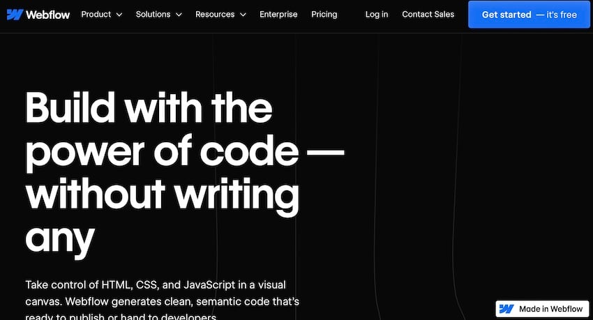
The rise of no-code and low-code platforms present a unique opportunity for web designers to rapidly prototype and deploy sites without deep dives into complex coding as well. Platforms like Webflow or Wix offer the versatility to create sites with drag-and-drop builders.
Web Designers Can Learn A Lot from Mobile App Developers
Web designers stand to gain a lot from mirroring the practices of mobile app developers. And by using things like user-centric design, performance optimization, and continuous testing, you can elevate your creations and make more effective decisions in the long run.
What have you learned from mobile app developers? Anything you’ll be putting into your web design workflow?