Flares. Mullets. VHS. You may remember them the first time around (and hoped you’d seen the back of them), but they’re officially back!
And whatever your views are on the matter, the same can be said for web design trends. Yes, we now have so much more technology at our fingertips than we did back in the heady days of the 80s when the internet first burst onto our screens. But more and more, we’re seeing nods to the digital past popping back up. Love it or loathe it, read on as we dissect some of the retro web design trends making a comeback today.
What is Retro Web Design?
Forget blindly chasing the latest web developments of 2024 and beyond, retro web design favours a nostalgic look back to web design trends of the past.
It could refer to the early days of 1980s web design or look later towards the 2010s (and everything in between). It gives past web design respect, rather than seeing it as something that should be wiped out in the spirit of progress.
Why is Retro Web Design Resurfacing?
Whether you’re mad on modern or rave about retro, there are a few reasons why these classic cyberspaces are showing their (pixellated) faces once more. Why, I hear you ask?
Nostalgia
Like fashions or music that you swear will never come back in again, many people who grew up during the early days of the internet feel nostalgic about retro web design. Building websites that remind them of their youth will bring a sprinkling of joy!
Difference
With simplicity and minimalism taking centre stage over the past years, retro web design can help your web design stand out. After all, why blend in?
Counter-Culture
You can also appeal to people who celebrate non-conformity. Rejecting the norms and going your own way makes a statement that can suit many companies, including fashion brands or food outlets targeting a young or trendy set.
Eye-Catching
Many retro web design trends opt for bold colours, pixel art, and animated GIFs that catch users’ eyes when they’re scrolling. By going back in time, you can hopefully keep more people on the page.
What To Look Out For in Retro Web Design
Of course, with retro web design largely referring to “everything that came before”, there are so many ways this aesthetic can make itself known in web design.
To get started, you can think of retro web design as displaying a throwback to a specific decade.
- If you’re after an eighties vibe, think text-based with limited graphical elements. After all, computers back then were less advanced than even the most basic of phones many of us have today.
- If you’re nostalgic about the noughties, you might prefer rounded corners or grid-based layouts.
10 Retro Web Design Trends Making a Comeback in 2024 and Beyond
Pixel Art
Pixel art first burst into the web design scene back in the late 1970s and early 1980s with the birth of home computers and game consoles. Think Space Invaders and Pac-Man, which both used blocky graphics to create recognisable figures.
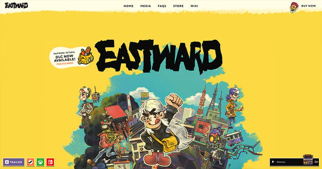
Eastward
Look out for cool little pixel art examples on the Eastward gaming website. There’s static pixel art such as a camera, as well as more animated art of gaming characters.


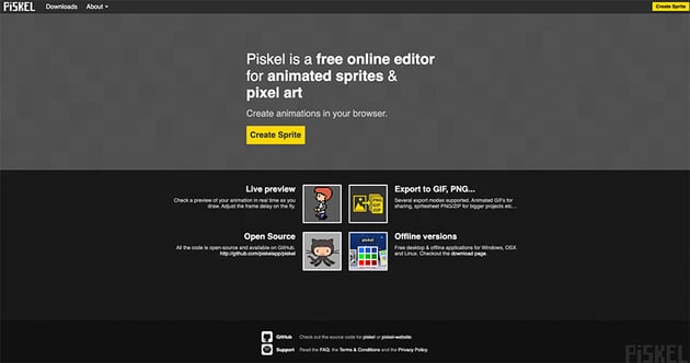
Piskel App
Check out Piskel App for examples of super nostalgic pixel art that may inspire you.


Want to learn how to draw hand-crafted pixel art in Photoshop? Head this way.
Old-School Web Elements
In a similar vein, websites back in the day would make the most of elements like animated GIFs, visitor counters explaining how many people have visited the site, and ’under construction’ GIFs to let users know that updates are coming soon. Because these elements are now so rare, they can surprise and delight visitors today with their retro charm.
TLDR – Notification Email Sets + Animated Icons
If you fancy adding some nostalgic charm to your web design, then check out these animated icons. Inspired by animated GIFs of the past, the icons have been updated to belong in 2024 and beyond.

Nostalgic References
Of course, retro web design can include the site’s content as well as how it’s designed. Gameboys, cassettes, the Spice Girls; this is about giving airspace to whatever it is that floated your boat back in the day.
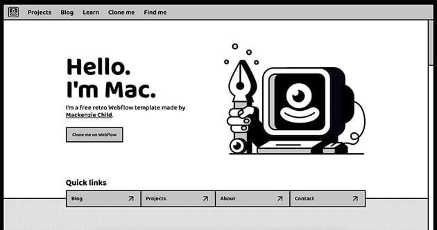
Mac
You can’t get much more retro than this Webflow template, which is inspired directly by the early Apple OS interfaces. With monochrome colours, simple navigation, and the custom mouse cursors, this website screams nostalgia.


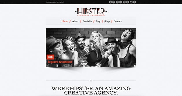
Hipster – Retro Responsive WordPress Theme
This retro layout could be a good option if you’re ready to add your own vintage elements. Like many of the best retro WordPress themes out there, you can easily edit the images and text to suit your vibe.


Retro Colour Schemes
We’re all familiar with the colour schemes that fill most of our web space today (think whites and blues). Web designers back in the day weren’t shy about using colour; perhaps because they had fewer exciting functionality tricks at their disposal. Neon colours, pastel hues, or contrasting colours all belong to the retro aesthetic.
Retro Portfolio – One Page Vintage WordPress Theme
If you’d like to step towards the muted colour palette, then the Retro Portfolio WordPress theme could be for you. These colour choices were particularly popular in the mid-2010s, so will be familiar to a lot of users.
VintWood – a Vintage, Retro WordPress Theme
Step back in time with the retro colour choices in this cool WordPress theme. There are two homepages to choose from and they come with 20+ inner pages too.
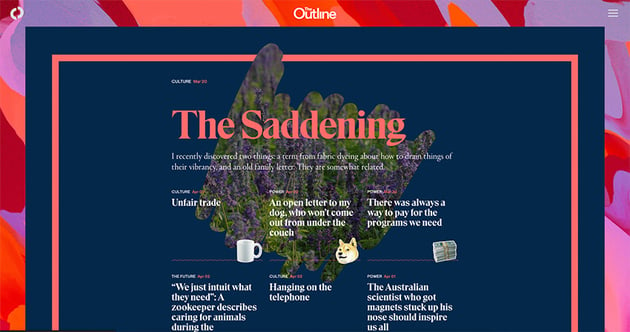
The Outline.com
Check out the retro, clashing colours within The Outline. Favouring a “more is more” approach, there are also animated GIFs and text appearing over different colours and textural elements.


Music
Remember the days of Myspace when users’ profiles were accompanied by the sweet tones of their favourite tunes? Website music, otherwise known as MIDI melodies (Musical Instrument Digital Interface), has fallen out of fashion over the years. (Anyone else remember struggling to find where on earth the random music was playing from?) However, it’s creeping back into web design today…
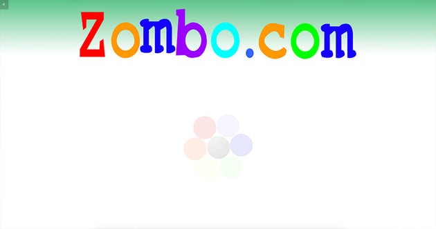
Zombo.com
If you stumble across this retro, stripped-back website you’ll also be greeted by a surreal soundtrack welcoming you to the page. Whatever your views are on the return of MIDI sites, you can’t deny they catch your attention.


Super Simple Navigation
Retro web design tended to favour simple navigation. Often featuring a very simple scroll, the sites were designed with desktop in mind rather than also needing to work on tablet or mobile screens.
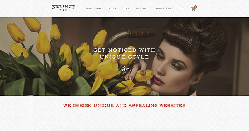
Extinct – Retro Vintage Portfolio WordPress Theme
How about picking this retro WordPress template if you’re looking for a design that reminds you of simpler times? Although this works across any screen size, the simple vertical scroll and classic content blocks serve as a super reminder of retro web design.


Geometric Patterns
Grids, checkerboards, or stripes, geometric patterns were also frequently used in retro web design. Whether used on their own or to aid navigation, these designs are making a comeback.
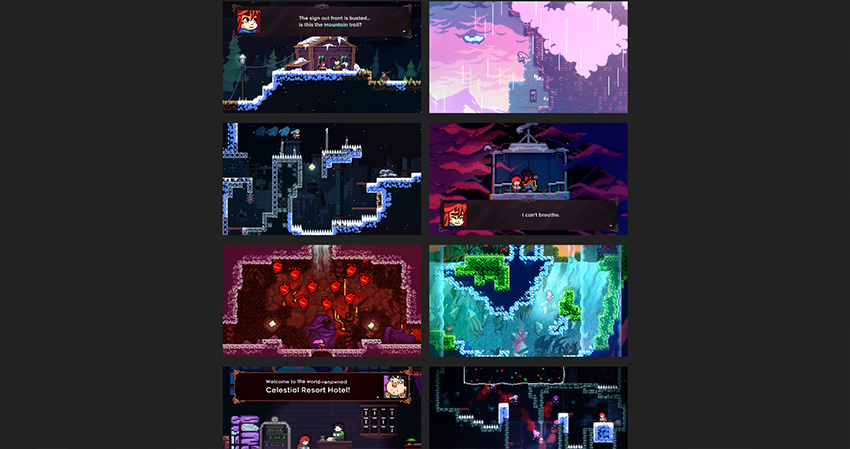
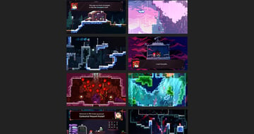
Celeste
A grid comprising retro game screenshots contributes to this website’s retro feel.

A Love of Text
In the past, big chunks of text were not unusual in web design, but this was soon replaced by websites favouring imagery and video content. Today, we’re seeing more and more sites not being afraid to use more text than imagery in their designs.
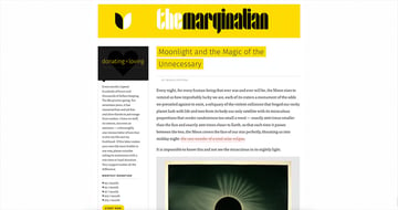
The Marginalian
You’d be forgiven for completely missing the pictures on this site as they’re hard to spot! Not shying away from large blocks of text, this website has its own retro charm.


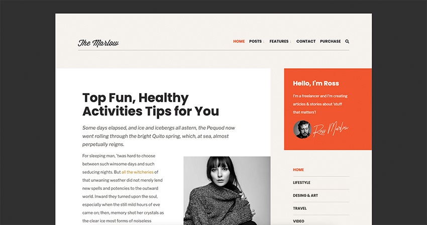
Marlow – Distinctive, Typography-First WordPress Blog Theme
If you’d like to do something similar, you can pick a retro WordPress template like Marlow. The template allows for large chunks of text alongside a single image, which is perfect for a blog, review, or news sites.

Vintage Typography
And when it comes to text in retro web design, it’s not just about how much there is – it’s also about the style. Picking fonts that are no longer in vogue can be a way to set your site apart.
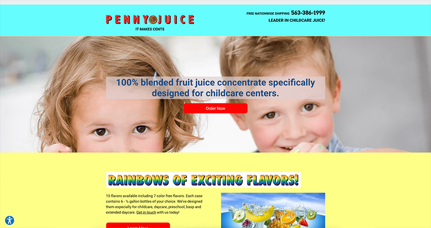
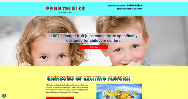
Penny Juice
See how this site uses a combination of stripped-back fonts, including some with classic rainbow gradients! Against clashing colours, the design looks very different to most sites today. Love it or loathe it, it makes you look twice.

Skeuomorphism
This is a fancy term for design elements mimicking the real world, and it was especially popular in the early days of web design. However, there are still countless examples today, i.e. think about app icons looking like real-life calculators, trash cans, clocks, or notepads. Apple’s GarageBand, for example, would always opt for virtual knobs and dials that look like the real thing.
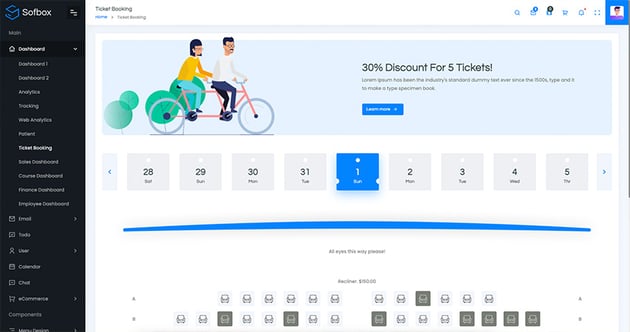
Sofbox Admin – Vuejs, Laravel, Angular 9, React, HTML Admin Theme
Take a look at the Ticket Booking demo and you’ll see dates are shaped like ticket stubs. The design is very clean and clear, revamping retro styles with a more modern look.

So, Are You Ready to Rock Retro?
Whether you love the revival of older looks or are desperately clinging to modern web design, there’s no denying vintage styles are making a comeback. Will you be getting involved?