The year 2017 is slowly running to the end, so we can start drawing the first conclusions in regards to the trends that were in the biggest demand among the web audience. It’s become our good tradition to start every New Year with the series of predictions for the next 365 days and finish the year with the roundup of the ideas that were really brought to life.
In 2017, we have already seen a number of the new and revamped web resources, the biggest part of which run on WordPress CMS. The popularity of the most functional content management system continued to grow in 2017. According to the usage statistics and the market share of WordPress for websites, the CMS is used by 59.7% of all websites whose CMS we know. This makes up 28.9% of all websites on the today’s web.
With the growing number of WordPress sites, the choice of the ready-made WordPress themes was also expanded with thousands of the pre-designed solutions designed and developed as per the latest web trends. So, the main goal that we pursue while working on this post is to reveal the top 7 WordPress web design trends for 2017 and find inspiration in the ready-made themes that can help us launch the web resources of all levels of difficulty in the shortest period of time.
As we were looking for the best examples of the fresh releases of the trendiest WordPress theme for 2017, we decided to get inspired by the ready-made solutions from the TemplateMonster digital marketplace. Submitted by the vendors from the worldwide, all of the chosen themes fall under the industry-set web design standards. So, let’s get started.
Mobile-first Web Design
It may sound like a well-established approach to the development of the websites. However, do not make quick judgments. It’s been a while since web designers started to release responsive designs, that look on all screen sizes perfectly well. However, with the growing demand for the handheld devices and millions of users who search the web from the screens of their smartphones and tablets, the web developers had to re-think the way they build websites.
The mobile-first approach tool the central role. More and more often, web designers start with the mobile versions of their projects and then expand layouts to the sizes of the laptops and desktop computers. The main challenge that web developers face when opting for this approach is the need to decide on the core information that is of the greatest value on the site. Smaller screens have less space to share all pieces of content that one may wish to display. So, you grow your chances to end up with a website that caters to the needs of the target audience.
Corporate WordPress Theme
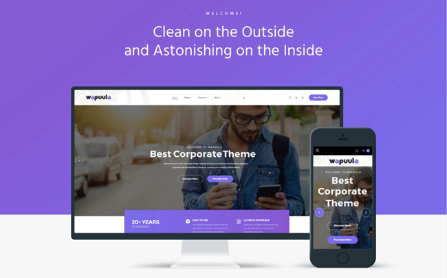 Details | Demo
Single-page Layouts
The trend is closely connected with the previously described technique. Browsing websites from the screens of the handheld devices, it’s more convenient to see all content displayed within a single interface rather than navigate to the extra pages to access more information. That is why single-page layouts where scrolling is applied instead of clicking are in the great demand this year.
Single-page websites are popular among companies and individuals specializing in the specific products and services. As a rule, such web projects stand out with the captivating storytelling, keeping the users’ attention focused on the content as they scroll down to the bottom of the page.
Single-page layouts are also used for building landing pages and resume websites. Clear and concise page structures bring the main focus of the site visitors’ attention to the essentials, making it easier to understand the main objectives.
Wedding WP Theme
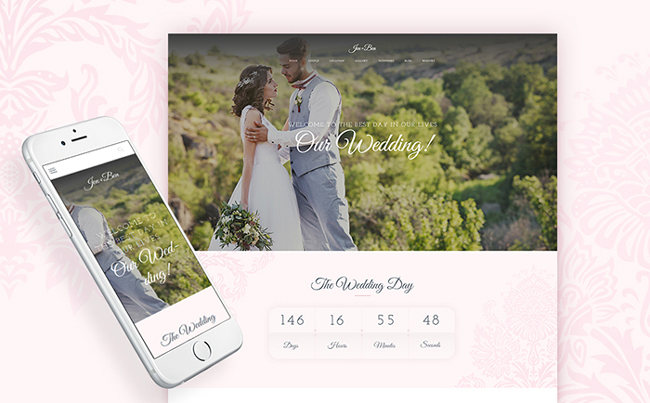 Details | Demo
Videos are Everywhere
A picture says a thousand words. A video can deliver even more when integrated in the web page. Video content is generally considered to be one of the most effective marketing tools, which captures the users’ attention and delivers your ideas in the easy-to-follow style.
Today, you can place videos in the literally every section of your online resource. These can be added to the sliders, backgrounds, single posts, product previews, etc. By watching a video, the user gets a better understanding of the things or services that you represent, which grow the chances that his interaction with your website will end up with a conversion.
Electronics WP Theme
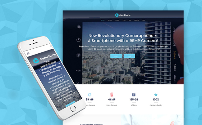 Details | Demo
Vivid Colors
In 2017, we can see more brands starting to experiment with the increasingly brave color palettes, designing their websites in the bold and vivid hues. The modern technologies allow us to experiment with the gradients, oversaturation, and colorful shadows, all of which can make web resources more outstanding and catching.
Job Portal Template
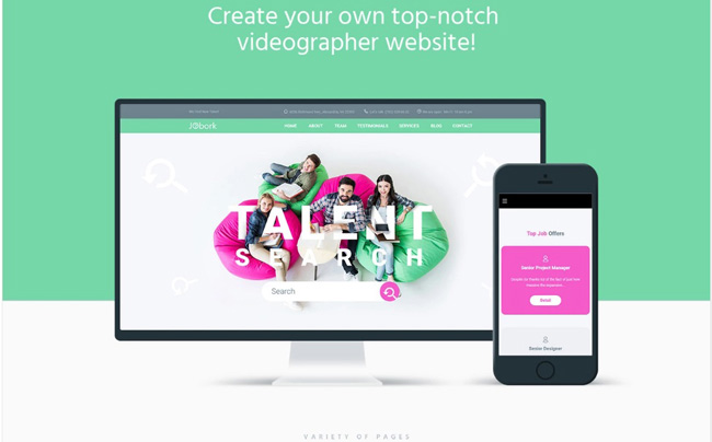 Details | Demo
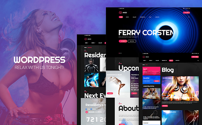
Large, Bold Typography
2016 saw the creative use of typography. The trend continues to boost in 2017. More and more often we can come across the web projects making use of the bold and large fonts added to different sections of their designs. Large typography is more effective for the UX for a couple of reasons. First of all, it is more visible on the smaller screens. Additionally, it helps you separate different content blocks from one another, making it easier for the site visitors to navigate through each section.
Nightclub WordPress Theme
 Details | Demo
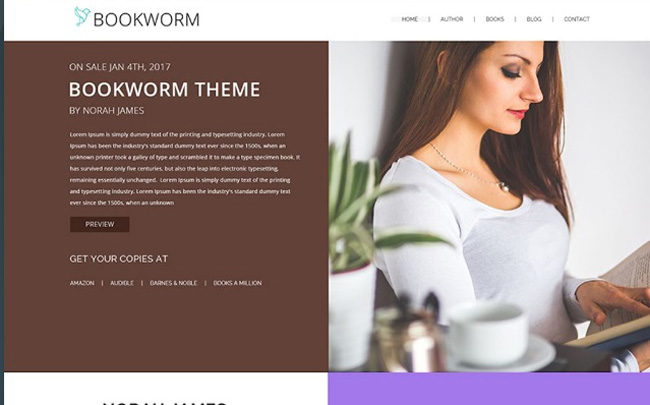
Modular Design
The trend is not new yet is gained more popularity in 2017. The approach is all about bringing grid pattern to different elements of the design. The modular design lets you create clutter-free web pages, which make it quick and intuitive to define each section.
NF Book Worm – FullScreen Book Authors WordPress Theme
 Details | Demo
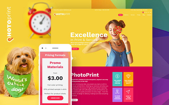
Material Design
Ever since 2014 when Google presented its material design to the web community, the trend started to become more popular among the web designers looking for the new and usable ways of building web designs. Cards make it easier to navigate the content, whereas the nature-inspired colors and little to no shadows make materials sites more usable and easy-on-the-eyes.
Print Shop Responsive WordPress Theme
 Details | Demo
This is our selection of the top 7 hottest web design trends for 2017. Do you agree with our choice? Are there other popular web design approaches that you think are worthy to be mentioned in this post? Share your ideas in the comments.