In the history of Instagram, there have been three logos. Yes, three. Not two like most of us may believe.
Majority of people don’t remember the very first Instagram logo, the original icon of the app: a detailed polaroid camera fluctuating on a white background.
The elements included in the design were so detailed that it may hardly be called a logo nowadays. But before 2010, this was the best the company could do.
The icon included a rainbow stripe going right through the middle of the camera (possibly representing the various available filters but that’s not confirmed information). Moreover, the users could see a lens, multiple buttons, a viewfinder, and a flash.
Related: Logo Trends for 2019
On top of it all, the design showed a reflection of the buttons in the lower body of the camera. Last but not least, the icon wasn’t flat. And who designed it? The CEO and co-founder of Instagram himself, Kevin Systrom.
The app’s most famous logo
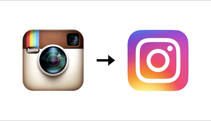
In 2010, however, Kevin and his team realized that Instagram isn’t really about the Polaroid camera and pictures. Actually, the app and the logo have pretty much nothing to do with one another, especially when it comes to the functionality of Instagram. So, they decided to change the Instagram logo.
This time, however, the team didn’t take the designing upon themselves. They outsourced it to Cole Rise, the app’s beta user, photographer, and designer. Apparently, it only took him 45 minutes to complete the project! Perfecting the design and making the final decision about using it, however, took the management team around 6 months.
His inspiration was an old camera from the 1950s by Bell & Howell. This is how the app’s most famous logo was born. So famous that the majority of people thinks this was the original icon.
Although it was designed in 2010, it was in use officially only from 2011.
Did you know that Cole also designed the back of the logo? In order words, the back of the camera? There wasn’t any purpose for that though, it was done simply for the fun of it.
The app’s most recent logo
The 11th May 2016 was the day Instagram introduced the words to its third logo.
The response? Terrible.
There may have been a handful of people who gave the company positive feedback about this big change. The rest of the feedback was either criticizing the company’s move or laughing at it.
It did create huge publicity though. Not only did major news sources talked about it, but an uncountable number of individual users posted Twitter comments or created memes just to add their two cents on how bad they found the design. Some big names even called it ‘a change no one wanted’.
What can be said about the technicalities of the design? It is minimalistic, flat and in accordance with the rising graphic design trends. It includes fewer colors.
Now the logo featured only pink, purple and yellow, smoothly transforming from one into another. The gradient was something new as in the previous icons all colors were separated very distinctively.
Moreover, the rainbow stripe, and any rainbow indication, was removed. What did stay the same, however, was the original position of the lens and the viewfinder. This time, it took the team overall 9 months to agree on everything and show us their new logo.
Some people argue that with the 2016 logo design, Instagram lost its most valuable branding element – the rainbow. As well as the distinctive viewfinder and lens. Although these two are still sort of there, instead of proper illustration the users only see metaphorical, minimalistic outlines. The rainbow, on the other hand, got replaced with the three-color gradient.
There’s more to Instagram’s visual identity than logo
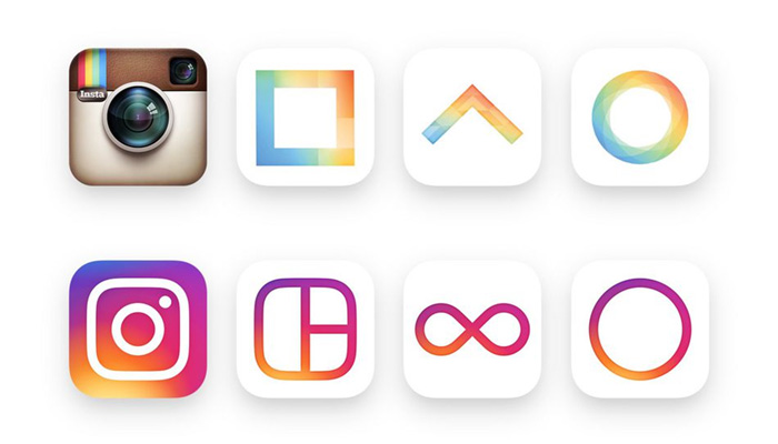
Instagram’s overall visual identity includes three supporting icons for layout, hyperlapse, and boomerang. The logo design from 2010 didn’t match the visual identity design whatsoever. The three supporting icons were flat (the logo wasn’t) and featured a different color scheme. If you didn’t know the icons in advance, you wouldn’t guess they even belong to the same company! In contrast, the 2016 visual identity is perfectly integrated.
The design trends
As previously mentioned, the public response to the introduction of the new logo was far from positive or quiet. Now, however, the time has passed. It’s been three years since the shocking change. Wouldn’t you agree that after all this time it feels like the newest Instagram logo integrated very well into our daily lives?
The graphic design trends changed a lot in the past few years. Minimalism and flat icons took over. Many companies turned and still turn to rebranding to appeal to their customers and/or users and to keep up with their modern-looking competition. It could be concluded that the shocking change Instagram exposed us to was a great business and design decision. Looking at it from the perspective of time, the app’s logo was actually ahead of everyone else and almost set the following branding trends.
Cole, the designer of Instagram’s second logo, shared his views when the newest icon was released. His point of view is very much true not only this app’s case but any other company changing its rebranding: “It’s kind of like the Uber redesign — people freaked out, and now it’s totally fine. Change can be hard, and people will have to adjust to it, but I think people will love the new stuff once they get used to it on their home screens.”
About the author
Natalia Raben is a design and art enthusiast; takes care of marketing at DesignBro; loves to visit museums and teach photography.
Author: Spyre Studios