
Learn Procreate with easy tutorials for artists, designers, and beginners who want to improve drawing and illustration skills on iPad. These Procreate tutorials are useful for beginners who want to learn procreate without getting confused by too many tools at once. These online lessons focus on simple pencil sketching, while others teach coloring, shading, and… Continue reading 50+ Easy Procreate Tutorials for Drawing, Sketching and Illustrations
Category: Resources
I’m very font of you because you’re just my type
35+ Japanese-Style Fonts for Commercial Design Projects
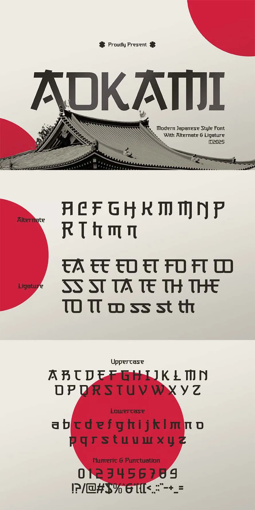
Japanese typography has a unique look that works well in many traditional art and design projects. From restaurant menus to product packaging, the best japanese-style fonts help create a clear visual connection with Japanese culture. Some fonts are based on brush lettering, while others take ideas from traditional calligraphy or modern signage. Designers often use… Continue reading 35+ Japanese-Style Fonts for Commercial Design Projects
Sitemap Generator Uploadarticle.com: Boost Your SEO with Automated Sitemap Creation
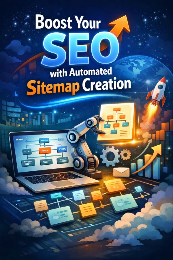
Sitemap Generator Uploadarticle.com: Boost Your SEO with Automated Sitemap Creation If you’ve ever wondered why some websites seem to rank better than others, or why search engines find new pages on your site faster than you’d expect, the answer often comes down to something simple: a well-structured sitemap. Most site owners don’t realize how much… Continue reading Sitemap Generator Uploadarticle.com: Boost Your SEO with Automated Sitemap Creation
The Great Replatforming: WordPress Is Training Its Own Replacement

For twenty years, WordPress empowered millions of people to build websites. It lowered the barrier, democratized publishing, and quietly created an entire economy of designers, developers, freelancers, and agencies who knew how to bend it to their will. It wasn’t glamorous work most of the time, but it was dependable. If you knew your way… Continue reading The Great Replatforming: WordPress Is Training Its Own Replacement
30+ Top Rounded Fonts for 2026
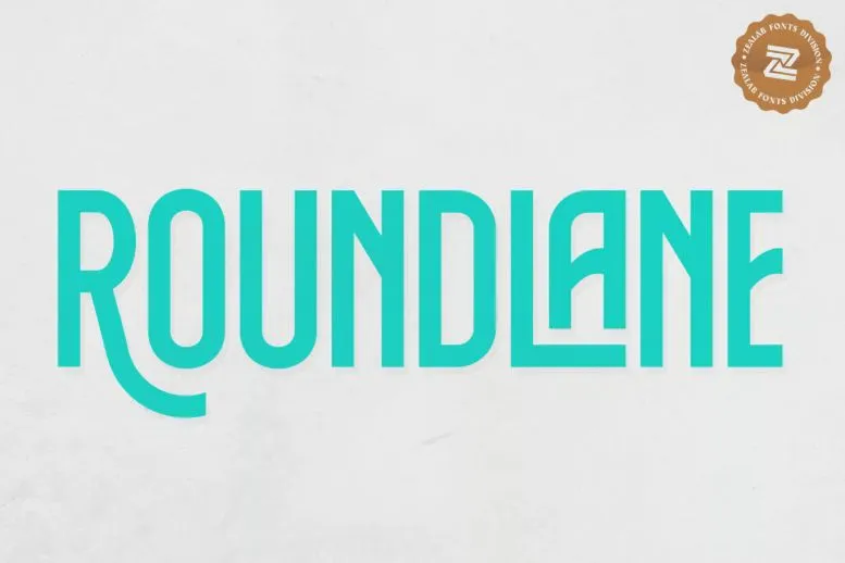
Rounded fonts are still popular in 2026 because they look clean, soft, curve edges and easy to read. Many designers use rounded fonts for posters, websites, mobile apps, and social media graphics. These fonts work well for modern brands that want a simple and friendly style. In this collection some rounded fonts are bold and… Continue reading 30+ Top Rounded Fonts for 2026
50+ Motivational Quotes in Beautiful Typography Styles

Beautiful typography can change the way people read simple words. A short quote with clean letters and balanced spacing feels more personal and easy to notice. Many designers use beautiful typography to make posters, phone wallpapers, notebook covers, and social media posts. The style of the text matters as much as the quote itself. Bold… Continue reading 50+ Motivational Quotes in Beautiful Typography Styles
Design Dialects: Breaking the Rules, Not the System
“Language is not merely a set of unrelated sounds, clauses, rules, and meanings; it is a totally coherent system bound to context and behavior.” — Kenneth L. Pike The web has accents. So should our design systems. Design Systems as Living Languages Design systems aren’t component libraries—they’re living languages. Tokens are phonemes, components are words,… Continue reading Design Dialects: Breaking the Rules, Not the System
Firefox Brand Identity Gets Its First Mascot, Kit
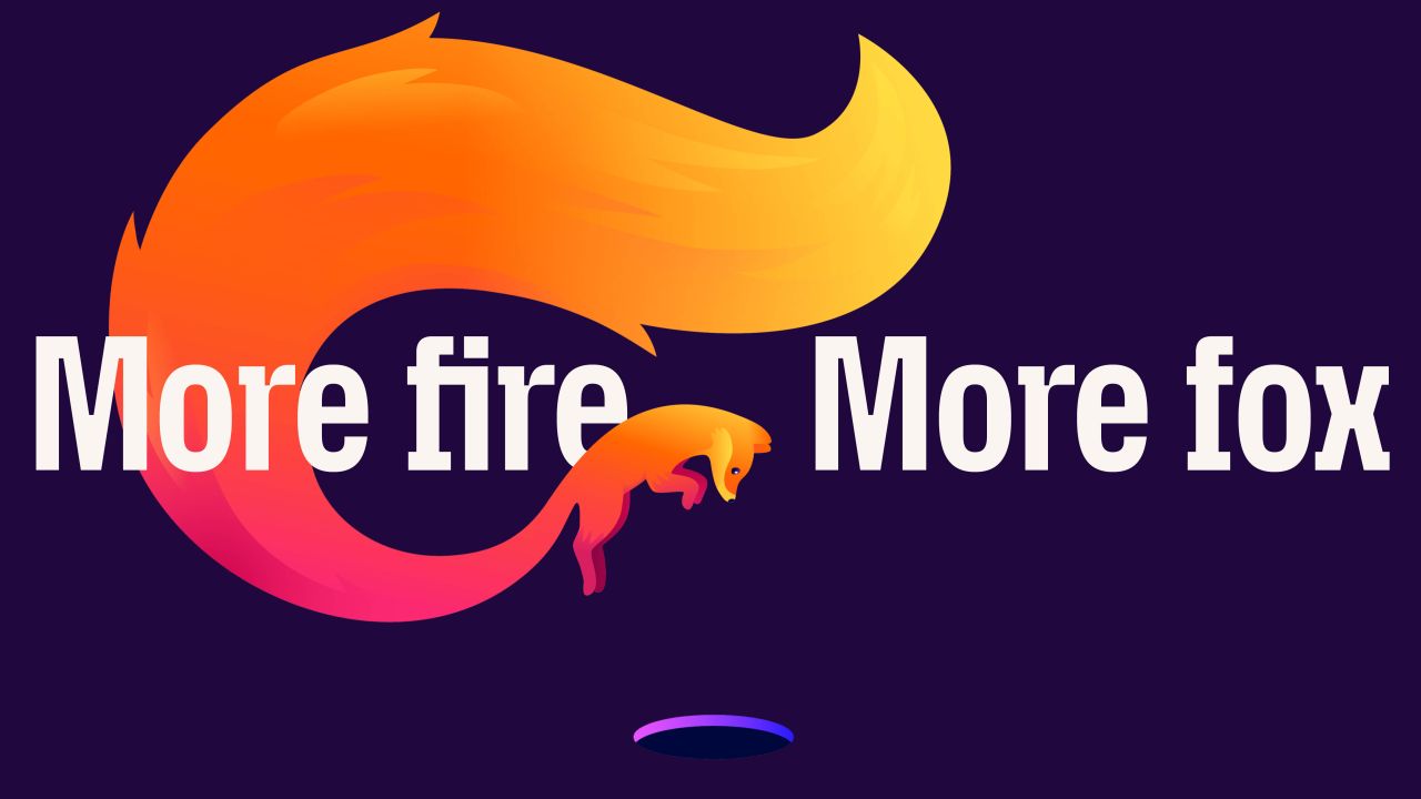
Firefox brand identity gets its first official mascot in Kit, a fox-red panda creature by JKR that expresses all emotion through eyes, posture, and tail. Mozilla worked with brand agency JKR (Jones Knowles Ritchie) on the most significant Firefox brand identity evolution in years. The creative platform is called More Fire. More Fox. Rather than… Continue reading Firefox Brand Identity Gets Its First Mascot, Kit
The Evolution of the “Buy” Button: 1995–2026
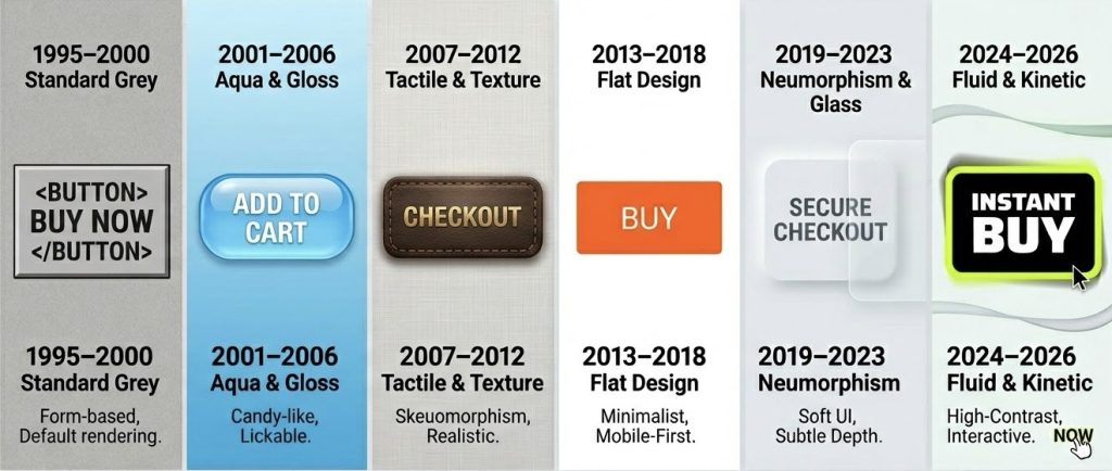
In the summer of 1995, a revolution occurred that didn’t involve a single gunshot or a political speech. It involved a grey, rectangular block on a screen that read “Add to Shopping Basket.” When Jeff Bezos launched Amazon from a garage in Washington, he wasn’t just selling books. He was testing the limits of human… Continue reading The Evolution of the “Buy” Button: 1995–2026
ChatGPT first run
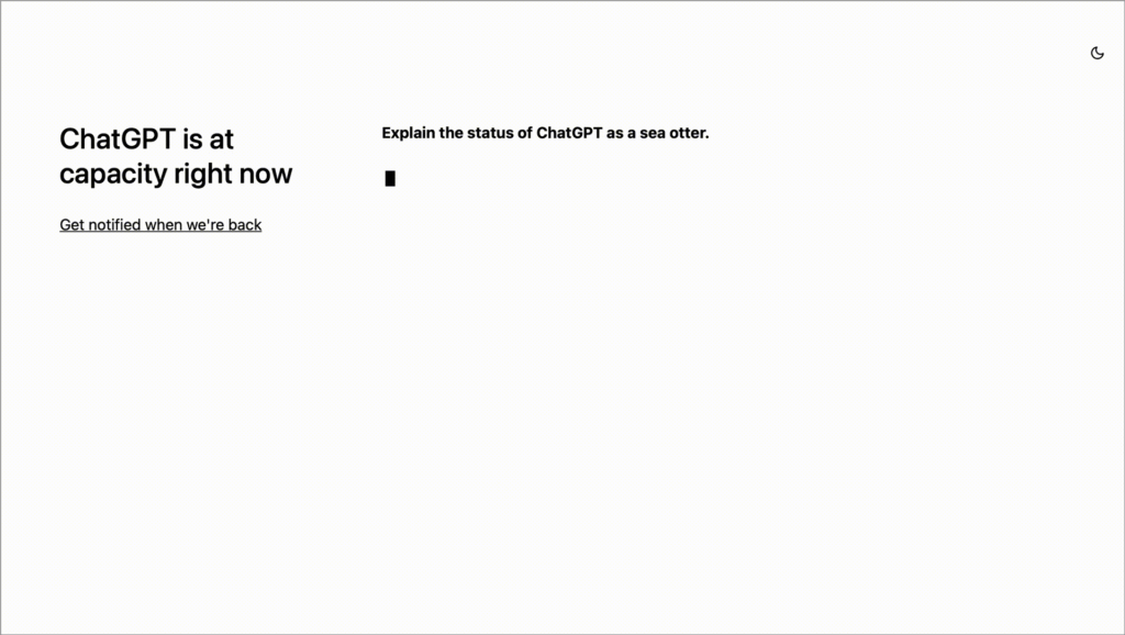
This post is a runthrough of the first use experience of ChatGPT, an AI conversation bot from the OpenAI research lab. Handling server overload on first visit ChatGPT has gotten a lot of media attention, and the number of people visiting the site to try it out sometimes overwhelms its servers. This could put a… Continue reading ChatGPT first run
Fresh Website Design Examples for Modern Creators
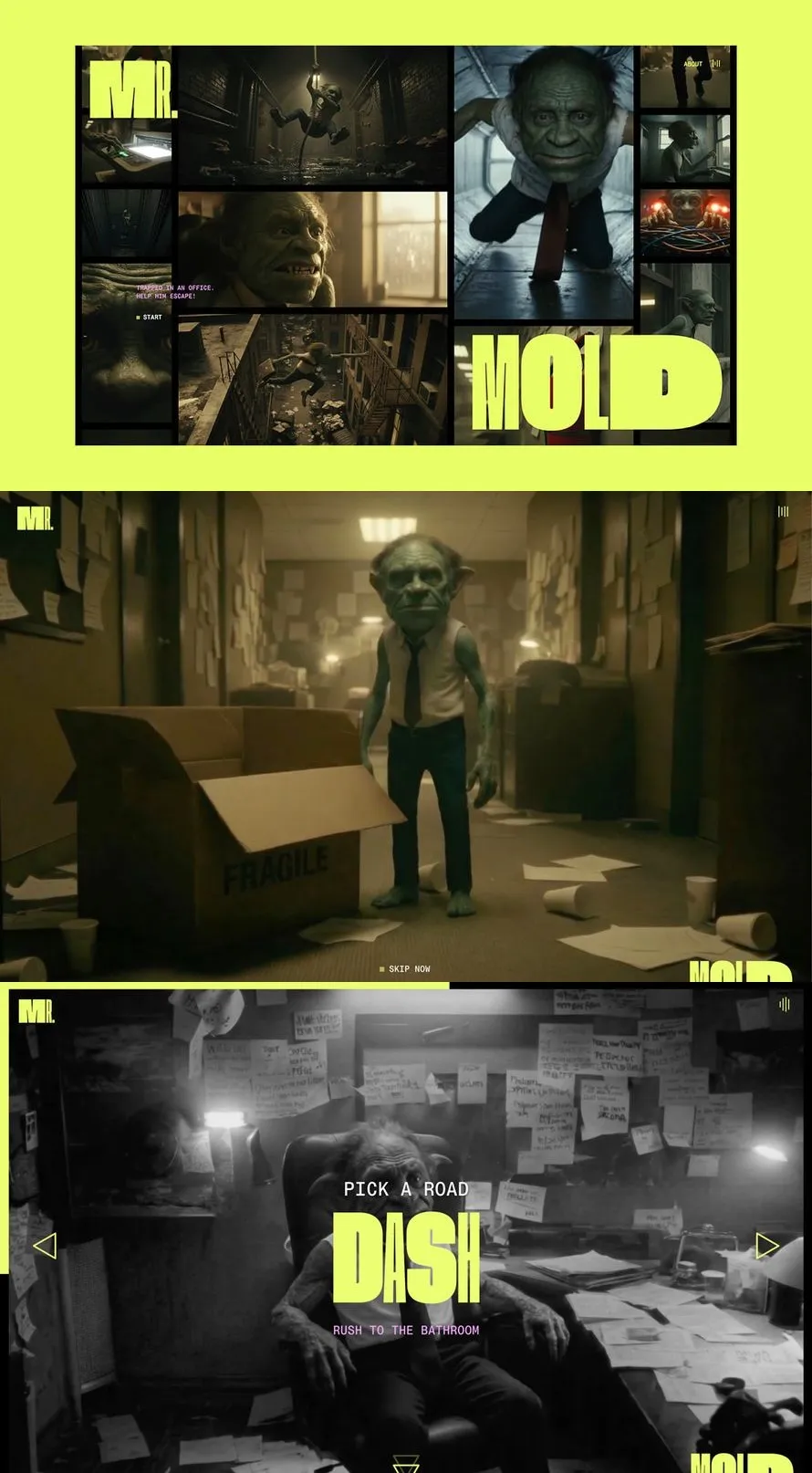
This web design gallery shows fresh webside design ideas made in 2026. It is a simple web design showcase where creators can see how real websites are built today. Each example focuses on layout, spacing, and easy user flow. Designers can learn how pages are arranged and how content is placed in a clear way.… Continue reading Fresh Website Design Examples for Modern Creators
20 Useless Websites to Waste Your Time
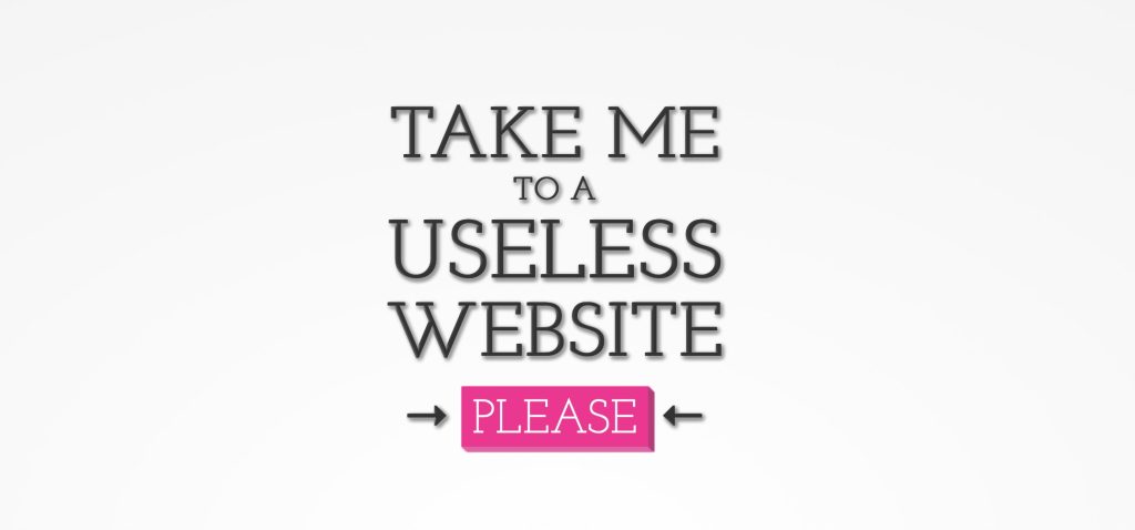
The internet is usually a place for “getting things done,” but sometimes the soul just needs a little bit of high-quality nonsense. These websites aren’t trying to sell you a subscription or optimize your life; they exist purely to celebrate the absurd, the artistic, and the oddly satisfying. They are the digital equivalent of a… Continue reading 20 Useless Websites to Waste Your Time
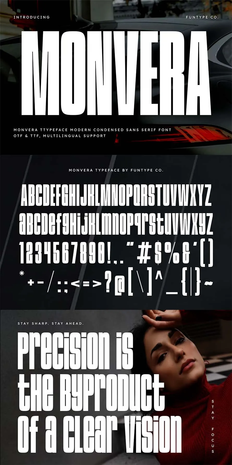
35 Best Condensed Fonts for Bold Design
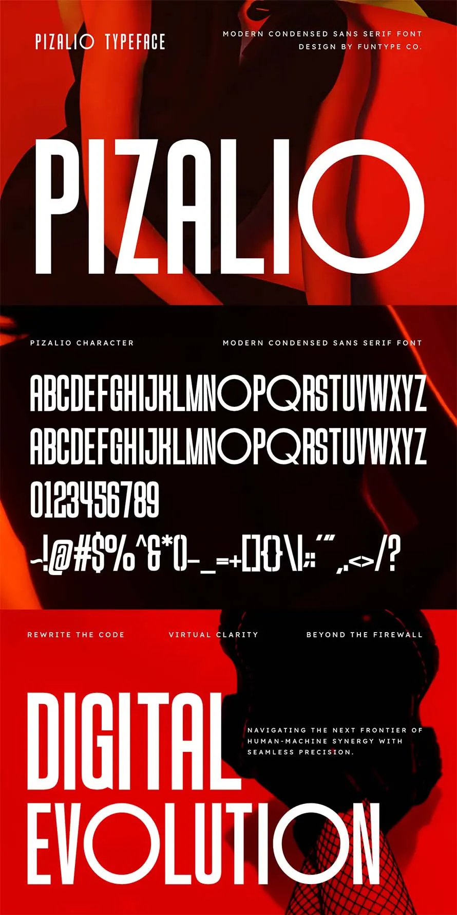
Another collection of condensed fonts which are best for big bold headings. the best condensed fonts are useful when space is limited but you still need strong message. Ultra slim fonts help fit more words in one line without breaking the layout. Many designers use condensed fonts for big bold headings, posters, and thumbnails. These… Continue reading 35 Best Condensed Fonts for Bold Design
Logo Design Pricing Guide (USA/UK)
If you are a graphic designer or just starting to sell your work on platforms like Fiverr, Upwork, Dribbble, or Behance, one of the first questions that will trip you up is pricing. What do you charge for a logo? What counts as a logo package? Why is one designer charging $25 and another charging… Continue reading Logo Design Pricing Guide (USA/UK)
7 Best Design Tools & Resources for Faster Web Builds in 2026

Best design tools and resources are those that can lay claim to characteristics that typically include ease of use and related workflow characteristics, future-readiness, easy integration with supporting tools or resources, and overall performance. All of these lead to the establishment of exceptional brand reputation for the product in question. Future-readiness can be of outsized… Continue reading 7 Best Design Tools & Resources for Faster Web Builds in 2026
30 Best Condensed Fonts for Powerful Headings – Free & Paid
Best condensed fonts are useful when you need strong and powerful headings in small space. Condensed fonts also knows as “Slim fonts” help fit more words without breaking layout. Many designers use condensed fonts for posters, logos, and social media graphics. These fonts keep text clear while saving space. You can mix condensed fonts with… Continue reading 30 Best Condensed Fonts for Powerful Headings – Free & Paid
AI Belongs in Context, Not Just in Chat Windows
We need to stop treating AI as something you visit in a separate chat interface. The current approach is backwards. The typical implementation goes like this: build an application, then add an AI chatbot in the corner. Users click the chat icon, type their question, get an answer, close the chat, and go back to… Continue reading AI Belongs in Context, Not Just in Chat Windows
15+ Best Creative Brand Guideline Templates for Strong Branding
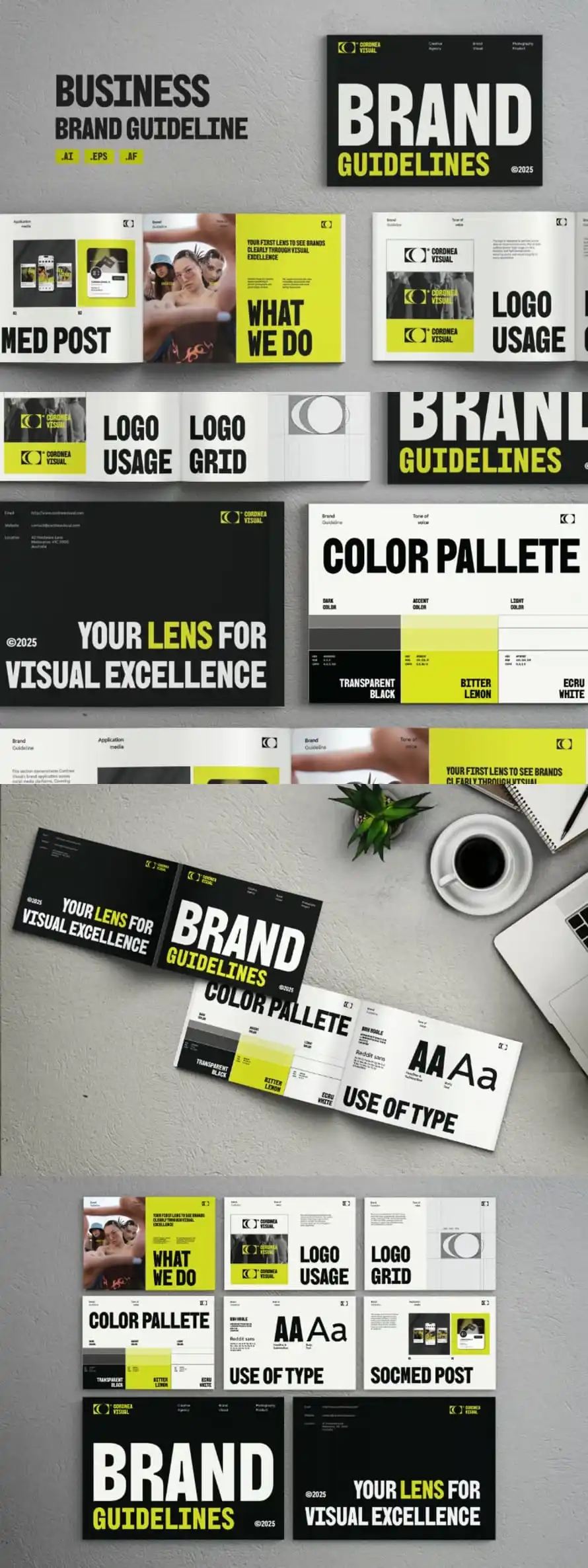
Brand guideline templates help teams keep their brand look clear and steady. A beautiful and creative set of brand guideline templates shows logo use, colors, fonts, and spacing in one place. This makes it easier for designers and clients to follow the same rules. When rules are clear, work looks neat and stays on track.… Continue reading 15+ Best Creative Brand Guideline Templates for Strong Branding
Powerful Corporate Visual Identity Designs That Stand Out
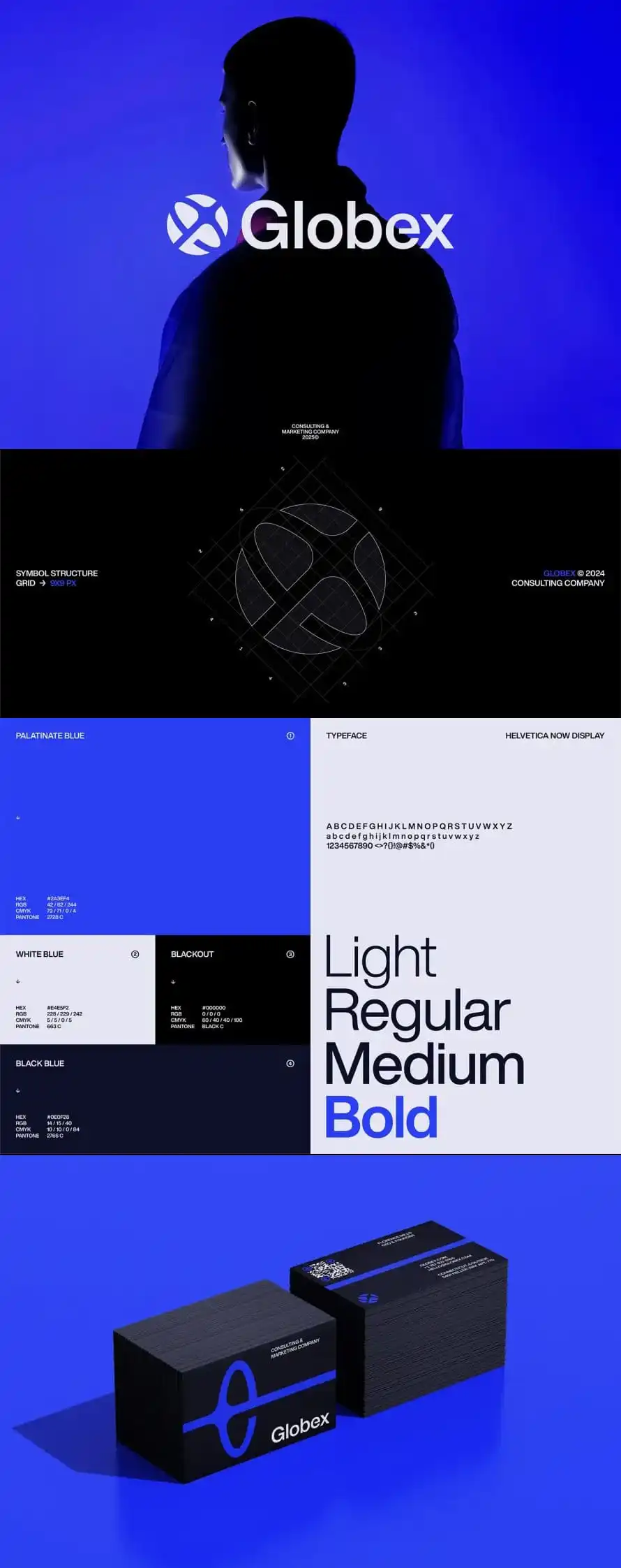
Strong brand identity helps people know a company fast. A clear corporate visual identity uses simple things like logo, colors, fonts, and layout. When these parts stay the same across website, social media, and print, the brand looks stable. People can remember it without effort. Creative brand identity design is not about adding many elements.… Continue reading Powerful Corporate Visual Identity Designs That Stand Out
Good designers, bad websites: a proposal
I want to discuss accessibility because it is the most important thing for making websites. Other A List Apart articles give you innovation and insight. This article will give you homework. These are just my personal views, but they’re pretty good. I want to start off with a couple of statements, and you will agree:… Continue reading Good designers, bad websites: a proposal
12 Reasons Claude is Outperforming ChatGPT in My Daily Workflow

Most AI comparisons stay stuck at the surface—benchmarks, speed tests, or who writes the better tweet. But for those of us in the trenches, the “fastest” model isn’t always the “best” one. In early 2026, a clear divide has emerged: ChatGPT remains the ultimate generalist executive assistant, but Claude has evolved into the industry-standard creative and technical… Continue reading 12 Reasons Claude is Outperforming ChatGPT in My Daily Workflow
Modern Arabic-Style Fonts For Arabic Calligraphy & Traditional Art
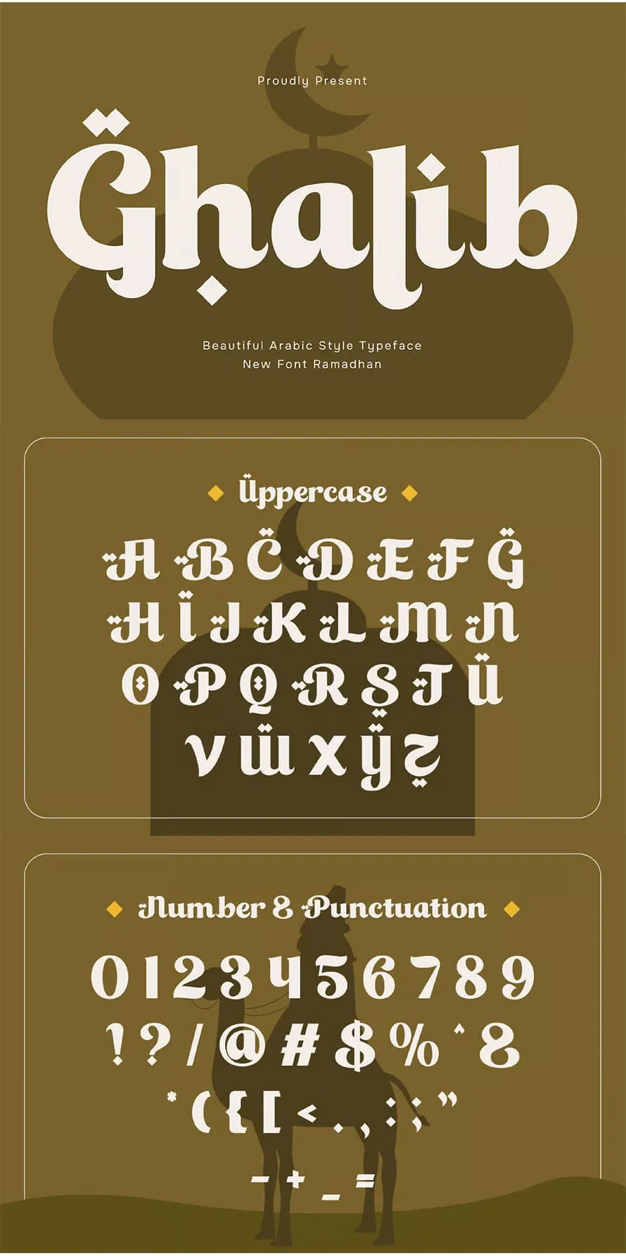
Arabic-style fonts are used in many traditional and islamic design projects today. These arabic fonts are based on old writing styles but made for modern use. As Bakra Eid is coming, many designers start looking for Islamic fonts that fit well with posters and flyers and give a strong traditional Islamic feel. Arabic-style fonts keep… Continue reading Modern Arabic-Style Fonts For Arabic Calligraphy & Traditional Art
AI-Generated Prototypes: Faster Routes to Better Interfaces
I’ve noticed a shift in how teams are approaching interface development. AI-generated prototypes are becoming commonplace and, used correctly, they can significantly accelerate the iterative design process I’ve always advocated for. The promise is compelling: describe what you need and get a working prototype in minutes rather than days. But here’s the catch – speed… Continue reading AI-Generated Prototypes: Faster Routes to Better Interfaces
Isometric Graphic Design: Adhemas Batista’s Modular Boxes
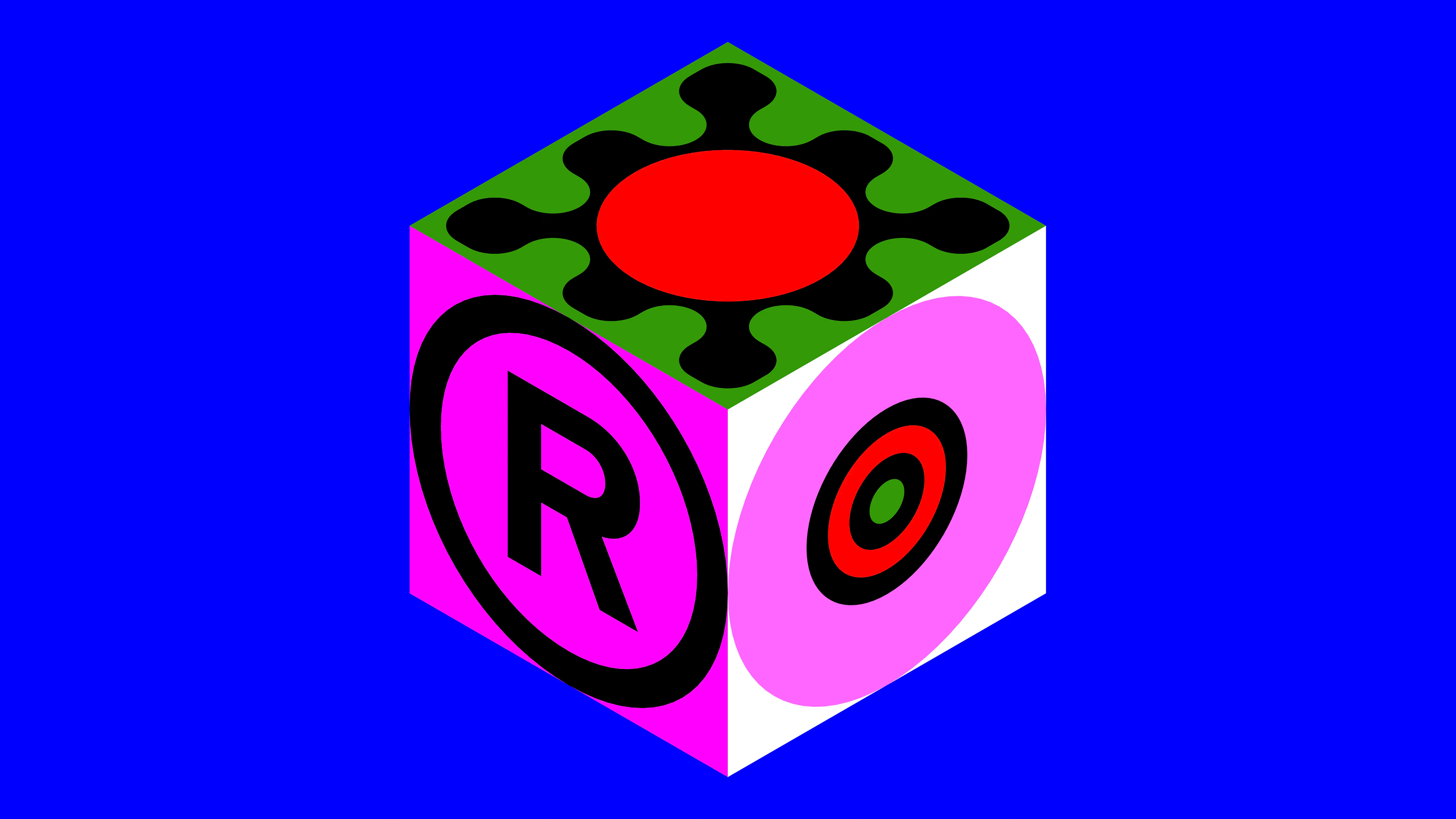
Adhemas Batista’s isometric graphic design series maps flat symbols onto bold modular cubes using a 13-color palette and live generative Processing code. The project, titled Isometric Boxes, translates a library of flat graphic assets into three-dimensional space. Each cube in this isometric graphic design sits on a grid, with its top, left, and right faces… Continue reading Isometric Graphic Design: Adhemas Batista’s Modular Boxes