The US economy was on an upswing — in fact, the United States GDP expanded by 2.3% in 2019. 2020, however, is not looking so hot for the labor force or online retailers. There’s no question that the online shopping world has always been competitive, but the recent economic downturn has turned the competition up to 10.
If you want to stand out, you have to do things a bit differently from everyone else. This has led many online stores to focus on tactics like guest posting and online link building —- which can certainly be effective.
But what happens when those users get to your sales page? Are they excited to buy, or do they run away?
If your site isn’t converting as well as you like, the issue might not be your social media strategy or your link building process — it might be your sales page.
Here are five online store designs that you just might want to steal a bit of inspiration from.
Zoma Sleep
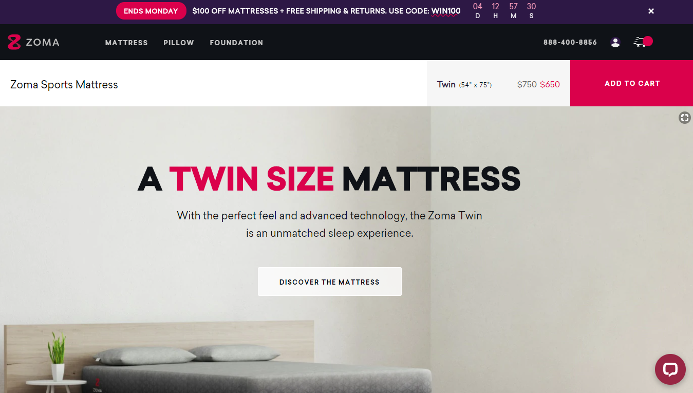
Zoma Sleep is an online mattress company specializing in American-made mattresses and pillows designed to relieve pressure points and help athletes sleep, and thus perform, better. Their mattresses are all foam and get pretty good ratings online.
Here’s a look at their twin mattress sale page:
Online Store Design Features to Steal
There are several design elements here that stand out, including the large red Add to Cart button and the banner ad discount — which also includes a countdown.
The count down helps create a sense of urgency. And while using banner ads through Google Ads won’t earn a particularly high ROI (thanks banner blindness), coupons like free shipping could increase conversion by as much at 50%.
Scroll down a bit, and you will see they’ve included several examples of social proof, including quotes from other publications and customer reviews. These reviews help convince online viewers that the mattress is a great investment — though using pictures can make it easier for readers to trust reviews.
Brands can also take their online review strategy up a notch by leveraging influencers and posting their reviews on the site as well.
Duke Cannon
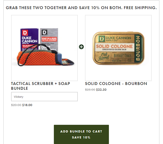
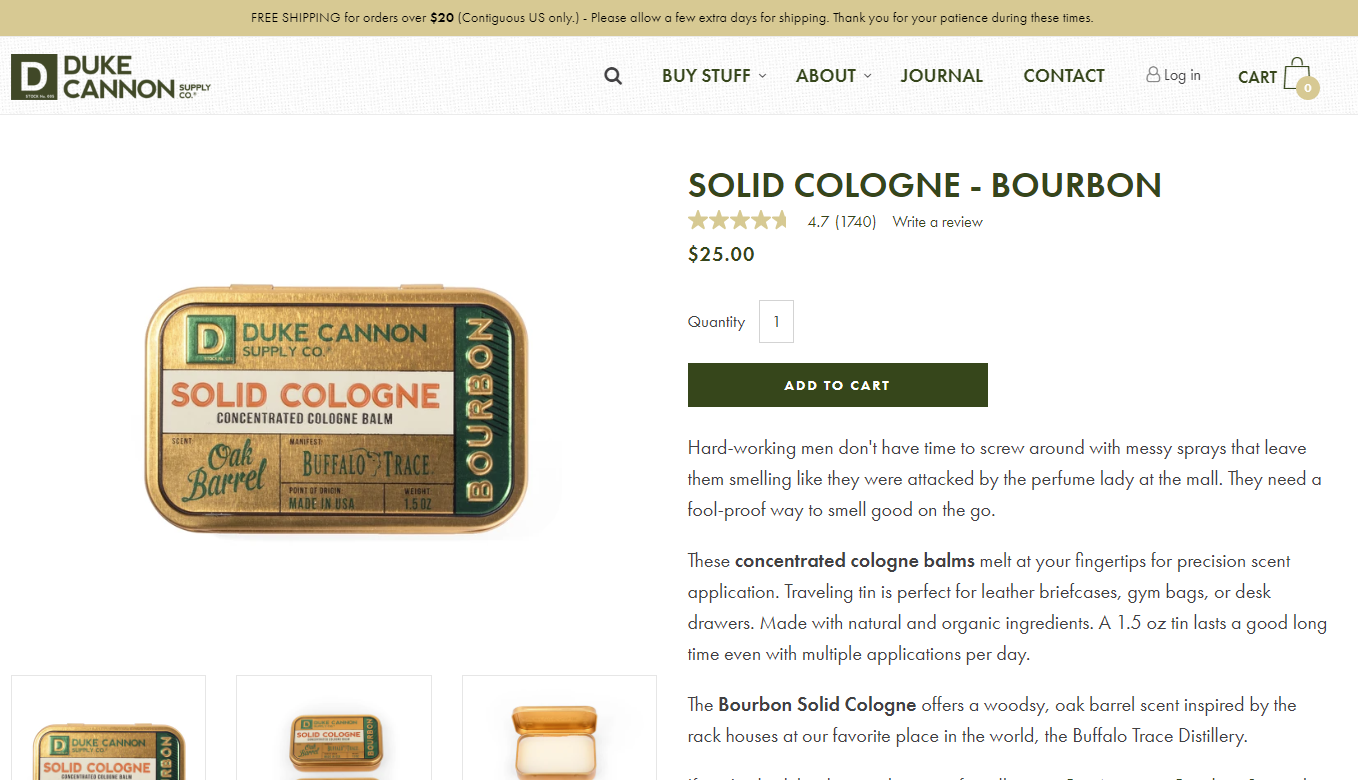
Duke Cannon is an online retailer for men’s hair and body products, including soap scented with beer and solid cologne scented with whiskey.
Here’s the sales page for their popular solid cologne:
Online Store Design Features to Steal
In addition to social proof in the form of reviews, Duke Cannon also includes a star rating and situated their add to cart button right at the top of the page, which makes it easy for site visitors to convert.
Making elements like social proof easy to find is essential for user experience, but it can also impact SEO by increasing time on page and reducing bounce rates.
They also offer a bundle option, which gets customers 10% off if they add additional items to their cart. The discount is an easy way to increase order amounts without spending much on marketing.
Looking for more ways to build a user-friendly site? This list of WordPress plugins, which includes WP Rocket for speed and HubSpot’s All in One Marketing for SEO, can help do just that with a quick click of the install button.
Truff Hot Sauce
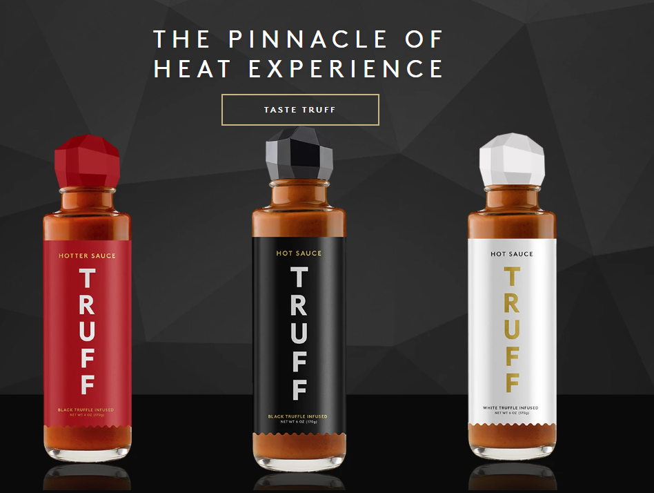
Truff is an award-winning truffle-flavored hot sauce brand with a unique flavor profile and high-end approach to their branding. Their website and sales pages feature minimalist designs and darker colors.
Online Store Design Features to Steal
Several features that stand out in Truff’s store — the first is the sauce size options, which are located right below the product description and their star rating.
Do you want a gallon of Truff hot sauce? You can get a gallon of Truff hot sauce.
But, they also put a ton of effort into their photo design. While the bottles themselves are appealing, pictures of street tacos and other tasty foods make the sauce far more appealing.
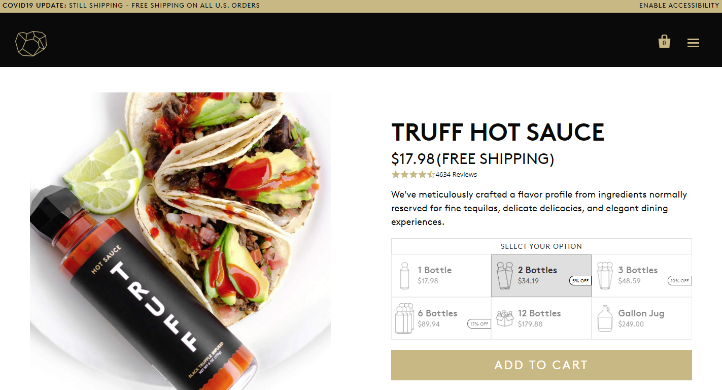
These design elements are carried over from the homepage, which is minimalist and sticks to a darker color pallet.
Using modern design trends, rather than sticking to the standard white background is a sure-fire way for your store to stand out. Using the minimalist design can help keep the user’s eye focused on the products, rather than getting lost in complex designs.
KnitCrate
Another brand that takes advantage of modern design trends is KnitCrate, an online fiber store and popular subscription box service for knitters and crocheters.
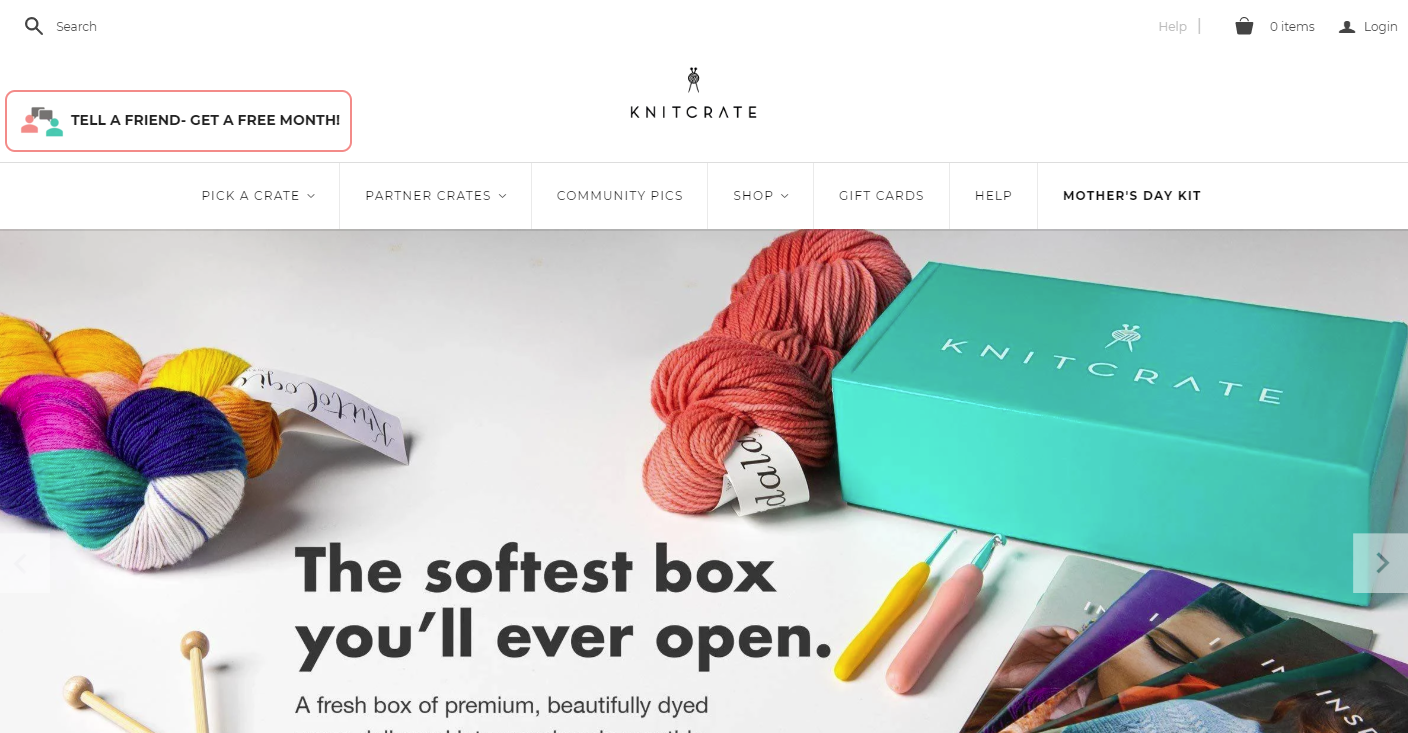
The site’s minimalist design and simple logo keeps the attention focused on the colors of the beautiful yarn and patterns they offer.
Online Store Design Features to Steal
The minimalist design carries over to their sales page, like this one for a deep purple color with white flecks. The white background allows your eye to fully focus on the yarn, while the teal font and button (which is their brand color), draws attention to the most important conversion features on the page.
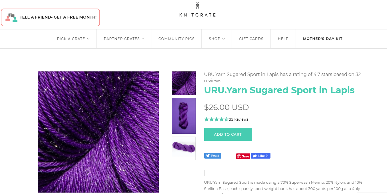
Like many other online stores, they use social proof to encourage purchases. However, they also include social buttons, which allow users to save to Pinterest or like the item on Facebook. This is ideal for their target audience — crafters — who are likely to use Pinterest to store their favorite patterns and yarns.
The social buttons also make it easier for users on mobile devices — where 1 in 4 ecommerce dollars are spent— to easily share or save their favorite items.
A number of the products they sell are in limited supply — such as this limited edition box that included skeins from an indie dyer. For these, they use a supply count to remind customers to buy soon.

Connecting their stock to inventory management helps drive purchases by increasing scarcity — if you want to buy the beautiful yarn color, you better buy it before their stock runs out!
Cotopaxi
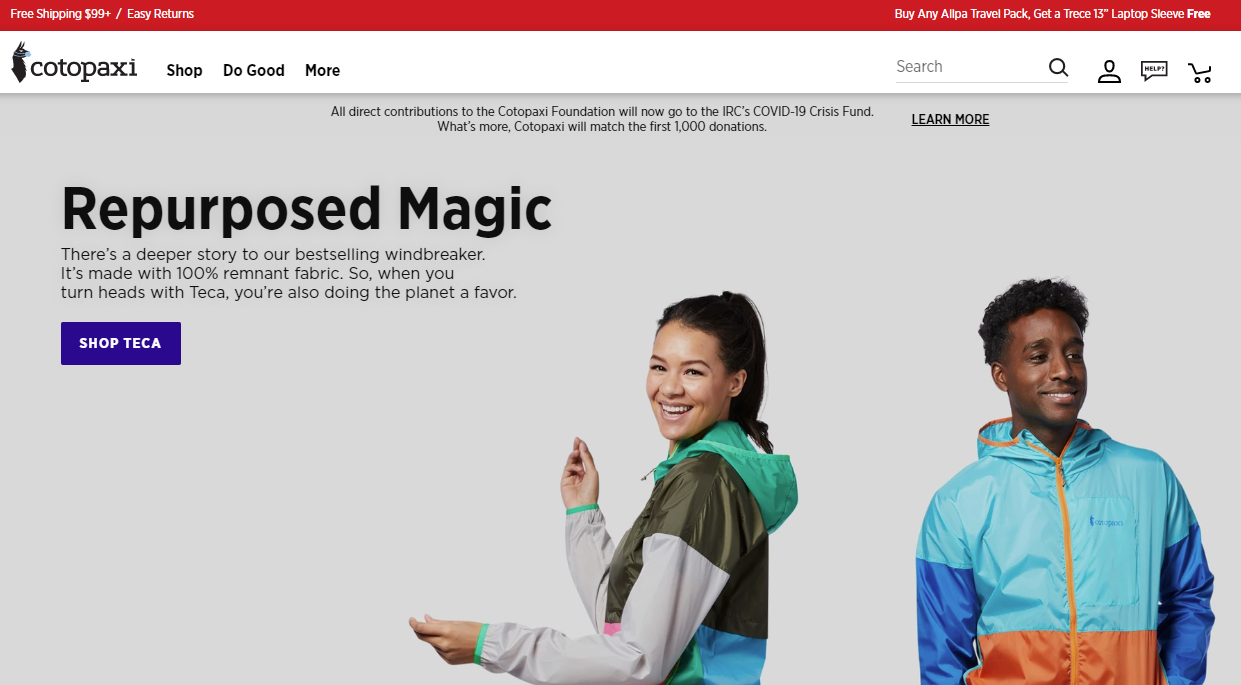
Cotopaxi is an outdoor gear company committed to creating positive social impact by using responsibly sourced and sustainable designed backpacks, fanny packs, and apparel.
In addition to producing bright-colored, long-lasting outdoor gear, they also use 1% of their revenue to address poverty and for community development.
Online Store Design Features to Steal
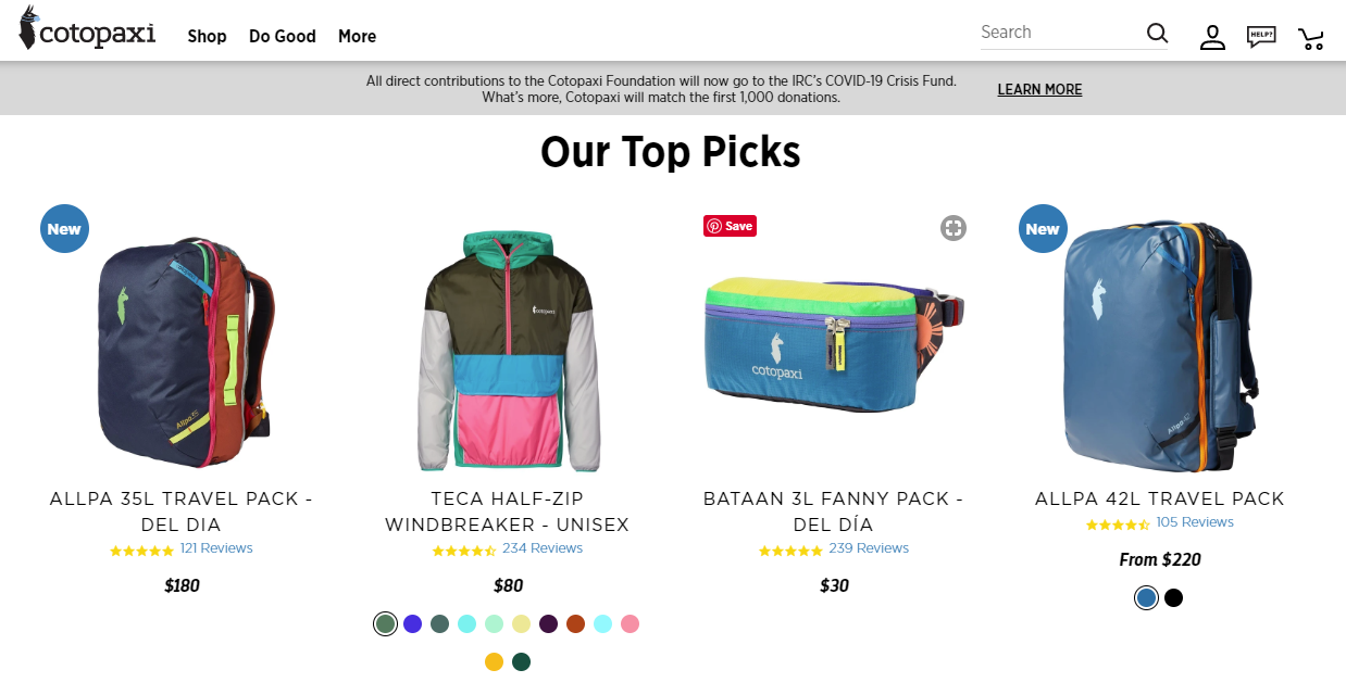
Cotopaxi’s online store features really stand out. While many online stores require users to navigate to category pages, Cotopaxi makes it easy for users to convert right from their landing page with a list of their top picks just below the hero image:
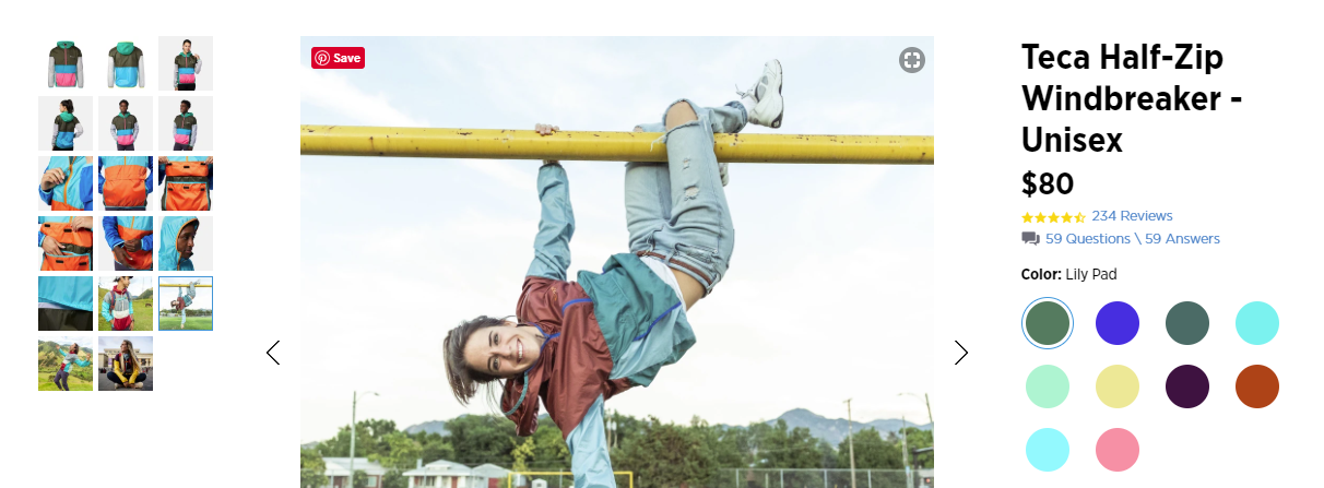
Unlike other sales pages, which tend to include one or two photos of the item, Cotopaxi offers more than 20 photos of their windbreaker. This allows consumers to see all the details — including how the front pocket opens and what the item looks like in action.
Worried about the cost and time required to take and edit that many photos?
Consider using a platform like DesignBro to hire a freelance designer — or use a photo editing software tool like Photoshop to bring your designs and photographs to life.
Final Thoughts
When it comes to online store design, it’s easy to get caught up in making things look pretty — and those features do matter. The sites above should serve as an inspiration to create beautiful pages that provide a fantastic user experience.
But don’t forget that online store design isn’t just about making things look pretty. It is also about leveraging the right SEO tools to ensure on-page optimization is on point. Your URL structure, meta titles, and alt tags can also have a massive impact on sales page performance.
Author: Spyre Studios
