Would you like to increase views on your YouTube channel?
YouTube is a giant platform for creators to showcase their talent. Many users have gained fame and respect by creating quality content. You can increase your chances of making a viral video by opting for an appealing thumbnail. It grabs the audience’s attention towards your video.
However, it can be challenging for a beginner to create an eye-catching video thumbnail without prior training.
Therefore, we talked to some experts in the field to provide you with a guide to begin your YouTube career.
So without much raving, let’s get started.
What is YouTube Video thumbnail?
A video thumbnail is the first impression of your video on the audience when they are browsing through YouTube. It can either make them click the video by grabbing their attention or let them scroll past without even noticing your video.
YouTube allows users to select a frame from the video for using it as a thumbnail. However, we won’t prefer this method since it is not practical for getting the desired results.
Our goal is to make an eye-catching video that grabs user attention within seconds. Besides, it would be helpful if your video thumbnail explains the context of your video.
You can use attractive thumbnails to improve your channel’s brand. Also, you can increase your viewers by designing a strategic video thumbnail.
Tip: You need to verify your YouTube account to access the option of using the custom thumbnail.
How to Make Attractive YouTube Video Thumbnails: Best Practices
There are several techniques that you can use to create an attractive video thumbnail. First, you have to decide the style or branding for your YouTube Channel. Then, you can use the following tips for an effective result.
– 1. Choose an appropriate photo editor
The best way to start your YouTube career is by choosing the correct editing programs. We will talk about video editing application for YouTube later.
Well, creating a thumbnail needs more of a design approach than software skills. Therefore, it is not essential to use a massive program for doing this task. If you are new in the field and want to learn things quickly, use Movavi Photo Editor.
It is a one-stop solution for every photo editing need. You can enhance your images and add text and watermarks in a few simple clicks.
– 2. Use the right YouTube thumbnail size
If you want to bring more viewers to your channel, it would be best to select the correct thumbnail size.
According to YouTube’s guidelines, your video thumbnail should follow the 16:9 aspect ratio. The ratio is ideal for YouTube previews and other video players as well. Also, your image should be 1280×720 pixels in dimension. The recommended width of the image is 680 pixels, at least.
You are going on a wrong path if you think that small images can also do the trick. Given that YouTube video thumbnails look relatively more modest in size on the homepage. Still, always remember that someone might embed your video on their website.
Therefore, to ensure top-quality, you should opt to scale down a large image than scaling up a small one and lose quality.
– 3. Use a delightful photo for your YouTube video thumbnail
You can use high-quality images to grab your viewers’ attention.
An image that serves as a teaser for your video can explain your video’s overall context. Moreover, you can use this as an opportunity to familiarize the audience with your style.

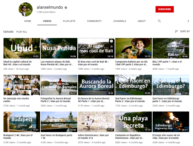
Alanxelmundo is a Mexican travel channel where the host goes to popular places throughout the world. Alan uses high-quality pictures with minimal text for his thumbnails. It helps him to provide viewers with a summary of the whole video.
However, it is not likely that everyone can click pleasing photographs. Nothing to worry, you can quickly get an engaging image from a stock images site.
– 4. Include title text in your YouTube thumbnails
You can add your main keyword of the video as a title text on the thumbnail. Apart from fetching users’ attention, it serves multiple benefits.
It can be challenging to convey your message by using a simple photo. Your viewers need to know what they are clicking into; otherwise, they won’t.
For instance, you can use the text “Welcome to Hawaii” on your video thumbnail. It should instantly deliver the context that your video is about your experience in Hawaii. Thus, your viewers get excited to know more about it.
Moreover, try to add numbers in your video thumbnail if you are making a series of videos. It helps the audience to keep track of your content.
– 5. Use the best font for your YouTube thumbnails
Now that you got your title ready, it is essential to choose a suitable font.
Fonts are self-dependent to tell your audience the meaning of your video. Thus, you should select one accordingly.

It helps the viewers to get familiar with your content when you use a consistent thumbnail style. It would be best to use a standard color palette and font for your videos.
If you are creating a brand, then try to use the same font as much as possible. Visual branding is a crucial concept in marketing. Users find comfort when they see the similarity and consistency throughout your work.
Besides, people use YouTube on a variety of screen sizes. Thus it becomes necessary to choose a bold or heavyweight font. It should pop-up even on smaller screen sizes.
Moreover, try not to choose fonts with a thick and thin variation or outlines, shadows, and similar stuff. Remember, our goal is to deliver our message in a glance.
– 6. Create a branded YouTube video thumbnail template
The best way to avoid confusion while making a thumbnail is to define a standard template.
Spend as much time in researching and designing the model for your video thumbnail. Then, continue using the model unless you have to change your video style. This approach saves you from indefinite time spent in optimizing your thumbnail for each video.
On the other hand, it allows you to brand your channel with initial efforts. That means viewers can identify your content as soon as they look at the image. It helps you grow a dedicated audience for your channel.
If you find the designing task tedious, then you can always take inspiration from other YouTube channels that grasped your attention. Otherwise, you can select from premade video thumbnail templates that are available online.
– 7. Use good contrast in your YouTube thumbnail design
You wouldn’t write with white text on white background, correct. That is what we call contrast.
It is a vast field in terms of design. However, we don’t have to dig deeper into the technicalities. The only thing to remember for creating a good thumbnail is to make it visually pleasing.
To clarify, you can read white text on a black background because they have high color contrast. Similarly, it isn’t easy to read red text on a pink background since it has low color contrast. You can define the contrast as the visual difference in simple terms.
When creating a thumbnail for your video, always remember to use appropriate contrast. Otherwise, viewers might find it difficult to read the title and might lose interest in the video.
You can use tools like Adobe Color if you want to perfect your color contrast.
– 8. Be honest
No matter how good is your video, if you use tricks to lure viewers, then it is not going to work.
Using an off-topic thumbnail can cause severe harm to your channel growth. People feel disappointed when they click a video with different intentions than what the video has to offer.
Your video thumbnail should be a summary at a glance of your video. Thus, people feel connected and offer you a chance to create a fanbase.
Additionally, you should try to provide a teaser of your video in the thumbnail. It encourages users to click by increasing their curiosity.
Final Thoughts
YouTube is a significant platform for sharing video content with the world. Besides, in the past few years, video content has gained enormous popularity among the audience. Therefore, it is the best way to deliver your content to maximum people. However, according to studies, humans have a short attention span. Thus, you only have a few seconds to grab the attention of your audience. The only way to do so is by using an appealing thumbnail and video title.
I hope you find this article helpful in creating perfect YouTube video thumbnails.
