Start with Your Target Audience Research
So, if you open any article on the development of a business, marketing or social media strategy, then you will see that they all begin with a recommendation to start with a study of the target audience. The reason for this is simple – everything that you do as part of your business, you do first of all for your customers, and only then for yourself.
That is why when creating a logo as the first element of brand identity, it is also important to come from the characteristics of the target audience. Obviously, it is not always possible to develop a universal logo that will be perceived by different segments of the target audience equally. Although, history knows such examples, as it was with Coca-Cola.

But in the case of a niche business, you need to proceed from the main characteristics of the target audience, as well as the psychology of colors in marketing. Examine your target audience, and based on the psychology of colors, as well as the values and mood of your business, find the most suitable colors and shapes. And then we will tell you how to integrate the results of your research with the latest trends in logo design in order to achieve the best result.
Logo Design Trends – Find out Which Suits Your Business Most
Here are some logo design trends for 2019 you may use to proceed from in your brand identity development.
Bright Colors
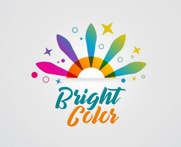
This is a trend of recent years that you can safely use if it matches the mood of your business. The most trending approach at the moment is unexpected combinations of bright colors to enhance the effect and marketing message. This approach is suitable for all types of businesses whose mission is bold and ambitious.
Gradients

If you need to focus on the durability, stability, and reliability of your business, choose smooth shapes with iridescent gradients. And by the way, the previous trend of bright colors can also be used as part of this approach.
Metallic Ornaments
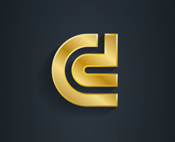
If you are an individual entrepreneur, and your activity is to some extent connected with metal, this is a good way to strengthen your brand identity. Ornaments and clear lines will also be appropriate.
Geometric 3D Figures

These are two trends combined into one. Such an approach can help you show that your brand and business are holistic, comprehensive, but at the same time transparent and clearly structured. This is an ideal option for B2B companies.
Minimalism

It is necessary to be careful with this trend. It is very easy to overdo it with simplicity and just do not put the marketing message in the logo.
Typographic Logos

It would seem that this is an option for those who are too lazy to develop a logo for too long – just write one or two letters from the name of your brand. However, this approach helps to enhance the impression of clarity and contributes well to remembering the brand name.
Creative Logo
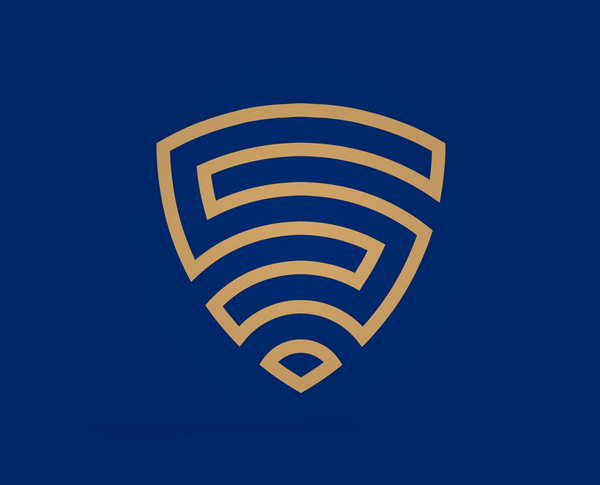
This approach allows you to combine all of the above trends in any way. However, remember that you work for the target audience, and here, as well as with minimalism, it is very easy to overdo it with creativity, and then the potential user will be forced to think and make assumptions about the essence of your business.
Make Your Logo Able to Cause Emotions

Remember, at the beginning of the article we touched on the topic of the psychology of colors in marketing? So, the basis of this theory is that each color causes certain emotions in different groups of people. For example, let’s look at the PayPal logo and design, which is made in white and blue. These colors were chosen because they evoke feelings of confidence, reliability, and peace of mind, which means users receive a subconscious signal that they can trust money to this service.
Think about the emotion your proposal should evoke, and try to intuitively understand what colors and shapes can help you with this. By the way, it is still possible to conduct A / B testing to confirm or refute your hypothesis.
Keep an Eye to Make Your Brand Identity Holistic
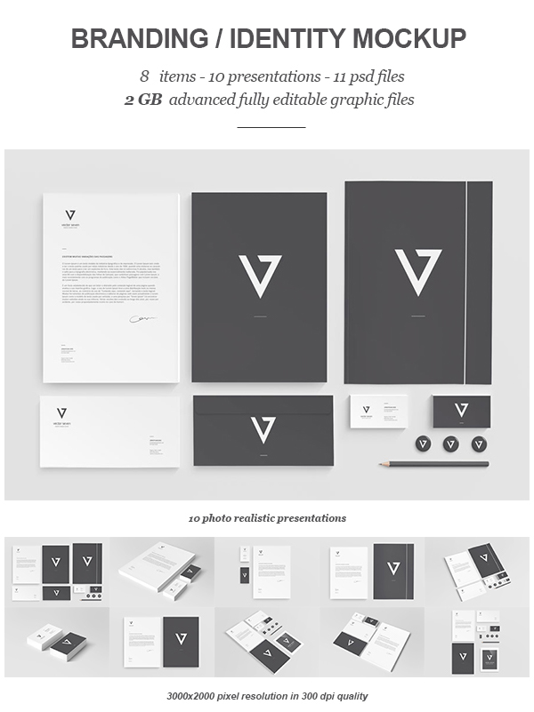
At the beginning of the article, we said that the logo is the starting point in the development of your brand identity. And of course, it’s not enough to create just one logo. When developing it, remember that it will be the basis of all your graphic design, and will also be displayed on the site, in the graphics that you create for social networks, email newsletters, printed promotional materials, outdoor advertising, and so on.
Creating all these graphics, you will need to adhere to one style, the basis of which has already been laid in your logo. Therefore, choosing colors and shapes, think in advance how you will integrate your logotype into all your other graphic materials, and make sure that the result is as holistic as possible. Because brand identity is, first of all, integrity and unity of perception.
Conclusion
In this article, we talked about the latest trends in logo design, as well as how to find your perfect color and shape to convey the mood of your business and take the first step towards creating a holistic brand identity. Remember that the features of the perception and preferences of the target audience, in this case, are more important than your personal vision. Try to correctly combine your opinion, vision of your target audience, as well as the latest trends in the development of logos with the psychology of colors in marketing, which does not lose its relevance.
]]>
