
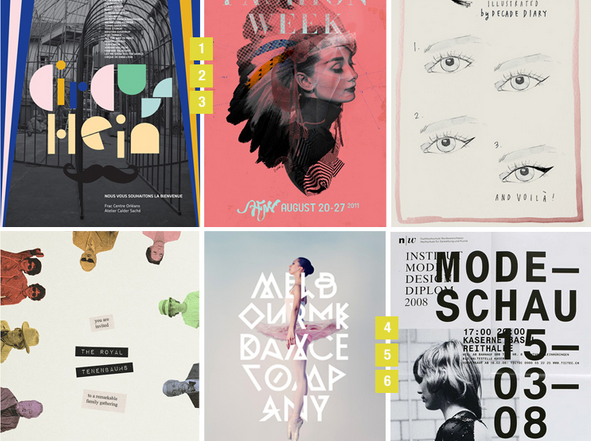
Posters have been around from the time of Jules Cheret, the father of posters, and intriguingly, some of the things that worked back then still work today. A sharp departure from the 1800s, however, is that posters are no longer only meant for the roadside. They can fit anywhere, online or offline.
When talking graphic design projects, poster designs are often said to be the most exciting and the most challenging. According to Steve, digital marketing manager at Print-print.co.uk, “a poster is a simple media tool that communicates important information about a product or an event. It has to capture attention and develop interest. Our printers roll of some amazing designs every day”.
Poster Purpose
When designing posters today, your main focus should be on the purpose of the poster and its application. If you are making a poster to be displayed in a public area, you should keep in mind that it will have to compete with not just its surroundings, but also with other posters. This is perhaps why some designers choose to create outrageous posters to grab more attention than other posters in the vicinity.
Poster Size
The first decision you must make when creating such a poster is to determine the size and shape of the design. This is of course generally determined by the display area. The most popular sizes are as follows:
Large Format Posters: Most common sizes are 24″ wide and 36″ wide.
Portrait and Landscape: Most common sizes are 81/2×11, 11×17, and 22×34.
8 Tips
To get the best result when designing a poster here are 8 quick tips you have to keep in mind:
- Work out the information that needs to be conveyed and set a hierarchy. The most important information (may be name of an event or place) should always be the biggest and brightest.
- Decide on whether you need different sizes for the poster. Making only one size of the poster is not always a great idea, especially when the goal of the design is multi channel promotion.
- Keep in mind the locations for your poster to ensure the posters are good for the sites. This will help you design something that will resonate with the audience.
- Make the information you are looking to communicate as simple as possible. This is arguably one of the most important tips for poster design. You have very little time to get your message across so too much information will only discourage your potential audience from engaging with the content.
- Always have scaled down versions of your design. This will come in handy when there is a need to put the poster on websites, or when you want to attach it to an email.
- Be careful when choosing your typefaces. They must fit the event ethos and general design requirements (circus typefaces for circus events etc.) and should not normally number more than 3. Again, make sure the typefaces deployed are easy to read.
- Be sure to use simple words and short messages.
- Be careful with your use of colour. Your choice of colour is very important so you need to be sure you understand colour theory. It you are not sure about colour stick with an established colour palette.