There is nothing simple or minimal about the concept of selling real estate or renting out apartments. It’s one of the most lucrative and competitive businesses in the world today. However, when it comes to selling and marketing such services online, a minimalist design and approach have proven to be a winning combination time and time again.
With WordPress offering millions of custom and premium themes, it’s never been easier for independent and big name realtors and brokers to go live with site designs of their own — many of which focus more on the visuals, then filling up the site with clutter and unnecessary information and navigation.
To help spread awareness and inspiration on just how important and effective a minimalist site design can actually be, let’s take a look at some of the top realtor and rental property site designs on the internet today.
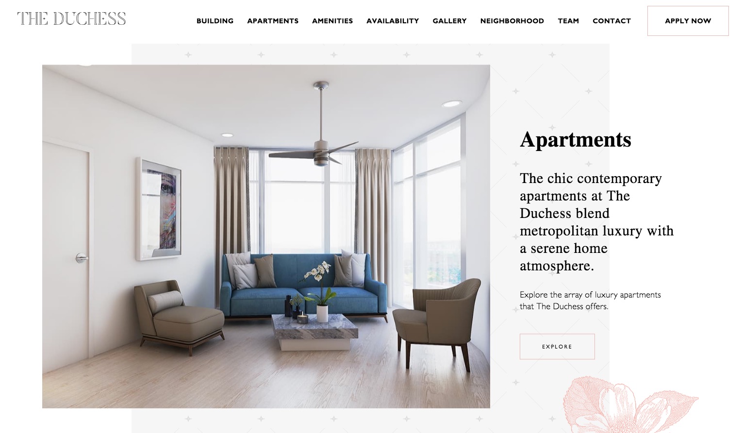
Duchess Apartments
When it comes to minimalistic designs, few colors work better than white and black. It’s this combination that allows for photographs to simply pop right off the page — which is one of the most important things to accomplish when trying to sell a home or rental property online. This is something Duchess Apartments has accomplished quite well with their site. Not only do they have the color scheme right, they also have a simple navigation menu at the top of the page that pops out enough to grab your attention, but isn’t bold enough to pull your attention away from what matters most.

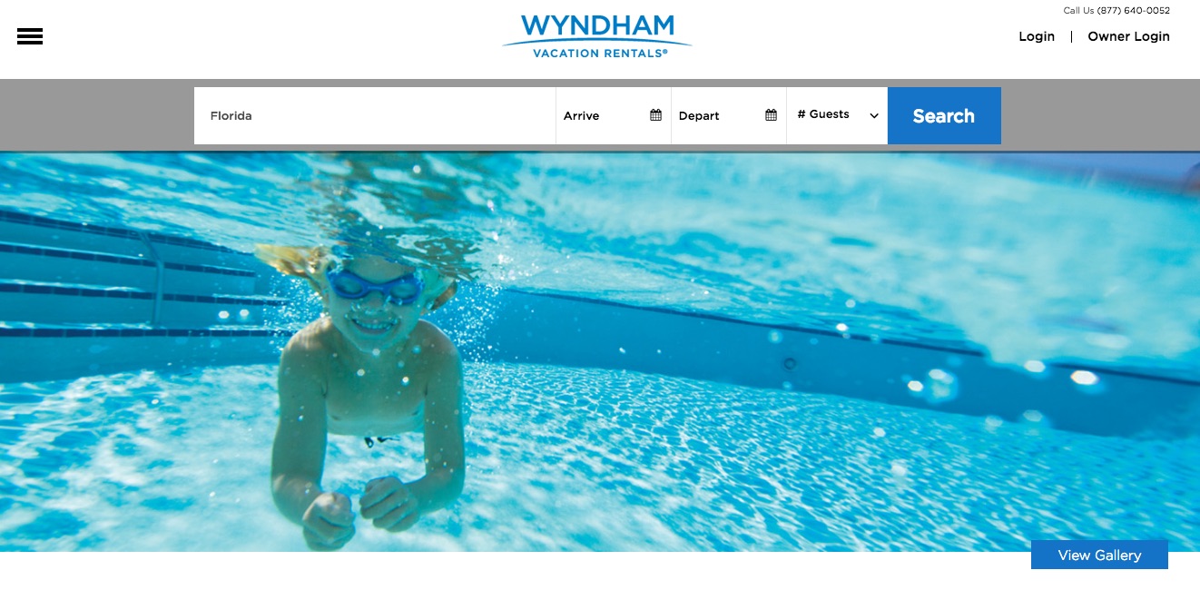
Wyndham Rentals
It’s not just smaller brands and independent brokers that rely on minimalist designs to increase conversions and site engagement. Wyndham Rentals is one of the most popular names in the world today when it comes to rentals, hotels, and vacations. Right when you look at their site you can immediately get a sense of how much fun it would be to go on a vacation right now, while also having the simple (and only) option to search for where you would like to go on travel, when you would arrive/depart and also how many guests you would be including. This type of simple and straight forward design likely makes Wyndham one of the top websites for rental properties across the nation.
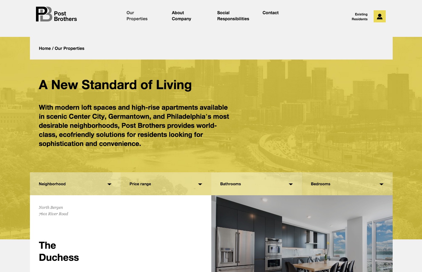
Post Brothers
No matter where you are renting apartments in the world, you need to make sure you have a site design that translates with all audiences. This is something Post Brothers have done extremely well with. Through their easy to navigate website, you can see their current listings for apartments in Philadelphia, while also using the different search features on the site to view listings based on neighborhood, price range, bathrooms, bedrooms and more. As for the minimalist look and feel to the site, the gray, white and yellow colors are a perfect combination to make the actual house and rental property photos pop right off the page.
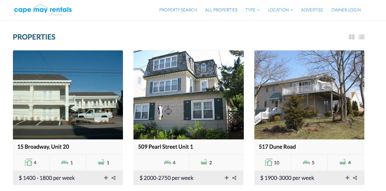
Cape May Rentals
A common theme among many of the realtor and rental property websites above is that most of them are focused on individual properties or the brand and service provided. However, this isn’t what you are going to find on many sites that offer access to a wide range of listings, or individual brokers that might have a lot of properties to promote. The good news is, even with a bunch of properties in place, there are still plenty of great minimalistic designs out there to get inspiration from. Cape May Rentals is a perfect example of this, as they simply have their logo on the top left portion of the page, an easy search and navigation menu on top, then individual property listings below.
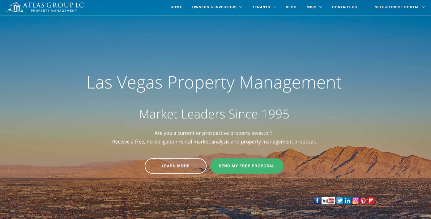
Atlas Group Property Management
Having a great realtor or rental property website also means making sure your design looks great across all devices. This is something that is easily accomplished with through the use of a WordPress theme, but still something many brands are doing wrong. Atlas Group, however, is an example of a responsive site that is also minimalist at the same time. Visit their site on a mobile device or on your desktop to see how the content and images seamlessly load without any errors. This is yet another key component to creating a quality website and offering the best on-site experience to your audience in the process.
It’s All About that Minimalist Site Design
At the end of the day, it doesn’t matter if you have a fancy website or one that’s quite basic. What matters most is the information provided, the use of high-quality images and how you are portraying your message to an audience. Through each of the realtor and rental property site designs above, you should gain a whole new sense of inspiration and creativity for how a site can be designed.
Author: Zac Johnson
Zac Johnson is an entrepreneur with 20 years of experience in the world of online marketing and branding. Follow his journey at Blogging.org and ZacJohnson.com.