It’s funny that some people look for write-ups on examples of bad web design online instead of directly learning from articles that show the good practices. It’s the reverse approach to learning the best practices, and it is even funnier to learn that other people even ask about popular websites with bad designs.
Learn more about web development and software development for startups from Redwerk. They can help you come up with an effective design and build your website with professionals working in different areas: frontend and backend, SaaS development, mobile layout development and database processing and development.
Here, we’re also taking the same opposite methodology, so you can avoid doing the things you should not do when designing your own online site or when helping someone who wants to give online entrepreneurship a try.
Here are the design mistakes to avoid:
Flat Design Applied on Call to Action (CTA) Buttons
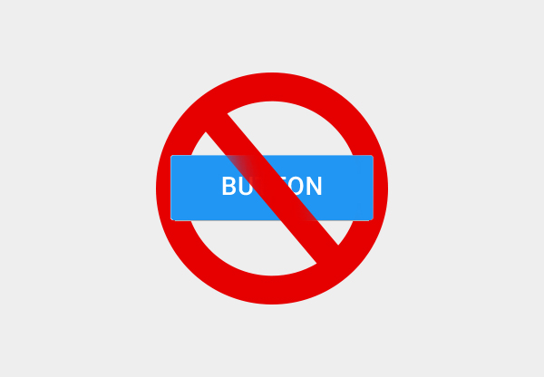
Flat design is in vogue today, but applying it on CTAs does not make any sense at all. Flat design is a useful strategy that carries the primary advantages of fast load times and easy resizing.
The technique is achieved by using only 2D flat images and texts, and eliminating the use of stylistic elements such as gradients and shadows.
Online businesses can take advantage of the technique for enhancing user interface, but when the technique is applied on CTA buttons, these businesses risk hurting their conversions.
Do they expect potential customers would click on a boring transparent-outlined SIGN UP?
Fallacious Website-Logo Connection

Bootstrapping their startups, business founders try to save money by utilizing a friend who willingly lent a helping hand to design their logos. Or they would get their logos from a marketplace. Still others get their logos via a crowdsourcing platform.
Either way, the usual result is a logo that deviates from the appeal and content of the webpage that it is on. They just plugged the logo on an HTML template and did nothing more.
The truth is, as a startup, your logo is not your priority. Your priority instead is to create consistent branding. When creating consistent branding, what you do is you set some guidelines, which you should apply in all your pages.
Hidden Masses of Keywords

You may be tempted to put hidden text on your webpages because someone told you that keyword stuffing can land your pages high on search results. The expected result can be achieved and enjoyed for some amount of time, but this mischievous practice will soon be detected.
Search engines have large amounts of resources aimed at providing their users quality information relevant to their needs. Using tricks like hidden text strays from this aim, and so you risk your pages being ignored, or worse, blocked.
More Images and Animation Results to Higher Conversion

You can make your pages eye-catching by putting in those pages lots of interesting pictures and images, but mind you, these visual elements are invisible to search engines.
A good design is a balance between text and graphics, enabling the website to offer a nice user experience, and at the same time allowing it to be easily found by search engines.
Use a Video that Automatically Plays with Sound
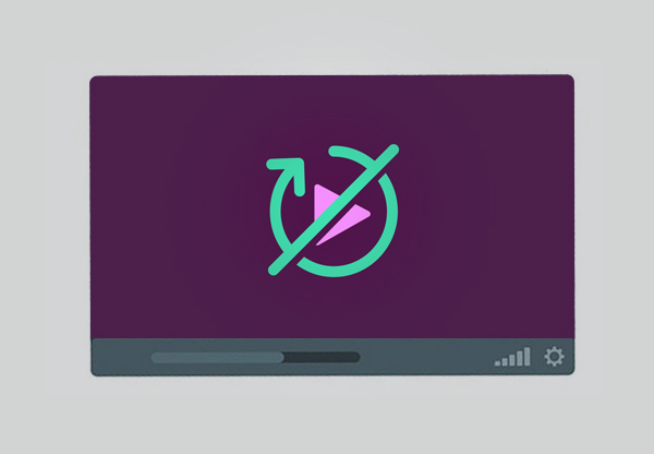
While inserting a video here and there is a great strategy to break up content, don’t make the mistake of using auto-play-with-sound feature on your videos. Not everyone welcomes an auditory jump-scare when they scroll down a page. Auto-playing without sound is a better feature because it gives your visitors/customers control over whether or not they want to hear the accompanying sound.
Provide Lots of Content

On the contrary, not everyone has the attention span to read every bit of your copy. The advice is to make a copy that is striking and concise with sufficient punch to make an impact.
Use Stock Photos

If you have read it somewhere that using stock photos can also help you create a good design, think twice. These photos might actually look great, but remember you have your own unique message to get across.
What you can do to make sure that the photos you will use are specific and relevant to your brand and message is to showcase in your images and videos the actual product offerings of your company and the men and women behind the making of those products.
Need More Help in Web Design?
Above are some of the must-avoid fallacies new entrepreneurs should carefully consider.
Check out: Web Design Trends 2021: Designers Should Know
