Feel the love in the air with these Valentine’s day poster ideas. Each poster sends out a message by using a wide variety of visual tools. Let’s see what we can learn from these ten examples.
#1: Play Around With Typography
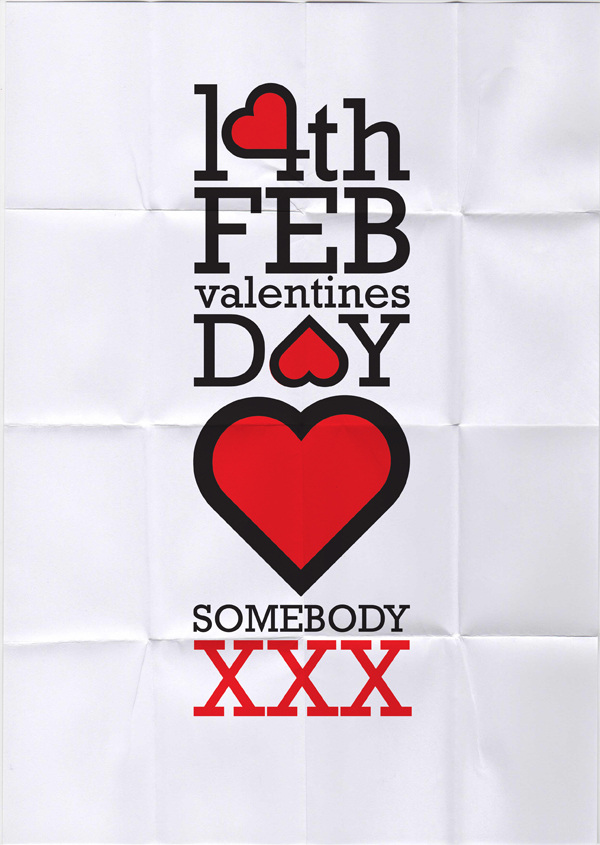
Created by: Ryan MacDonald
Found on: Behance
The Valentine’s day poster design of the UK-based designer Ryan MacDonald is an example of how typography can be used to creatively reshape the design. The little heart elements found in some of the letters and numbers give this design a playful look.
#2: Create a Depth of Field with Different Elements
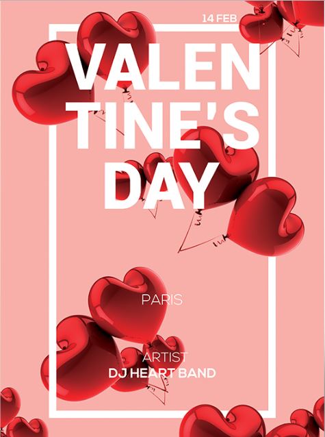
Created by: Petruse Daniel
Found on: Behance
This LA creative has combined a simple set of elements in a way that gives the design a feeling of depth. The layer arrangement of the heart balloons, the white frame, and the heading give the poster a 3D-like appearance. This modern Valentine’s day poster uses straight lines, a clean background, and modern typography which all combined give a minimalist look.
#3: Make it Pop With a Dark Background
Found on: IMP Awards
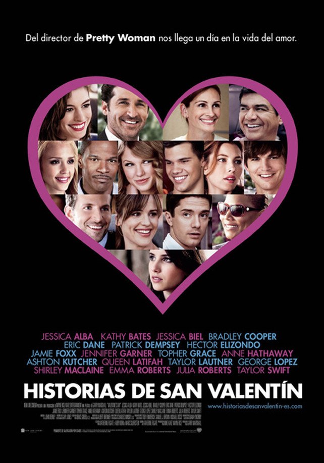
As a typical romantic movie poster, this one uses card design to display all the important characters in the story by symbolically wrapping them up into a heart-shaped frame. The dark background allows the colors to pop and gives the poster a luxury feel.
#4: Use Humor to Grab The Viewers Attention

Valentine’s Day promotion posters for the Heineken brand.
Created by: Dawoud Thiong’o
Found on: Behance
Heineken’s advertisement design always manage to grab the viewer’s attention and this one is not an exclusion. Who says a good beer can’t replace the oh-so-popular chocolate box as Valentine’s day present? The message is simple and uses humor in a relatable and personable manner to make an impression.
#5: Create a Romantic Collage
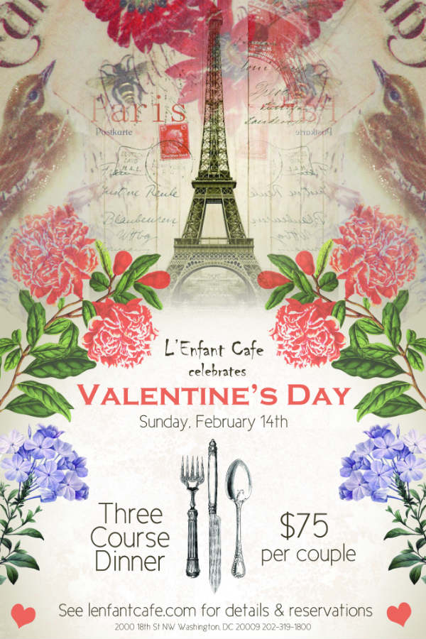
Found on: Lefant Cafe
This gorgeous Valentine’s day collage combines uses vintage collage elements and clip art to create a romantic Parisian design. The beautifully mixed elements and textures used in this collage remind of an old scrapbook or girly diary and create a charming and sentimental design.
#6: Design a Vintage Valentine’s Day Poster
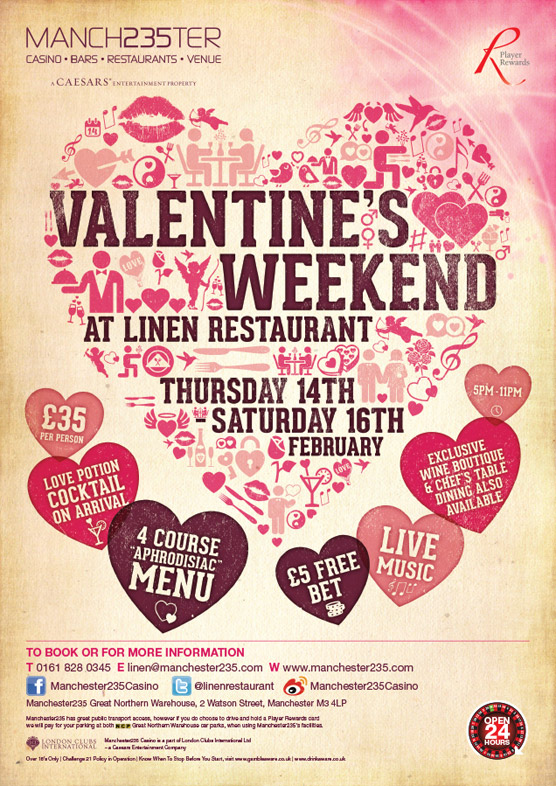
Found on: Manchester Finest
The vintage style has been among the top design choices for years. It has a certain romantic feel that perfectly matches the spirit of Valentine’s day. In this Valentine’s day poster, the rough stained paper and grungy element textures give the poster a vintage appearance. The pink and purple tones are used to additionally highlight the romantic style of the poster.
#7: Use Saturated Colors to Make an Impression
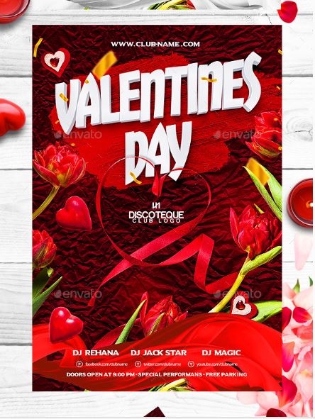
Created by: BigWeek
Found on: Graphics River
The high-quality imagery and textures used in this Valentine’s day poster make it one of the best on the market. Yet, one thing that grabs the viewer’s attention is the increased color saturation of the high-resolution graphics. Of course, putting a blank electric red background won’t work on its own. The elements’ positioning is another factor that makes this design so beautiful.
#8: Create Your Own Type With Line Art
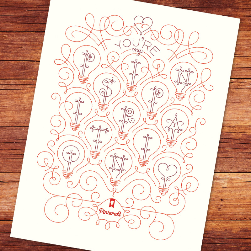
Created by: Pinterest
Found on: The Pinterest Blog
Pinterest has created a gorgeous Valentine’s poster by using simple line art. What makes this poster design idea truly stand out is the creative typography that can be spotted in the light bulbs. The message is carried out in a simple way and puts the brand in a central position.
#9: Create a Better Accent With a Monochromatic Design
Created by: isoarts on Behance
Found on: The Are Hunters
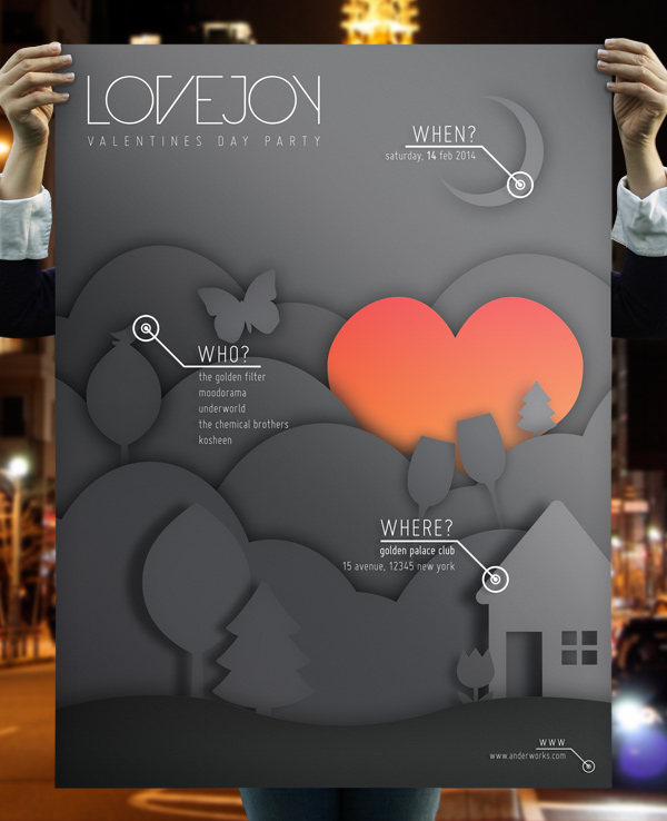
This Valentine’s day poster idea is so simple, yet, so incredibly pretty. The decision of the isoarts team to use only monochromatic gradients and vector shapes has worked out perfectly. The red heart easily stands out from the rest of the monochromatic elements.
#10: Be Provocative
Created by: inoginta on Behance
Found on: Awwwards
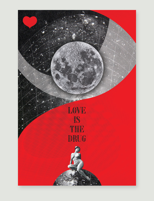
If nothing else works, you can always go with a provocative design. This Valentine’s day poster combines minimalist and vintage elements with contrasting colors and uses a provocative message to make an impression on the viewers.