Split Toning
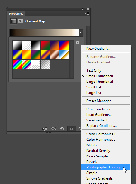
The first effect you will learn is split toning. Split toning is an effect that tints the highlights and shadows of your black & white photo to give it a two-tone color effect. You can do this easily in Adobe Lightroom but sometimes you need to do it in Photoshop for more control. Thankfully, Photoshop CS6 already comes with 32 photographer-created split toning presets.
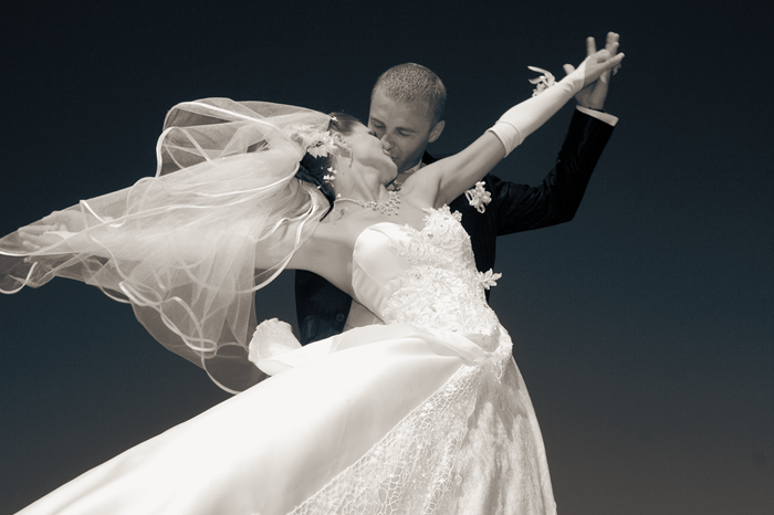
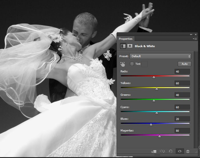
Before you apply this effect, you need to convert your image to a black and white photo. You can do this easily by adding a Black & White adjustment layer (Layer > New Adjustment Layer > Black & White). Feel free to make any adjustments you like or use the auto button to have Photoshop guess the best settings for you.




High Contrast Black & White
Sometimes when you convert an image to black and white it can look a little flat. So to improve it, you would add an adjustment layer to increase the contrast. The bad news is that this usually clips the shadows and highlights – especially for wedding photos of black tuxedos and white dresses. You can try using the curves tool to increase the contrast but you might get flat looking spots that make the image look even worse. The good news is that you can fix this and it’s easier than tinkering with the curves tool.
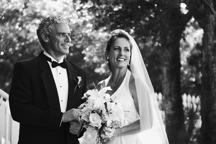


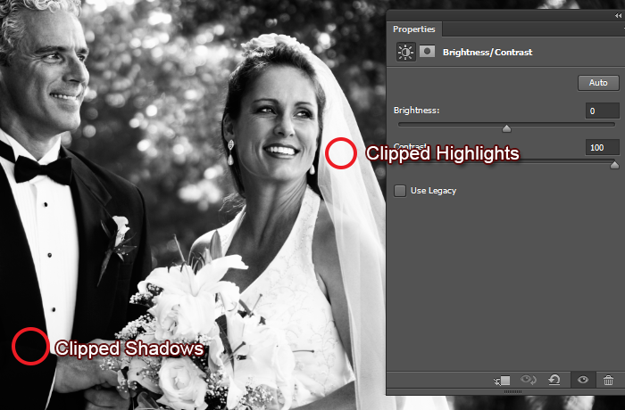


Use this technique any time you need to restore clipped shadows or highlights. It’s easier than using a layer mask and it’ll save you a lot of time.
Film Look
Finally, you’ll learn how to create this film look that’s popular with wedding photographers. It gives your photos a low-contrast effect and can make nearly all your photos look better. Many people pay a lot of money to buy Lightroom presets but we’ll show you how to make it yourself. This technique uses just one curves layer and you can use the same technique in Adobe Lightroom to create your own presets. You should have some knowledge about how curves work but we’ll show you it step-by-step so that you can understand what we’re doing.


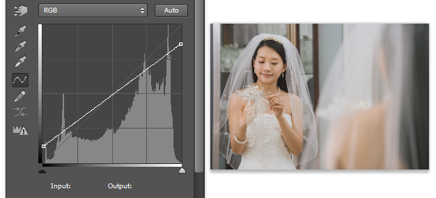
To start, create a new Curves adjustment layer (Layer > New Adjustment Layer > Curves). We’re going to begin by reducing the contrast of the photo to give it the film look. Drag the bottom-left point up. As you drag, you’ll notice that the shadows are getting brighter. Now drag the top-right point down slightly to make the highlights darker.


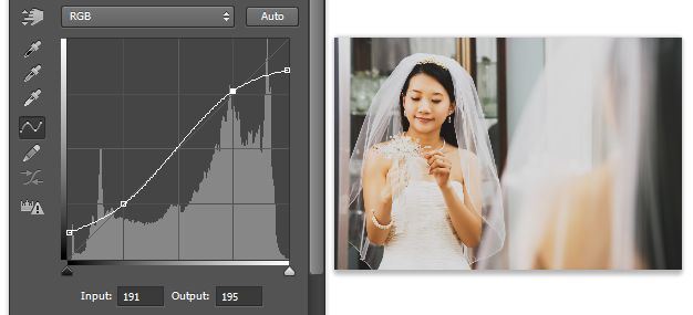
Now we have a low-contrast photo but it doesn’t look all that great; we only want the low contrast effect in the highlights and shadows but not in the midtones. So to correct this, create a S-shape curve to increase the contrast in the midtones. The curvier your S-curve is, the stronger your contrast will be. So try to keep the points near the diagonal line in the middle to keep the contrast subtle.


If you want to give it a lomography or expired film look, go into the the red, green, or blue channel and create a S curve to increase the contrast. In most cases, the red channel gives the best results.
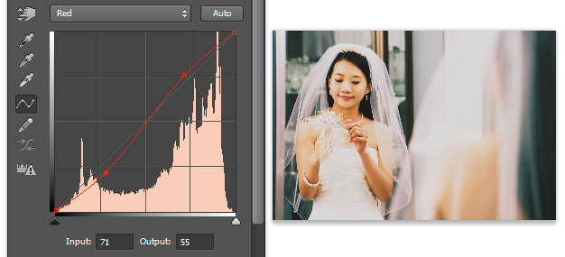


You can also tint the shadows and highlights with the opposite colors. For example, if you switch to the blue channel and drag the bottom-left point up, you’ll increase the blues in the shadows. Drag the top-right point down and you’ll increase the yellows which will balance the colors in the midtones.
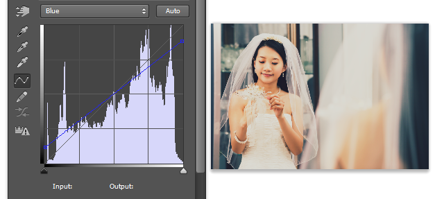


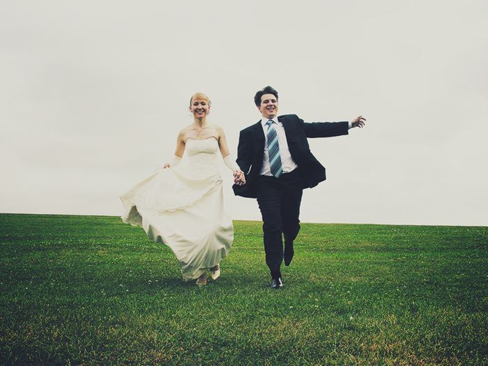
Play around to create your own effects – there’s endless amounts of effects that you can create with the curves tool. If you want to see some examples, have a look at the Instagram and Prestalgia actions by SparkleStock – they all use RGB curves to create their look. Here’s the results of this film effect.
You can even use this effect to make bland photos look nostalgic and memorable.
