Today with all the different devices we can use on the internet it is very important that your website is responsive and can be viewed in any browser on any device. The different devices we can use are all quite different with different screen sizes, you can use your mobile phone, tablet, laptop, desktop or even a TV. It is important to be able to design websites that can be viewed in all these different browser sizes.
The problem we have is that to design for these different browser sizes you need to be able to test in these different browsers. You have a few options to test in the different sizes, you can get all the devices you want to test on, you can resize your browser to fit the different sizes, you can use web developer tools to select the exact sizes or you can use a tool to resize your browser.
Viewport Resizer Tool
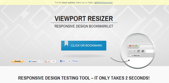
Here is a responsive design tool which allows you to add a bookmarklet to your browser to test any website is different browser sizes. All you have to do to use this tool is save it to your browser when you click on the button.
When you click the button it will add a toolbar to your screen where you can select what size to have your browser. When you click on a device the viewport will resize the browser to this size, allowing you to see what a website will look like on this device.
To use this in your website development click on the link below and add the resizer bookmarklet to your browser.