UX case study for Concept project WeDate App

Methods
Concept mapping, Storyboard, User flow, Wireframes, Paper prototyping
Tools
Marvel
User research- Asking the right questions.
On my second day of my General Assembly UX Immersive course I was tasked with creating an app that solved a problem for the person sitting beside me.
I began the problem-solving process by simply asking my neighbour ‘do you have any current frustrations that cause you stress’.
It became clear that Alberto my user was having arguments with his girlfriend. Uh oh!
Delving deeper into this sticky subject I asked him why, they were arguing?. It turns out he never planned anything for them to do together so Alberto’s girlfriend was frequently frustrated with him.
User research with Alberto
During our interview Alberto revealed he had attempted to plan surprise dates previously using websites such as Timeout and searching on Google but he only thought about doing this on the day or hour of.
‘Some notification could help me plan ahead’
‘I take notes of places to go from time out maybe once a week on my phone’
‘I think I should check for a place to go in advance’
In a nutshell, Alberto didn’t have issues finding things to do but rather remembering to plan in the first place. He needed reminding.
It was also important that Alberto wanted to plan ‘experiences’ rather than material surprises for his partner. I created a concept map to help me link up all of the features of Alberto’s problem
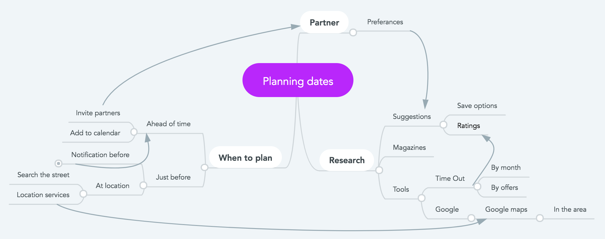
Concept map
Proposed Solution
Alberto needs some tool on his phone (as he always has it in his hand) that will help remind him to start planning for things to do a few days ahead.
I propose an app that will prompt Alberto with alerts which include suggestions of places to go for dates around London.
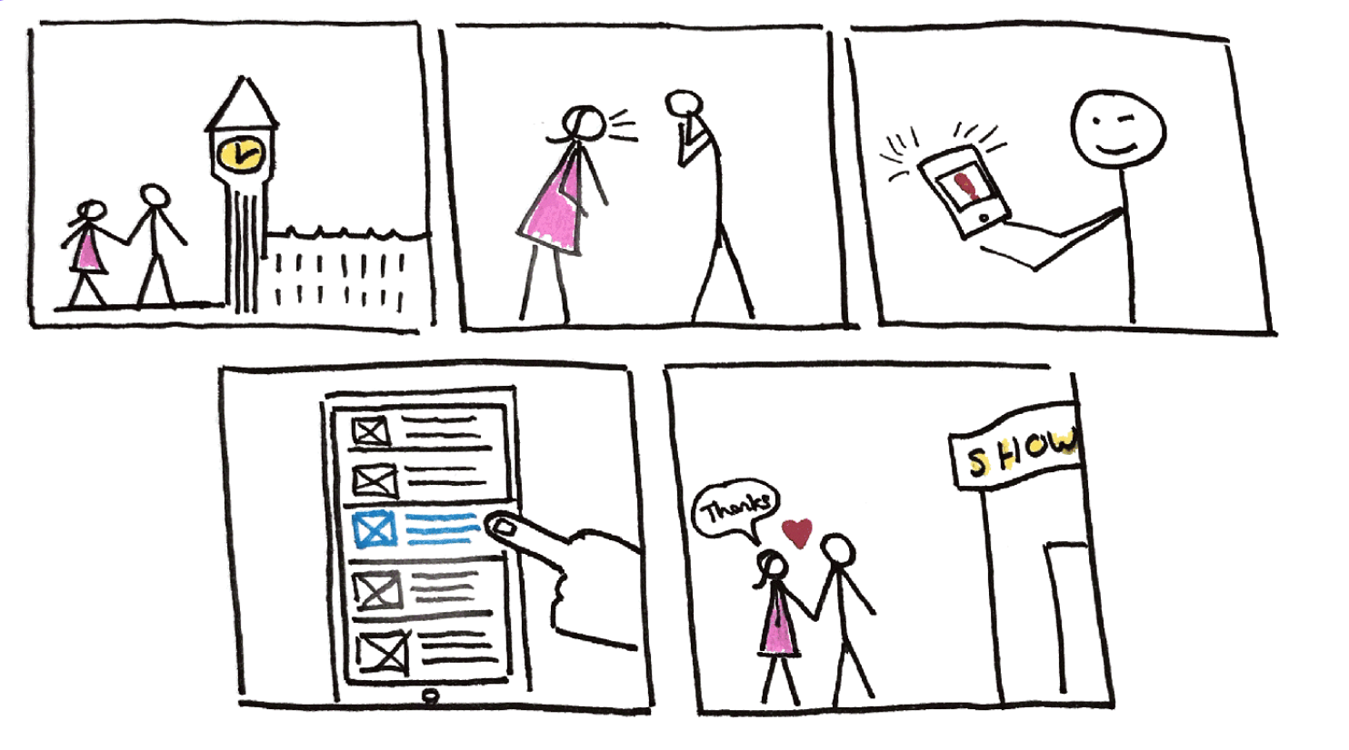
Storyboard
I visualised Alberto’s problem and solution through a storyboard.The App would allow him to view suggestions by categories and theme. He would then be able to log the place or event into a ‘dates calendar’ to help him remember what dates he has planned for his partner. I am calling this App WeDate.
Fist Ideation — forgetting the problem
The beginning of my design process started with a quick sketch of a date planning app, the app at this stage operated much like the ‘things to do’ app Dojo.
The app would offer suggestions for places to go divided by categories such as ‘events this month’ or ‘near me’.
Alberto would then be able to expand and view the suggestions and email the details to himself and his partner as a reminder.
One of the first features was ‘likes’ that each partner could select and the app would combine these ‘likes’ to form the basis of future suggestions.
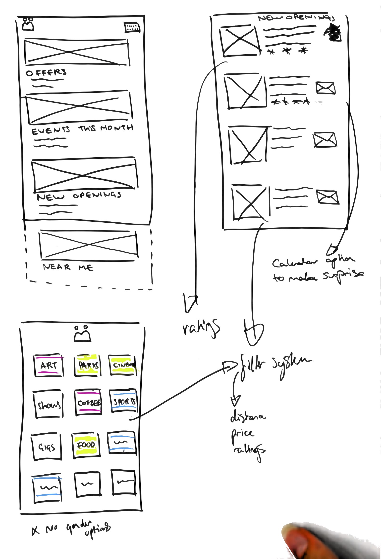
first ideation sketch
Bringing it back to the user
Since the user wanted to plan surprise dates for his partner the option to email the date night details to his girlfriend needed to be scrapped.
And Since Alberto would be the one using this app it would only be his ‘likes’ that formed the basis of future suggestions.
After questioning Alberto further it became apparent that ratings of places and a filtering system were also important to feature.
However, I hadn’t actually addressed how the user will even remember to start planning future dates In this ideation.
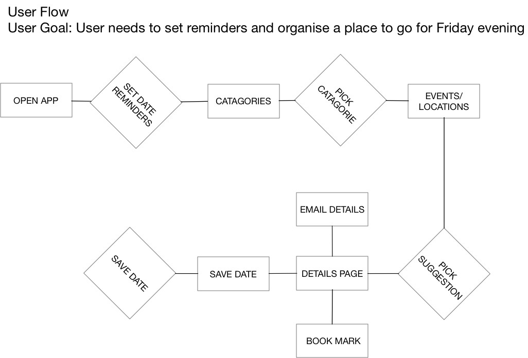
Iteration Process
The app was still lacking its core goal which was to ‘prompt’ the user into planning dates, therefore, I created a user journey to help me plan the flow my user was going to take.
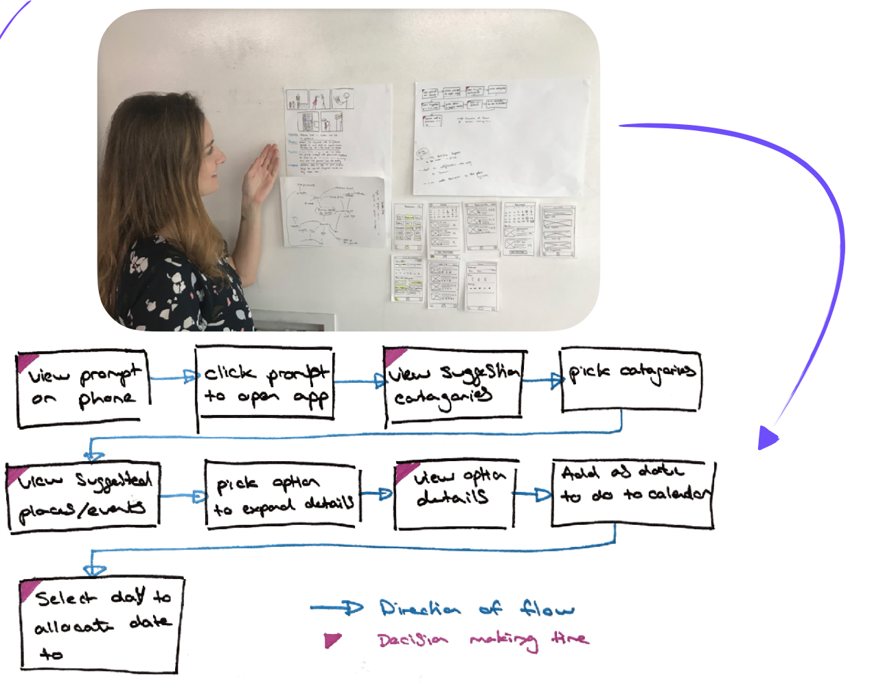
First user flow
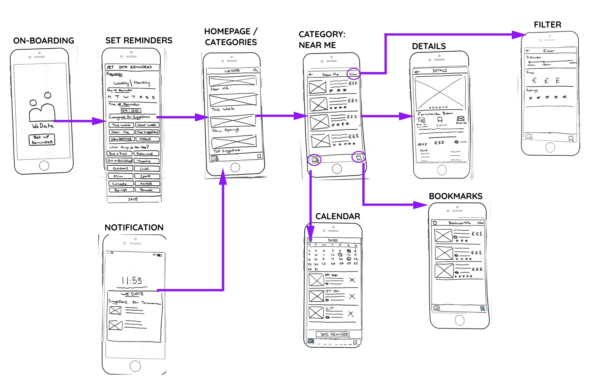
User flow
My first user flow addressed that my user needed to be prompted so I needed to create a feature that addressed the issue of setting reminders to plan ‘dates’. This feature would need to be at the beginning of the app when the user first logs in so he can fill it in once and then get prompts intermittently going forward.
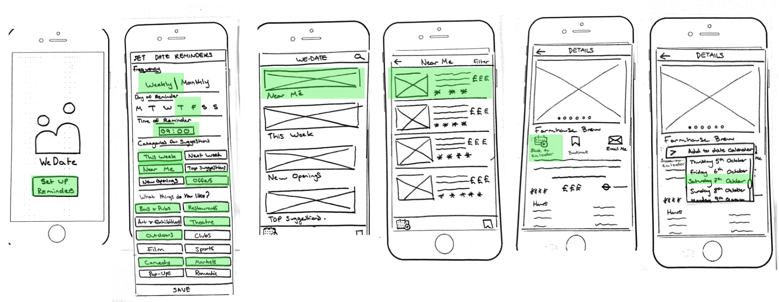
Wireframes
After establishing my user flow I had to apply it in a wireflow to test usability .
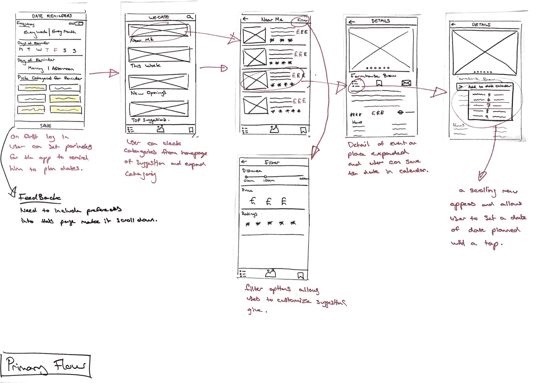
Primary wireflow with annotations
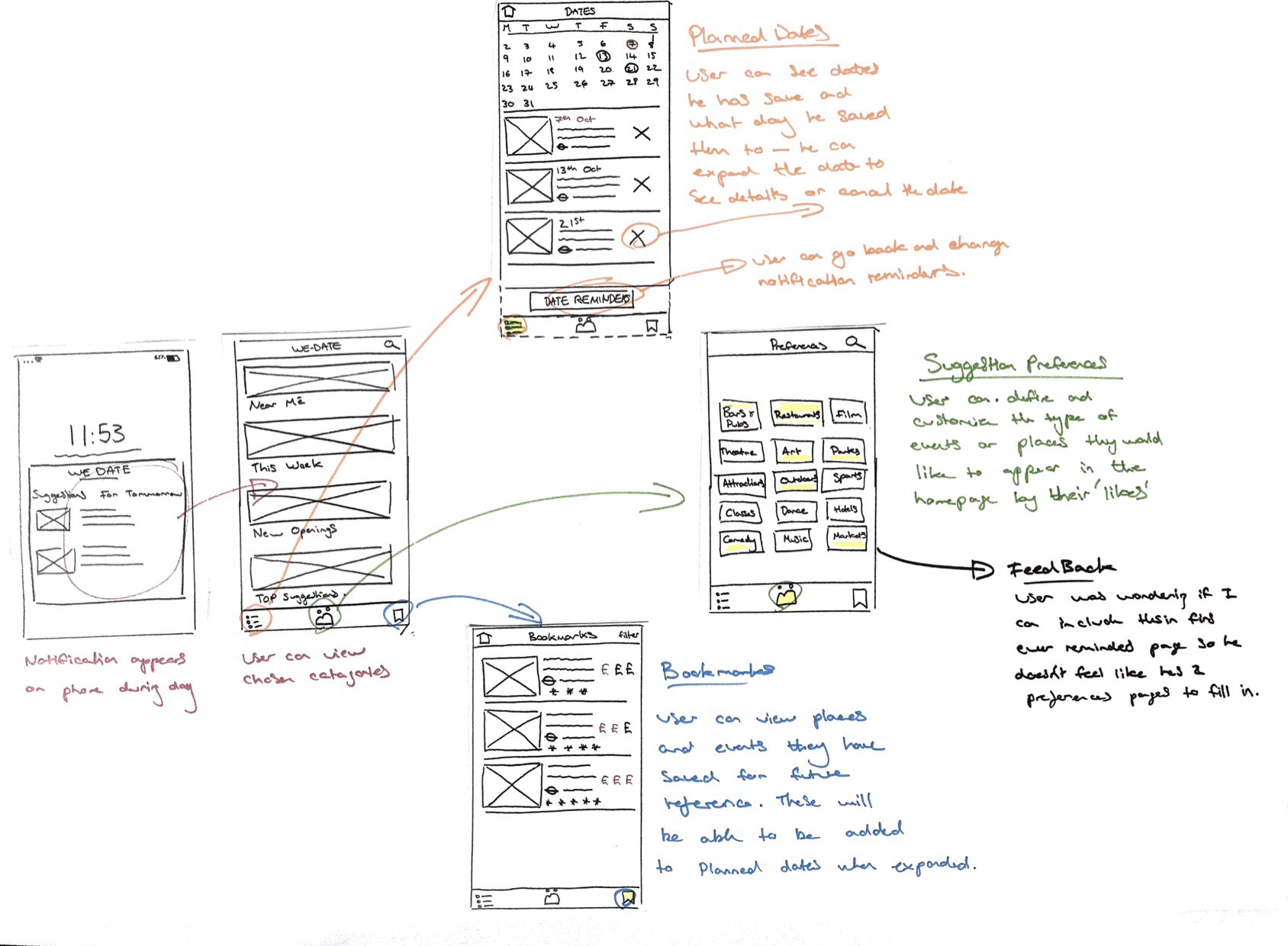
Navigation wireflow
During my first iteration of the wireframe flow, I decided it would be more functional to the user if the ‘likes’ feature were incorporated into the on boarding ‘set reminders’ screen. Why ? -This would enable the user to customised his prompts and the suggestion he received in his prompt message straight away. I
Paper prototyping
To improve and test the wireflow I tasked my user Alberto two scenarios.
1. Can you please go onto the app and set up when and how often you would like prompts to action you into planning a date for your partner.
2. Can you please look through the suggestions from the ‘Near me’ category and select a place to save to your dates calendar on the 7th of October.
Watching behaviour
Through observing the behaviours and comments from the Alberto during the prototyping session, I identified a few issues with the use and visuals of the app . These included confusion with the saving date and bookmark icons and the ‘likes’ copywriting needing to be more conversational so the user could understand what the app was asking for.
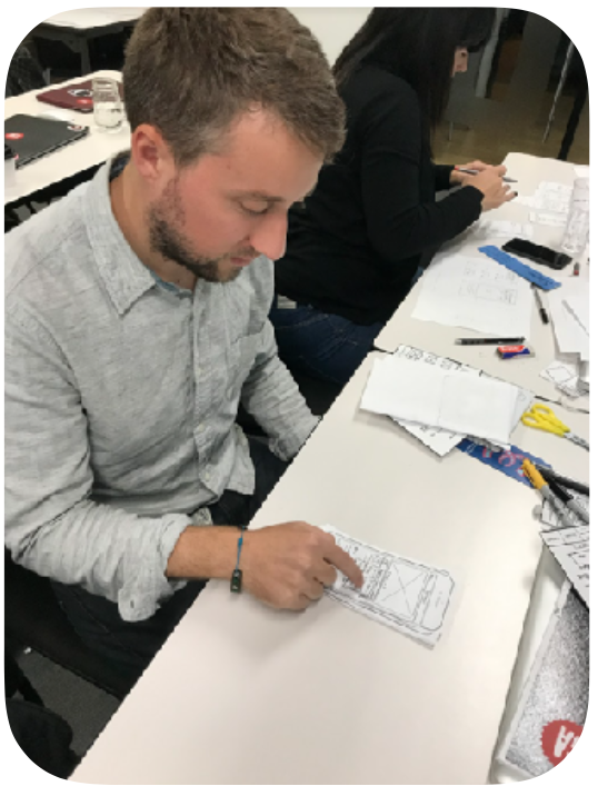
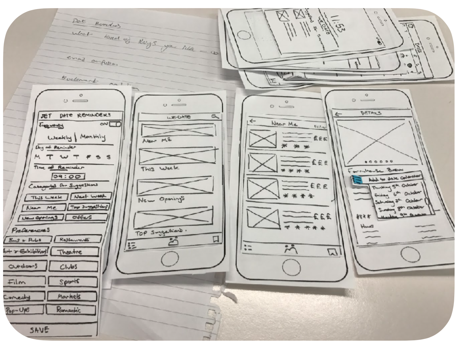
Paper prototype Usability testing with Alberto
Iterations
After a process of implementing iterations from my paper prototype testing, I used the tool Marvel to create an interactive version of the improved wireflow. Again I set tasks for my users and watched them interact with the prototype. This gave me insight into any further improvements to be made to flow, functionality and UI aspects.
New wireflow with improved ‘set reminders’ screen and instructional feature titles introduced
Primary flow hotspots on Marvel
Iterations to be made
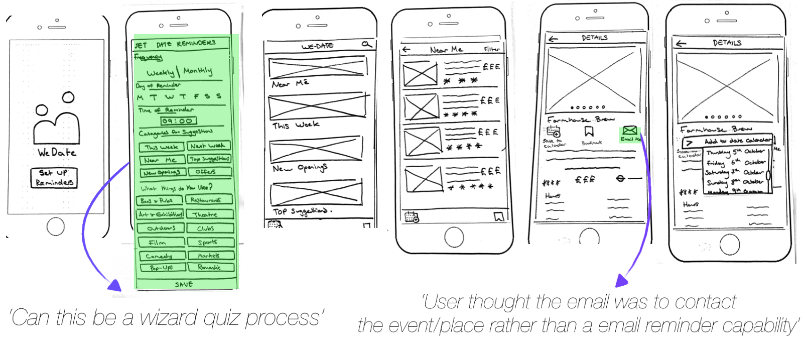
Further Iterations
After testing with Marvel I decided going forward clarity is needed in regards to using the ‘email me’ feature. Alberto thought this feature was an email portal to message the establishment rather than send to themsleves as a reminder.
Another major change could be to expand the ‘set reminders’ screen into an on-boarding quiz for the user. This would create a more interactive investment by the user and a better understanding of the purpose of setting reminders .
Read the about how I implemented this on-boarding quiz and added visual design here.
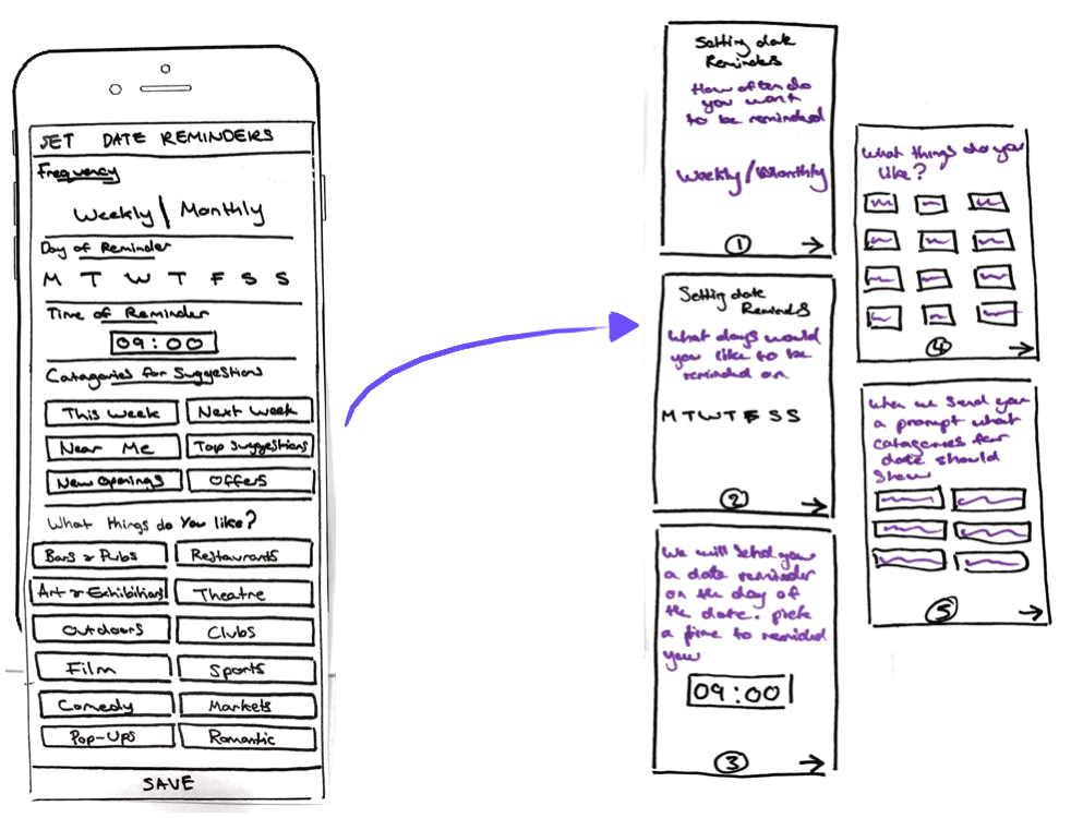
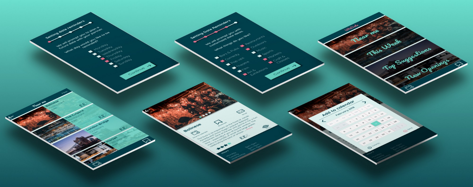
Expansion of setting prompts page into an onboarding quiz split between the screen with conversational instructions and questions.
Outcomes- The Experience
The WeDate app allows Alberto to plan dates for him and his partner to go on by reminding him with alerts. It allows him to impress his girlfriend with his effort and promotes bonding between the couple over their shared date experience .
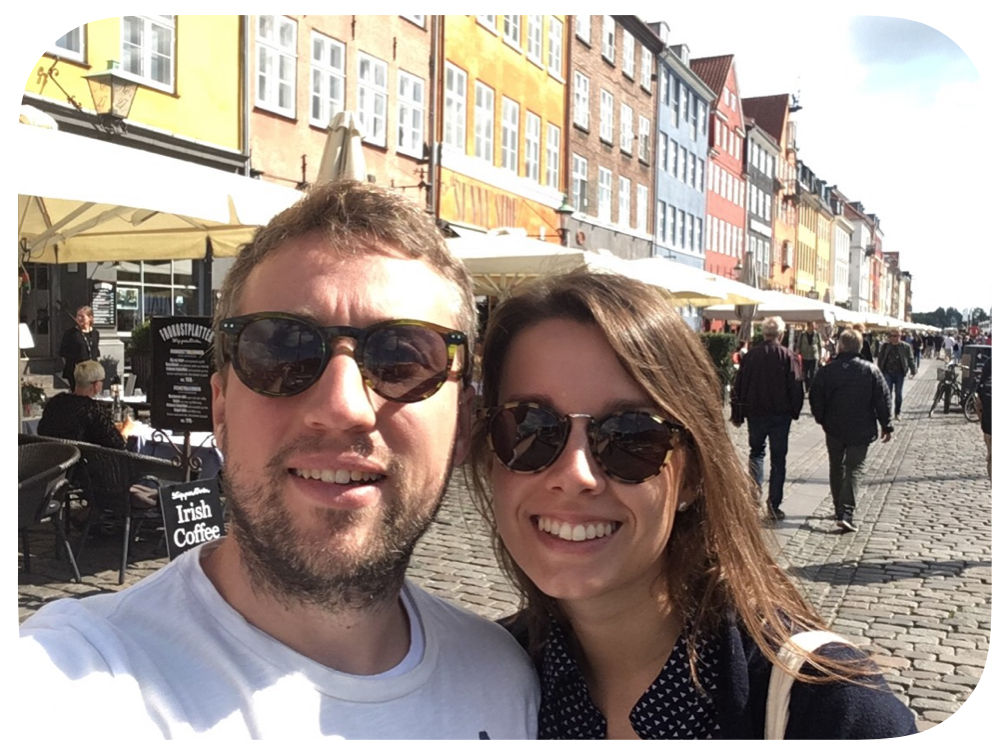
Alberto impressing his girlfriend with his effort and bonding over shared experiences
Future developments
The WeDate App has potential to become a part of peoples lives through its core goal but adding features and capabilities will allow users to integrate it even further. Here are some furture steps
Produce wireframes for testing and hi-fi mock ups with a UI style guide.
Booking capabilities to allow users to book ahead and reserved tickets or seats and to contact the establishment or event.
Discounts on certain places or events could be offered through the app saving the user money.
Monetising the app through the promotion of business and events around London.
Map and travel integration to allow ease of planning around the dates created through the app.
Reading and entering reviews of places or events to go so the user has a more informed insight into potential places and so he knows he is getting the best quality date experience.
Read the about how I next implemented Visual Design here, and Find me at linkedin.
Thanks for reading!