The Sketch Plugin
First I’m downloading the Material Theme Editor from the official Website. Currently, there is only a plugin available for Sketch. As Sketch is my favorite tool for creating wireframes and mockups — I’m happy for using an existing tool. To get an idea of how to get started with the Material Theme Editor, I checked out the Blog section of Sketch.
The Plugin provides access to the Material components library, Material Theme Editor and the ability to upload artboards directly to a Gallery. These three elements offer you the following benefits:
- Theme Editor: select colors, fonts, corner style of the components surface and choose one of the various icon collections.
- Material components library: a well structured Sketch library with all components. For now, I only use the System icons collections tab and download an icon set. The baseline template and the downloaded System icons collection, these two documents I link into Sketch as Libraries and from now on I can use the embedded symbols in my projects.
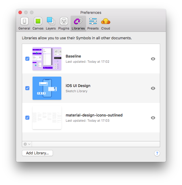
These libraries can be used in different projects to ensure consistency and up-to-date documentation of the interaction design overall applications in the same product line.
Adding the key screens
Key screens of the application were created in prior sketching sessions in co-creating with project stakeholders, and the final wireframes are created in Balsamiq Mockup.
The necessary components are all available as Material Design components. After building the main layout grid, I can start inserting all components through the insert menu.
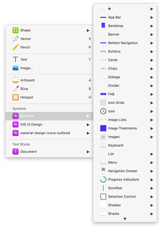
All elements of a component can be accessed through the component inspector. The guidelines available online are a useful resource when it comes to the questions what is the basic concept behind the component and how to use it.
Customizing the theme
After adding all key screens, I can now start customizing my theme. This process is divided into these four sections:
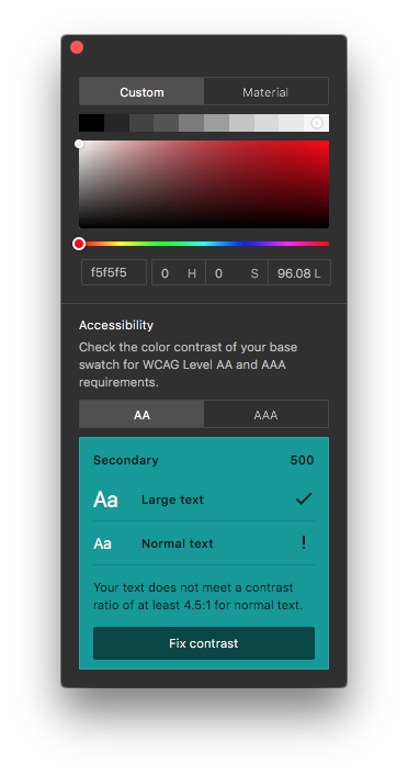
- Colour Palette: define the primary, secondary color and additional colors for backgrounds, surfaces, errors, typography, and iconography.
- Font Families: choose the fonts and define all styles used in the components.
- Corner Style: adjust the style of the shapes used in the Material surface.
- Icon set: there are five types of icons sets available for download, which can then be integrated as a library in Sketch.
The official website provides additional information about the underlying design principles of each topic.
There are nice features when it comes to the color palette. The contrast of the text color will be checked against the WCAG Level AA and AAA requirements for accessibility. You can decide if you like to fix the contrast by the Plugin or let the color definition as it is.
The key screens with the customized theme can now be uploaded to the gallery for gathering feedback from the stakeholders or serve as a reference for developers.