Have you ever heard of a font called Arabesque? Well, you can’t download it online, if that’s what you’re wondering. It’s estimated to be around 171 years old and can be found in an 1858 type catalogue. As the name suggests, Arabesque is highly decorative in appearance, featuring wavy, leaf-like strokes that appear to have been created with an ink brush.
I adore the look of the typeface. It has a calligraphic quality and possesses gracefulness, where the words seem to dance on paper when Arabesque is used. However, if I want to use Arabesque as a font, I must locate someone who still possesses the metal types and use it with a letterpress machine. Alternatively, is there a better solution available?
You may have come across Garamond in a restaurant menu or a book. This serif font is even older than Arabesque, yet it is easily available to purchase as a digital .ttf file on many online platforms, including MyFonts. Why so? It’s because many people have digitised it. Type foundries take the time to trace the printed letterforms of Garamond on computers. These traces become font files that can be easily used on devices, so you can conveniently use them in your Word app, if you fancy.
Another advantage of Garamond and Arabesque is that they are both ancient Western typefaces, which means they have fallen out of copyright licensing for decades. This allows anyone to recreate these fonts from scratch and sell or share them online without any issues. Therefore, if I wish to trace Arabesque from a print and use it as a font file, I am free to do so.
However, if Garamond has been so heavily digitised, then shouldn’t someone have already created a digital font for Arabesque? Well…
Popularity plays a major role in determining which fonts become digitised and which do not. Garamond made the cut and stood the test of time as a timeless typeface. Arabesque, for all its decorative glory, wasn’t as fortunate and died in the past as an obscure display type.
But Garamond isn’t the only font that has been continuously revived. We have many different versions of popular fonts such as Futura, DIN, and Gill Sans. Helvetica too became so famous that you can buy four different versions of each (Original, Neue, Now, and Variable) on the first page of MyFonts’ Sans Serif listings.
One reason for current type designers’ desire to revive these fonts lies in their dissatisfaction with how the famous fonts look. Regarding the older versions of Futura, type foundry Lineto has this to say: “Some were based on dubious phototypesetting sources, while others focused too narrowly on reproducing metal types and replicating characteristic details resulting from the limitations of long-gone technologies.”
Another reason why certain fonts keep reviving is money. Type companies have always wanted to sell typefaces that are historically profitable. Font releases from new type foundries tend to hinge on the popularity of genres like geometric sans serifs and neo-grotesques to create a dominant market of same-looking typefaces, but now with different names.
No one could blame you if you can’t tell the difference between Suisse Int’l, Basel Grotesk or Neue Montreal. In fact, try to tell them apart based on these screenshots:
So, we have a multitude of Helvetica “clones,” and it seems we’re facing another problem. Many people have noticed that big fashion labels are all using similar sans serif typefaces in their wordmarks at the moment.
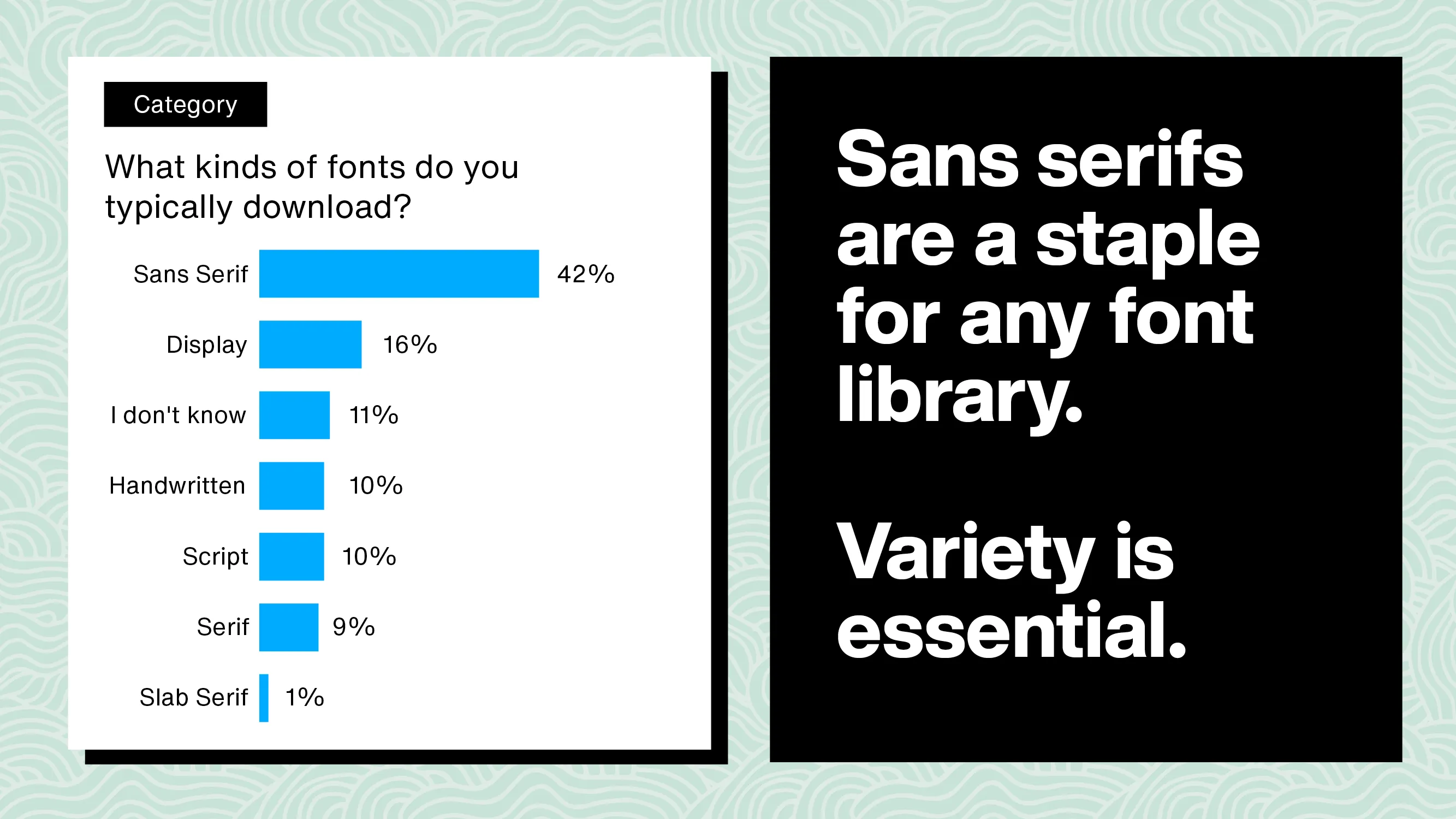
But could type foundries be contributing to this issue? In 2019, Mary Catherine Pflug, Director of Partner Product & Operations at Monotype, conducted a survey of font purchasing habits. Of the 21,187 respondents, 73% agreed that they were more likely to purchase a font they had seen in products or logos. On top of that, 42% of the respondents said that their typical font downloads were sans serifs, with other type genres falling below the 20th and 10th percentile.
Monotype provides further insight by explaining how sans serifs have acquired the reputation of being “edgy” and “current.” As a result, “the sans serif connotations of modernity and innovation help reinforce these perceptions, and as audiences, media, and the marketplace constantly evolve, brands do not want to be left behind.”
With the desire for higher profit and globalisation, it’s tempting for type designers to produce similar kinds of sans serif typefaces and meet the demand. When type foundries encourage a homogeneous typographic environment, it only reinforces the use of the same typefaces in branding and wordmarks. This vicious cycle can contribute to the “blanding” phenomenon that goes beyond fashion labels, as big companies like Google and Airbnb have also adopted similar types of wordmarks.
Is Arabesque then doomed to forever remain in obscurity? That may not be the case. Type designers have been looking to the past to reintroduce old typefaces to our digital age. Since 2019, Commercial Type has set up a companion website that markets such fonts under the label Commercial Classics. One of the obsolete types they resurrected reaches back as far as 1834, an early Sans Serif design created by Vincent Figgins.
An effort by P22 Type Foundry also brought a 1920s Art Deco type family called Bifur into the digital realm back in 2004. They also revived Tuscan Expanded, a wide and flared serif belonging to a type specimen dating as far back as 1854, in 2006.
These are some of the rarities that metal types managed to bring into modern times as digital fonts. But there are many more wonderful typefaces that can be revived, such as Ornamented №1256, which is stylishly wispy and pointed; the seemingly monospaced yet dashingly slanted Lithographic Italic; and the spooky, branchy Tuscan-style hairline of Ornamented №35. They are currently stuck in metal, with little hope of being used in print and advertising again.
Should we then promote businesses to use funky-looking display fonts? Funnily, that may have been cool at one time. It’s hard to perceive noticeable changes in design culture within a short period, so let’s see the bigger picture. When we take into account the prevalence of ornate visuals in print and logos during the 1910s, and the great geometric obsession of the 1970s’ symbols, the current trend of sans serif wordmarks in the 2020s can be viewed as a design fad that may simply vanish by the next decade.
The reality is, there are more innovative and novel typefaces being created now than ever before. Additionally, new types are being reinvented from old types. The culture of typography is evolving. Although many big businesses and current designers may not presently embrace change, we can continue to encourage new and upcoming designers to push the boundaries of type design, hopefully overthrowing the visual norms that are established at the moment.
So, my message to all designers — both new and experienced — is this: if you are searching for a sign to revive an obsolete font, this is it! Find an old specimen, imitate its form or remix it to your heart’s content, and by all means, sell it and use it in your projects. By doing so, you not only preserve the legacy of historical typefaces stuck in the past, but you also promote greater diversity in the current type market, which currently favours only a limited selection of font styles.
Since we have run San Serifs down to the ground, let’s as well resurrect typefaces that deserve a new wave of attention.