Mar 15
Background Context
Parking is a huge problem in major cities.
Drivers spend an average of 17 hours a year searching for parking spots. The hunt adds up to an estimated $345 per driver in wasted time, fuel, and emissions.
SpotAngels is a community-based app that helps drivers find parking thanks to a live crowdsourced parking map.
The app works by displaying a map with the location of all street parking spots, parking lots and garages. It helps drivers find free and cheap parking, comply with the rules and avoid tickets.
In 2018, the app was featured by Apple and Google as “Waze for Parking” among the best apps.

How to design a parking map?
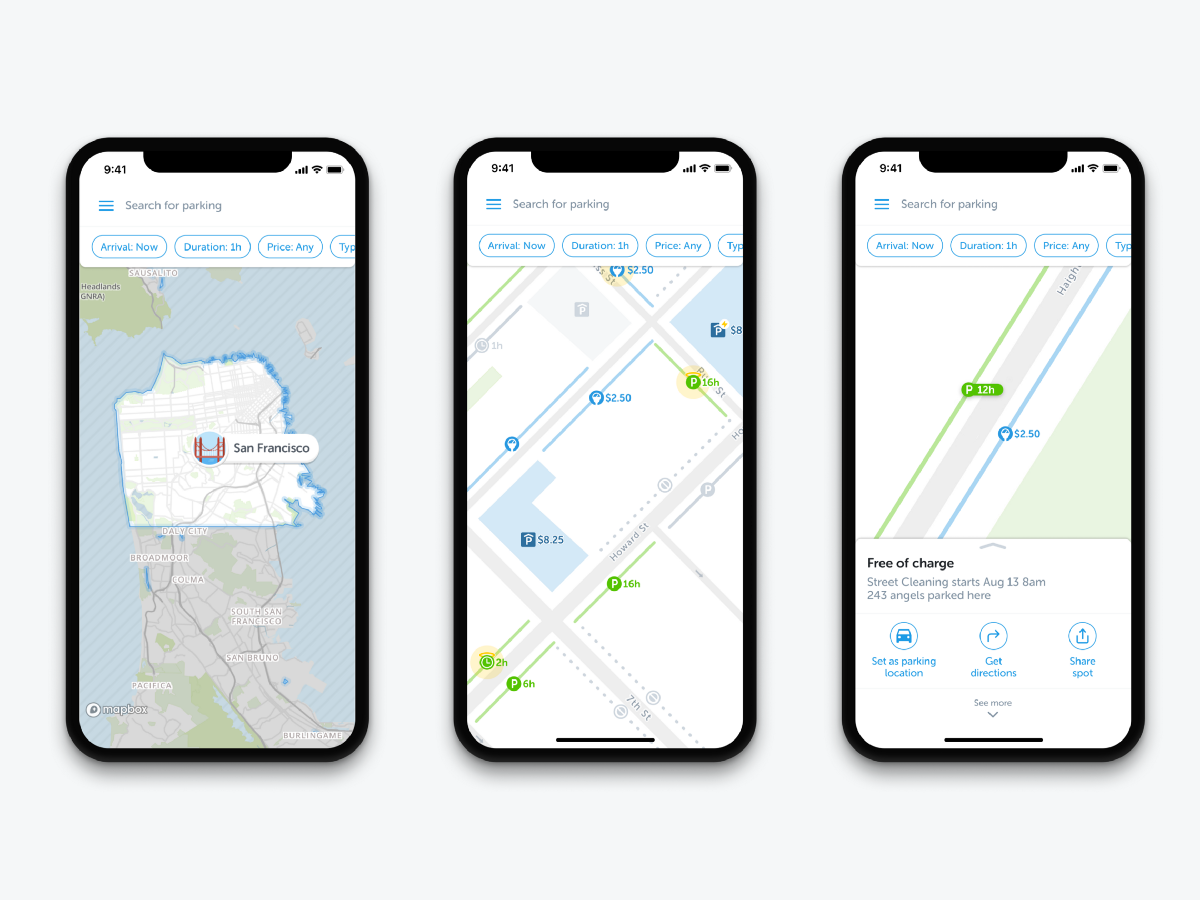
Overview: Design a parking map to display parking information users need. Users have to be able to find free and cheap parking, filter the map by preference and locate their car.
My Role: Wireframing, User Experience Design, Interaction Design
Tools: Figma, Principle, Mapbox Studio

Before I joined the company, a pin was displayed in the center of the screen. You had to move the pin and press a park button to get the parking rules. At that time, we had the parking information in New York and San Francisco and we needed to display them on a map to help users in their parking hunt.
Proof of concept
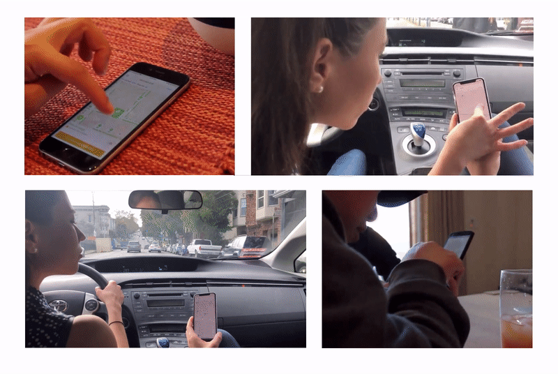
When you design a map, it’s important to interact with a prototype as soon as possible: playing with something tangible, more advanced than static artboard screens, is always better. You should be able to zoom, scroll, tap icons to have a feel on how the product works.
My goal was to design an initial map as fast as possible in order to test it with users, spot weaknesses early and iterate. For that, I used Mapbox Studio.
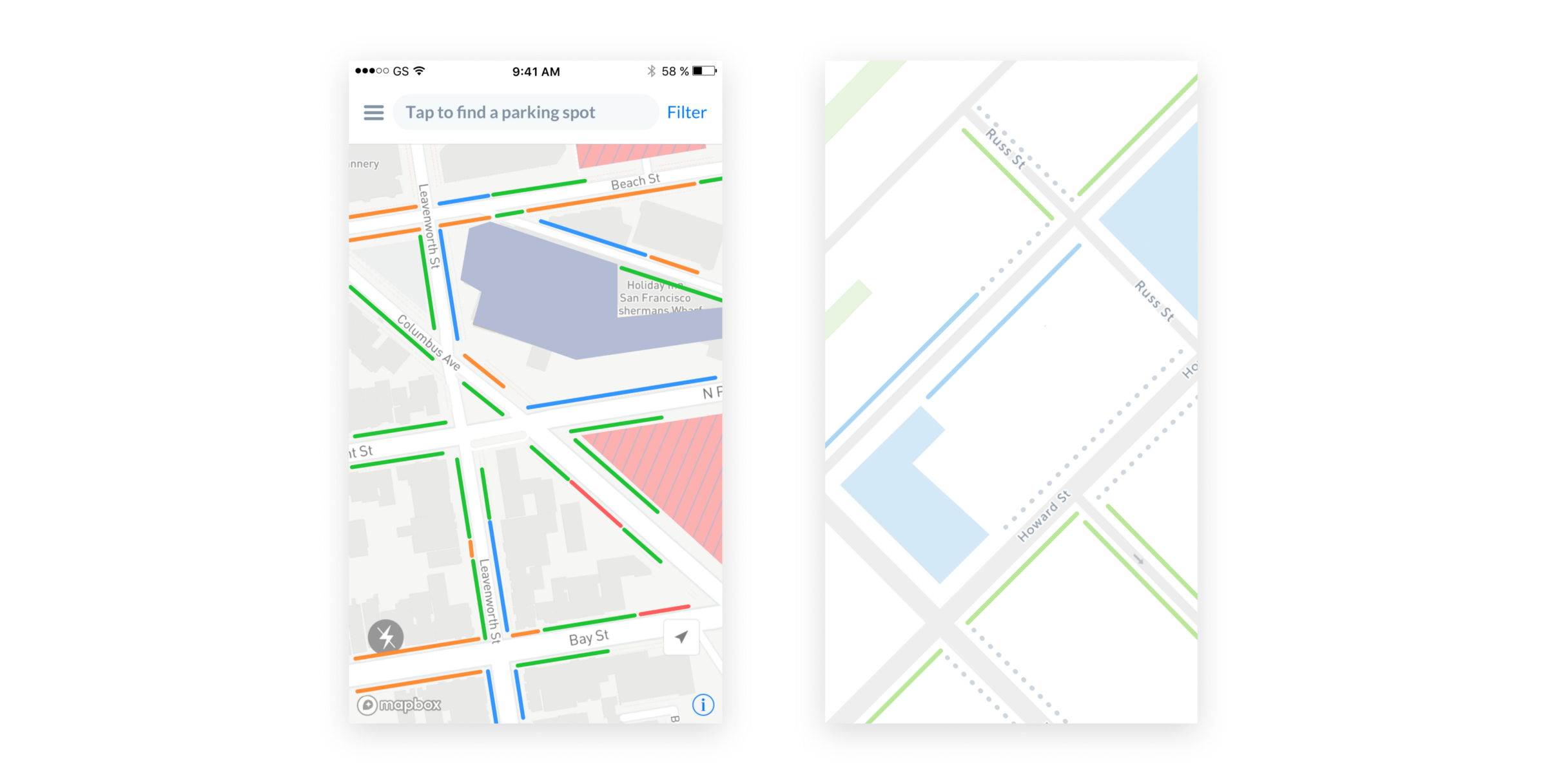
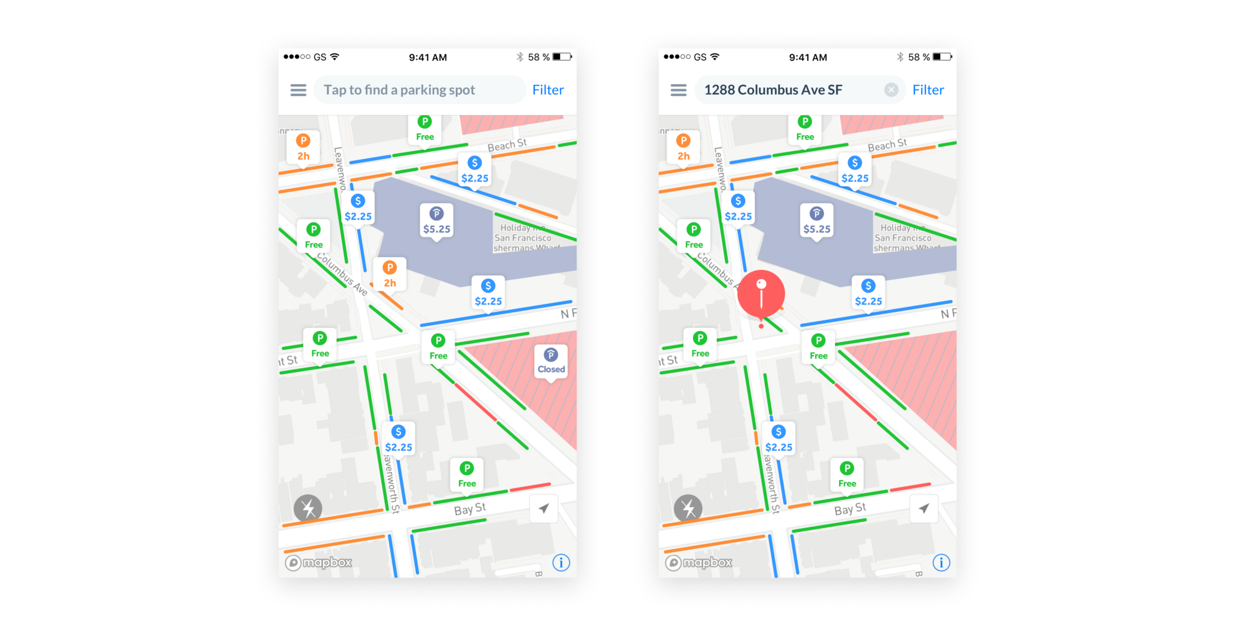
Using iconography, colors, typography, and shapes, below is what the first version of our Map looked like.
Gathering feedback
We used this prototype to see how people would interact with it. We tested it with two scenarios:
- You’re at home scouting for parking around a destination
- You’re driving looking for the best parking spot
We ran user research sessions with both existing and new users to try to answer one question: What could be the perfect parking map?
1) Use the map to find the right spot
User story:
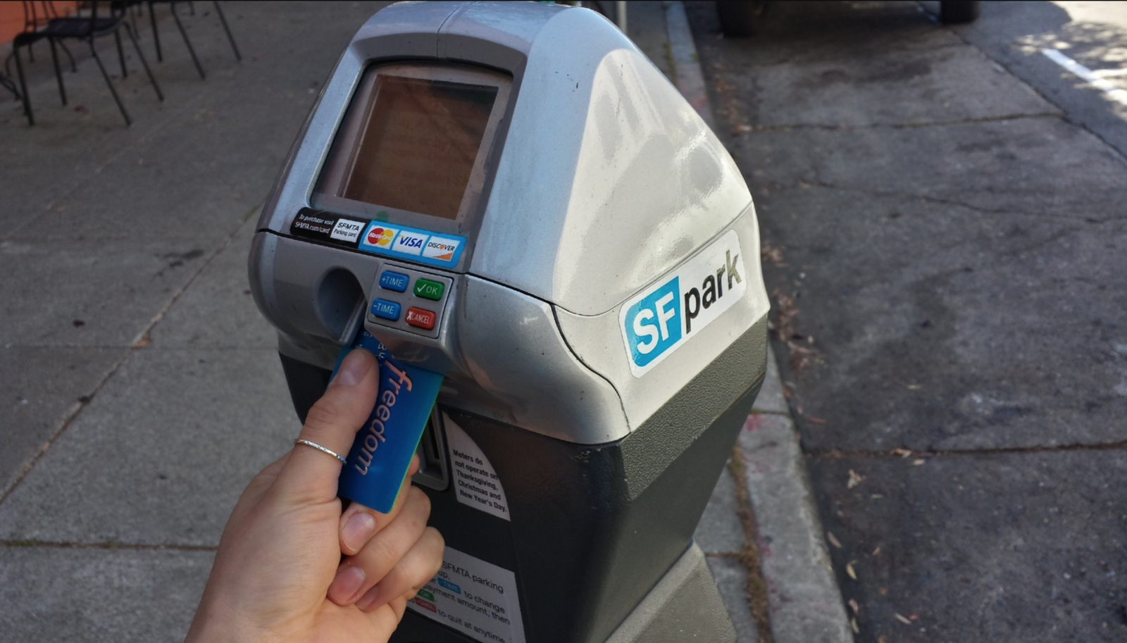
“I parked my car in a super expensive area: $7.25 per hour. While walking to my destination, I found out that I could have parked my car for free and save money!”
Use cases:
- I want to find free parking
- I want to find the cheapest meter
- I want to find the best garage
Assumptions
We could display different types of spots in various colors to help people identify quickly their best parking option.
Challenges
How to display parking spots? — Which icons and colors should we use? — What should the interaction with the map be? — What is the right zoom level? — How to provide the right information at the right moment?
Proof of concept
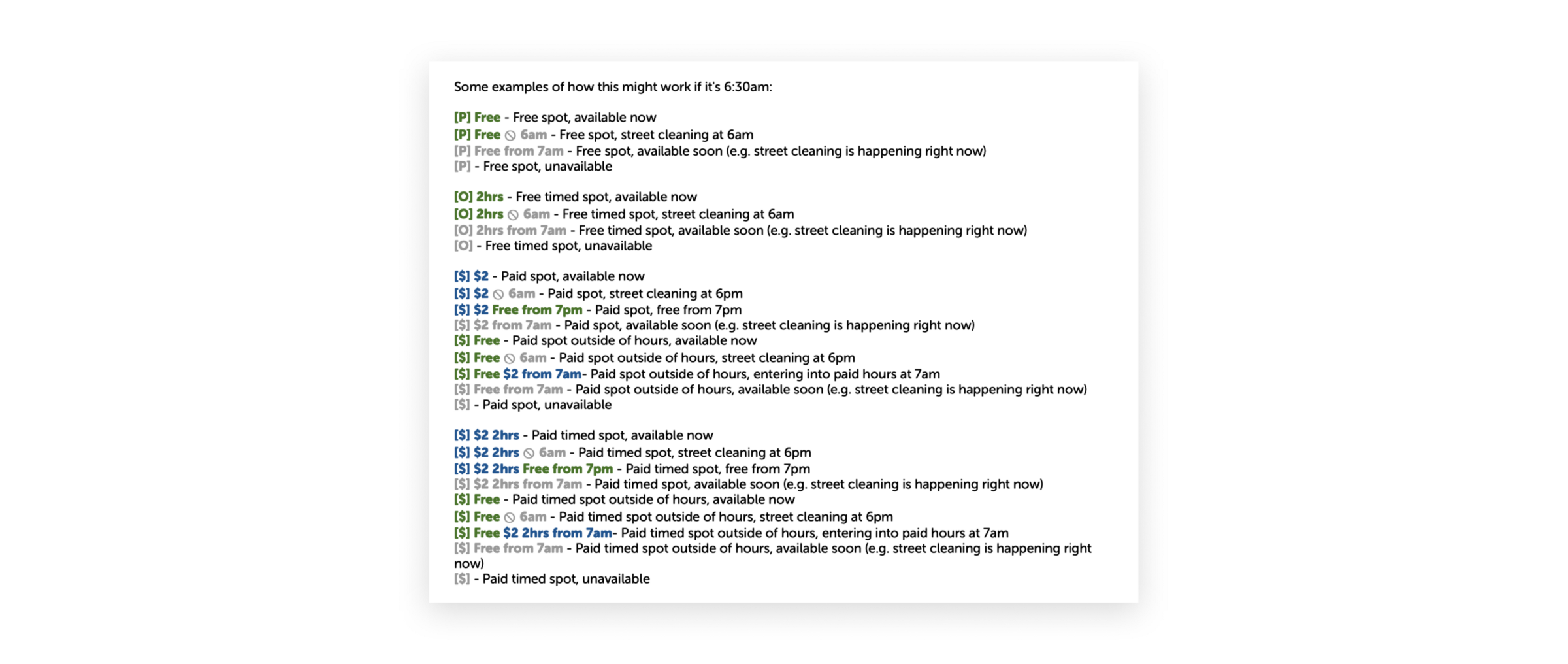
In order to design a parking map, we naturally listed all the possible combinations of parking rules to have an idea of the information to display.
This list helped us design our prototype and run user tests to identify problems before designing the best solution.
Problems & Solutions
a) A traffic Map
“It looks like a traffic map or an occupancy map.”
Context: In our prototype, we used green to represent a free of charge spot, orange a time limit spot, red a no parking spot, and blue a meter.
Problem: When some users saw the map for the first time, they instantly thought that the map was representing traffic in the city but not parking. While others guessed that the map was about parking, they mistook the definition of the different colors and assumed that it was representing the current occupancy of the spot: Green for “open”, orange for “might be open” and red for “occupied”.
Solution: We decided to never use green-orange-red together and came up with this alternative: color is for a price.
We use green when free of charge and blue when the driver has to pay for parking. We never use red, it drags too much attention. We use grey dots to indicate there are no parking spots.
Without green-orange-red colors, it didn’t look like a traffic map anymore.