This popular business metric is hurting you.
Organisations have blindly followed the NPS method for nearly two decades, with even the majority of FTSE 100 companies today proudly touting their scores. However, NPS is unscientific and meaningless. Here are 10 reasons to help you understand why, plus suggestions to enable you to reverse this tide of nonsense.

Introduced in 2003 in the Harvard Business Review, NPS — or Net Promoter Score — promised to deliver one easy, comparable, predictive metric to help track customer loyalty and satisfaction, and guide business decisions. NPS supposedly achieves all this by asking one seemingly simple question:
How likely are you to recommend [BRAND] to a friend or colleague?
Let’s pause here and ask ourselves:
- Is the methodology good?
- Is it implemented well?
- Are you getting meaningful, reliable data from it?
- Does it tell you what you want to know to understand your customers?
- Does it tell you what you need to know to make informed business decisions?

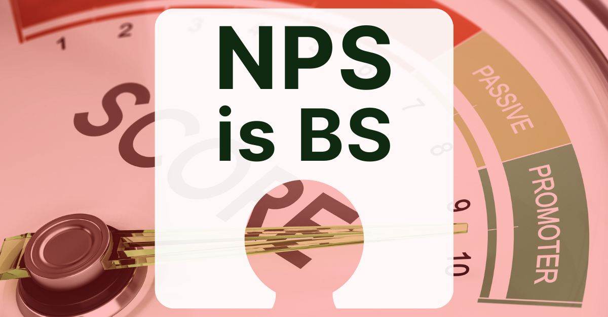
1. There is no such thing as a “Passive”
The premise of NPS is based on the idea that there are three groups of people: Detractors, Passives, and Promoters. You want Promoters, you don’t want Detractors. You don’t care about Passives. In fact, just throw these people and their opinions out (see #3). The names for these categories are arbitrary and based on nothing — there is no reason why a Passive is called a Passive (what does that even mean?). Why should a person who gives a score of 6 or lower be considered a Detractor? Does it necessarily follow that they don’t support the brand? Aren’t satisfied or loyal?
2. The category breaks are arbitrary
There is no evidence that these categories exist as such, e.g., ‘passivity’ about recommending a product does not correlate with a 7 or 8 score of anything. Furthermore, the category breakpoints aren’t universal across industries or cultures; a rating of a 7 out of 10 for an airline wouldn’t deter me one bit, but that same 7 for a pizza parlour would definitely give me pause. But neither of these scores even matter because…
3. NPS throws away 18% of the scale
All those who respond with a 7 or an 8 literally don’t count and get tossed out. It is not scientific and there is no reason for this. Never mind that this feature of this ‘methodology’ results in fewer data points and wildly inaccurate and variable scores.
4. There are no data collection standards for NPS
This means that the score you get is not comparable across teams, businesses, regions or cultures. Even with the best implementation, if others don’t use the same standards, we can’t and shouldn’t compare results. But for many brands, that’s what they love best about it, because…
5. You can easily game the score a number of ways
You can achieve this deceit based on when and where you place NPS in the user journey. For example, you will get more favourable scores if you place the NPS question after a successful task completion such as a purchase. You will also get more positive scores when the NPS is deeply embedded in the journey — the ‘detractors’ have likely bailed out by then. This is exploited mercilessly.
6. Your feedback surveys are a lie
A typical way NPS is presented is by asking for a score prior to a ‘How can we improve’ question on a survey. Besides this being bad research practice, it’s like saying, “Your feedback is important to us. But first, please tell us how much you like us and why.” Sadly, many companies do exactly that. And only that.
7. People are terrible at assessing their own behaviour
They’re especially bad at predicting their own future behaviour. Asking someone to put on a scale how likely they are to recommend something is fairly silly, especially if it’s something they aren’t inclined to do in the first place. The most accurate and representative research questions are about past behaviour, especially when asked indirectly, e.g., “Tell me about a time when …”
8. Loyalty does not equal satisfaction
Here’s a short list of things I’ve been loyal to but am not satisfied with: RyanAir, Apple, America. Satisfaction is also relative; an unremarkable experience can be a great one. For example, if you’ve just moved house, you do not want to be wowed by your new energy provider and their million offerings. You want your electricity sorted, as quickly as possible, with no fuss. That’s the bar, it’s low, and that’s just fine.
9. NPS doesn’t actually tell you what your customers think
If you want to know, you need to ask them — NPS-based stats can’t convey a realistic picture of how you’re doing. It can’t tell you whether lower scores are because of adverse reactions to new changes, if positive scores are because we’ve improved the experience, or anything else related to cause and effect of your efforts.
10. It’s tiresome (and makes your brand look desperate)
People are tired of annoying pop-ups asking about their recommendations. It looks pathetic and desperate. For those who know about NPS, it’s an additional annoyance — play the game or opt out with a 7 or 8? Either way, it’s all a bit much from an app or brand, don’t you think?
Imagine the possibilities if you asked better questions:
- You’d have better response rates = more data
- Your data would be more reliable
- You’d more accurately measure progress
- You’d learn more from your customers
- Your customers would feel heard rather than observed or data-mined
- You’d build deeper customer relationships
- You’d make more informed business decisions
- You’d innovate and lead change
- Your brand wouldn’t look so desperate and needy
- Measure smaller, specific things directly with an audience before and after a change.
- Ask the right questions: Ask about specific, recent behaviour, not how loyal people might be to you in the future. Ask how the company could have done better or how satisfied they are with X, etc.
- Ask more than one question, and look at the responses by segment. Separate metrics would mean you could track things at a more granular level. It’s much more flexible — you could combine things into one metric if you needed. You could also drill into segments and find insightful patterns, accurately compare over time and across products, teams or businesses, see the correlations between metrics, and monitor the metrics independently and test improvements.
- Measure things using valid tests of statistical significance, not arbitrary and unscientific NPS category subtraction (ie., % of Promoters minus % of Detractors). You can still use the NPS survey data, but measure the mean of all the responses and don’t throw away any data.
- Ask new users if they were recommended by someone. Netflix did this and were able to correlate satisfaction and loyalty.
- Display the results using easy-to-understand charts and support it with qualitative data (e.g., quotes and feedback).
In sum, NPS is broken and it’s hurting your business. Once you understand why, you can choose something better. The alternatives aren’t hard to implement. They’re more accurate, comparable and rewarding. You’ll be able to measure success meaningfully, save time and effort, and make informed business decisions. And you’ll put an end to this business astrology nonsense.