
We are accustomed to taking different helpful elements that are inbuilt into website design for granted. For example, a small load dynamic icon that allows controlling volume of sound seems to us a matter of course.
Various effects that transform integral elements into brisk eye-catching items also do not cause delight. Trendy techniques of using lazy-loading animations in order to smoothly dish up data appears to us a nice touch and no more, though it contributes to readability and makes surfing through a website comfy and natural.
As a rule, the majority of such tiny assistants stay unappreciated, though utilization of them is strategically vital; and if you are obsessed with providing your online audience with a perfect experience then leveraging micro UX effects should be your top priority. Of course, it demands lots of efforts from developers, since it varies depending on each project. There is no exact solution, nowadays, its implementation relies only on desires and the knowledge base of a developer who should think over numerous aspects and take a look at website design from the users’ side.
Today we are showcasing websites that have already used some small yet significant UX solutions.
Websites Using Micro UX Effects
1. Numero Neuf
This site has a modern full-screen image-based navigation. This elegant component has a high-end direction-aware 3D hover effect that traces moves of your cursor and slides in an overlay from the direction you are moving with the mouse.

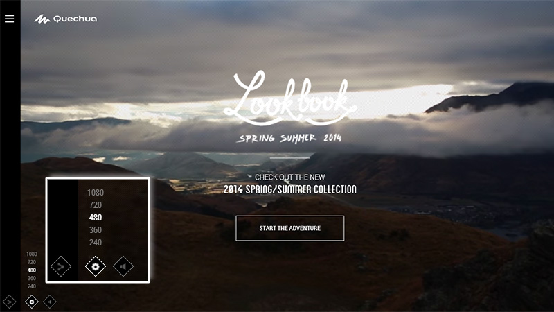
2. The Quechua
Since this website features several fantastic videos, the team has taken care to provide online users with a comfortable visual experience. The front page includes a small icon that allows visitors to choose the resolution for the video stream thereby making their exploration pleasant and unconstrained.
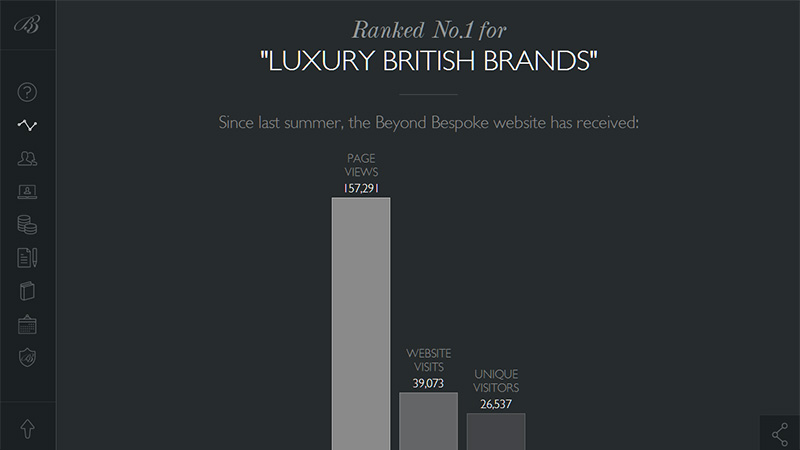
3. Beyond Bespoke
This is a regular parallax-driven website that has smooth movement between sections. It includes lazy loading animations that nicely enliven charts and graphs as well as help to slowly fill subpages with data.
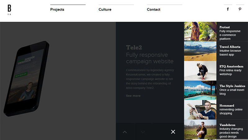
4. Build in Amsterdam
This home page has a trendy slide-out menu that reveals an extra image-based list from the right side. Each item has its own distinctive soft color that appears when the mouse is over it. Moreover, the team implements several animations that add to the website a nice dynamic feeling.
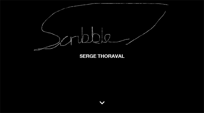
5. Serge Thoraval
The artist understands that a time-consuming loading process can be irritating, so he has added a small animation that lets users draw sketches with their mouse while they are waiting. Such an entertaining solution prevents losing visitors and even engages them.
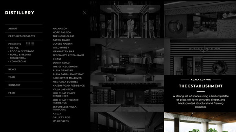
6. Distillery
First of all, the team offers various options for navigating through the website including swipe technique, mouse control and keyboard. Secondly, take a look at the menu, to be more precise to “Projects” that not only has a drop-down menu and slide-out menu, but also it lets users choose the manner of looking through the portfolio section either using a list or a grid style presentation.
7. Leadsite
Here the designer pays even more attention to detail, taking into account such small yet highly important functions like a search. When you hit the icon, an opaque panel appears from the top. It has a light solid colored background in contrast to previous one and a huge input field so that no one can miss it.

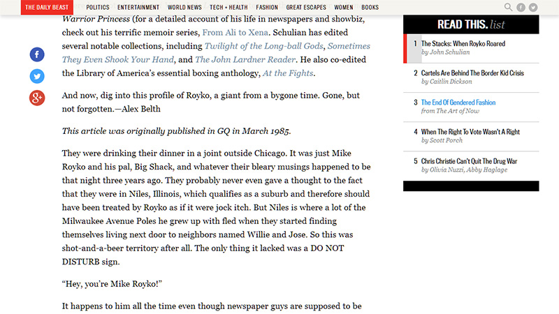
8. The Daily Beast
This news website not only offers high-quality interesting articles but also equips every post with a special indicator placed in the sidebar that is aimed at displaying the current status of your reading process.
9. The perfect kilometre
Here the loading process continues only when you are viewing the website, if you leave it the process stops. I personally believe that this option is not convenient; however a digital indicator of current status slightly lessens my discontent.
10. Terra Digitalis
Here we want to draw your attention to the tag cloud where each item smoothly increases in size and overlaps others when the cursor hovers over it. The approach of using tags with the effect of zooming in/out slightly enhances readability.
11. Duralast
The team does not want to overload their online audience with its film that is dynamic and full of action, so they supply a multimedia player with a mouse activated option. The latter should switch on video stream when you hover over the button “Watch now”.

12. Facemother
Facemother has a striking loading bar that effectively blends with the website design with a strong cosmic vibe. It includes a timer and a small animation that is able to hold users’ attention for a while.
13. Go UFO
This website is populated with various pleasant effects that give it a modern and high-end look. Thus the image background follows your cursor whereas a huge geometric-style portfolio section demonstrates brief information for each item that is hidden behind every piece with the help of a small animation.
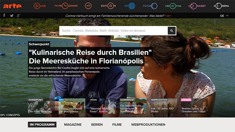
14. Arte.tv
Here on the front page you will find a standard image slider, however, it is not as primitive as it seems. The team tries to contribute to readability and make the list of newsflashes easy to scan. Each info panel changes from a light transparency to a darker one when the mouse is hovered over it.
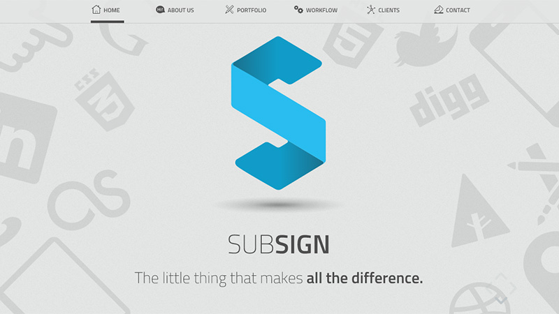
15. Subsign
This website has a small introduction video, which is activated by pressing the button. But where is it? The team has hidden it behind the logotype, to be more precise, the huge letter “S” is transformed into a control panel on mouseover, with such essential buttons as “play”, “stop” and “repeat”.
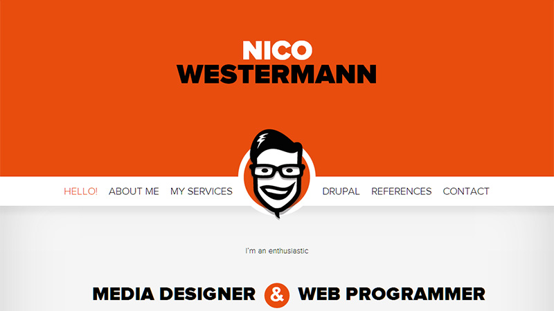
16. Nico Westermann
This landing page features a cartoon-style self-portrait of the artist that is placed in the navigation panel. While you are scrolling down, the panel along with the illustration gradually decreases in size and takes up a fixed position on the top, leaving lots of space for the content and accompanying the user along his exploration of the website.
17. DigitalPod
How is this for thorough attention to detail? In this website you will find indicators for menu status. The first one shows that navigation is opened and the second one demonstrates that there are extra links that can be displayed.
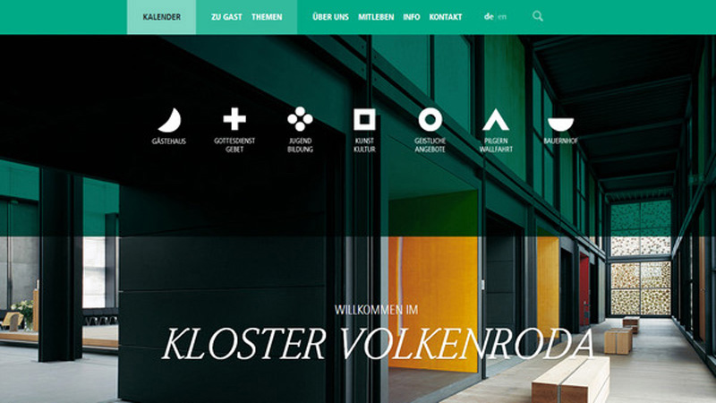
18. Kloster Volkenroda
The designer leverages semi-transparent canvases to add to the website an elegant and refined edge, however, this solution plays badly on readability, especially when it comes to navigation. In order to avoid this, each menu item is supplied with a colorful monochrome backdrop that appears when you place the cursor over it.
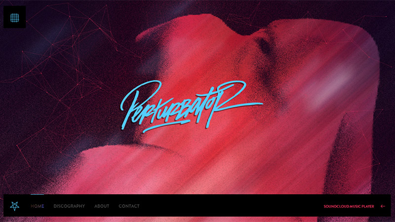
19. Perturbator
Since this website is connected to the Soundcloud, it’s not surprising that the team has included a music player that is tucked away from prying eyes. The panel on the footer that serves as a navigation aid transforms into a regular music player with all necessary controls.
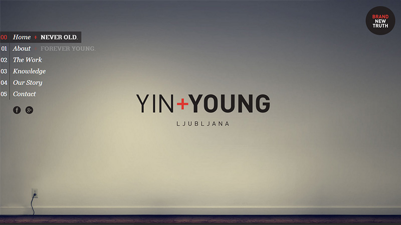
20. Yin+Young
The main menu has a lovely fading effect that gives it a flash-like appearance. Moreover, subpages are slowly filling with content, giving you enough time for comfortable reading.
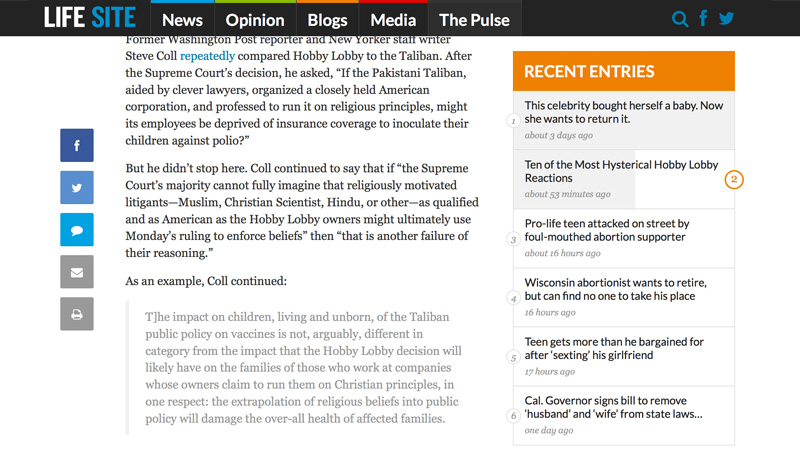
LifeSiteNews
The single article page has a panel on the sidebar that displays your progress as you scroll down the article. You can also click on the name of any article to jump straight to it.
Conclusion
Microscopic attention to detail always brings considerable benefits for website owners. Sometimes online audiences may not even notice your implementations and add-ons, however they certainly won’t leave your website without a really good lasting impression.
Do you think implementing mirco UX elements or effects can improve your user experience? Share with us how you bring your website to life.