Mobile being the talk of the town, being the architect of your town (mobile app) it is incumbent on you improves the aesthetics and facilities of your town, so that it can attract maximum number of visitors. It is also you duty to stay abreast with the latest advancement in order to deliver the best app to your users.
So without much ado let’s discuss the most trending mobile app design trends prevailing in the market.

Translucent elements
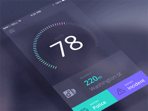
This trend of blurred elements was introduced by Apple in iOS7. Apple beautifully uses transparent/blurred underlying elements and overlays text or other elements on them. The term given to these elements is translucent elements and looking at its cognitive impact one can easily use it to focus on a targeted element overlaying on top. The picture given below shows how beautifully one can employ this method to get business gains. This happens to generate some sort of curiosity among the users, as they can read the content, but still they need to know what’s hidden back, behind that translucent veil.
Improved Design
At the inception of mobile apps we had designs with glossy buttons drop shadows and gradient was used in the navigation bar.
This design pattern was overtaken by flat design which is growing very luxuriantly. Colors are now used in single tone, icons are simplified and load time is reduced. The design pattern is now moving towards delivering better usability to the users. Wherefore, the navigation was changed into a streamline flow by moving options into hamburger styled menus.
Improvement in the designs has given us apps which are quite easier to read, navigate though and browse. Though it would be complacent of us if we say that this design is the best, as there is always a room for improvement in the steepest corner.
Apart from this we have seen that the developers are now opting for data-driven approach for designing modern age mobile apps. Though now we have a new buzz word in the technical town called as the material UI launched by Google.
Minimalistic interface
Talking about online magazines we can see minimalist interface adopted by the most famous ones. In order to make the letters legible to the users the font chosen was very simple and they focused more on the images. Moreover, the current focus is to deliver on bigger devices such as iPad, as people prefer these bigger devices to read.
There are various minor design changes which came across us during past couple of years. For instance, we now use light shades in the background so as to make the text more legible to users. Along with this the advancement has now increased the space and mobile apps now accommodate big pictures for featuring their websites. This new feature looks terrific on large screens and on smart phones with higher pixel resolution.
Card layout
This increasing mobile traffic is quite a pain for developers and for those who have so much information to showcase on one goes. News or interest based social networking websites and online magazines to name few as example. How to arrange things to utilize the limited space intelligently which can serve the purpose? : Was the biggest question. This was when designers came up with card design. Though simple yet this was an extremely intelligent creation. Information fragment in chunks along with their images seems quite appealing to the users and the experience seems quite intuitive to the users.
Animated elements
If you have mastered the art of attracting the users for more interactions then consider your half job done. Animation seems to be the most attractive thing to gain attention of users. Wherefore, mobile apps are using animations to gain their visitors attention.
Animations have replaced platonic visuals and are now playing a vital role in delivering messages and making your app more enticing. They are thus a strong motivational factor for apps and further deliver a pleasant user experience. If implemented in a subtle way they can work as the center of attraction for your mobile app.
Gestures
Apple who was one adamant over the size of its flagship phone eventually realized that the users are now opting for bigger phones. Thus, they launched the bigger and slimmer version of iPhone 6. Apple is renowned for its usability and renders services which functions using a single hand. However, this was not possible with iPhone 6 and 6 Plus. Wherefore, gestures arrived.
Gesture is the essence of a touch screen Smartphone and with time we can see a considerable advancement in the gestures as well. Operating system is now the new input system and now you need not to go to the interface button to go through your app. This allows users to go through the different pages simply by swiping through. They can also swipe up/down which allows users to go to the notification and control center. Keeping in mind that the future devices will generally be of larger size, as compared to the present one we will tend to see a considerable improvement in the gestures.
