Creating websites is getting more and more complex and is usually not a one person job. It is important to ensure that design is consistent and optimized to meet business objectives and create enjoyable experiences for users.
One of the ways to ensure that team is on the same page when designing separate parts of the website or saving designs from developers is to create design documentation or a web design style guide.
It is beneficial to have a style guide in order to create a cohesive experience among different pages. Also it helps to ensure that future development or third-party production will follow brand guidelines and will be perceived as part of the overall brand.
Luke Clum has touched the surface of using style guides as your first step in web design last year and I would like to take a more in-depth look on how to create a usable web design style guide for your projects.
What is a Style Guide?
A style guide is a collection of pre-designed elements, graphics and rules designers or developers should follow to ensure that separate website pieces will be consistent and will create a cohesive experience at the end.
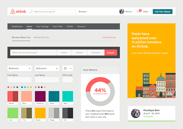
Airbnb UI Toolkit – Web by Derek Bradley
Why Is It Important?
It is extremely important when multiple designers are working on a big website or web app to ensure that they don’t interpret too much and don’t alter or adjust styles based on personal preference. In development, having defined elements of the website makes it easy for developers to reuse these elements. Moreover, it can make it easier because they will get what elements they have to code and will see exactly how they need to look from the start.
In order to make developers lives easier, it is the designer’s duty to include all possible interactions such as hover, click, visit and other states for buttons, titles, links, etc.
Creating a Web Design Style Guide
1. Study the Brand
First, you need to study the brand so that you understand what it stands for. Get to know the story behind the brand, observe the team and figure out the vision, mission and values of the company. It is important to dig deeper into the brand so the style guide you produce will visually and emotionally represent the organization.
If you’re a designer who can’t code, simply open Photoshop and give your document a title and a short description of what the document is and what it is for.
If you can code, it is better to create an html document with pre-coded assets so they can be easily reused.
2. Define Typography
According to Oliver Reichenstein, typography is 95 percent of web design.
You must get typography right because it is one of the most important communication tools between visitors and your website.
Set hierarchy and identify it. There are headline types: h1,h2, h3, h4, h5 and h6. Then body copy, bold and italic variations. Think about custom copy that will be used for smaller links, intro text and so on. Provide font family, weight and color.
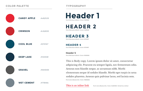
Style Guides by Zech Nelson
3. Color Palette
It is incredible how humans perceive color and associate hues with known brands. Think of Coca-Cola, I bet you see that red now.
Begin by setting primary colors for your style guide that will dominate your website, dominant colors should include no more than three shades. In some cases, however, you will need secondary and even tertiary colors to illustrate your user interface, make sure you define them too. Also include neutral colors like white, grey and black for the primary brand colors to stand out.
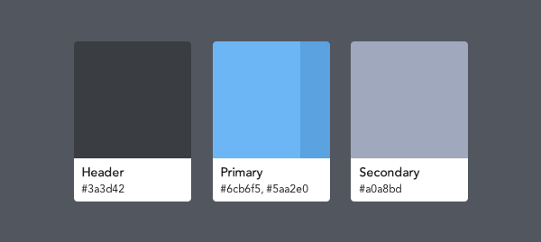
Guest Center color palette by Chloe Park
4. Voice
The voice that I am referring to is actual copy. You have studied the brand before starting the style guide and found out that brand is youthful and trendy. If there are no directions for voice of the copy, you have to define it. It can be a simple example given showing that voice has to be professional yet funny and welcoming. Instead of stating “You’ve got 404 error” you can say “Oh boy, you’ve broken the interwebs. 404 error.” If the voice were more corporate, you wouldn’t do that. Brilliance hides in small things.
5. Iconography
Icons have existed for thousands of years and are older than text and words. Take advantage of using icons in your projects because they will give an instant idea to visitors as to what’s going on and what will happen next. Picking the right icons will give more context to content than color palette, copy or graphics. When using icons, make sure to think about the target audience, religion, history, so you avoid misconceptions and misunderstandings. One more thing to mention, think about the brand and its values so you don’t use hand-drawn icons on a large banking website.
![]()
Iconfinder is a great tool for finding awesome icons for your projects.
NounProject is building a visual language of icons anyone can understand
6. Imagery
Pictures speak thousands of words. Make sure to include imagery that defines the style and direction of pictures the website should use. Once again, think about the values of the brand and its mission. For example, a water charity uses striking imagery that has strong emotion, good cause and calls to human emotion for them to be fortunate to have essential living commodities like water, food, electricity and education.

Some great websites for free imagery: 16 Places to Find the Best Free Stock Photos.
7. Forms
Forms are what make your website or web app interactive and dynamic so the user can enter the data and you can then manipulate it and do the work.
Make sure to establish a hierarchy and include possible feedback from forms — active, hover, add error, warning and success messages including things such as a password being too weak, email being not valid or simple success messages e.g. “email was sent.”
8. Buttons
Buttons are a mixture of color palette, forms and voice. Rely on these previously created assets to create consistent looking and functional buttons with different stated designs.
9. Spacing
How can spacing be in style guide? It is extremely important to mention the spacing. It can be in the form of a grid used for a layout; it can be spacing defined between headlines, buttons, images, forms and other elements.
Getting spacing right is important because it gives more breathing room to elements, and consistent use makes your work look structured and professional.
10. Dos and Don’ts
Last but not least: Make the DOs and DON’Ts section much like an FAQ showing the most common pitfalls and give examples of how things should look and work instead.
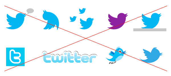
Twitter brand assets and guidelines
Examples
Here are some of the best style guide examples to use as inspiration when creating your own style guide. Keep in mind that these guides are highly influenced by the organization setup, their vision, mission and values and some decisions might be irrelevant or illogical in relation to what you are doing, so don’t blindly follow the things done there.
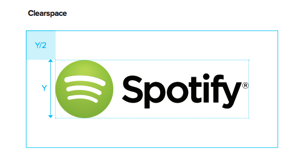
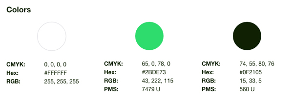
Spotify – Partner Brand Guidelines (PDF)
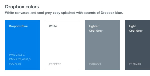
Dropbox Branding and Logos
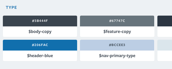
Kickstarter Style Guide
Lonely Planet Design Guide
Find Guidelines – The Fastest Way to Brand Assets
Conclusion
You have to study the brand you’re creating style guide for, make sure to get different parts of the design right and ensure that a style guide is consistent and includes all possible scenarios when turning designs into working products.

