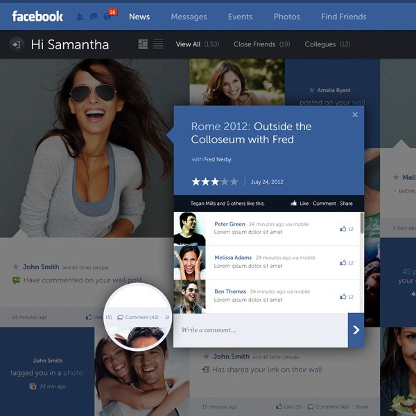
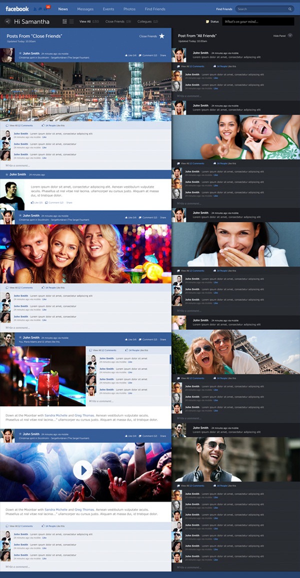
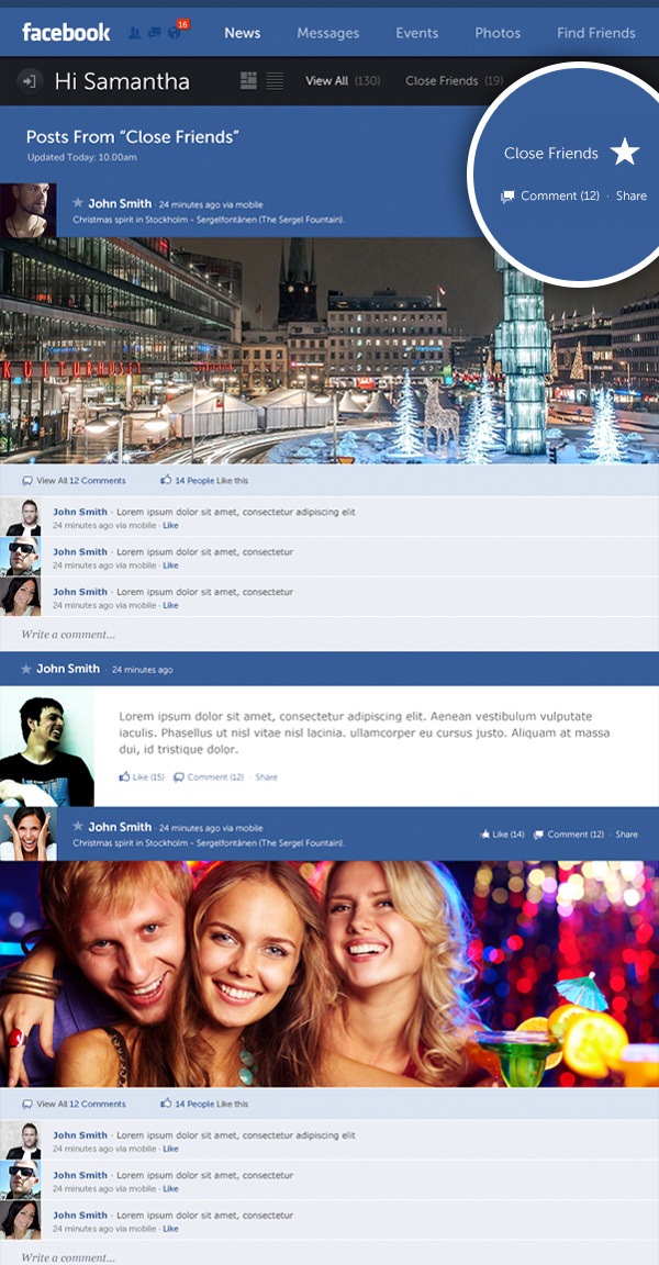
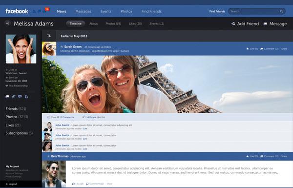
Swedish designer and art director Fred Nerby made an attempt to redesign the user interface of the social media giant with awesome and stunning results. Fred has created a brand new look and concept for Facebook using a conceptional and systematic design approach encouraging user behavior giving a greater control of data within a responsive grid.

Fred Nerby approached the platform from a user perspective and focus on targeted & personalized data while maintaining a visually appealing interface. The concept of seeing the full extent of what’s possible within the platform draws upon a systematic theory letting the user control what they want and what they don’t want to see, resulting to a more personalized environment online.
Q: What made you want to attempt this new look and concept?
FRED: I’ve wanted to create a better understanding and relation between user and content and how such data can be displayed. Today, Facebook is not about doing something because you have to anymore, or being told you “should” do it. It’s become part of people’s behavior on a daily basis. Such behavior is triggered by an emotional need that wasn’t there several years ago. That behavior is a very powerful tool for both end users and companies around the world when “used correctly”. The visual impact is crucial today and how we’re displaying information is essential for any application’s success.

Q: What were your guiding principles during the design process?
FRED: To approach the platform from a user perspective and focus on targeted & personalized data while maintaining a visually appealing interface. Facebook has done a good job on this for a long time but we’re still not seeing the full extent of what’s possible within this platform. I believe the future of data, design & dev lies within personalized or targeted information online, because currently, we’re flooded with information online such as banners, ads and other media’s who have based their campaigns on more narrative strategies and are desperately trying to get our attention. This concept draws upon a systematic theory and lets the user control what they want and don’t want to see, creating more of a personal environment within the interface.
Q: Are there any other sources you specifically looked to for inspiration?
FRED: New design trends online or within applications is being introduced on a daily basis by solid creative’s around the world. I’m not inspired by a specific application as such but more so the overall UX/UI experience of products and websites. I draw upon Apple’s way of executing an interface plus other Metric systems that are currently being introduced by other platforms. I don’t draw to much inspiration from one specific source it’s all about understanding the need for that application or platform that you’re working with and what the expectations are from the end user.
Q: Would you be willing to license this to Facebook if they asked for it?
FRED: FB and its current creative team has proven it’s talent. i’m sure we’ll come to an arrangement.
Q: Would you design for Facebook if they offered you a job?
FRED: My door is always open for discussion.
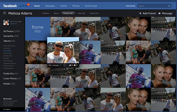
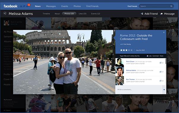
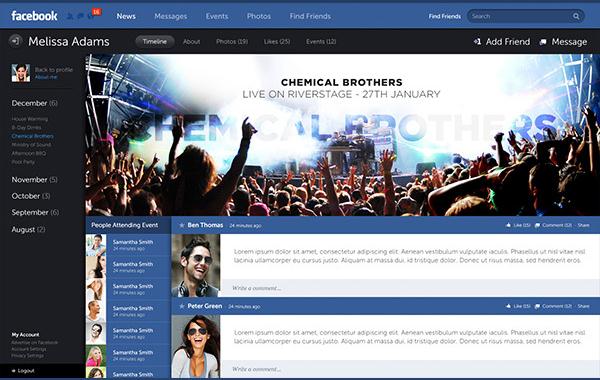
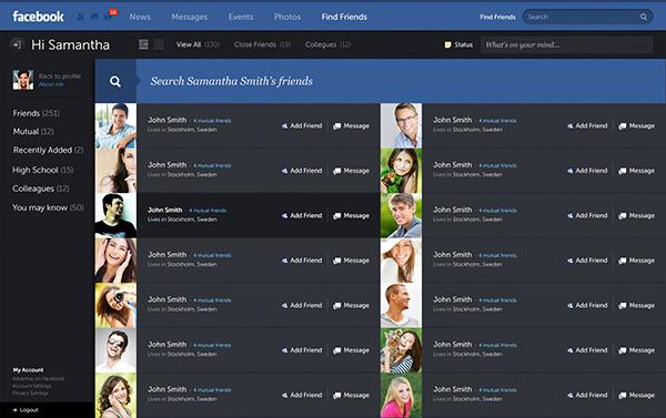
Fred Nerby’s Facebook redesign has gained positive reviews online after publishing the whole project over his Behance portfolio. The project has now reached an estimated two million views in different sources online. Check out more of Fred Nerby’s awesome projects in his official website and updates from his Facebook page.
