Getting Started with WatchKit
WatchKit allows you to develop a companion Watch app of your iPhone app. Unfortunately you cannot develop standalone apps for the Apple Watch. Yes, that is unfortunate, just like the first version of the iPhone we expect this to change in the near future.
Watch apps are accessible from the home screen and usually provide only a portion of the functionality of their containing iOS app. The purpose of a Watch app is to give the user quick but more in-depth access to app-related data.
Architecture

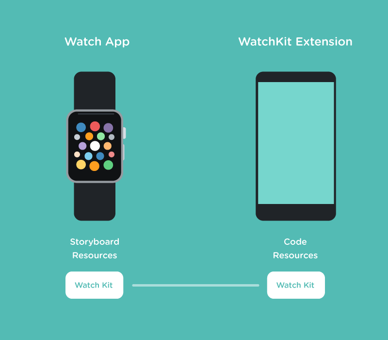
Apple Watch apps represent the View in the Model-View-Controller design pattern. If the Apple Watch app is the View then the Model and Controller reside within the iPhone app. Your Apple Watch app simply consist of Storyboards, UI elements and Image assets and no custom code. For example, if your watch app has a button then the action is sent to the iPhone app which responds to the event with view updates. Technically all this code resides within the WatchKit extension which runs on the iPhone. This architecture is very similar to extensions on the iOS platform, except now it has to marshal content wirelessly to a watch.
User Interaction
There are three main user interactions one can provide on the Watch app: the app itself, glances and notifications.
Glances
This is the simplest view. As the name implies, it provides a quick summary that resides within the iPhone app. For example, a flight tracker app could display the flight status. Glances are read-only views without any user interface elements. Tapping a glance opens up the Watch app which we will discuss below.
Notifications
If your iPhone app is programmed to receive local or remote notifications then the companion Watch app can receive them too. Watch apps don’t have to do anything specific to display notifications on the phone unless they want to customize its interface.
Notifications have two views: short and long.
Short-Look Interface
Upon receiving a notification, the user is subtly alerted and if they choose to view the notification then they are presented with a short view. The Short-Look interface is a template which contains an app icon, app name and a title which is retrieved from the notification. If the user taps on the Short-Look then they are taken to the Long-Look interface.
Long-Look Interface
The Long-Look interface is customizable and displays the content from a notification. Once again a default template is provided, however, this time it can be customized with images and buttons. The Long-Look interface is divided into three sections: header, content and footer. However, Apple has their own terminology for them, the header is called the Sash which contains the app icon and app name. The content area can be customized which we will discuss below. Finally, the footer is where all the buttons reside along with the dismiss button.
The content area can be configured with either a dynamic or a static interface. The dynamic interface can contain labels, images, groups, separators, tables and maps. However, it cannot contain any interactive user elements. Tapping anywhere on the header or content area will launch the Watch app, whereas the buttons have actions defined.
If for some reason the Watch app cannot launch the dynamic notification interface then the static interface is used as a fallback. The static interface can contain only an image and label and cannot have any controls, tables, maps or interactive elements.
Watch App
In addition to Glances and Notifications you can have the Watch app which is a companion to your iPhone app. The Watch app itself is a little restrictive but there are lots of things you can do with it. It is a UX challenge to fit just enough information within such a tiny screen. Nobody is keen on scrolling through endless amount of information on such a small screen. The goal would be to have quick interactions for which the user does not have to pull out their phone. For example, a start/stop timer, one tap to start and the subsequent tap to stop.
As a Watch app developer, the biggest decision you have to make upfront is whether you want a hierarchical or page-based navigation style within your app. Users can interact with the app in many ways, such as: buttons, gestures which are provided by the system, force touch, and finally the digital crown, used for accelerated scrolling.
There are several UI elements available to build your app: labels, images, groups, tables, buttons, switches, sliders, maps and menus. Since the goal is to keep the interface simple you can enhance the interactions by providing single or paged modal sheets or even context menus.
The most interesting thing about building a view in a Watch app is that you cannot create view hierarchies like you would in your iPhone app. Instead, you simply add UI elements and they are stacked vertically and at runtime they are laid out based on the space available.
Conclusion
WatchKit is an exciting new framework for a device that has yet to prove itself. Apple has provided enough to build quite a complex yet functional app. Like I mentioned this is one device that will take a team effort of designers and developers to think of new ways to provide interactivity.
Here are two links if you want to dive further into WatchKit:
Designing for Apple Watch
