Designer Ledger – A web design blog for designers by designers
Logo is an insignia that burns itself into memory the identity of your brand.As defined, it’s an emblem aiding instant public recognition of organizations and individuals. It is skillful fashioning of iconic forms with occasional use of typesets of organizations name to elevate depth and individuality.
Easy to grasp, simple in design and eye-catching, a perfect logo runs over these three traits. Most designers keep them simple as simple is easily comprehensible. Yet simple is not that simply designed. It needs more skills to be spent as you are limited to very few elements. You need a mind for perfect simple idea and an eye at perfect composition. There are many simple techniques that designers use of which, one is very interesting, that is, usage of “Negative Space“. It’s basically utilizing background tone to your benefits. It elevates the element of optical illusion which, once interpreted correctly, makes the design one hard-to-forget experience. If done right, your logo served the purpose most appropriately. This technique adds perspective to idea and creates depth in design without losing the vitality of three basic logo designing traits.
That is exactly what we are after today, showcasing examples of clever logos with negative space. See how simplest form with properly crafted negative space gives even a single alphabet a whole new meaning.
The Polar Bear Mark

Noise Designs Logo

Pin dog

Another Bear

Elephant2
Negative Zombies
Phone Box

Unused Elephant Mark Icon Logo Design Concept

M star logo

Dog Dental

Doggie Paddle

Boutique Ultra Lounge

Wine Glass

Poker Dictionary Logo Mark
Identity For The Loft
Umber Rebranding

Layne Savoie Golf Logo

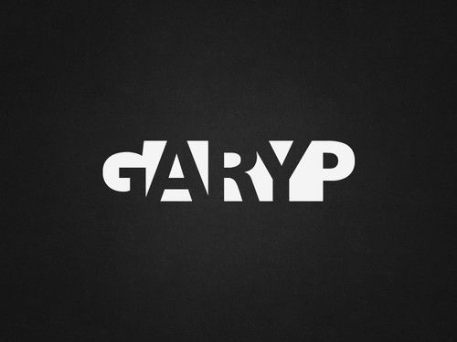
GaryP Logo
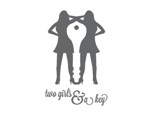
Two Girls & a Key Logo
Negative Space Turkey

