The recent article on flat design login page was well received. This is a follow up on the same idea, which is showcasing the use of flat design in different parts of the website. In this article, we are focusing on flat design for the contact us page. Arguably, this is one of the area that receives the least attention from the designer. Most of the design typically concentrated on the home page, navigation, content page etc. However, contact us page should be equally well designed as they provide the means for potential customers or user to contact the web site owner. If you have been neglecting this page, use the following 11 examples as inspirations for your future work.
Flat design contact us page #1 by Nagendra
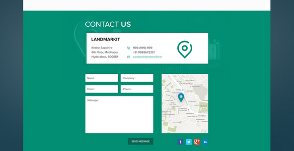
Nice color scheme that looks modern. Notice how even the pin on the Google Map matches the color scheme of the page? This is the kind of details that separates a good design from a great one.
Flat design contact us page #2 by Clint Crothers
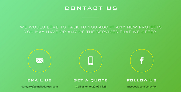
A very futuristic and effective flat design for the contact page. Besides the aesthetics, it has everything a contact page should carry, including mobile number, email and social media accounts. The color scheme can used a bit of work but no complaints other than that.
Flat design contact us page #3 by BuiltByBuffalo
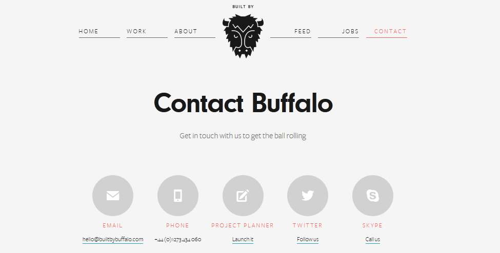
BuiltByBuffalo always have a great design website and this extends to their flat UI design for the contact page. Everything is clear, clean and allow users to know exactly how to contact the company through the different communication channels.
Flat design contact us page #4 by Nielsen Ramon

A simple but effective use of flat design for the contact us page. There is a short introduction, an address and a contact us form to allow the website to receive message. The map header works great as well as a concept.
Flat design contact us page #5 by Noearaujo
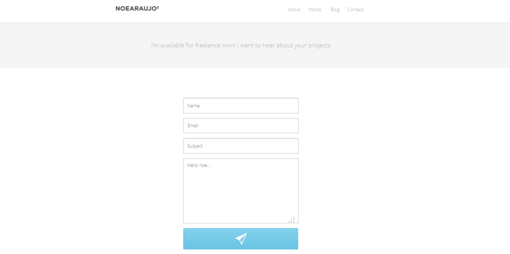
This is one of the most understated and minimalist design I have seen from a contact us page. Yet, I loved it. It is clean and doesn’t distract the user from the purpose of contacting the website owner.
Flat design contact us page #6 by Grainandmortar
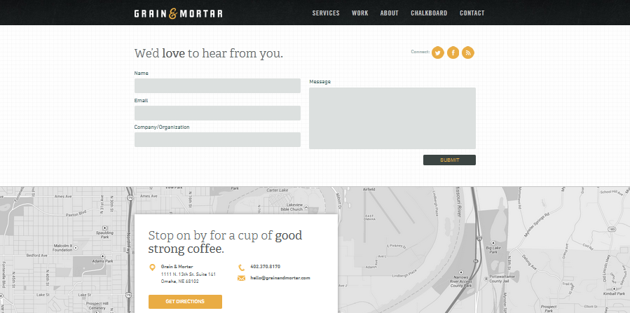
A strong clean design using a flat UI and block layouts. Love the micro message on the map that makes the visitor feels more welcome in contacting the company.
Flat design contact us page #7 by Tomas Korosi
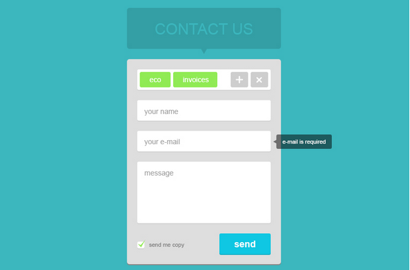
This is a nice psd file for a flat design contact us page. You can download the file by clicking on the head link above. I love the default color scheme as it is so refreshing on the eyes.
Flat design contact us page #8 by Othmane Machrouh
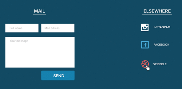
This particular contact us design is great if you want to place it at the bottom of the website. It is non instructive but striking enough for visitors to notice.
Flat design contact us page #9 by Emanuel Serbanoiu
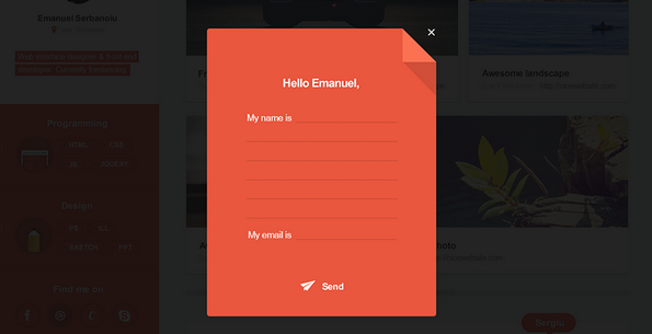
What we have here is a nice pop up kind of contact us form. It is simple but elegant and uses the flat design style well. What I would do is to add a different color to the ‘send’ button so as to make it more outstanding for the visitor to click.
Flat design contact us page #10 by Stephane Bouget
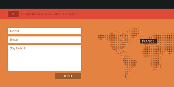
Another footer style contact us page using flat design. I loved the stylish world map which shows where the designer is located. Very understand and cool.
Flat design contact us page #11 by Supereightstudio
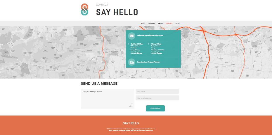
I love the color tones and the layout of the page.
Free Online Resources For Developers, Designers and Photographers @Smashing Hub
