In this article we’re going to look at a simple analogy which will illustrate effective ways of communicating through design. Once we’ve established the idea, we’ll take a look at some familiar examples to drive the point home.
The analogy we’re going to look at is The Fourier Transform, an intruiging mathematical tool named after Frenchman Joseph Fourier.
To begin with, it might fail to impress you with its complex (and seemingly boring) equations. But, hidden deep within these equations, is a simple idea: that any wave, or time based signal, can be broken down into many other waves, which make up the original. In other words, it points out the individual ingredients which go into making the final product.
The Fourier Transform has applications ranging from nuclear magnetic resonance (NMR) to MP3 compression, but we’re going to apply it to something more familiar: design.
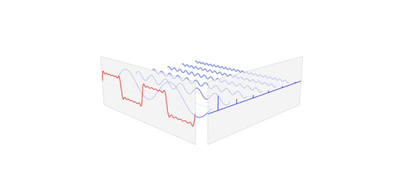
For example, you set out to create a website when you have a concept which needs to be conveyed to users. Your job, as a web designer, is to create a web page which breaks this idea into manageable bits; bits of images, bits of text, or even videos which when consumed by a visitor convey the idea in their mind.
Think about the red square wave in the image above as being the idea or message you want to convey through your website. Each blue wave, although they look entirely different when taken individually, contribute to creating the red wave in some way when combined with the other blue waves. Your job is to figure out the “blue waves” (the composite elements) of your main message. Alas, if only we had a formula for that!
Ultimately, if the visitor understands the purpose of your website completely and is confident in using it, then you’ve succeeded in your role as a designer.
Design to Embrace Content, not Clutter
Apple’s latest iOS 7, even though received with mixed response about the new colors, aesthetic, iconography and typography, is a positive step forward. As an iPhone user, I find the latest software offering from Apple a much more usable and enjoyable experience than its predecessor. I cannot imagine going back to iOS 6 now that I’ve become used to the new interface. This is attributed to more than just parallax effects, animations and other eye candy. One of the major reasons that make iOS 7 so usable is that it embraces content, rather than wrapping it up in a skeuomorphic skin. Apple calls this approach “Deference”.
Deference – The UI helps users understand and interact with the content, but never competes with it – iOS Human Interface Guidelines
In the first page of the design guide, a side by side screenshot of the native Weather app running in iOS 6 and iOS 7 speaks for itself; the design embraces content. You don’t have to read a word to be informed about the current weather instantly. Every bit of detail should help express the message.
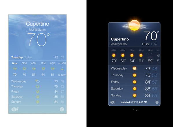
While designing your perfect website, make sure to think twice about every detail. Every component that makes it up; typography, color, imagery, every single detail right down to the favicon, should contribute constructively, working together in perfect harmony to deliver your message effectively.
Counterproductive Details
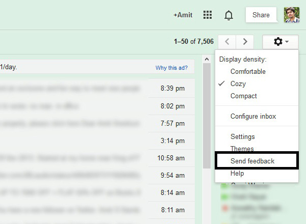
I’ve often wondered why some websites prominently place a “feedback” button right on the front page. While getting feedback on your work is absolutely necessary, never give the impression that you are unsure and not confident. Think about it this way: when you go shopping, have you ever been asked the question “What do you think about our store lighting and paint?” right when you step into a store? Such details are essentially invisible to us. Good store lighting and the overall ambience of the store are not processed by us consciously.
Saying that, your brain is continually receiving information from your eyes and other sensory organs about the environment around you. A good store ambience would definitely change your mind about not buying a product from them. Getting back to topic, Feedback links should be accessible, but tucked away. Gmail does a good job in this:
Ask yourself two questions when adding anything to your website:
- Does this help my visitors understand the purpose of my website?
- Is there a better way to do this?
Perfection is achieved, not when there is nothing more to add, but when there is nothing left to take away
Minimalism
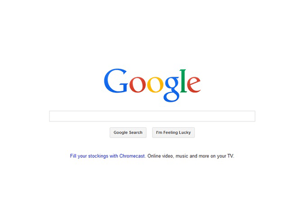
Google has always been a master of minimalism in design. A recent update removed the dark top bar from their homepage, because people come to Google.com to search, not to get distracted by other products Google has to offer. This extra bar never contributed anything to the main message of their search engine: search the web. Instead, these links are now neatly placed in a dropdown popup, so that interested users can take a look and navigate when needed.
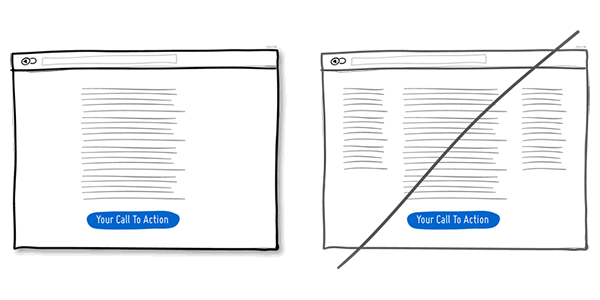
GoodUI.org is an excellent compilation of 32 ideas by Jakub Linowski which will help you build a good and usable UI. The first tip is that you should try a One Column Layout rather than a Multicolumn Layout. The justification for this argument is that by doing this, you should be able to guide your readers in a more predictable way from top to bottom, whereas a multi-column approach runs some additional risk of being distracting to the core purpose of a page.
Multicolumn layouts have been used in print for ages, and they work well. Take the case of The New York Times or Mashable. The content is a collection of articles (or news items), each having a prominent heading. They don’t have a single core message for their visitors, rather, a collection of information for them, and their interfaces deliver this effectively.
A One Column Layout will guide your readers in a predictable way, without the risk of distracting them from the core purpose of a page
Design to Express Better
Take a look at this simple diagram, which I use to represent “expression”:
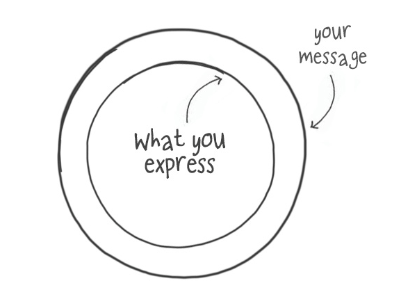
The inner circle represents what you express to others and the outer circle is the message which you intend to express. This doesn’t just apply to web design, in fact, this concept will help you improve your communication skills in general. Whenever you try to express, or communicate an idea to others, try your best to increase the inner circle. Evaluate yourself and try to put yourself in the shoes of your audience. How much of your intended message are you actually expressing?
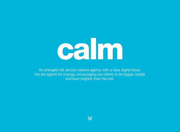
The Portfolio of Calm Digital is a good example of how it’s possible to express a core idea effectively. In this case, the first thing you notice is the word “Calm” written in huge Sans-Serif letters against a blue background. The contrast between the white and blue used is perfect; not too much and not too little, just calm enough. The color blue is well known for promoting feelings of calmness and serenity.
Don’t shy away from any opportunity that can help you express things better. Internet connections are faster than they used to be, browsers are much more powerful and capable and rich technologies like HTML5, CSS3 etc. are giving more power than ever to web developers. Gone are the days when you were restricted to creating static pages. Don’t shy away from using the latest array of tools and technology if it can help you get your message across to your visitors better. I stress the latter half of that sentence: if it can help you get your message across to your visitors better.
Just a few years ago, we couldn’t imagine placing a fully-blown video as the background of a website. But, lo and behold, it’s not uncommon practice these days. There is no better way to convey the experience of using a tablet than a video. This is exactly what Google did for their Nexus 7 website. Clicking a button puts you right in the middle of the Nexus experience.

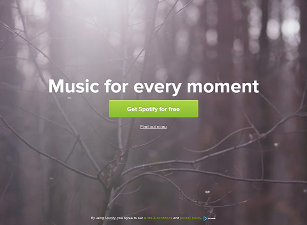
Spotify goes a step further and automatically plays a video in the background. It is captivating…
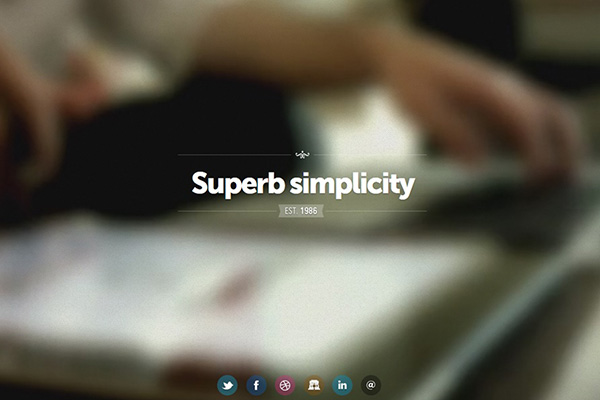
The website of designer Fernando Maclen uses a blurred video in the background which shows him at work. The whole page stays true to the caption “Superb simplicity”.
Conclusion
Let’s briefly run over what we’ve covered in this article:
- The Fourier transform is a simple yet effective idea, informing us of the individual ingredients that go into making a final product. This simple idea of dividing a main message into small components is what a Web Designer should aim to do.
- Design to embrace content, not clutter. Every bit of detail, right down to the favicon should help express the message of the content.
- Design to express. Don’t shy away from going that extra mile to express your idea in a better way. Use the latest and greatest that technology has to offer, if you think it will help you express more effectively.
I hope you enjoyed this article, thanks for reading!
