Aside from regular web & graphics design, the process of designing icons is vast and complex. Iconography can be created with a sketch or from a blank document in digital software. Digital icons can be created using either pixels or vectors. There are many options and the outcome is heavily reliant on the medium, such as websites or mobile apps.
![]()
I can’t teach everything on this subject but I would like to share a few tips for getting started with icon design. As with many other skills practice does make perfect – but you really need concentrated practice to expand your skillset. Since icons can range from highly-detailed OS X app icons down to thin line icons there is a wide landscape to cover. It’s best to pick a few icon types you wish to learn and just keep practicing.
Graphics Design Software
The most popular choices would typically be Adobe Photoshop or Illustrator. These are both great programs as the industry standard for any type of digital design. I would definitely have to recommend these pieces of software, although not everyone can manage to get a copy.
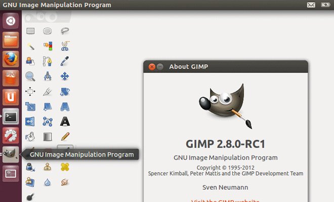
One nice alternative is GIMP which can run on Windows, Mac, and Linux. This larger OS support does make it slightly superior to other software which doesn’t usually get released for GNU Linux/Unix machines. GIMP behaves very much like Photoshop and although the interface is different, you can perform many of the same tasks. And best of all it’s completely free!
Another alternative for Mac is Sketch by Bohemian Coding. This app has a lot more features for UI designers and works great with raster or vector images. The unfortunate downside is that you need OS X to run Sketch, but if you have a Mac this is a cheaper alternative than Adobe software. A quick Google search will return plenty of helpful Sketch tutorials.
Mastering the Pen Tool
Somewhat of a vice to beginning designers, the pen tool is an absolute must-learn. This tool creates paths which can be turned into shapes or smart objects and scaled up to any size. Obviously it’s beneficial when creating icons because you get perfect lines and curves without relying on pixels.
However the biggest problem occurs when just starting to learn the pen tool. It’s very challenging because much of the learning process requires memorizing keyboard shortcuts for modifier tools.
Let me say that you can learn this tool very quickly if you practice every day or every week. It’s almost like riding a bike – seemingly impossible at first, but once you understand how it works you can do the activity without thinking about it. But those first few times you try it’s gonna be tough.
First hunt down some tutorials on YouTube which go over the different tools and modifiers. The pen tool is almost identical in Photoshop and Illustrator with similar tools to be found in other graphics design programs. Look for a tutorial explaining whichever software you’re using and really try to memorize those keyboard shortcuts.
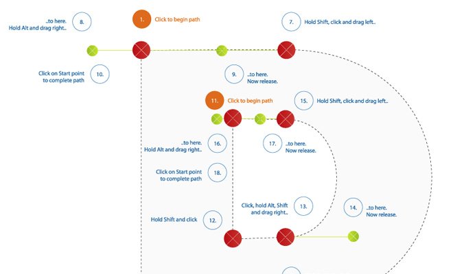
Next all you need to do is practice! My favorite guide is this one from Tuts+ which gives you a handy little template for outlining. The best images to start with are company logos or simple cartoon characters because many of these graphics have smooth curves. Matching curves accurately will take a long time, but once you understand you’ll never forget. Then you can start building icon paths from scratch or even trace your own sketches.
Tutorials and Guides
Aside from pen tool tutorials there are many tutorials online which go over the process of icon design. Some focus on mobile app icons, others focus on simple interface design. There are dozens of different icon styles and you’ll want to find what most interests you.