If you have to design an interface it’s almost obvious to think to begin the process by drawing. But is this the best way? I once casually started by writing an imagined human-computer conversation, and only afterwards I continued by drawing.
This changed my way of thinking and I never went back to drawing first. This article will explain the reasons behind my decision.
I have always been a huge admirer of the guys at Basecamp1. Some time ago, I was reading a tweet by Jason Zimdars, one of its designers:
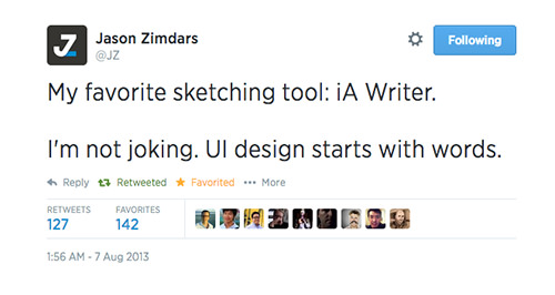
“UI design starts with words.” He wasn’t joking. The comment got a lot of retweets, a lot of favorites. Everyone understood what he meant — except me.
Writing Conversations
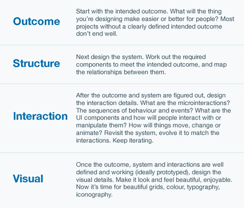
When I’ve had to design an interface interaction component, I used to start by sketching possible solutions. (Product design is made up of many layers. See, for example, Jesse James Garrett’s layers3 (PDF) and Intercom’s4. Here, I’m referring to the interaction layer.)
 5
5I used to start by using a pattern that I know or by copying other people’s solutions to the problem or to similar problems. Imagine that you have to design a website’s registration form. You could start by “stealing” other designers’ solutions. Or, if you feel confident, you could read the requirements and start to draw.
But I started by drawing.
I once had to design a shopping-cart process for an e-commerce website. I don’t know why, but at the time, before researching possible solutions, I imagined what I do when I go to pay at the supermarket. I wanted to reproduce a similar experience on the web, possibly improving it by exploiting the web’s digital capabilities. I wrote down what happens at a supermarket checkout counter:
Cashier: Hi, do you have a loyalty card?
Me: Yes, please. [I give it to her.]
Cashier: Thanks.
Me: Thank you.
Cashier: Do you need some bags?
Me: Yes, two please.
[And so on.]
I realized that imagining the conversation was much easier than drawing on a white canvas. I’m not sure, but I suppose that is true for most people: Conversation is an intrinsic part of human nature. We have evolved as a talking species.
Also, when I imagine a conversation, I draw from my real-life experience, which is good for design — less abstraction. If a user’s interaction with a computer resembled a real-life experience, then the interface would probably be considered easy to use, wouldn’t it?
Moreover, I pay a lot more attention to words and their meanings when I write than when I draw. The benefit is that when I get around to sketching, I will make fewer mistakes in the copy. Because copy is7 an extremely important8 part of any interface, this is a great side effect of writing out conversations.
A Real Example
While imagining a conversation is easy, imagining a variation of that conversation is also easy. Back to the supermarket example: I can easily imagine the cashier asking me whether I need bags before asking for my loyalty card. It’s easy to imagine the cashier asking me a different question. This may or may not change the sketch of the interface. It wouldn’t matter if it doesn’t change anything — what’s important is that I’ve taken it into consideration. The more variations I can think of, the more confident I will feel that I haven’t missed anything in the final design.
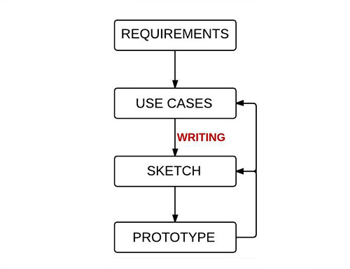
I usually go from product requirements to a list of use cases to a mockup (i.e. a low-fidelity sketch or a high-fidelity wireframe, depending on the situation), which becomes the base of the HTML prototype. Ideally, this process would be linear; in reality, it’s a loop, in which each step provides feedback for me to change something in previous steps.
 9
9Because writing enables me to see more variations, it improves the effectiveness of the loop between “use cases” and “sketch.”
Let’s see this in an example. The following conversation comes from an actual project, a web app called Mediaddress, a press office software. It’s an archive of journalists’ addresses. One of the requirements of the project was that people should be able to send emails to one or more recipients.
The use case I was considering was this: A user has mistakenly selected 5 people from a list of 100 and has forgotten to deselect them and instead would like to send an email to the entire list of 100.
Variation 1
Human: I’d like to send an email.
App: Just to the five you’ve selected or to all of them?
Human: All of them.
App: To write the email, would you prefer to use your email program or my editor?
 11
11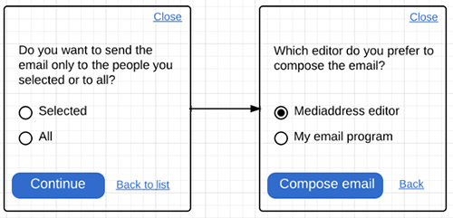 13
13Variation 2
Human: I’d like to send an email.
App: OK, I’ll send an email to the 5 you’ve selected. To write the email, would you prefer to use your email program or my editor?
Human: No, wait! I meant to send an email to all 100 of them, not just the 5 I’ve selected
App: OK, no problem, I’ll do that. To write the email, would you prefer to use your email program or my editor?
 15
15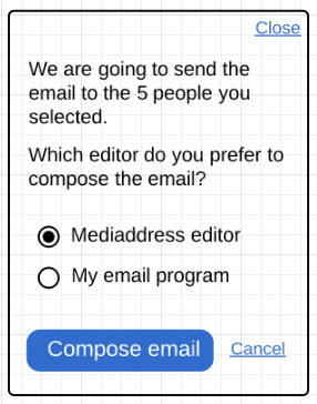
Based on the use case, I’ve written a conversation that can easily be translated into a flow and sketch. Then, I imagined a variation of the conversation, which produced a different flow and sketch. To understand which flow and sketch was better, I compared use cases.
I took the case of the user selecting 5 people from the list but wanting to email the entire list. Was this the most frequent case? I didn’t think so. Wouldn’t optimizing for a user who actually wants to email those 5 people make more sense?
Design consists of trade-offs. We have to always weight the costs and benefits of our options. But I don’t want to get into the details of how I decide which solution is best. I follow many criteria. My point is to show why a written conversation is a useful design tool.
I jump back and forth between written conversation and flowchart and sketch. But the guiding tool is the written conversation. I find it to be the easiest tool to imagine an interaction. The diagrams and sketches (or wireframes) come afterwards. They create order and help me to see the steps clearly. They are also a better tool to communicate with developers and other stakeholders.
To summarize my points:
- Imagining a human-computer conversation and then sketching it is easier than drawing the interface directly.
- Imagined conversations are drawn from real-life experience, while direct sketching is drawn more from remembered design.
- Copy is fundamental to any interface, and writing first and sketching later enables you to concentrate on it at the right time.
- Imagining different conversations is easier than imagining different sketches, which makes it easier to come up with more design options.
- When I write, I am more creative (because I can imagine more variations), and I tend to copy other people’s solutions less.
What About Jason’s Meaning?
In the end, have I understood what Jason meant by his tweet? Why not ask him directly? I wrote an email asking for his opinion on the method that I’ve laid out. He was very kind to answer me:
So, I read through the article and I think you’ve pretty much figured out what I was trying to say with the tweet. Imagining a conversation between the user and the computer is a neat way to think of it. I do something slightly different in my own work. Instead of thinking about the computer at all, I try to imagine how Iwould explain the feature to a friend. This has the effect of being conversational, clear and helpful. I think it’s especially helpful to not think about computers because it’s so easy to fall into the patterns we’ve all seen before; “computer speak,” which is terse, leaves out words and sounds nothing like anything people actually say. I want my UI to read like I’d say it, and that means natural language and full sentences.
I’ll certainly rewrite many times in the form of sketches and continue to refine all the way through the process. It’s much better to trim and optimize the words than start with too few. That’s why I prefer this method to drawing. When you draw, you think too soon about the layout and the available space and what’s too long to fit on a button. Those are too many constraints to deal with at once. I find it better to get the words just right and then figure out the visual design.
Here’s a quick example. First the computer-speak version you might draw:
“Delete file”
[OK] [Cancel]
Now a version you might actually say:
“Are you sure you want to delete this file?”
[Yes, delete it permanently] or [No, I want to keep it]
That’s a little contrived, but you get the idea. I feel like the computer-speak version is an easy trap to fall in when you draw first. I could certainly whittle the second one down to that if space was extremely limited, but why not start with your best version and then consider any compromises?
Here are the lessons I’ve noted:
- “I think it’s especially helpful to not think about computers because it’s so easy to fall into the patterns we’ve all seen before; ‘computer speak,’ which is terse, leaves out words and sounds nothing like anything people actually say.”
- “That’s why I prefer this method to drawing. When you draw, you think too soon about the layout… I feel like the computer-speak version is an easy trap to fall in when you draw first.”
- “It’s much better to trim and optimize the words than start with too few.”
I followed up with one more question, asking Jason how this method helps him to figure out flow, if it does. I wrote:
Let’s say you have a feature and you start to write. Does writing make you think about the flow or the feature, and because of that you change the flow or the feature? Or is the flow or the feature a separate thinking process? Maybe I would make myself more clear with an example. Imagine a bookmark app:
Me: Save this web address.
Computer: OK.
A second version:
Me: Save this web address.
Computer: Before I save it, do you want to change the title of the page? And do you want to add a short description of the contents of the page? And do you want to tag the page (so that it’s easy to retrieve it later)?
The second version changes the flow. Now, when I want to save a web address, a forms pops up. In the first version, I would just see confirmation feedback.
Here is Jason’s answer:
So, how the flow factors in depends on the situation. Many times features aren’t completely isolated. They fit into existing flows and screens — or at least start from there. So, I may have some idea of the flow already in mind. But I’m always open to improving that if the writing leads me in another direction. But even if it’s something completely new, I’ll start with writing because that helps me figure out the flow. If it takes a lot of steps to explain the flow to your friend, then maybe it needs to be broken up into similar literal steps in software. So, a typical writing sketch might include several blocks of copy as I figure out the flow. I think the important part of the exercise is figuring out how you might think of it in the real world, rather than simply thinking of it purely as a software problem. That leads to fresh insights.
These two emails seem to validate my method. They also give me new insight. Coming from a superior designer, the feedback fills me with joy. I thought I had an original idea, but maybe it was just a side effect of having carefully read what the smart guys at Basecamp have written17. I’m not joking either.
Further Resources
- “5 Principles for Great Interface Copywriting18,” John Zeratsky, Google Ventures
- “Copywriting Is Interface Design19,” from Getting Real, 37signals
- “The Dribbblisation of Design20,” Paul Adams, Intercom
- The Elements of User Experience21” (PDF), Jesse James Garrett
- “BCX: Exporting22,” 37signals
Jason Zimbars and Jason Fried’s discussion of UI design
