In this tutorial, you’ll learn how to transform an HTML list into a wall of “sticky notes” that look and work like the following:
The effect is built up gradually and works on all the up-to-date browsers like Chrome, Safari, Firefox and Opera. Older browsers simply get some yellow squares.
Step 1: The HTML and Basic Squares
We will be using some common CSS properties that work across all browsers. As we are using HTML5 for the effect, the basic HTML of our sticky notes is an unordered list with a link containing all the other elements in each list item:
<ul>
  <li>
    <a href="#">
      <h2>Title #1</h2>
      <p>Text Content #1</p>
    </a>
  </li>
  <li>
    <a href="#">
      <h2>Title #2</h2>
      <p>Text Content #2</p>
    </a>
  </li>
  […]
</ul>
Notice that each note is surrounded by a link. This is a a good element to use for interactive items, as it automatically means that our notes become keyboard accessible. If we used the list item for the effect we’d need to set a tabindex property to get the same access.
The CSS to turn this into the yellow squares is simple:
body {
  margin: 20px auto;
  font-family: 'Lato';
  background:#666;
  color:#fff;
}

*{
  margin:0;
  padding:0;
}

h2 {
  font-weight: bold;
  font-size: 2rem;
}

p {
  font-size: 1rem;
  font-weight: normal;
}

ul,li{
  list-style:none;
}
ul{
  display: flex;
  flex-wrap: wrap;
  justify-content: center;
}
ul li a{
  text-decoration:none;
  color:#000;
  background:#ffc;
  display:block;
  height:10em;
  width:10em;
  padding:1em;
}
ul li{
  margin:1em;
}
We reset things the browser normally gives us like margins and paddings and the list style to get rid of the bullets of the list.
We want the list items to be side by side. We would have used the float property to achieve this a while back. However, we can now use the much more powerful flexbox layout module now. This makes it very easy for us to place elements in a two-dimensional layout.
All we have to do is set the display property to flex on the ul element. This will place all our list items in a single row. The list elements will start to overflow at some point. The best way to avoid that is to use the flex-wrap property and set its value to wrap. Extra elements will now keep moving to next row instead of overflowing.
We style the link as a yellow rectangle and float all of the list items to the left. The result is a series of yellow boxes for our list:
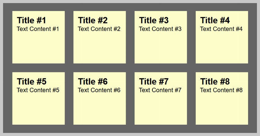
Flexbox is supported in all major browsers today. This covers around 98.5% users at the time of writing this tutorial. If you need to support older browsers, you can consider using float to lay out the elements.
Step 2: Drop Shadows and Scribbly Font
Now it is time to add a drop shadow to the notes to make them stand out and to use a scribbly, hand-written font as the note font. For this we use Google Fonts and the fonts they provide us with, called “Reenie Beanie” and “Lato”.
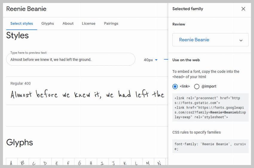
Using this, we get a simple line of HTML to include this new font into the page. This is supported by all modern browsers.
<link href="https://fonts.googleapis.com/css2?family=Reenie+Beanie&display=swap" rel="stylesheet">
We then can set some padding to the headings in the sticky notes, and set the font of the paragraphs to the new font we included. Notice that Reenie Beanie needs to be big to be readable:
h2 {
  font-weight: bold;
  font-size: 2rem;
}
p {
  font-family: 'Reenie Beanie';
  font-size: 2rem;
}
In order to give the sticky notes a shadow to make them stand out from the page, we need to apply a box-shadow. Most browsers in use today support this property without use of prefixes.
ul li a{
  text-decoration:none;
  color:#000;
  background:#ffc;
  display:block;
  height:10em;
  width:10em;
  padding:1em;
  box-shadow: 5px 5px 7px rgba(33,33,33,.7);
}
The box-shadow property sets the offset, spread and color of the shadow. In this case a dark grey with an opacity of 70%. Together with the new font our sticky notes now look like this:
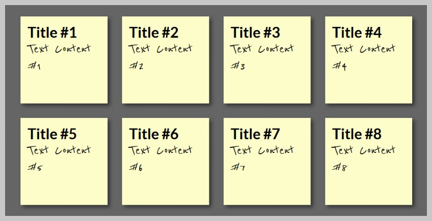
Step 3: Tilting the Notes
Both the tilting of the notes and the zooming we’ll add in the next step were already explained in the past, in this article by Zurb. So big thanks to them for publishing this trick.
In order to tilt an element you use the transform:rotate property of CSS3, again adding the prefix for each of the browsers:
ul li a{
  transform: rotate(-6deg);
}
This tilts all the links by six degrees to the left. Now to make the sticky notes appear to be randomly tilted, we can use the nth-child property of CSS3:
ul li:nth-child(even) a{
  transform:rotate(4deg);
  position:relative;
  top:5px;
}
ul li:nth-child(3n) a{
  transform:rotate(-3deg);
  position:relative;
  top:-5px;
}
ul li:nth-child(5n) a{
  transform:rotate(5deg);
  position:relative;
  top:-10px;
}
This tilts every second link four degrees to the right, and offsets it a bit by five pixels from the top. Every third link gets tilted by three degrees to the left and pushed up five pixels. And every fifth link gets rotated five degrees to the right and offset ten pixels from the bottom. All in all this gives the impression of random sticky notes:
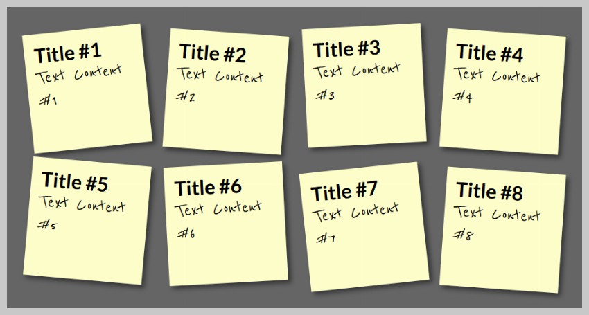
Step 4: Zooming the Sticky Notes on Hover and Focus
To make a sticky note stand out we use a larger drop shadow and the scale transformation of CSS3.
ul li a:hover,ul li a:focus{
  box-shadow:10px 10px 7px rgba(0,0,0,.7);
  transform: scale(1.25);
  position:relative;
  z-index:5;
}
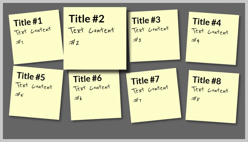
We also add a higher z-index to ensure that the enlarged sticky note covers the others. As we apply this on hover and focus, it means that moving the mouse over or tabbing to a link now makes it stand out:
Step 5: Adding Smooth Transitions and Colors
The last step is to make the change from tilted to zoomed smooth and appealing rather than sudden. For this we use the CSS3 transition module in its different browser vendor implementations:
ul li a{
  text-decoration:none;
  color:#000;
  background:#ffc;
  display:block;
  height:10em;
  width:10em;
  padding:1em;
  box-shadow: 5px 5px 7px rgba(33,33,33,.7);
  transition: transform .15s linear;
}
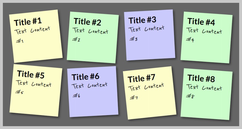
In essence this says: if something is to change to this element, do not just switch to that other definition but do it gradually during a quarter of a second. As another extra, let’s add some color into the mix by making every second sticky note green and every third light blue:
ul li:nth-child(even) a{
  position:relative;
  top:5px;
  background:#cfc;
}
ul li:nth-child(3n) a{
  position:relative;
  top:-5px;
  background:#ccf;
}
Your sticky notes should now look like this image:
Step 6: Making the Sticky Notes Editable
The easiest way to make the sticky notes editable is to use the contenteditable attribute on all the links. This will allow users to click inside the title or the content of the sticky notes and change it.
However, the changes won’t stick if the user reloads the page. We can change that by using some JavaScript. Load the latest version of jQuery on the webpage and add the following JavaScript after that.
We will be using localStorage to store the data about our sticky notes. The key will be based on the index of our list item and its value will be the title and content of the sticky note.
all_notes = $("li a");

all_notes.on("keyup", function () {
  note_title = $(this).find("h2").text();
  note_content = $(this).find("p").text();

  item_key = "list_" + $(this).parent().index();

  data = {
    title: note_title,
    content: note_content
  };

  window.localStorage.setItem(item_key, JSON.stringify(data));
});
The above code attaches a keyup event to all the sticky notes. Whenever, a user types something inside the title or content of a sticky note, we get its content using the text() method. This data is stored in the localStorage of the browser by using the index of the sticky note as a key.
Storing the updated list in localStorage serves no purpose if we can’t retrieve it and show it to users. The following code will loop through all the list items and check for their corresponding keys in localStorage. If the key exists, we extract our title and content from it and update the HTML of our list item.
all_notes.each(function (index) {
  data = JSON.parse(window.localStorage.getItem("list_" + index));

  if (data !== null) {
    note_title = data.title;
    note_content = data.content;

    $(this).find("h2").text(note_title);
    $(this).find("p").text(note_content);
  }
});
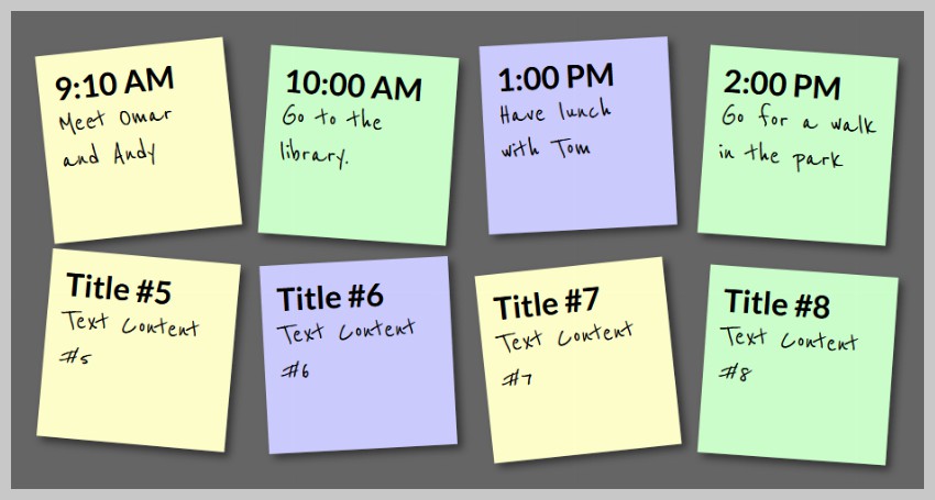
With this code in place, you should now try to edit any of the sticky items and reload the pages to see if the changes stick. Here is a screenshot of my sticky notes.
Here is the complete JavaScript code that you need to use in one place. Please make sure that you have also are also loading jQuery on the page.
$(document).ready(function () {
  all_notes = $("li a");

  all_notes.on("keyup", function () {
    note_title = $(this).find("h2").text();
    note_content = $(this).find("p").text();

    item_key = "list_" + $(this).parent().index();

    data = {
      title: note_title,
      content: note_content
    };

    window.localStorage.setItem(item_key, JSON.stringify(data));
  });

  all_notes.each(function (index) {
    data = JSON.parse(window.localStorage.getItem("list_" + index));

    if (data !== null) {
      note_title = data.title;
      note_content = data.content;

      $(this).find("h2").text(note_title);
      $(this).find("p").text(note_content);
    }
  });
});
Summary
There you have it—smoothly animating and tilted sticky notes. Alll supported by Firefox, Opera, Safari and Chrome and falling back to a set of yellow boxes in older browsers. By clever use of the nth-child selector and CSS transformations and transitions, we saved ourselves some scripting. Further, Google’s Web Font API made it easy to use a custom font. Using both hover and focus for the effect also means that keyboard users can observe the results as well.
We were also able to add some useful functionality to the sticky notes with use of some JavaScript.
While you’re here, check out some of our other CSS tutorials here on Envato Tuts+.
 Web DevelopmentThe 30 CSS Selectors You Must Memorize
 CSS315 Elegant CSS Pricing Tables for Your Latest Web Project
- WordPressHow to Add Custom CSS to Your WordPress Site
This post has been updated with contributions from Monty Shokeen. Monty is a full-stack developer who also loves to write tutorials, and to learn about new JavaScript libraries.

