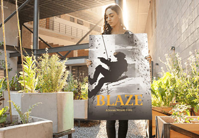
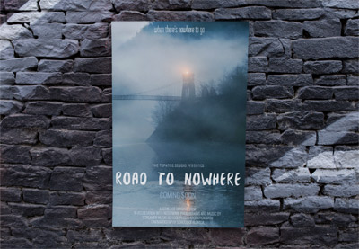
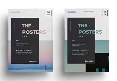
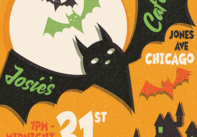
The humble movie poster is one of the oldest and most effective promotional tools for movie studios. Whether you’re looking to emulate your favorite movie poster design or learn more about how to make a movie poster, consider this your ultimate guide to the anatomy of movie poster design.
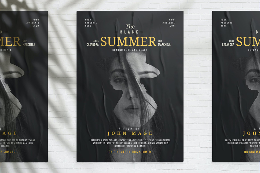
From action movie poster design to comedy movie poster design, pick up pro tips for crafting poster designs for every genre, including how to lay out a movie poster, how to choose perfect fonts and color palettes, and how to create reusable movie poster design templates that can be adapted for online or print.
So grab your popcorn, settle into your theater seat, and prepare to become a master of movie poster design in no time.
Discover a range of pro-designed movie poster design templates on Envato Elements to get you in a cinematic mood.
What Is a Standard Movie Poster Size?
While there are commonly accepted sizes for print posters used in movie theaters and for advertising on bus and subway stops, movie posters come in a large range of sizes and dimensions.
While this gives designers a level of freedom in creating poster designs, it’s wise to be aware of these commonly used sizes:
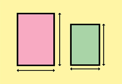
- One-Sheet (27 by 40 inches, or 686 by 1016 mm)—this is is the size used to promote movies in theaters. One-sheets have an aspect ratio of slightly more than 2:3, or a width that’s 67.5% of the height.
- 40 by 60 inches (1016 by 1524 mm)—the standard size for advertising movie posters at bus stops and subway stops, with an aspect ratio of 2:3.
- Architectural D—movie posters sold by retailers to customers (and not distributed by movie studios for advertising purposes) are usually sized at 24 by 36 inches.
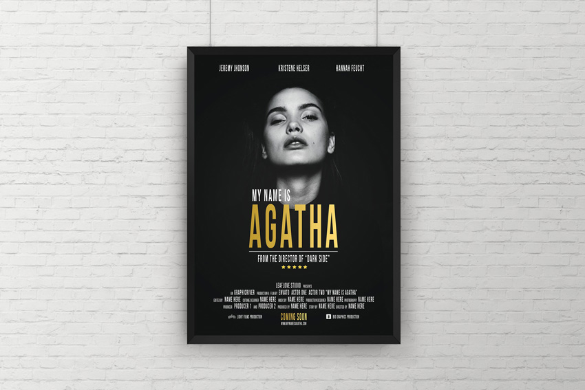
Wondering how to make a movie poster online? Today, many movies are advertised just as heavily online and across social media as they are in print, so designers will have to adapt poster designs for a wide variety of online sizes, from Instagram’s 4:5 or square 1:1 aspect ratio to Twitter’s landscape-oriented 16:9 aspect ratio. In terms of how to make a movie poster for online, you should check the specific sizes used by websites and social platforms, and keep these in mind while you design.
For example, while you might start by creating a portrait, Architectural D version of your design, it’s possible that you will want the poster to have the flexibility to be adapted to landscape orientation, or condensed to a much smaller size (and therefore feature less text and busy, detailed elements) for viewing online.
What Do All Movie Poster Designs Have in Common?
While many vintage movie posters are now cherished by collectors and art fans for their striking designs, movie posters had and continue to have a simple commercial function—to promote the studio’s film and attract audiences into theaters.
At a functional level, all movie posters usually contain the title, star(s), director, and release date, and some may also feature review quotes or slogans to further entice cinema-goers.
Of course, the poster design and the overall brand identity play a huge role in ensuring the success of the movie marketing campaign.
Eye-catching colors, larger-than-life typography, and exciting graphics help to conjure up a cinematic experience in static form, while images of well-known movie stars help to connect with fans. Sure, there will always be examples of bad movie poster design, but these are always outshone by some of the amazing movie poster designs released by designers and studios (see below for movie poster design inspiration).
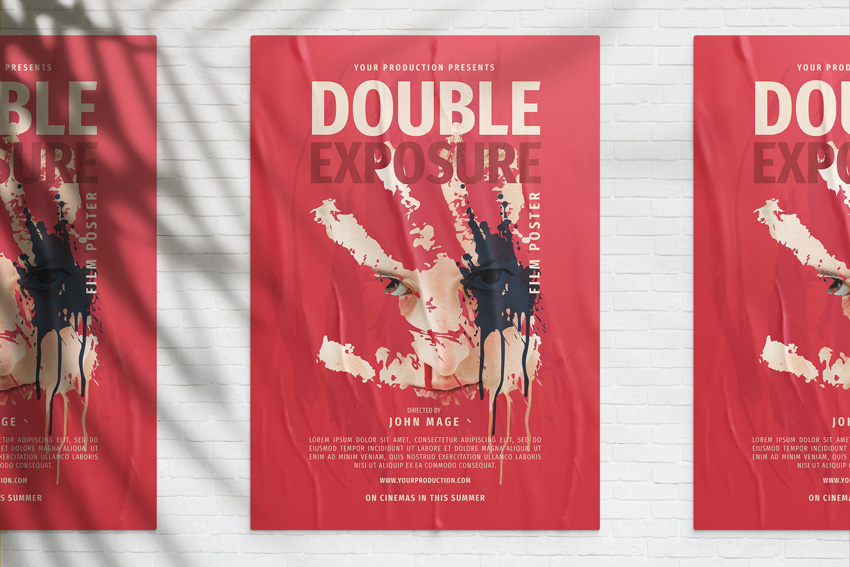
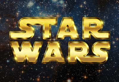
As long as a poster features most of the functional elements listed above, designers can be as creative and innovative as they like with the movie poster layout. Some of the most commercially successful movie poster designs have intentionally strayed from the traditional conventions (such as the ultra-minimal poster for Ridley Scott’s 1979 Alien), while others revisit tried-and-tested styles to tap into audience nostalgia (such as the multi-character montage format of Star Wars posters, which has remained largely unchanged since the first movie’s release in 1977).
-

How to Make a Star Wars Inspired Movie Poster in Photoshop
-

Create a Retro Star Wars Inspired Text Effect in Adobe Photoshop
Perhaps what all movie posters strive to have in common is a sense of summation—the narrative, mood, and/or characters of a lengthy movie need to be condensed into a single static image. The most confident and successful movie poster designs often achieve this by using very little. A preference for more minimalist movie poster design seems to be the hallmark of contemporary poster design, which might partly result from the need for online images to be graphically powerful at a small scale.
What Software Do I Need to Create a Movie Poster?
While early movie poster designs were created by hand, today poster artists tend to use digital software to create their designs.
There’s no single recommended program for creating a movie poster, but raster programs like Adobe Photoshop or Affinity Photo are best for photo-dominant designs. Publishing software like Adobe InDesign or Affinity Publisher give you more balanced control over both typography and images, and allow you to easily adapt your poster design to different page sizes.
Learn how to make a movie poster in Photoshop with this easy-to-follow tutorial:
A Brief History of Movie Poster Design
Movie studios used to commission artists and graphic designers to create poster designs by hand, with the results reproduced using lithographic printing.
During the 1960s, hand-drawn illustrations of movie stars were a common poster style, with photography becoming more widely used in the 1970s. By the 1980s, imagery filled the whole of the available layout space, with movie titles often added to the bottom of posters, seemingly as an afterthought. This era produced some of the most iconic and replicated movie poster designs of all time, such as the adventure-montage format of The Goonies and Indiana Jones.
In the 1990s, movie studios moved towards more comprehensive marketing campaigns for movies, commissioning variations of posters for billboards and magazines, and often creating brand identities for movies which included consistent logo-typed versions of titles, color schemes, and character photo styles.
This brand-marketing approach, which extends the identity of the movie past a single stand-alone poster, is a strategy that movie studios still use today. A campaign for a movie will now be distributed across a range of print and online channels, from online review sites to bus wraps.
What Are the Common Traits of Different Movie Poster Genres?
Movie posters often use deliberate visual signifiers to indicate to a viewer the genre and mood of the movie. These visual signifiers ensure the right audience for the movie will be targeted. For example, if a viewer enjoyed watching a romantic comedy, they are more likely to watch a different movie which has a poster with similarities to the poster of the original movie. These visual similarities group into poster genres, such as horror, sci-fi, thrillers, and action movies.
A particularly successful movie poster may inspire a range of ‘copycat’ posters, which use elements of the design, such as fonts, colors, or layout style, to try to bring some of that success to the movie they are advertising.
While this might sound plagiaristic, this consistent copying of individual design elements leads to an identifiable look for a particular movie genre, allowing studios to target audiences more effectively.
While most movie posters will feature some design elements that signify their genre, that’s not to say that all movie posters are simply copies of others. Rather, the best movie poster designs balance a unique and innovative concept with some inherited elements of genre-specific design. Below are some examples of the best movie poster designs that achieve this balancing act across some of the most popular genres, including action and thriller, comedy, horror, drama, and sci-fi.
How to Design Posters for Action and Thriller Movies
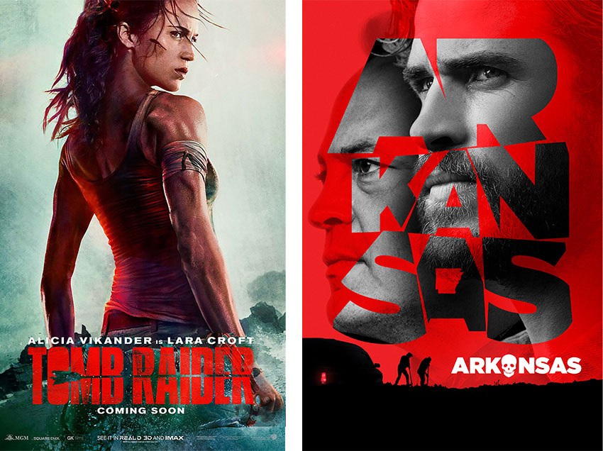
Movie posters for action and thriller flicks are all about replicating the feeling of rushing adrenalin. You can create a sense of urgency and energy by focussing on the impact of movement and color in your poster design.
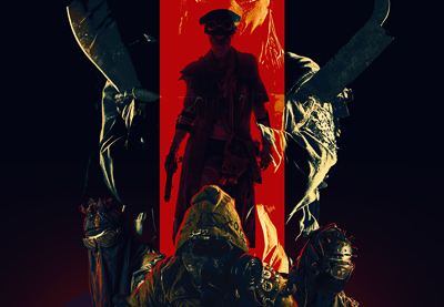
It may be a cliche, but red is a near-permanent fixture of most action movie posters. It’s the color of energy and passion, so using vibrant red in your poster layout—whether on type or in the background of character pictures—is an instant way to channel an action vibe.
Images should have a feeling of movement and dynamism to make the design feel immersive, as if the characters were about to leap out from the page.
Textured, haphazard fonts, or condensed type styles will also help to reinforce the feeling of gritty, hard-hitting action.
How to Design Posters for Comedy Movies
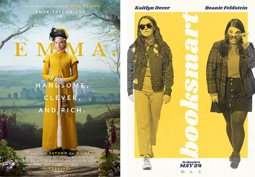
Comedy audiences are looking for fun, laughter, and light-heartedness, and poster designers can channel this in their designs by using expressive photography and bright, optimistic color palettes.
Character photographs are often the focal point of comedy posters, with laughing or knowing facial expressions helping to give audiences a sense of the comedic mood of the film.
Bright, eye-popping colors on typography, graphics, and costumes can help a viewer feel optimistic about the movie. Pastel colors are still the standard for romantic comedies, while 1970s-inspired palettes of yellow and orange seem to be popular across the board.
Movies like Superbad set the tone for retro styling for indie comedy posters, with rounded fonts like Cooper Black and Stripes becoming popular across the comedy genre.
How to Design Posters for Horror Movies
The horror genre has produced some of the most iconic movie poster designs of all time, from Ridley Scott’s Alien (1979) to Stanley Kubrick’s The Shining (1980). Perhaps this is because horror-themed posters are often extremely memorable and impactful (as well as terrifying!).
-

30 Horror-Inspired Fonts
-

How to Create a Ghostly Horror-Themed Photo Manipulation in Adobe Photoshop
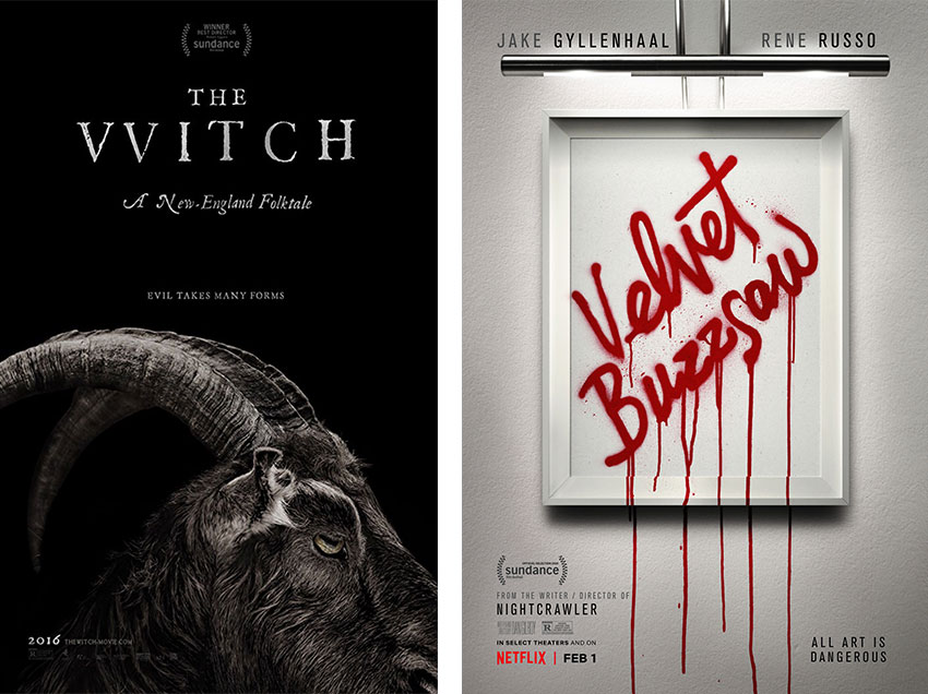
Gory references like blood and weaponry or spooky settings are common for the horror genre, but more thoughtful posters might make a mysterious and enticing reference to the plot or theme of the film, such as in the example of the posters released for The Witch (2015). Silhouetted figures and ghostly shapes in doorways or windows also help to reinforce the mysterious effect.
Dark, moody color palettes which use predominantly black or gray to conjure up a night-time setting can contrast strikingly with white or blood-red text, while fonts that suggest context or crime, such as period type styles or bloodied lettering will really set the horror tone.
How to Design Posters for Drama Movies
Drama movies tend to have a serious, theatrical tone which is focussed on the emotional interactions of the characters. The genre is very diverse, with movies set across a wide variety of settings and periods. Compared to the horror or sci-fi genres (below), drama posters are less likely to morph into one another and as a result are often an opportunity for poster designers to get really creative.
Designing a poster for a drama movie is an exercise in recreating the emotional mood of the film as a 2D image, which might reference the cinematography or characters. Atmospheric designs can be achieved by using immersive, dramatic photography taken from a film still or emotional character portraits. In recent years, the drama genre has produced some really interesting and unique poster art examples, such as the campaign for 1917 (2019), which used large-scale typography as a frame for the beautiful war-themed film shots.
While drama posters are all unique, the focus for the poster designer should be on creating an atmospheric, emotionally charged design which summarizes the mood and theme of the movie.
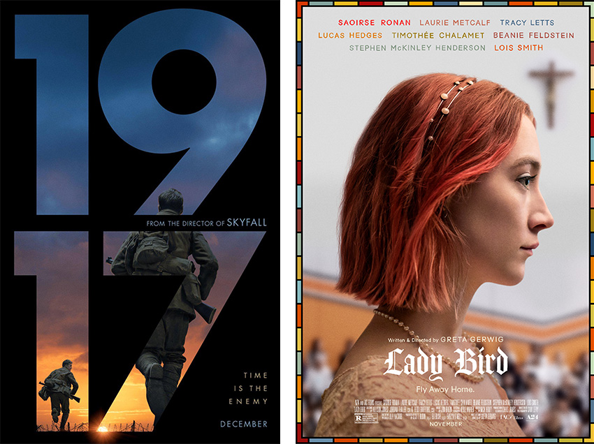
How to Design Posters for Sci-Fi Movies
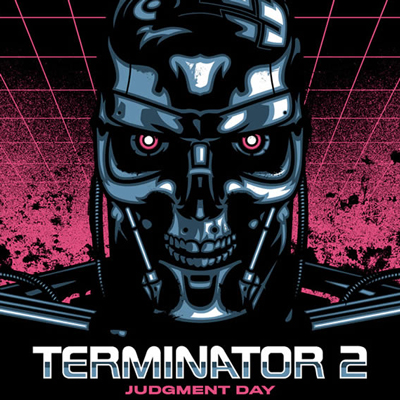
Science fiction is one of the most definable genres in terms of poster design. Often set in space or dystopian futures, classic sci-fi films like Blade Runner and Terminator set the tone for minimalist movie poster design in the 1980s.
To channel the sci-fi genre in your poster designs, look to neon color palettes teamed with inky blacks and blues, space or planetary backgrounds, and robotic-inspired graphics.
-

26 Best Sci-Fi Fonts (Science and Retro Styles)
-

How to Create an Abstract, Sci-Fi Portrait in Adobe Photoshop
Ultra-minimal sans serif fonts, such as Futura, can be typeset with generous tracking to give an airy, ethereal feel to titling for space-set movies.
Experiment with glow and other light effects on your designs to create atmospheric lighting which imitates the luminosity of machinery or stars.
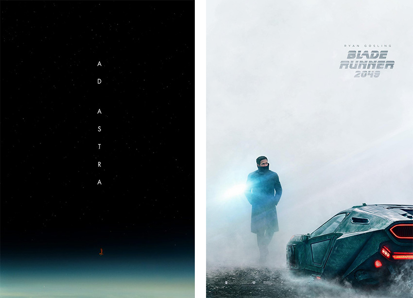
Conclusion: Movie Poster Design 101
From its humble beginnings as a hand-painted advert to its now highly collectible status, the movie poster has become both an indispensable marketing tool for movie studios and an admired example of graphic art.
In this article, we’ve looked at ways you can create your own movie poster designs, from sizing your poster layouts to choosing fonts and color palettes that will help your ideas come to life. You’ve also picked up tips for giving your movie poster templates genre-defining style for some of the most popular movie categories, from sci-fi to thrillers.
On the hunt for a quick movie poster layout template? Find hundreds of movie poster design templates on Envato Elements to get you in a cinematic mood.
If you want to learn more about poster design and how to create cool photo and font effects to use in your poster designs, don’t miss the tutorials and articles below:
-

30+ Best Poster Design Tutorials for Photoshop, Illustrator, and More!
-

42 Best Poster Mockups (Using an Online Mockup Generator)
-

Exploring Poster Design: Analysis and Interviews
-

13 Best Movie Poster Templates
-

42 Best InDesign Poster Templates (Including Flyer Templates to Download)
-

How to Create a Vintage Halloween Poster in Adobe InDesign
