Today you could hardly ever be successful online, if your website is not unique, trendy, and interesting. Year after year, new trends appear, designers find new elements to use in order to turn common things into astonishing art pieces. Now we are talking about geometry use in contemporary website design field.
Grids and columns are what websites are built on, aren’t these the elements of geometry? Yes, geometric forms lie at the core of these layouts: here we mean rectangles and squares mainly. What about circles, hexagons, triangles, diamonds and kites? These are the original shapes that you should definitely include in your web design project.
This article will answer the questions like where, how you should do this and the most important is what for.
Geometry: Uses and Functions
Web designers show their true talent and skills when achieve original simplicity for their websites. Simple UI can look beautiful and geometric shapes are helping with it. Geometry has a great power on website design and on how users perceive what they see. When you build a website with circles or diamonds or any other shapes you immediately put focus on certain details, highlight the content, make your design good-looking and memorable. So where can you apply geometric forms on your design?
1. Use Geometry To Design a Cool Logotype and Make Your Website Recognizable
Logotype is one of the hardest elements to design, because it is your distinctive mark, it is something like a signature and even more. Users remember you by logotype. Many designers use circles to represent their brand, as well as other geometric forms are used a lot. Before you create your unique logo, learn from others but do not steal or borrow.
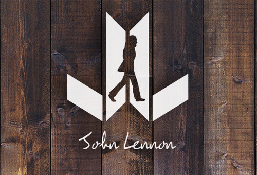
John Lennon Logotype by Armando Rinaldi.
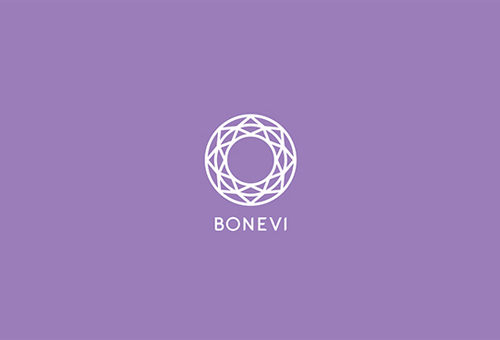
Bonevi Celebrate by IndustriaHed Branding.
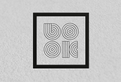
Publishing House Logo by Maurizio Pagnozzi.
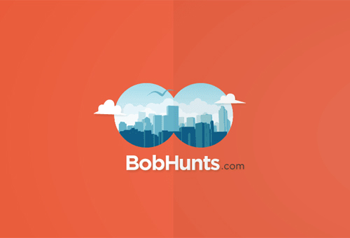
BobHunts Logo by Fixed Agency.
2. Use Geometry for Navigation Design to Make Your Website Simple and Original
Navigation is a crucial element of a website, especially because it has the biggest influence on user experience. Navigation methods vary a lot from regular horizontal menus to vertical oriented navigation, scrolling, sliding, and so on. Simplicity and usability principles should rule your choice, though any navigation menu can be done in a creative way – even the simplest top horizontal bar. If you use geometry and make the menu tabs circular, square or triangular, then you will get users at just navigation design.
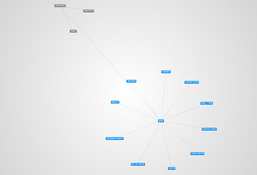
Hello Good Looking Website with Interactive Geometric Navigation.
There are three rectangles tied by lines and this is the navigation menu of the site. The principle is that you click on any of these shapes and more of them appear. Each represents one content section of this webpage.
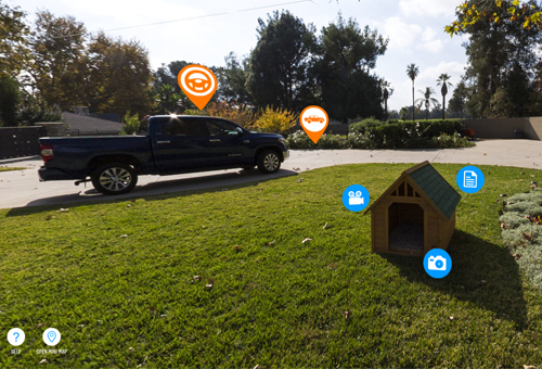
Toyota Tundra Interactive Backyard Website.
Revolvable circular icons make up the navigation of this interactive website. They draw users in and let them play a bit.
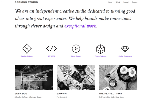
Serious Studio Site with Original Menu Shapes.
Three dimensional geometric figures are presented on the current navigation menu, they are: diamond, arrows, circle, square, and kite. Moreover, they are interactive.
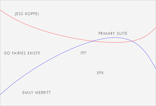
dk8 Website with 2 Lines to Navigate.
There are red and blue lines on this website page. They move just together, and as they move you can hover and click any text (which is a part of the menu) on the background and so open every page this site includes.
3. Design Your Website Background with Geometric Shapes to Give It a Better Look
While image background designs dominate on today’s web, geometric patterns and separate shapes of a right form can make the best foreground look for your website. First of all, this may differ you from others who take easier actions and pick one of their portfolio images to be the background. Monochromatic background design is also rather simple (yet it may look pretty well), and finally original texture or pattern is a wonderful solution to create your own style and make a website easier to recognize by users. Use geometry to create better background patterns and designs.
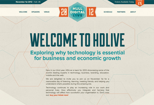
Hull Digital Live with Hexagons in the Background.
Varicolored hexagons make this website stylish and catching. One more section placed a bit lower on this page is designed with another style of hexagon design.
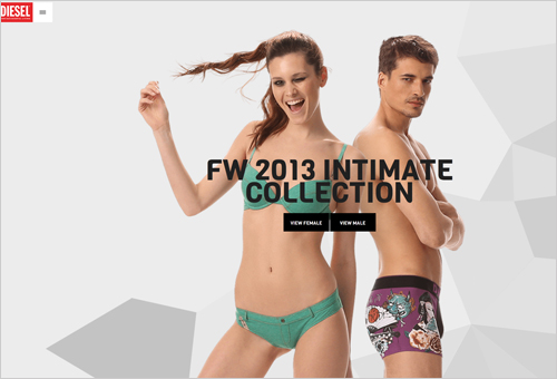
Diesel Website with Geometry in the Background.
Three dimensional shapes of a neutral gray color are placed on this page background to add dynamism, modern feel and originality.
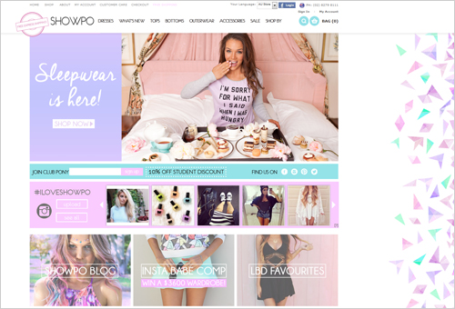
Girlish Website Showpo with Background Triangles.
This white colored website design looks very special because of the bright triangles in the foreground. Some of these triangles make up diamonds when put close to one another.
4. Create Stunning Image Previews for Your Portfolio Website
Image previews of a circle or square form are the most common for portfolio websites. There, instead of turning a homepage into portfolio, designers use small image previews on their main pages. The previews also appear on portfolio section within a slider or any other gallery that doesn’t mean showcasing all images in a big size. This approach to portfolio making is quite user-friendly, besides it keeps the design balance on a website page.
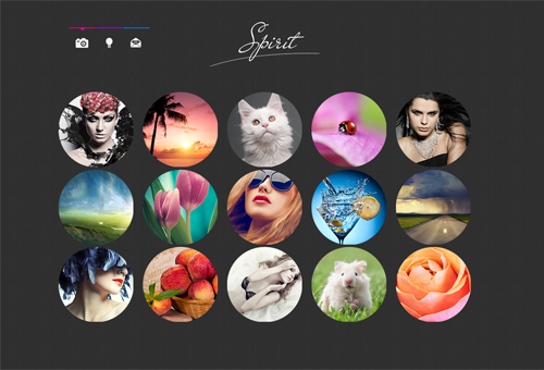
Portfolio Website Design with Circle Image Previews.
Image previews are designed as circles on this dark colored theme. They take less space than if these would be large images, they look accurate and harmonic.
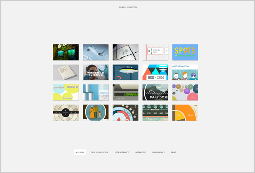
Forum+Function with Squares to Preview Images.
Geometry takes a bigger part of this design. Besides that it has a nicely done navigation menu with small black squares, it includes good-looking image previews with squares again.
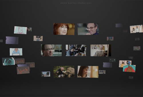
Seven Digital Deadly Things Site with Video Previews Squares.
Instead of image previews as in the above mentioned examples, this website contains nice preview rectangles for videos. The distinctive feature of this preview design is the organization of images: they are scattered over the layout.
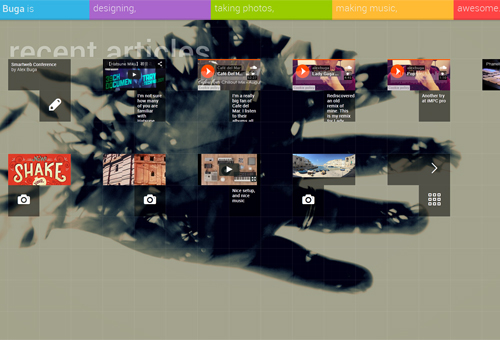
Alex Buga Portfolio with Squares to Preview.
This website makes use of geometry for the background and portfolio preview. The image previews fit the small squares of the geometry-based background. Not all preview squares are image previews, some of them direct you to the article pages, a few more demonstrate videos.
5. Make Your Product/Service Catalog Usable and Pleasing with the Use of Right Shapes
Product catalog is an eCommerce website feature, where users are given a page with a list of available offerings. It could be clothing catalog, apps store, any service provider with its services list. Squares are regular shapes to use for this reason, still you can go for more and make your product page in the most unusual way: design it with hexagons, kites or diamonds.
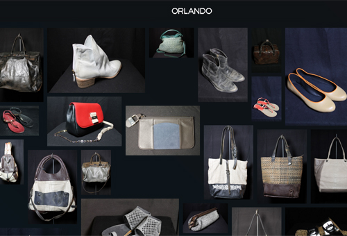
Orlando Website with Randomly Organized Catalog.
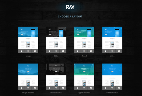
Pay Webpage with Well-Arranged Catalog.
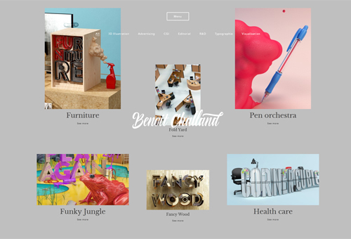
Benoit Challand Website with Differently Sized Images on a Catalog.
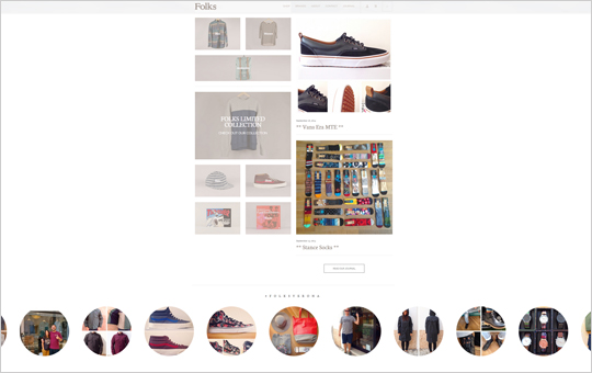
Folks Verone Web Design with Squares and Circles.
6. Organize Web Content in Creative Shapes and Blocks
The presentation of the content is the same vital as its writing. It is more likely that so-so content with awesome framing would be more interesting for users than that of a well-quality but with horrible arrangement. Make creativity to rule for this point, because any shape can be used for better content exposure.
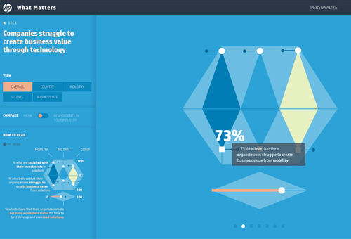
HP Matters Website with Exclusive Content Arrangement.
Circle, semicircle, triangle, hexagon, parallelogram, diamond are all here on this website to present the content to readers.
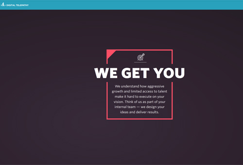
Digital Telepathy Website Design.
Rectangles with broken side lines are the base for texts on this site, while many circle icons are used a lot, too.
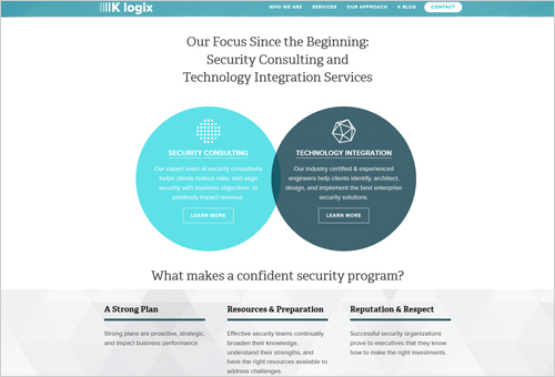
K logix with Round-Shaped Content Blogs.
Pop up content sections done as circles beautify this website design.
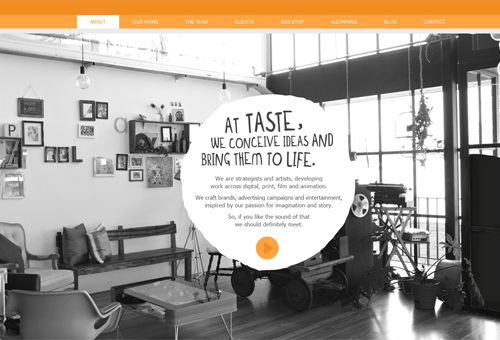
Taste Creative with Hand-Drawn Circles.
Uneven circles with text are creative geometry solutions from this creative team of developers, marketers and advertisers. Still, the employers’ pictures are put in perfect circles.
7. Content Looks Better with Well-Designed Icons and Buttons
Users begin reading a website from the point they find visually nice. This is how icons work: they attract users to the text content, because a website created as a wall of text would never be exciting for readers. A very simple example on how to diversify your text is by specific icon listing. The list of services, or any other one, can be illustrated with theme icons instead of making it a usual bullet list with tiny circles. Colorful icons of different geometric forms can become a superb collection for accentuating your content.
Another function of icons is the association and strong visualization building. One efficient icon can replace a sentence or a whole text. What would you notice faster: a shopping cart icon, or ‘cart’ text? Sure thing, icon would be a better choice.
Icons may be understood differently if placed differently. Let’s say, you have a set of social media buttons in the Footer and near each article/image/product. When it is seen in the Footer it is understood as a following button, but being put near the content section it is meant as sharing button.
Icons support your content, as well as they are very vital elements in building your website credibility.
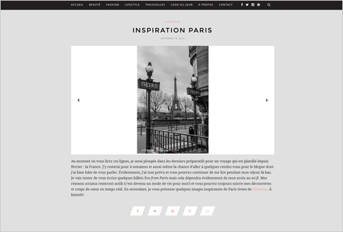
Le Blogue de Julie Lafrance with Unusual Social Media Icons.
We are used to circular Twitter and Facebook icons, while this website used parallelograms instead.
Orange accents on this neutral website design are original shopping cart icon, and differently shaped buttons.
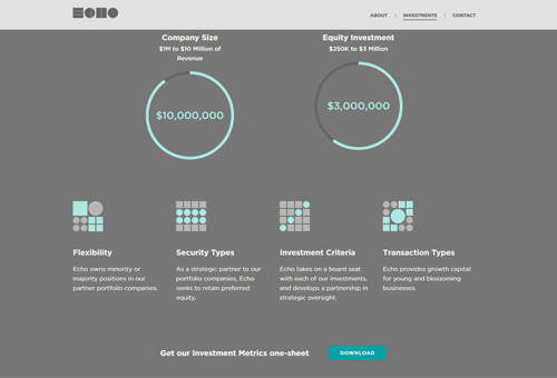
Eco Capital Group with Tetris-like Icons.
Complex icons of circles and squares are very creative and they truly make a perfect attention-grabbing job.
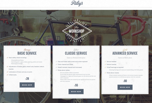
Riley’s Cycles Website with Diamond Icons and Circular Images.
This one-page website uses two various diamond-shaped icons: one for the content section title and the other for Twitter. Besides, there are many circular images and buttons of a geometric form.
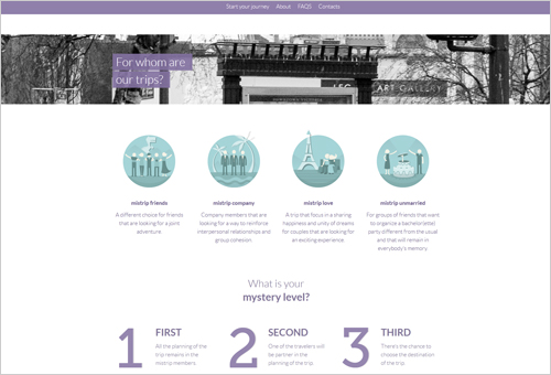
Mistrip Website with Interactive Circle Icons.
Logotype on this design is a circle, plus there is a circular globe model. The most interesting part is the icon, because four service icons on this webpage are interactive.
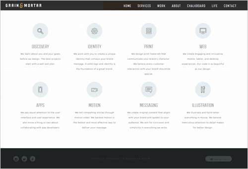
Grain & Mortar Website with Geometric Icons.
The icons on this site help users to learn the company’s services faster and better. Each service in the list is illustrated with a nicely designed icon.
This design includes circles and rectangles to make up creative icons which add personality to this website.
8. Make Sure Your CTA Is Catchy
Catchy CTA means a great success and it doubles your chances to get a quick response from users. ‘Catchy’ is all-in-one: colorful, well-written, and of course designed in a nice form.
Making a circular CTA button, you make it good for mobile users. Circle resembles the fingerprint and it is very convenient to use such buttons on small touch screens. Plus, circle is a creative shape that has many cute variations.
Square button, or rectangular, is quite a common thing in web design. Even though, it can be specified with bigger size, brighter color or so.
The other geometric shapes, like trapezium, diamond or pentagon are used a little, if used at all. But it is never too late to start, to be the first and most original, to set a new trend.
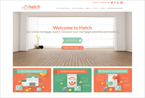
Hatch Mortage with Creative Arrow CTA Button.
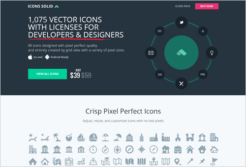
Icons Solid with Colorful Rectangular CTA Buttons.
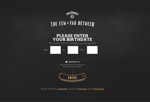
Jack Daniels Bars with Crescent Entry CTA Button.
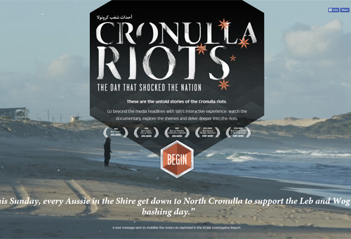
Cronulla Riots with Rhombus Enter Button.
Conclusion
Design is a matter of taste, and in this post we wanted to show you the good side of geometry website design in chance you like and use it for your project. As you see, there are many applications of different geometric shapes and we sure your imagination will lead you to even more great ideas. Comments and feedback are always welcome!

