In the second part of this two-part tutorial you’ll learn how to design the interior pages for an Illustration Portfolio book intended for print, in Adobe InDesign. We will create a number of different page layouts and explore how layout styles can showcase your work to its best potential.
In this tutorial I will be using vector assets from other Tuts+ tutorials, but the tutorial is designed so that you can interchange these with your own illustration work to create your personal portfolio. Refer to part one for creating the portfolio cover.
1. Set up the Layout of the Inside Pages
Step 1
In part one we created a cover for the portfolio book. It is much simpler if this is kept as a separate InDesign file, and that the cover and the interior pages are exported as separate PDF files before they are sent to print. We will be setting up the InDesign document for the interior pages with the same dimensions and bleed settings as the cover document.
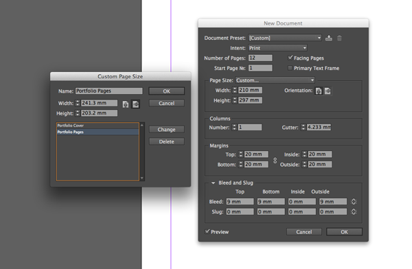
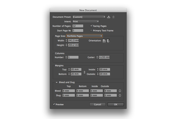
Open InDesign and go to File > New Document, to open the New Document window. Select Custom from the Document Preset drop-down menu and ensure Intent is set to Print. Set the Number of pages to 12 and select Facing Pages. From the Page Size drop-down menu select Custom… to open the Custom Page Size window. Type ‘Portfolio Pages’ under Name, set the Width to 241.3mm and the Height to 203.2mm. Click OK.
Step 2
Back in the New Document window, set the Margins to 20mm and the Top, Bottom and Outside Bleed to 9mm. Keep the Inside Bleed at 0mm. Click OK.
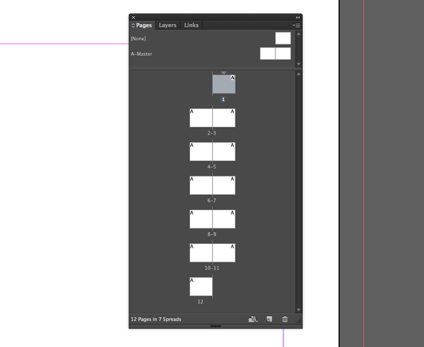
You now have a 12-page layout set up for your pages. The first and last pages are the only pages that are not part of a two-page spread. You should always begin and end your book with a single page, whether this contains content or not.
2. Set up the Masters for the Pages
We’re going to set up four different Masters to create four slightly different template looks for different spreads. If your portfolio is more lengthy than 12 pages, four masters will be a sensible number of templates to maintain. For now, this is a demonstration of how you can apply Masters to create difference and consistency simultaneously across your book.
Step 1
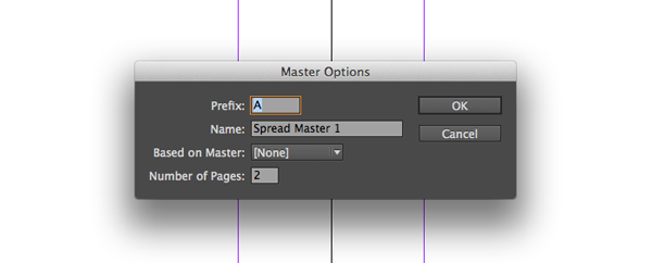
Go to the Pages panel (Window > Pages, if not already open). You will see that there is already a default Master in the document called ‘A-Master’. Control-click (Mac) or right-click (PC) on the A-Master icon or name and select Master Options for A-Master… . Maintain the Prefix ‘A’ and the Number of Pages at 2. Rename this ‘Spread Master 1’. Click OK.
Step 2
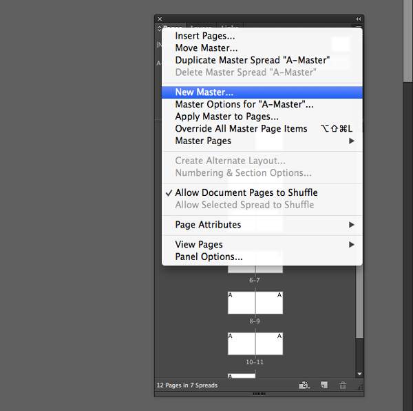
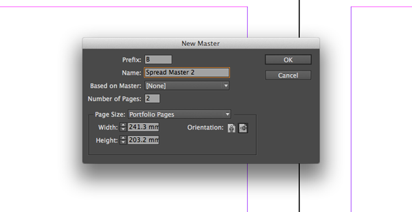
Create a new master spread by going to the Pages drop-down menu (accessible at the top right-hand of the Pages panel) and clicking on New Master. Name this Master ‘Spread Master 2’. Click OK. Repeat this step twice and create an additional two Masters – name these ‘Spread Master 3’ and ‘Spread Master 4’.
3. Apply Guidelines to the Masters
It is wise to add guidelines to your Masters to mark the center point of pages and provide guides for placing text and images.
Step 1
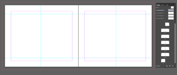
Double-click on the page icon for ‘Spread Master 1’ to edit the Master directly.
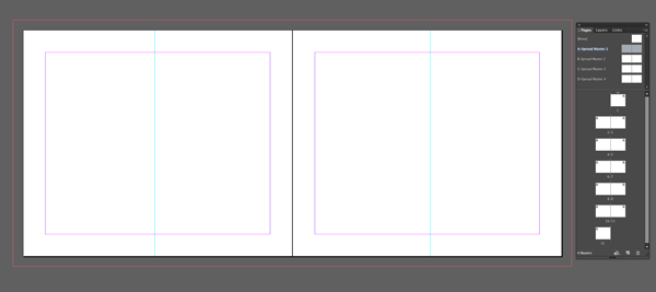
We want to insert a vertical guideline on each page to mark the center point for the page’s content. As the portfolio will be printed as a book, some visibility will be lost of the inside margins towards the binded center of the book. We can compensate for this by pushing the content of pages a little off-center. The true center line of a page in the book will be at 120.65mm, exactly half of the width of one page. We will subtract 3mm from this value for a left-hand page and add 3mm for a right-hand page.
Go to View > Rulers, if they are not already visible. Drag a guideline to X-position 117.65mm. Drag a second guideline to X-position 364.95mm.
Step 2
We will also set up additional guidelines for marking the boundaries of text and image frames on a given page. Drag a guideline downwards from the horizontal ruler to Y-position 29.6mm. Drag a second guideline down to Y-position 173.6mm. Repeat for the opposite page.
Click and drag to select all the guidelines on the Master and Control-click (Mac) or right-click (PC), Copy. Double-click on ‘Spread Master 2’ and select Edit > Paste in Place. Repeat across all the Masters.
4. Insert Page Numbers
We can add page numbers to a Master to help your portfolio have order. You don’t need numbers on every page however, some spreads may benefit of being completely free of clutter.
Step 1
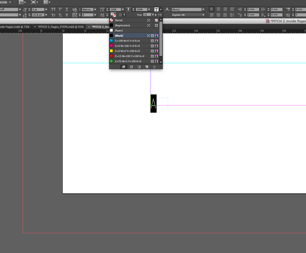
With the ‘Spread Master 1’ still on screen, select the Type Tool (T) and create a text frame with a Width of 4mm and Height of 2.5mm. Position this frame in the bottom left-hand corner of the left-hand page, resting against the left margin at Y-position 181.5mm. Click within the frame and go to Type in the top menu. Select Insert Special Character, Markers and select Current Page Number. An ‘A’ will be automatically entered into the frame. Set the Font to “Web Serveroff Regular”, Size 9 pt, Align Left and the Color to Black, Tint 75%.
Step 2
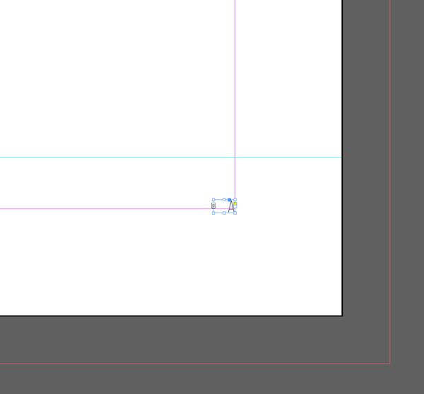
With the text frame selected, Control-click (Mac) or right-click (PC), and click Copy. Paste, and move the new frame to the right-hand corner of the the right-hand page, resting against the right margin at Y-position 181.5mm. Set the text alignment to Align Right.
Step 3
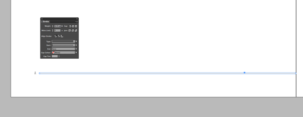
We will also use the Line Tool to create a frame for the page numbers, which is consistent with the style of the cover we created in Part One. Select the Line Tool (\) and, holding Shift, drag a horizontal line from left to right. Adjust the length to 217mm, the X-position to 24mm and the Y-position to 182.5mm. The line will now rest on the bottom margin to the right of the left-hand page number.
Go to Window > Stroke to open the Stroke panel. With the line selected, set the Weight to 0.75 pt, Type to Thick – Thin, and the Start value to Bar. In the top control panel set the Stroke Color to Black, Tint 75%.
Step 4
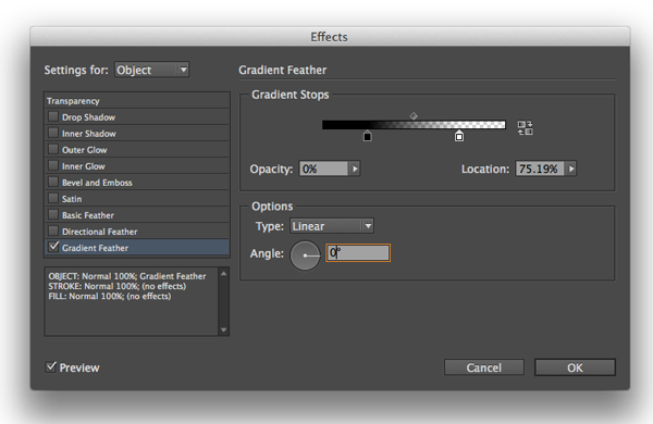
With the line still selected, go to Object > Effects > Gradient Feather. Under Options, set the Angle to 0 degrees and maintain the Type as Linear. Move the Black Gradient Stop about a quarter way along to the right, and the White Gradient Stop about a quarter way to the left.
Step 5
With the line selected, Control-click (Mac) or right-click (PC), and click Copy. Go to Edit > Paste in Place. Control-click (Mac) or right-click (PC) and click Transform > Flip Horizontal. Adjust the X-position to 459mm.

Step 6
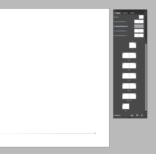
Zoom out so you can view the whole spread. Select the page numbers and lines from both pages and Copy. Double-click the ‘Spread Master 2’ page icon and go to Edit > Paste in Place. The page numbers will now appear by default as ‘B’.
5. Customize the Masters
We can create a monochrome theme across the pages of our book. Leave the ‘Spread Master 1’ as it is, and remain with ‘Spread Master 2’ selected on screen.
Step 1
Select the page number text frames on both pages and set the Font Color to white. Select both the lines and set the Stroke Color to White.
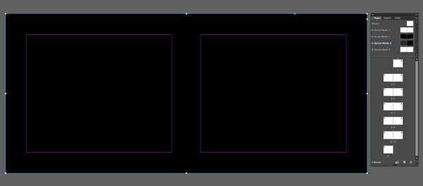
Select the Rectangle Tool (M) and drag to create a frame that extends across the whole spread, right up to the bleed. Set the Fill to black. Control-click (Mac) or right-click (PC), and click Arrange and Send to Back. The white page numbers and the lines will be brought to the front.

Step 2
Select just the black Rectangle frame and Copy. Double-click the ‘Spread Master 3’ page icon and select Edit > Paste in Place.
6. Apply Masters to Pages
Step 1
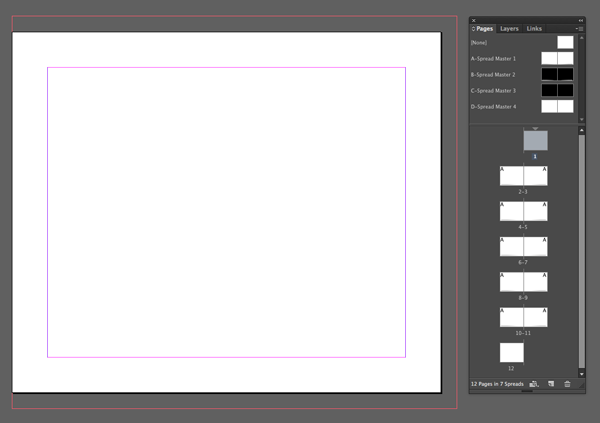
All the pages will have the ‘A’ Master (‘Spread Master 1’) applied to them by default. In the Pages panel click-drag the Master icon labeled as None and drop onto the page icons for Pages 1 and 12.
Step 2
Click-drag the ‘Spread Master 2’ pages icon and drop onto the page icons for Pages 8 and 9.
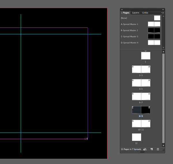
Step 3
Click-drag the ‘Spread Master 3’ pages icon and drop onto the page icons for Pages 4 and 5.
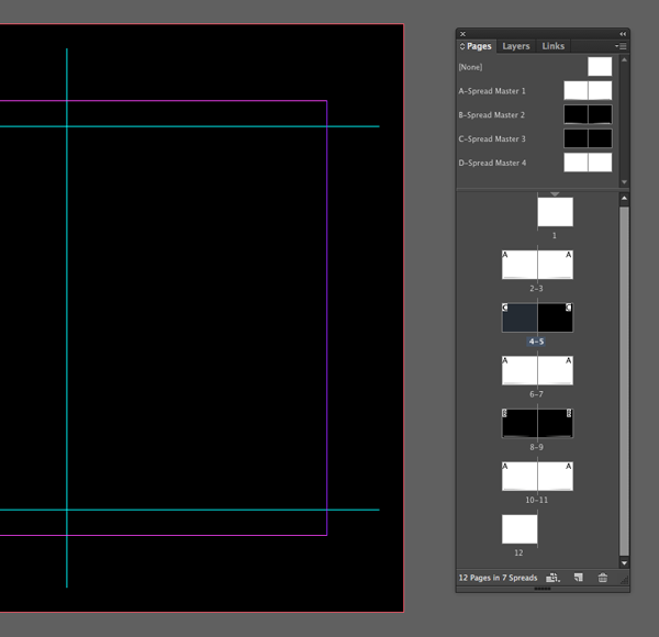
Step 4
Click-drag the ‘Spread Master 4’ pages icon and drop onto the page icons for Pages 10 and 11.
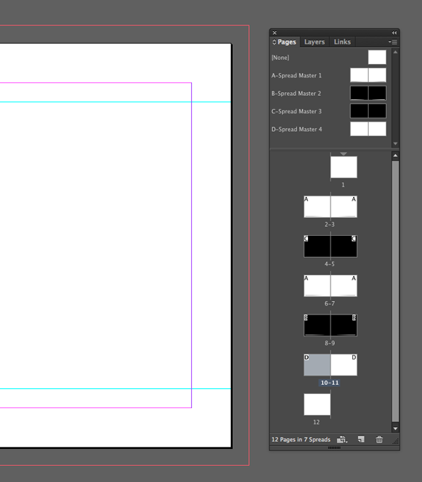
Your Masters have now been customized and applied to the pages of your book. You can repeat this alternating pattern of A, C, B, C, D Master templates throughout your book whatever the final number of pages. The black/white alternating template will be repeated throughout.
7. Set Up the First and Last Pages of the Book
In part one we set up a cover complete with colored surfaces for the inside of the front and back cover. To create a professional seamless look, we will apply the same color to the first and last pages of the book.
Step 1
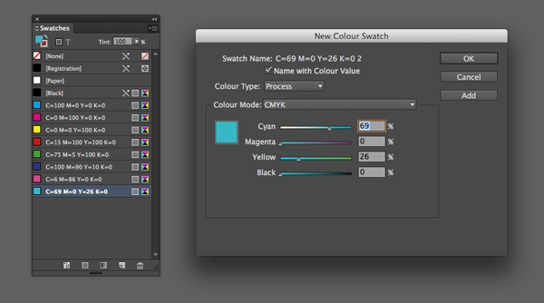
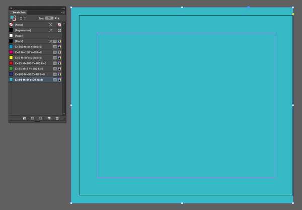
Go to Window, Color, Swatches to open the Swatches panel. In the Swatches menu, found at the top-right of the panel, select New Color Swatch. With Color Mode set to CMYK, set the Cyan value to 69%, Magenta 0%, Yellow 26% and Black 0%. Click Add and then OK.
Step 2
Go to Page 1 of the document and select the Rectangle Tool (M). Drag to create a frame that extends across the whole page, up to the bleed. Set the Fill to C=69 M=0 Y=26 K=0. Repeat this for Page 12.
Step 3
Return to Page 1 of the document. Here is a good place to insert a minimal page with a title, name and perhaps a logo if you have one.
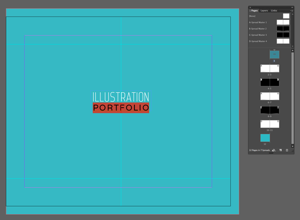
Firstly, you will notice that this page has no guidelines as the Master is set to None. Double-click on one of the Masters and highlight the guidelines from a right-hand page. Copy and return to Page 1. Click Edit > Paste in Place. You can now see the center guideline.
Insert a text box using the Type Tool (T). Set the Width to 65mm and the Height to 22mm. Rest the frame in the center of the vertical guideline and the Y-position to 79mm. Type ‘ILLUSTRATION (paragraph break) PORTFOLIO’. Set the text alignment to Align Centre.
Highlight ‘ILLUSTRATION’, set the Font to “Web Serveroff Regular”, Size to 39.5 pt, Tracking to 20 and Color to White. Highlight ‘PORTFOLIO’, set the Font to “Varela Regular”, Size 25 pt, Leading 28 pt, Tracking to 120 and Color to White.
Step 4
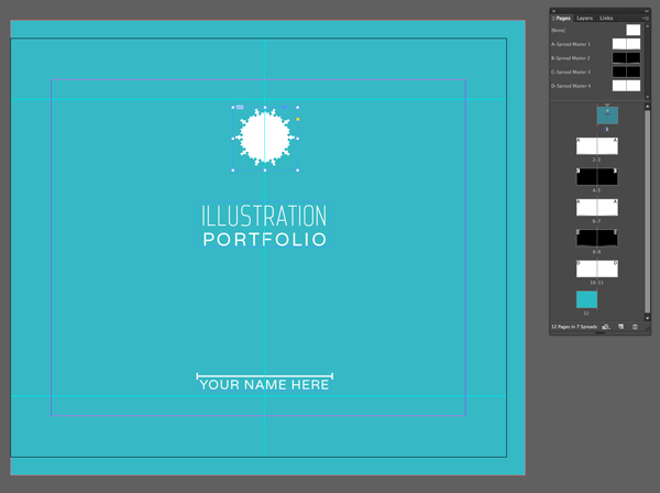
Create another text frame and adjust the Width to 64 mm and Height to 7 mm. Line it up directly below the first text frame at Y-position 164 mm. Type ‘YOUR NAME HERE’ into the frame, set the Font to Varela Regular, Size 18 pt, Tracking to 50, Color to white and Align Center.
You can also add extra touches, like lines and logos, it’s really up to you how to personalize your title page! Here I used the Line Tool (/) to create a framing line with bar-effect start and end points. I inserted the logo using the Rectangle Frame Tool (F) and placing an EPS logo in white.
Step 5
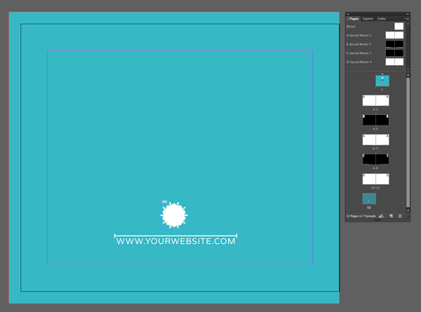
On page 12, or your last page, you can drop in a website or other contact details in a matching font and style to leave a lasting impression on the reader.
8. Using the Rule of Thirds
When designing the pages of your book, you should consider the visual impression an entire spread will have on the reader. A useful way to ensure your layouts will have visual appeal is to use the “Rule of Thirds”.
The rule states that layouts automatically appear more appealing when prominent elements of your design fall into the upper or lower third of a portrait page, or the far left or right third of a landscape page.
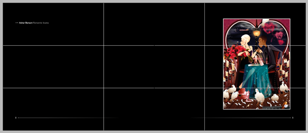
Here is an example of one of the layout styles we will look at creating with a “Rule of Thirds” grid applied on top of the spread. On a landscape spread, images are more appealing when the main element of a design is pushed into the far right third, as we are predispositioned in the English-speaking world to read a page from left to right. In this spread we acknowledge the caption before moving the eye to the main image.
Step 1
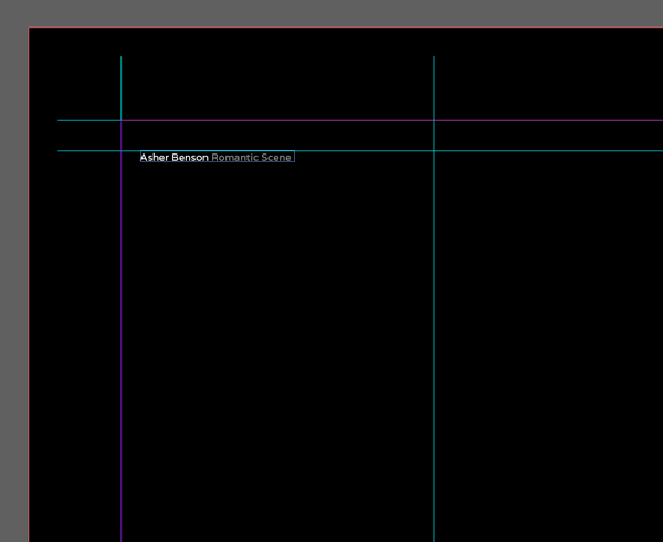
We’ll walk through how to create an example spread using the “Rule of Thirds”. Click on the spread of Pages 8 and 9 to bring the spread up on screen. Firstly, create a text box using the Text Tool (T). Set the Width to 48mm and the Height to 3.5mm. Rest the top of the frame against the top horizontal guideline and set the X-position to 26mm.
Type ‘Author Name Title’ into the frame. Set the Font to “Varela Regular”, Size to 9 pt and Tracking to 10. Highlight ‘Author Name’ and set the Color to white. Highlight ‘Title’ and set the Color to black, Tint 60%.
Step 2
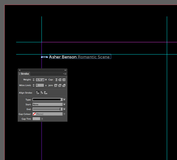
Select the Line Tool (/) and, holding Shift, drag from left to right to create a 4 mm Length line. Set the Stroke Color to white, and in the Stroke panel (Window > Stroke) set the Weight to 0.75 pt, and the End value to Bar. Rest the left-hand edge against the left-hand margin and move the X-position to 31mm.
Step 3
Select the Rectangle Frame Tool (M) and drag a frame to sit on the far right side of the spread. Go to File > Place and select your image file. In this example I’ve selected an illustration with dark colors which will look lovely framed against a black background, Asher Benson’s Romantic Scene. By carefully selecting your images to ‘match’ the color or layout of a spread, you can create a more integrated, design-led look for your portfolio. Click Open, and use the Fill Frame Proportionally option in the top control panel to adjust the size of the image. Using the Stroke option in the top control panel give the image a frame; set the Stroke Color to white and the Weight to 2 pt.
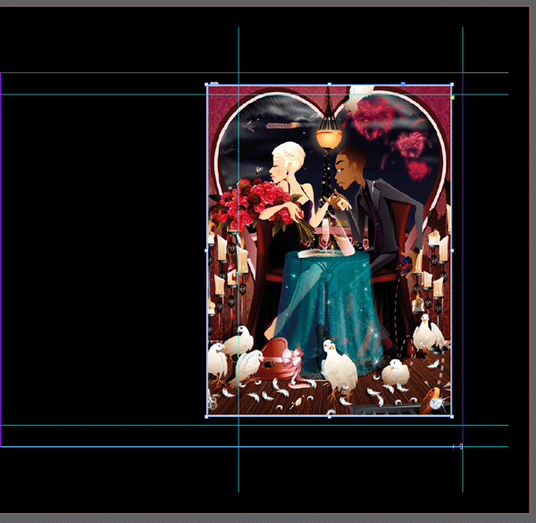
Nice work – you now have a beautiful spread layout based on the “Rule of Thirds” proportions.
9. Use the Rule of Symmetry
The “Rule of Thirds” isn’t the only technique for creating beautiful page designs. Exploring the potential of symmetry in your work can also lend to a visually appealing layout. Let’s walk through creating another spread for your book, this time with symmetrical effects playing center stage.
Step 1
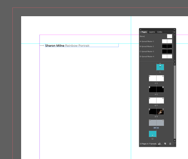
Go to Page 8 and select the text frame and adjacent line. Select Copy. Go to Page 10 and Edit > Paste in Place. Change the Stroke Color of the line to black, Tint 60%. Highlight ‘Author Name’ and change the Font Color to black, Tint 60%.
Step 2
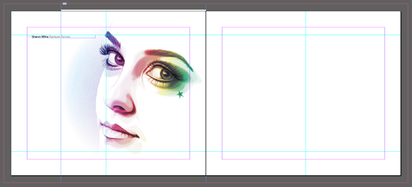
Select the Rectangle Frame Tool (F) and drag to create a frame 221mm in Height, which extends from the top edge of the bleed to the bottom edge. Rest the right-hand edge of the frame on the center of the spread. Go to File > Place and select an appropriate image file.
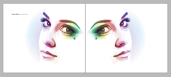
Here, I’ve used Sharon Milne’s lovely Rainbow Portrait which will work just as well when flipped (any images which contain text elements would not be suitable for this sort of spread layout).
Step 3
Click Open. Once you’re happy with the position of the image, select the frame and Copy, Paste. Control-click (Mac) or right-click (PC), and click Transform, and Flip Horizontal. Move this new image frame onto the opposite page (Page 11), again lining the left-hand side up against the center of the spread.
This spread will look great when it’s folded out!
10. Design a Spread Using Repeated Elements
If you have a series of similar images, you may want to feature these together on the same page. Don’t be tempted to crowd the pages with too many images – pick your two best illustrations from the series and allow them each a whole page.
Step 1
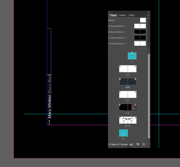
Return to Page 8 which features Asher’s Romantic Scene image in this example. Select the text frame and adjacent line and Copy. Go to Page 4 and click Edit > Paste in Place. Selecting both the line and text frame, Control-click (Mac) or right-click (PC), and click Transform, and Rotate 90 CCW. Move the two elements so the bottom edge of the line rests on the bottom margin in the left-hand corner of the page. The left edge of the text frame should rest on the left-hand margin. Edit the text caption if required.
Step 2
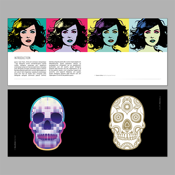
Using the Rectangle Frame Tool (F) draw a frame which is centered along the vertical guideline in the middle of Page 4. Go to File > Place and select your image. Here I’ve used Mary Winkler’s Disco Skull. It will work best if this image has a transparent background so that the black background seamlessly goes up to the edges of the image.
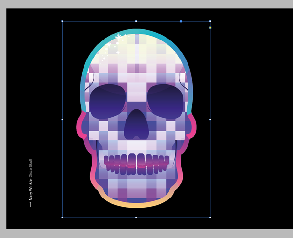
Step 3
Select the text frame and line below it on Page 4 and Copy and Paste. Control-click (Mac) or right-click (PC), and click Transform, and Rotate 180. It may be sensible to group the two elements together before doing this. Move the copied text frame and line to the opposite page, against the margins in the right-hand corner of Page 9.
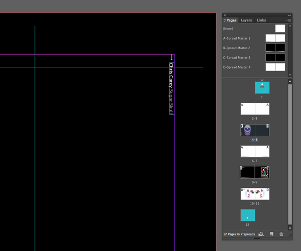
Step 4
Return to Page 8 and select the image frame. Copy, Paste and move to the opposite page in the same position. Go to the Links panel (Window > Links, if not already showing) and, with the new image frame selected, click the Relink symbol (found just below the list of Links). Select your new image (in this example I’ve used Chris Carey’s Sugar Skull) and click Open.
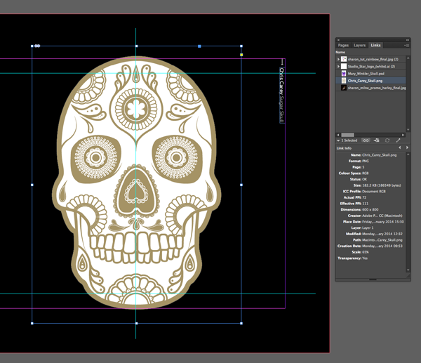
Now you have a spread based on the principle of repeated similar elements. Each image has plenty of space around it and the bright colors really pop against the black background.

11. Design a Spread Using One Central Image
Don’t be afraid of placing an image across the center of a spread. Even better, if the image is symmetrical, this can be a great way of adding extra impact to your portfolio.
Step 1
Go to Page 10 and select the text frame and adjacent line, and Copy. Go to Page 6, and select Edit > Paste in Place. Edit the text caption if need be.
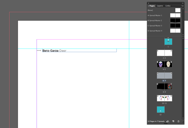
Step 2
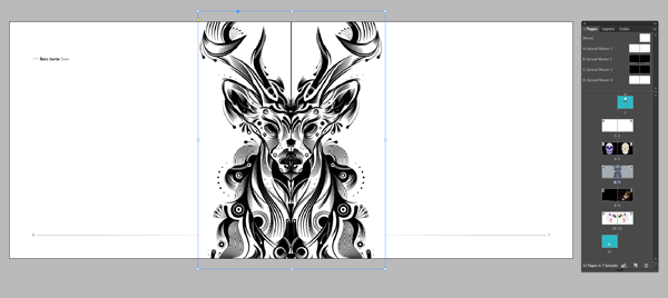
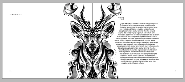
Using the Rectangle Frame Tool (F) create a frame that extends the whole height of the page, from the top bleed to the bottom bleed and align it down the very middle of the spread. Go to File > Place and insert your selected image. In this example, I’ve used Beto Garza’s Deer illustration, which is completely symmetrical. Click Open.
Step 3
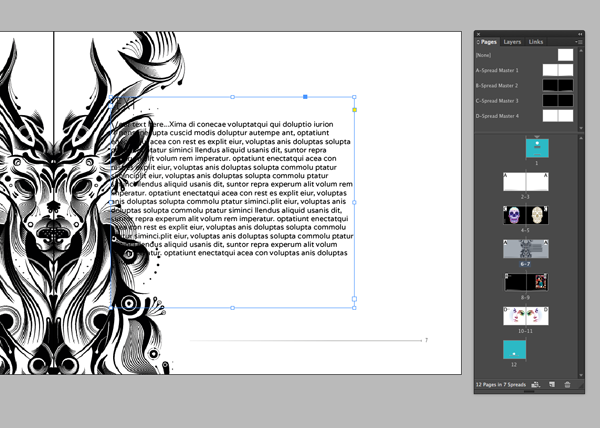
You might want to add a more substantial chunk of text to the spread to this page, to explain the client brief or the inspiration behind the drawing. Create a text frame using the Text Tool (T), Width 144mm and Height 125mm. Type ‘TEXT (paragraph break) Your text here…etc’ or alternatively, select Type from the top menu and click Fill with Placeholder Text for now.
Step 4
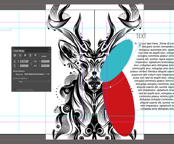
We want the text to wrap tightly against the image, but this image has a solid background. This means that if we select Wrap Around Object Shape from the Text Wrap panel (go to Window > Text Wrap to open) while selecting the image frame, the text will only wrap around the boundaries of the frame, and not the image.
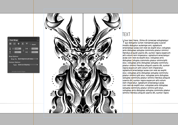
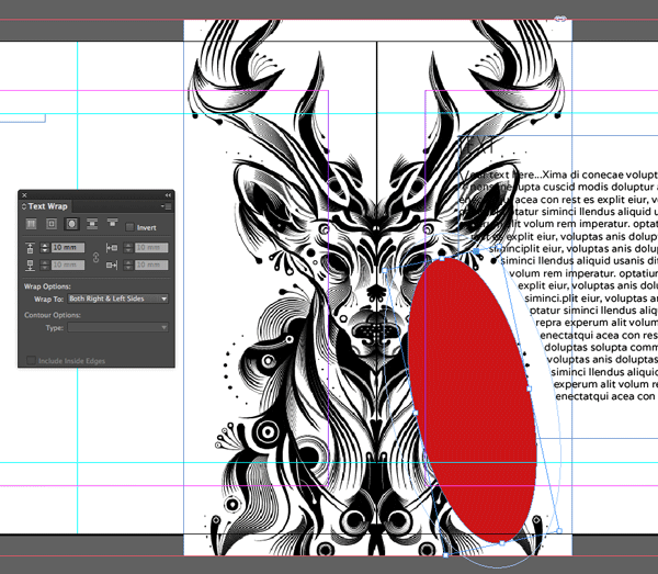
No matter, we can create the desired effect straight into InDesign, without having to go back and remove the image background in Illustrator or Photoshop. Select the Ellipse Tool (L) (found by clicking down on the Rectangle Tool icon in the left-hand tools panel), and drag to create a small ellipse. Rotate it until it lines up on top of the right flank of the deer. In the Text Wrap panel, with the ellipse shape still selected, select Wrap Around Object Shape and set the Offset to 10mm.
Step 5
Repeat the above step, creating another ellipse which is slightly smaller. Maneuverer this new shape to line up on top of the right-hand side of the deer’s head, up to the tip of its ear. Apply the same text wrap values as for the first shape.
Step 6
Select both of the ellipse shapes and set the Fill and Stroke to None. The text should now wrap elegantly around the right-hand side of the deer image.
12. Create an Introductory Page
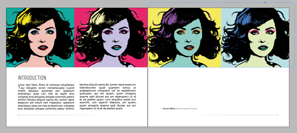
Depending on your personal preference you may want to fill your book simply with examples of your work. In this example, I’ve included an introductory spread on Pages 2 and 3 which you can adapt to fill in a general introduction to your work or career background.
Step 1
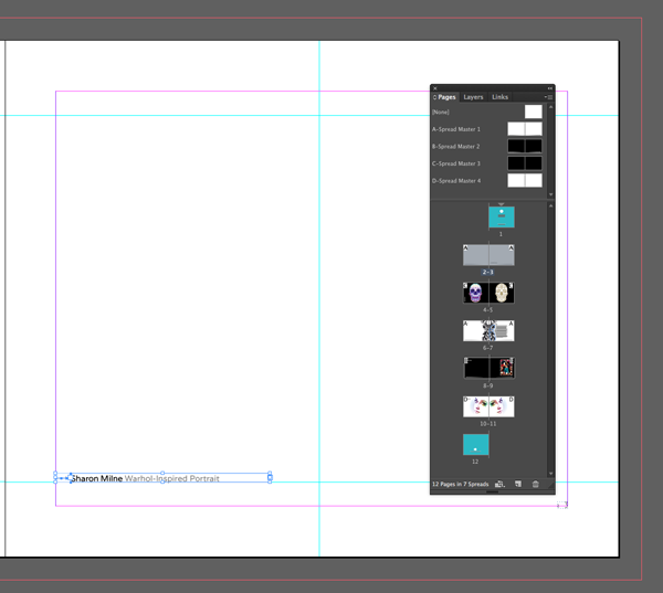
Go to Page 10 and select the text frame and adjacent line, Copy. Go to Page 3 and Paste. Edit the text caption if need be – we can showcase one piece of work across the top of this introductory spread. Move the two pasted elements to the bottom left-hand corner of Page 3, resting the bottom of the text frame on the lower horizontal guideline.
Step 2
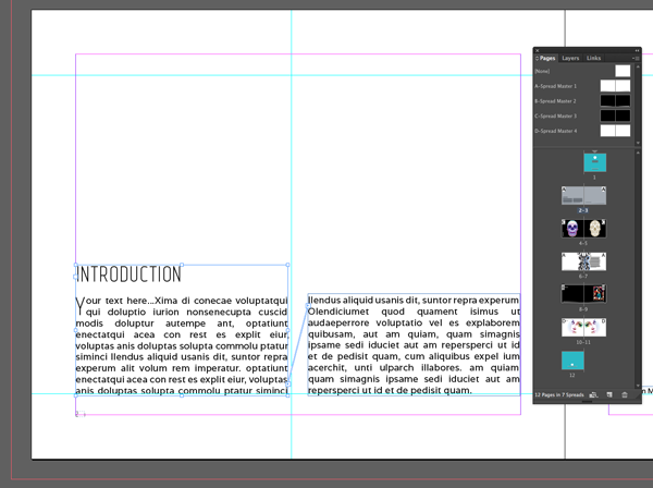
Go to the opposite Page 2. Use the Text Tool (T) to create a text frame with a Width of 96mm and a Height of 59mm. Rest the bottom of the frame against the bottom horizontal guidline and the left-hand side of the frame against the left-hand margin.
Copy, and Paste this text frame and reduce the Height to 46mm. Move this new frame to the right of the first text frame, resting the base again on the bottom horizontal guideline.
Click to select the original, left-hand text frame. At the bottom right-hand corner of the frame there is a small icon which looks like a ‘play’ button enclosed in a small white frame. Click this icon and click within the second text frame to link the two together.
Write ‘INTRODUCTION (paragraph break) Your text here etc…’ in the first box, and Type > Fill with Placeholder Text for the meantime if simpler.
Step 3
You can leave this page without images, simple and minimal. Alternatively, if you have a long landscape image you could run this along the top of the page. I created two image frames using the Rectangle Frame Tool (F) and placed the top and bottom halves of Sharon Milne’s Warhol-inspired Portrait in each frame respectively.
12. Prepare Your Pages for Sending to Print
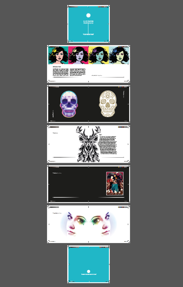
You now have 12 dynamic and engaging pages almost ready for the printers! First and foremost, do a final spellcheck, and ensure all color elements run up to the edges of the bleed.
Step 1
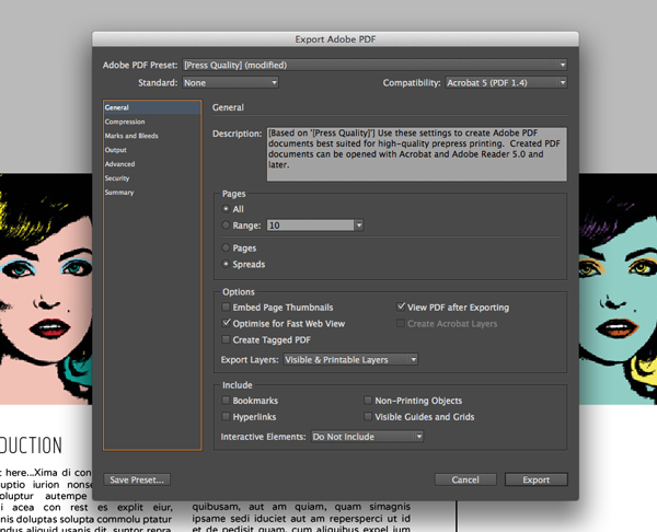
Then go to File > Export and select Adobe PDF (Print) from the drop-down menu. Choose an appropriate file name and location to save your PDF, then click Save.
Under General, and within the Adobe PDF Preset drop-down menu select Press Quality. Ensure Spreads is selected (not Pages).
Step 2
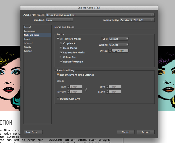
Under the Marks and Bleeds menu, select All Printer’s Marks and tick Use Document Bleed Settings. Click Export.
Well Done, Your Portfolio Pages are Finished!
Nice work, you now have your interior pages ready to be sent to the printers! If you haven’t already, see part one of this two-part tutorial to learn how to put together a cover for your book.
![]()
