As designers part of our job is keeping up to date with what’s happening in the industry, one aspect of which involves keeping an eye on the latest trends. Although it should be noted that ‘keeping an eye on’ and ‘being part of’ are two very different things.
The popularity of things like Dribbble rebounds just goes to show how inspirational we all find other people’s work. But there’s inspiration, and then there’s derivation.
Have you flirted a little too closely with trends? Here’s 12 signs that you’re a trendy designer:
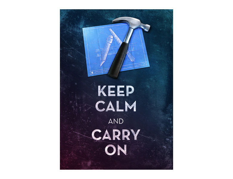
1. You made a spoof of the ‘Keep Calm’ poster
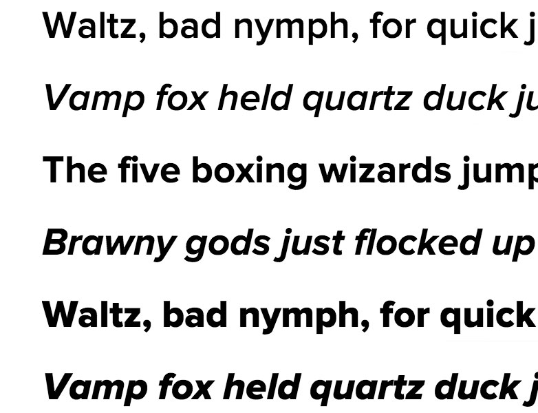
2. Your go-to font is Proxima Nova
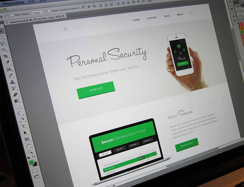
3. On Dribbble, you post angled photographs of your user interface designs rather than screenshots
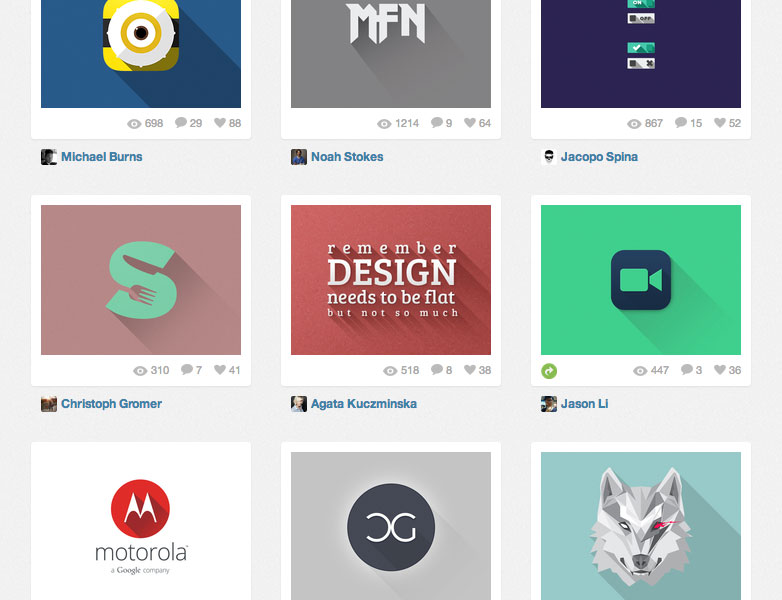
4. You recently started adding long shadows toeverything
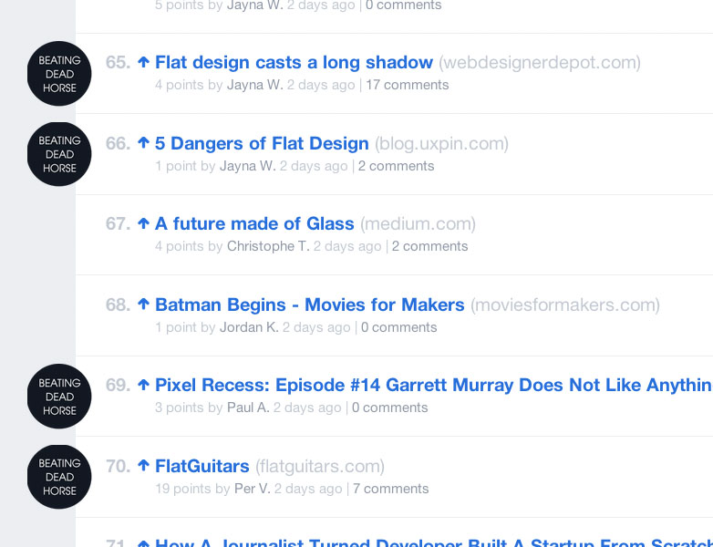
5. You’ve written a blog post about flat design
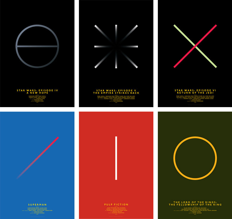
6. You’ve made your own series of minimal movie posters
7. Your personal logo features interlocking letters…
8. …or a crossed “X”.
9. You’ve released your own icon set
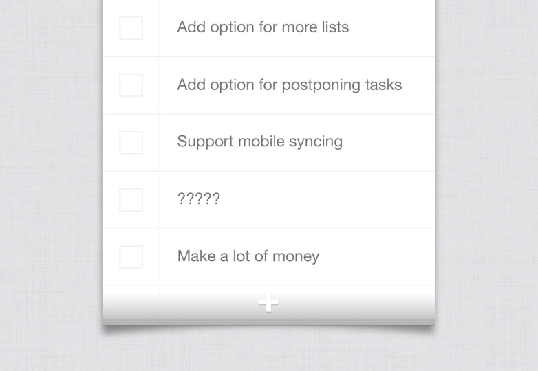
10. You’ve designed your own to-do app…
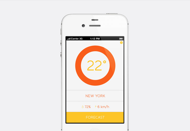
11. …or your own weather app
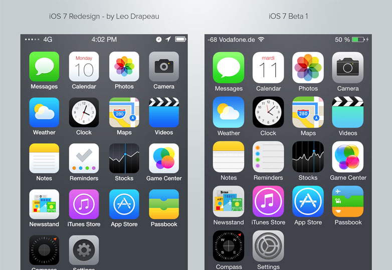
12. You’ve ‘redesigned’ iOS7
How many of these are you guilty of? Are there any other trends that are being abused? Let us know in the comments.

