I’ve never hidden the fact I need help with creating palettes when it comes to anything from illustration work to icon design to decorating my home. You can be a skilled sketch artist and designer, but color theory is still something which can be hard to grasp for some. This is why the new Adobe Kuler iPhone app and it’s integration with Adobe Illustrator CC has me jumping for joy so much I’ve needed a new computer chair!
Past Color Resources Available
Color theory is one of those fundamentals designers need to nail. It can be easy to grasp for some, but for others it is hard. There are so many colors out there, it can be hard to marry up the “right” palette of colors to make sure they look great together. Fair enough, you can learn the basics from the color wheel of which colors contrast with which, which colors are warm and which are cold colors… but beyond that, it’s a head scratcher.
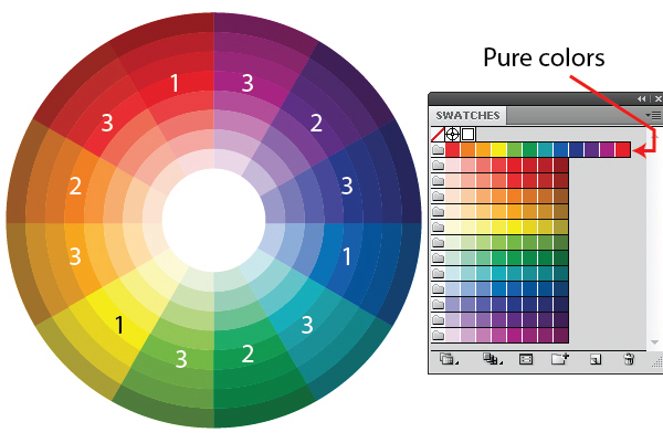
Recolor Artwork
Thankfully, as software develops, as does the tools we have available to us. Adobe Illustrator is certainly no exception.
With Adobe Illustrator CS3, Recolor Artwork was introduced. You could select several shapes at once, go into Recolor Artwork and then modify all the color groups in a matter of clicks, genius! It’s a tool very much at home in a vector application.
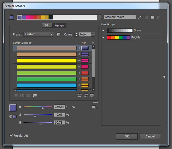
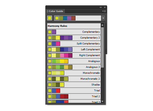
The Color Guide Panel
The Color Guide panel was also a great new addition. Need help making your colors more warm? Cool? More Saturated? Well this handy little panel not only helped you achieve this but also helped you with color inspiration. Clicking into the drop down menu gave you access to suggested palettes with Harmony Rules. When I discovered this panel, it blew my mind!
Adobe Kuler Was Born!
Then Adobe Kuler arrived. Unlike other tools available, Kuler is a web based and desktop application (via Adobe AIR) which allows you to collect themes and share them with the community. You could download any public available themes and open them in Illustrator. Not only that, you can even upload a photo and collect a variety of palettes from a single photo and modify each color as you desired. You could even download the Adobe Kuler Extension to import your palettes more conveniently! Check out this screen cast by Cheryl Graham on using Kuler with Adobe Illustrator.
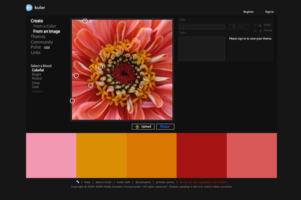
So we’re left with Kuler being able to gain palettes from a user uploaded photo and you can import the colors via a Kuler extension. It was only a matter of time that this work flow was made even easier!
Adobe Kuler: Now Available for iPhone!
It seemed logical for Adobe to release it’s own Adobe Kuler app for the iPhone (let’s hope for an Android version soon?!). The best thing about it, it’s completely free! I do love a good free app.
Download and Install Adobe Kuler
Do a simple search on the App Store for “kuler” and you should get it. Of course tap into it to read the features and reviews, or just tap install. You may come up with an error on downloading (as my husband did), however this may be because his iOS was not up to date.
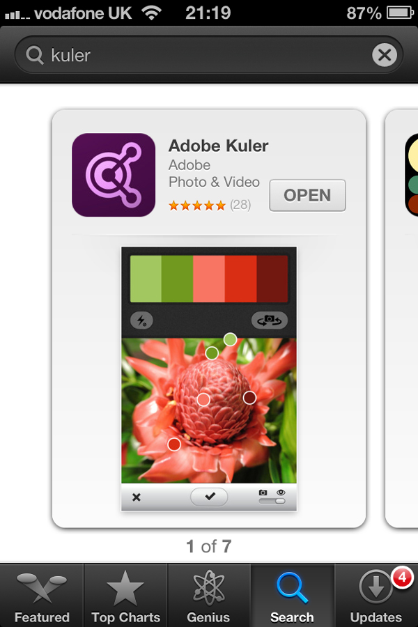
Then open it up to check it out. At this point you may be prompted for your Adobe ID. Even if you don’t have an Adobe Creative Cloud account, you can sign up for one for free. Do this by going to Adobe.com and register for an account.

Once you download it and install it, open it up and you’ll be welcomed with your camera active and it scanning the view for different hues of color. Now admittedly, I did something naughty on honeymoon in Greece this month. I downloaded and installed Kuler to have a play with it. So thankfully, we have some lovely Mediterranean views on the next series of screen shots.
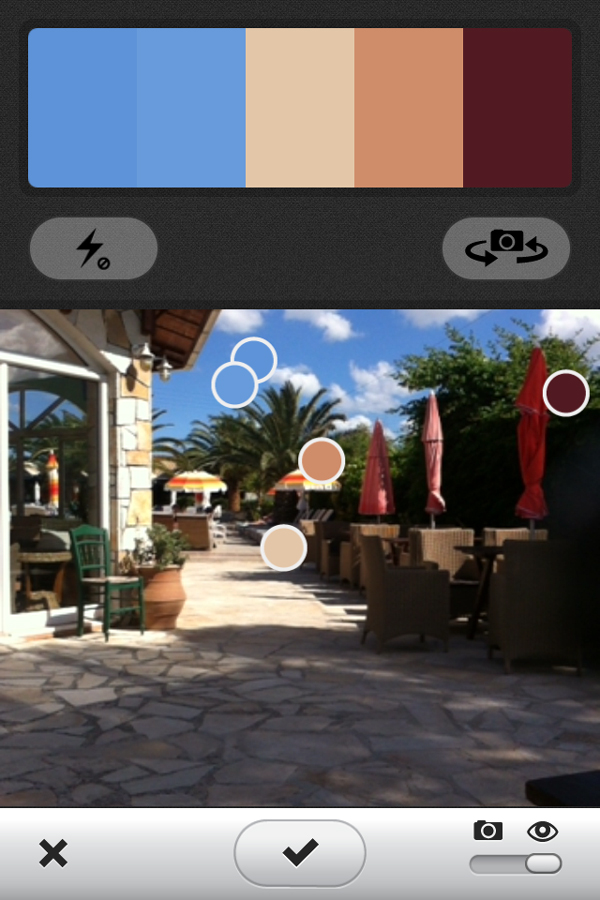
You’ll notice a couple of things when you’re in the viewer. You can enable your flash and switch the camera you’re using (Ooo, selfie palettes!). Being able to use the flash is a great option – especially if you’re inside and want to get that palette!
Once you lift your iPhone to a view you’d like to sample from, the color picking points will move around your camera view at short intervals sampling the colors you could combine to create a theme.
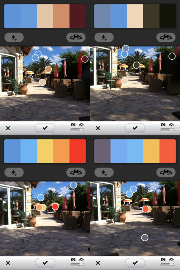
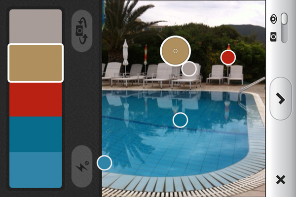
As you can see, it displays the colors above (or to the side in landscape) to show you the colors the pickers have chosen. Fancy eh?
Create a New Theme in Kuler
Step 1
Now you’ve opened Kuler and been hypnotized by the moving color pickers, it’s time to create a new palette. I noticed the parasols next to the pool have a great color scheme, so I’m going to create a palette from these colors.
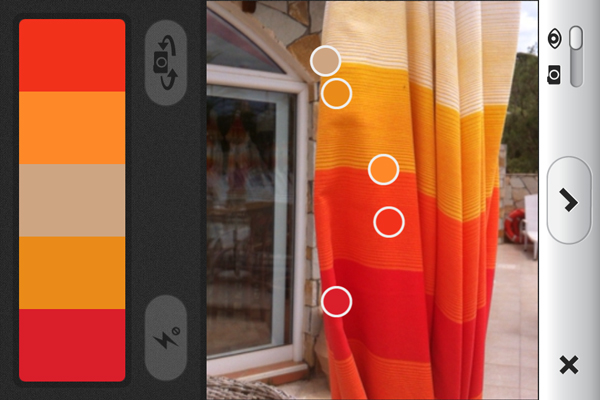
Step 2
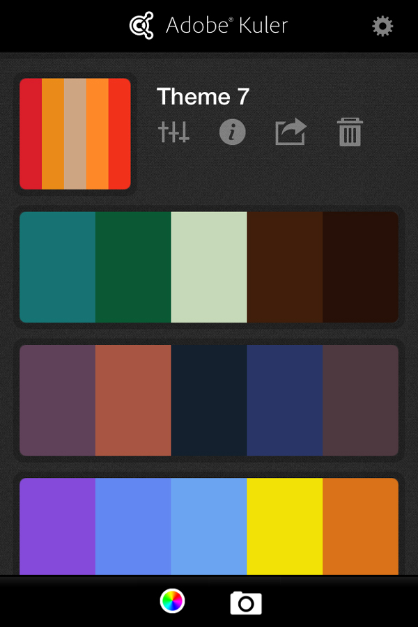
Once you’re happy with the colors it’s picked, click on the tick button and you’ll come to your listed themes (if you’ve got any previous from the web site) and your new theme will be automatically saved at the top.
You’ll also notice there are several options you can click on. There is an option to adjust the colors you’ve captured, then information on the theme, a sharing option (via Twitter and e-mail) and an option to delete. For now let’s click into the information section.
Step 3
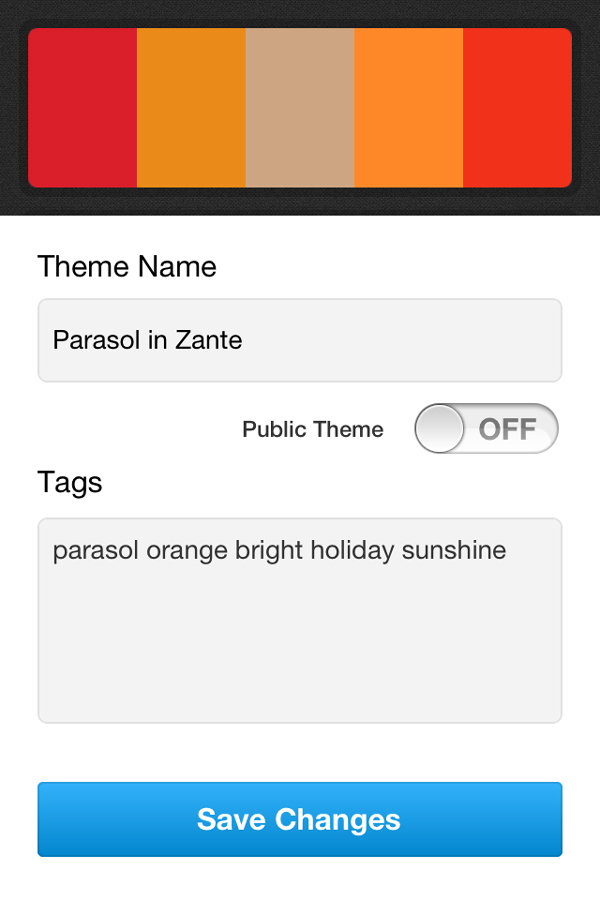
Here you can modify the name of the theme, whether others can view and use the theme when you enable Public Theme and any tags you may have to help make the theme easier to search on. Once you’ve completed these fields, click on Save Changes. Now your theme is saved and ready to download and use!
Modifying Colors via Adobe Kuler
Changing the Colors via the Camera View
So the color pickers are moving around and it’s not hitting the area of the view you wish to grab color from. What you can do is first tap the screen on the view and this will freeze the camera. Then, select the color from the palette you’re not wanting for the theme and you can then drag it over the spot you wish to sample. When you move around the picker, it will magnify the view so you can find the precise color you wish to grab.
From there, save your theme as you usually would by tapping on the tick icon.
Changing the Colors of a Saved Theme
So you may not be happy with all the colors Kuler has picked up. You may wish to modify one or more of the colors. So back to the list of themes and click on the sliders icon.
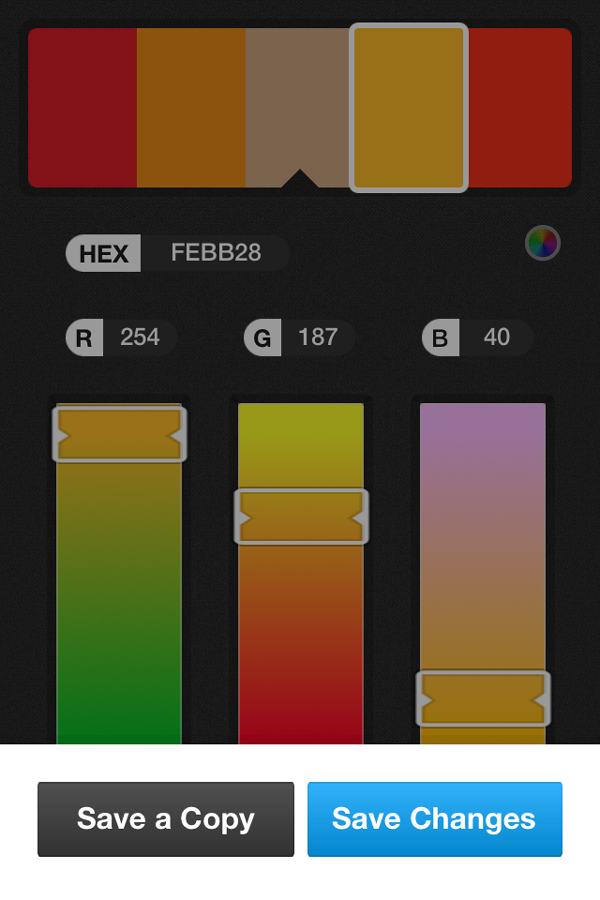
From here, you’ve got two choices. You can either select a color from the top of the screen and modify it using the HEX sliders…
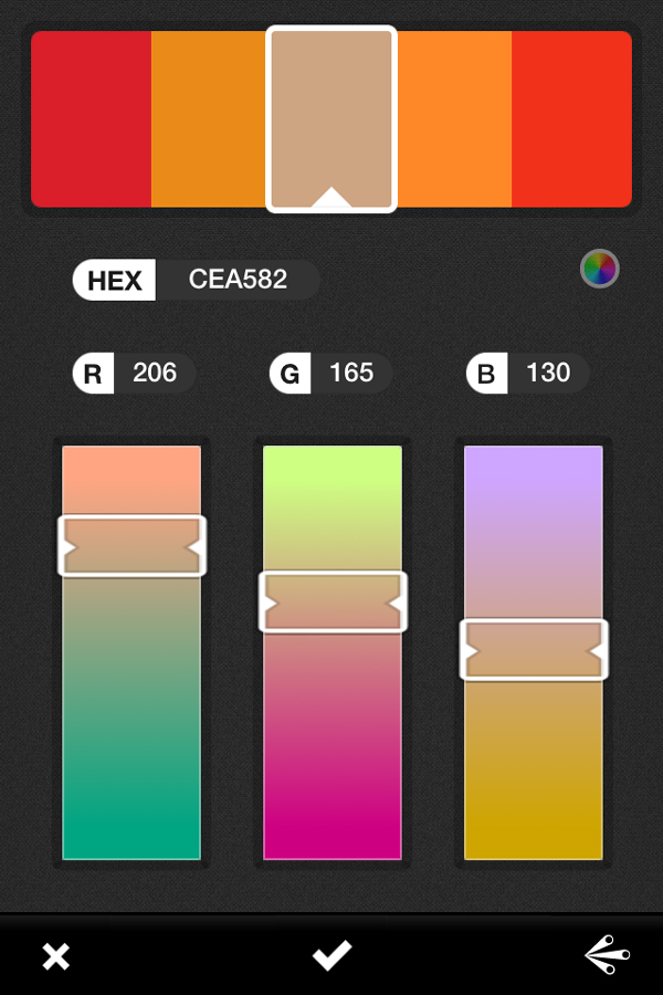
Or you can click on the icon in the bottom right of the screen. This behaves very similar to Harmony Rules in the Color Guide panel. So you can pick different types of themes based on the color you’ve selected from the palette!
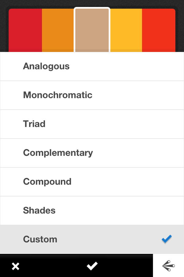
Once you’re happy with the theme, you can click on the tick and it will just ask you if you want to Save a Copy or Save Changes (the latter overriding the colors of the original theme).
Accessing Your Theme in Adobe Illustrator CC
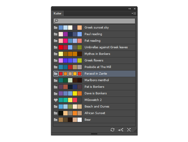
A great new addition to Illustrator, in Adobe Illustrator CC, is that there is a specific Kuler panel. This acts better than using the previous extension. As long as you’ve been signed into the Kuler app with your Adobe ID, you can open Illustrator CC and have access to your new themes straight away. If you’re not viewing it, be sure to click on the Refresh button.
You’ll notice one of the icons shows a heart instead of a folder at the left side. This is a theme I have previously favorite on the Kuler website that has automatically downloaded for me. Everything below that has been from previous tutorials I’ve created when I’ve included Kuler.
Capture Memories in Themes, Not Photos
As you can see from my Kuler panel, there are a lot of themes I’ve captured from Greece and they all do remind me of specific events. Maybe this is part of being a vector geek… colors may replace photos in my memory?
Anyway, Adobe Kuler is a fun app and it’s a great tool to use with Illustrator CC. It’s not without it’s annoying flaws which I found when I was playing with it. The camera view and changing colors wasn’t as user friendly as I hoped. If you’re new with iPhones and apps as I am, you may mis-tap from a color picker and end up tapping your screen and unfreezing it, thus loosing the palette you were aiming to get. For someone who always uses CMYK for their print illustrations, it would have been nice to have an option to use CMYK sliders (although understandable since you’re using a screen to pick them).
But you really can’t grumble too much, after all you don’t need a paid subscription to Adobe Creative Cloud to use the app and Adobe Kuler is free to use. Perhaps I’m trying to be as unbiased as I can being a fan of Adobe, but it really is hard not to love this nifty little app!
Have you used Adobe Kuler for the iPhone? What has your experiences been? How would you rate it?
