We are web designers and developers. As obvious as our work is (we build interactive media applications) there’s a deeper meaning to what we do. We analyze design problems and explore different concepts to solve them. This also means that we think of the communication between a device and the user. We develop that communication. We design what the user sees and does.
You are setting the stage for other people to perform. But you can never tell them what to do.
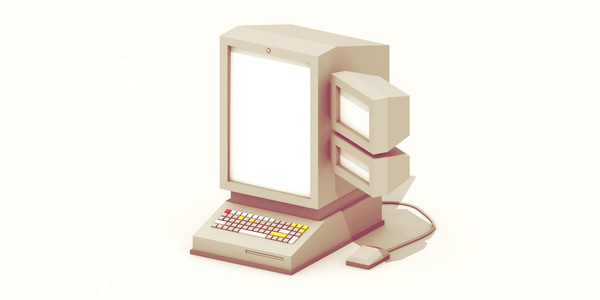
Designed by Timothy Reynolds
So, why are we exploring the future of interfaces? Simply, because we develop them. As media changes and evolves, so should we. It’s worth your time to see what the future might look like, as it will change the way we work and the products we deliver.
Let me give you a concrete example. Ten years ago, nobody had a clue that responsive design would become such an important key issue for our industry. Even to this day, there are still new websites being developed which aren’t responsive or have any kind of mobile contingency.
Users Have Changed
For a long time, we’ve been using a traditional way of working with media. We have a desk, a computer and the keyboard and mouse as input-devices. We have accepted that the internet is an essential part of our lives and it has become nearly impossible to completely disconnect, even if we would like to.
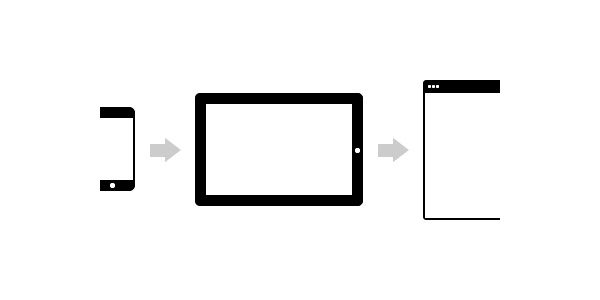
However, there’s a large shift going on at the moment. There’s a shift from desktop to mobile devices (and even beyond) and it forces designers to refocus. For most of us, this is an obvious evolution which is going on, but, it changes how we designers should look at the systems we develop.
In the past, in general we had a lot of control over our designs. There is a task and there is a consequence. Web design has become far more complex and it has become important to guide a user through one flow to optimize their user experience. We have to think of behavior patterns, desired outcomes and potential mistakes the user can make. We’re no longer developing a static experience, rather, we’re creating living, interacting systems.
Users’ behavior online also has changed incredibly. Google, for example, has divided their users in three main categories:
- The repetitive user: someone checking the same piece of information over and over again, such as e-mail or stock prices.
- The bored user: someone who has time to kill.
- The urgent user: a user with a request to find something specific and fast.
Your online habits make you a repetitive user on certain websites. Social media websites are great examples of this. The games you play online, or the news websites you check sometimes, are a result of you being a bored user. For example, when I’m bored and not feeling very productive, I like to spend time on Reddit. Finally, the urgent user is the target audience we often develop websites for during client work. They want information and they want it fast, such as the price of a product, a service they’re specifically looking for, or the closest location of something they need now. The key issue? Users want to achieve their goal now (or at least as quickly as possible).
For designing the best user experience, it’s always a good idea to keep these principles in mind. You should be able to tailor your website to make repetitive (predictable), bored and fast use as integrated as possible.
We’re Refocusing Constantly
We are a little bit confused of what’s really important in life
It’s amazing how mobile has became engrained in our lifestyle. Particularly since the arrival of notifications, we’re constantly refocusing our attention. The best concrete example I’m able to give is in conversations with friends. If you receive a notification or text message while having a conversation with your friends, the chances are quite high that you’ll peek at your mobile device.
We have to be aware of the consequences of the products we designers put in the world, as they can change behavior of people. Users’ divided attention can be enabling as well as disruptive. This is why the flow between an interactive screen and our real life should be as natural and accessible as possible. Users should comprehend interfaces in a glance.
The Coherent Experience
Digital natives expect that their favorite digital content follows them seamlessly through the world.
One interesting evolution is in the power of the multiplatform experience. Instead of products being accessible on one specific device and platform, slowly, everything is designed to have a fluid experience so you can recognize the same experience on multiple platforms. Saying that, it’s important to understand that each device and platform has its own strengths and weaknesses.
A great example is how Twitter translate the web experience to a mobile experience, and make both platforms successful by using the platform specific strengths to improve the features of their product.
Another strong evolution which has become very obvious in recent years is the rise of comfortable computing, with tablets being the perfect example of how our usage environment has changed. It’s become more than simply being about getting tasks done.
As designers, this means that we have to focus on the real human needs, instead of focusing on our regular design patterns.
The Future
What does the future hold? I can’t possibly know, but we can speculate..
Graphical User Interface
The graphical user interface isn’t exactly the future, rather it’s a current way of designing interfaces. The idea of graphical user interfaces is that you complete visual tasks to receive results, such as clicking on a link to open a new page.
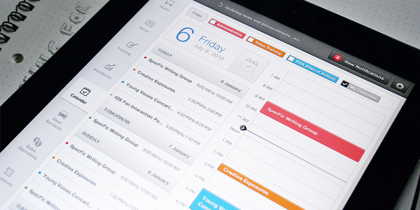
We guide our users through metaphors (such as the shopping cart icon) and standards we use in web design. Nothing new here.
Natural User Interface
The natural user interface is the current evolution we’re facing. It’s already used today, though to a lesser degree and it isn’t really being used in the standard web environment. It’s only a matter of time before the integration of natural interaction will become more prominent.
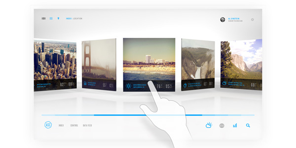
Natural user interfaces focus more on doing. Users interact with the device or platform to achieve results, ideally enjoying the actual interaction as much as the accomplishment itself. The interaction feels fluid, direct and organic. Gestures especially (tools such as the Leap Motion can play an important role in this) are important assets in natural user interfaces.
Existing examples include websites which have the functionality you can swipe (on tablets for example) to navigate through a gallery slider.
For quite some time, there’s been reference to Minority Report and Iron Man for an example on how the future of interfaces could be. The prospect excites people. The problem with these ideas is that much is focused on interface eye candy, rather than that we actually try to design more intuitive and effective ways of interface design. It shouldn’t just look good, it should work as well as it looks.
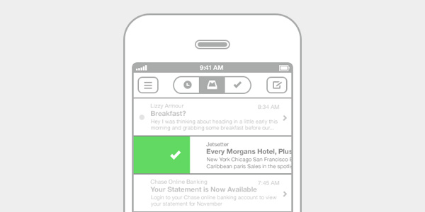
Content comes first, navigation comes second.
A key element in natural user interface design is direct manipulation. Users love to have the feeling that they’re directly engaging with a screen (use of gestures).
Another key element is that content becomes a major part of the interface. This concept already exists, such as your albums in iTunes or your books in iBooks. Our interfaces become a general framework users see their preferred content in. Content will become more aimed at the specific needs of the user. This is already happening, the best example being social media. My news feed on Facebook is obviously completely different than yours as I’m receiving content based on my preferences (my friends, in this case). This concept means that we’re trying to decrease the amount of navigation tremendously by providing the correct content in the first place, so that navigation is required as little as possible.
Provide immediate value whenever you open a website or application.
Organic User Interface
While we’re still slowly moving from graphical user interfaces to natural user interfaces, a third spectacular evolution is on its way. Although it may take a while before we see and use it, it’s closer than might seem at first sight. An organic user interface means that we manipulate the actual physical shape or position of a device to control it.
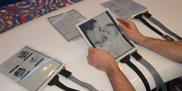
I’m referring in this case to bendable screens, and although this technology is very much in its infancy, it offers so many incredible opportunities to interact and navigate through devices.
Naturally, an organic user interface offers way more possibilities for input (and even output) than the previous interface concepts. At the moment we’re used to point and click, though we’re getting more involved with gestures, touch and (thanks to gyroscopes in devices) tilting and rotating, although it’s still limited on the web. Eventually, we’ll be bending, deforming and manipulating actual physical objects.
If you’re interested in these kind of projects, the Human Media Lab has quite a collection.
Conclusion
We can conclude that these are exciting times for us as web designers. Our function appears to be shifting more towards the job of interface designers and information architects. With devices and their interfaces changing, so too will websites and their functionality.
How do you see the future? How will our role change? What new technology will we adapt? Although much can be questioned at the moment, one thing is for sure: we’ll be stepping away from the classic job of web designer as we know it today.
