Typographic posters focus on the use of text as the main visual element. Instead of relying on images or illustrations, the message is shaped through font choice, layout, and visual rhythm. Typography becomes both content and form. These posters often explore contrast, balance, and alignment. Designers experiment with scale, weight, and positioning to lead the viewer’s eye. Each decision affects how the message is read and felt. The structure isn’t decorative—it shapes meaning.
Spacing and grids help maintain order, while intentional disruption can create tension. A clean grid can hold chaotic type in place. Or, structured compositions can highlight subtle shifts in form. Designers work within these boundaries to test how type can communicate beyond words.
Typography posters also play with real-world placement. The surrounding environment becomes part of the design. When viewed in context on walls, windows, or streets, the message gains another layer of meaning.
One designer who uses this approach with clarity and purpose is Kuvvat Ashyrov, based in Munich, Germany. His work shows a strong understanding of structure, typography, and spatial relationships.
You may also like:
Creative Typographic Posters with Visual Structure
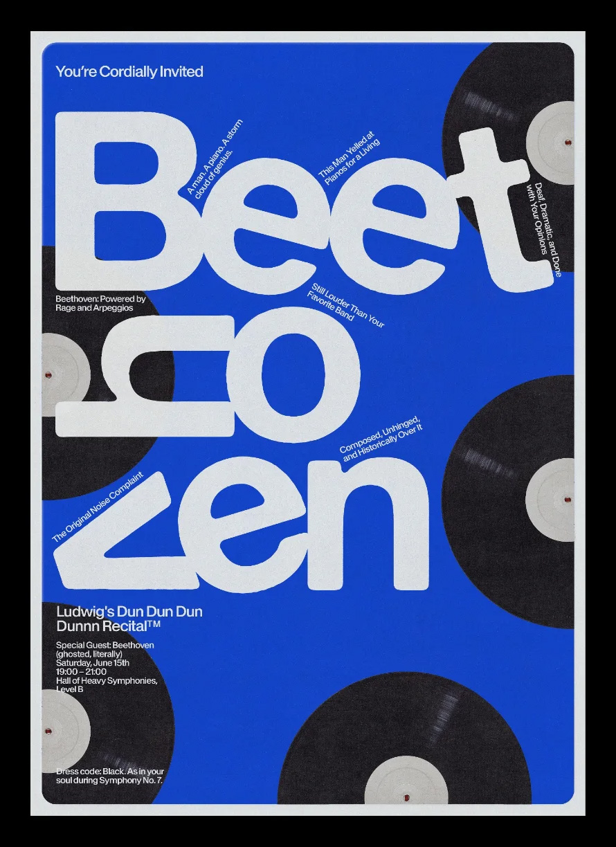
Ashyrov’s posters explores the tension between visual structure and conceptual chaos, the posters use typography as the main component, shaped through careful design choices. Each poster reflects thoughtful construction. His use of type, spacing, and visual tension feels grounded in real-world application, not just theory.
Explore his collection to see how he uses visual structure as a core element. His work reflects a clear point of view and a consistent design approach.


Typographic posters offer more than aesthetic appeal. When designed with structure and intention, they become tools for clear communication. Designers like Ashyrov show how typography can carry meaning without relying on extra decoration.
Behind the Posters: Thoughts from the Creators
This project is a personal exploration of narrative design, typography in context, and visual satire. All images and layouts were created, styled, and written as part of a self-initiated series.
(Visited 2 times, 3 visits today)