Summary:
Alternate methods for accomplishing frequent actions in user interfaces support expert users by speeding up their interactions, without hindering novice users.
Designing for expert users requires balancing learnability with efficiency. While new users need an intuitive interface to start quickly, expert users demand features that improve speed and productivity over time. Any system that will be repeatedly used should cater to both new users and expert users by including accelerators to allow people to complete certain routine tasks quickly and easily.
What Are Accelerators?
An accelerator is a UI feature that speeds up an interaction or process.
Also referred to as shortcuts, accelerators enhance user interfaces by providing an alternate method for accomplishing a specific action and thus allowing expert users to complete a common task more quickly and efficiently. Accelerators should be additional, alternate ways to accomplish a task — something that expert users can take advantage of, but that others can ignore completely.
Accelerators make the system more flexible and efficient — one of the ten usability heuristics. A highly flexible system satisfies both experienced and inexperienced users by allowing each to complete an action through whatever method works best for them.
Typically, all users hit an efficiency plateau once they have fully learned an interface, where further repetitions of a task do not significantly reduce the task time. Using an accelerator helps expert users push past that plateau: they can become even more efficient by adopting the faster method of completing that same task (once they have learned it, of course).
Examples of Accelerators
Common accelerators include:
- Keyboard shortcuts: Ctrl+C for copy, Ctrl+V for paste
- Gestures: Swipe-to-delete, double-tap to react, right click on a mouse, two-finger scroll on a trackpad
- Voice commands: “Start bedtime” to a voice assistant
Discoverability of Accelerators
Because accelerators are enhancements to the interface, discovering them should not be critical to learning and using the interface. In fact, you shouldn’t aim to expose new users to every accelerator, as that would be overwhelming and not helpful. New users just want to get started and complete their tasks — not read user manuals — and they should be allowed to do so. Only those users who have learned the basics and continue using the system should be exposed to the related shortcuts.
That said, we can’t know precisely when a user is “ready” to learn an accelerator. Some users may never look for these shortcuts, while others may do so immediately. For that reason, accelerators should be readily available, yet easy to ignore.
Incorporate the following strategies when considering the discoverability of accelerators.
Gradually Reveal Accelerators as Users Become Accustomed to the System
Novice users are focused on completing their primary tasks and will become overwhelmed if accelerators are introduced too early. Let users explore core functionality and reveal accelerators as they become more familiar with the interface.
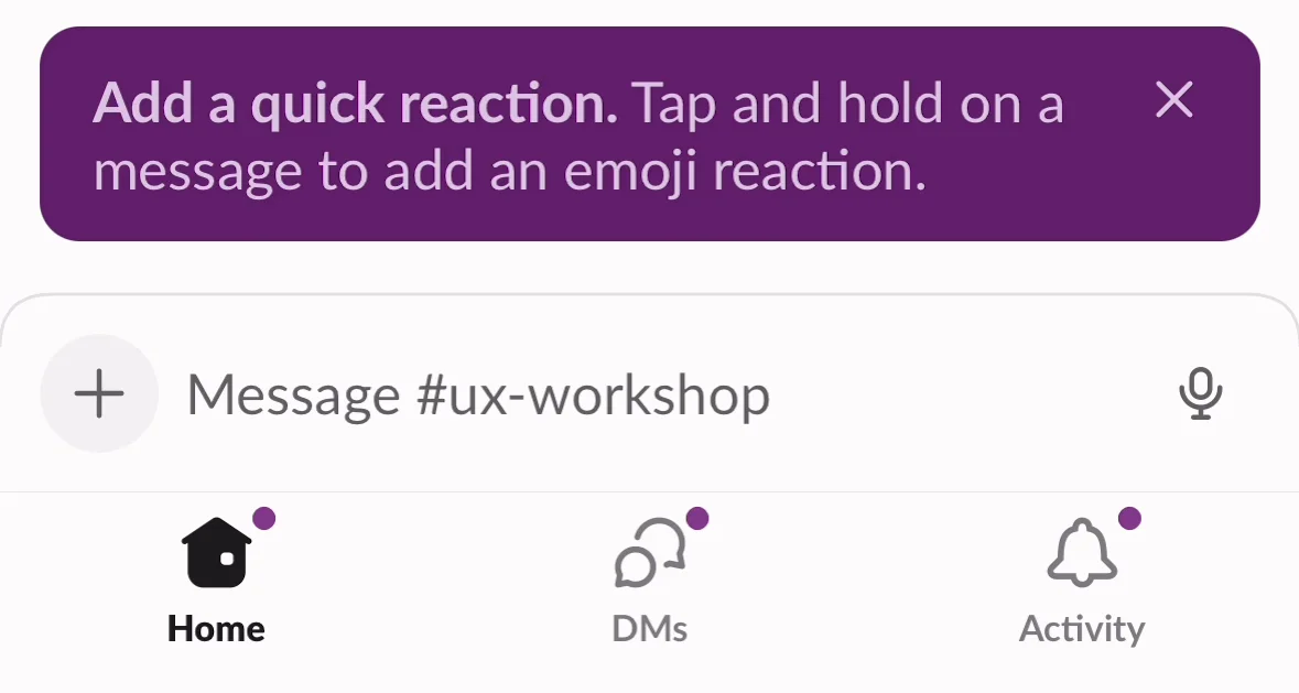
Provide Contextual Hints
For less-obvious shortcuts, it’s best to introduce accelerators after a user performs the action in the standard way. Just-in-time help (also called push revelations) makes it more likely that users will attend to the tip since it relates to their current task. Focus on a single action at a time using short, scannable messages.
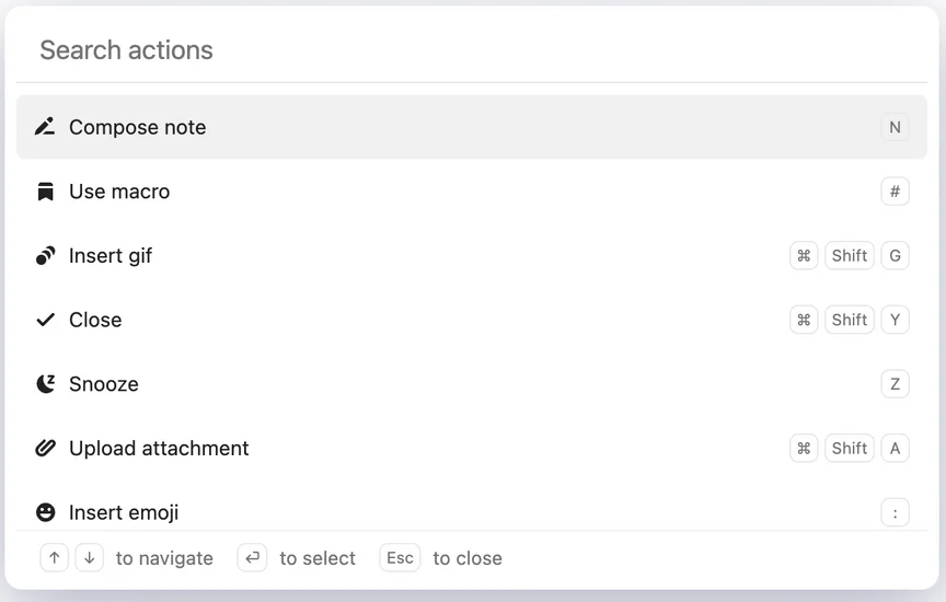
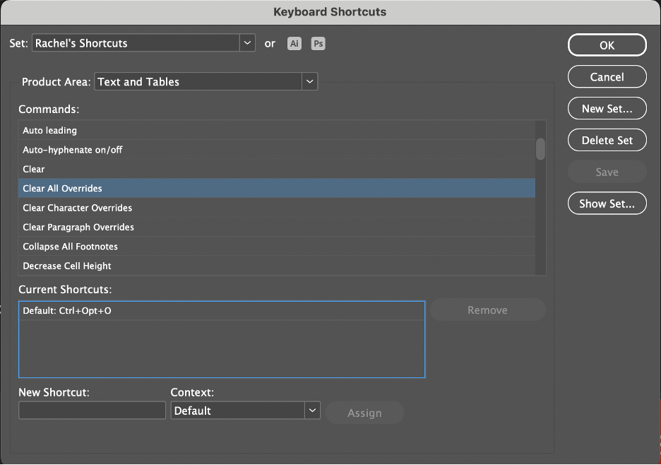
Display Keyboard Shortcuts Inline
Common shortcuts should be visible and easily accessible in the interface. Style them in a way that differentiates them from the corresponding GUI-command label. For example, you might right-align shortcuts next to the corresponding action in a dropdown menu or show them in parentheses. Different styling allows expert users to quickly spot them while novice users can ignore them.
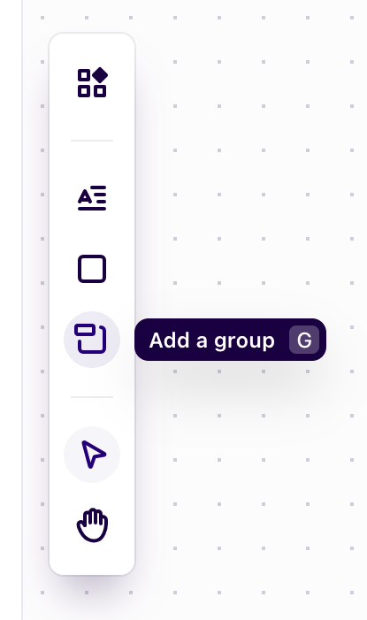
Show Accelerators Within a Tooltip or Hover
You can also provide the accelerator in a tooltip or hover. While this approach will help users discover the accelerators without disrupting their workflow, hover actions won’t work for users who do not use a mouse (e.g., because of physical limitations or because they use a touchscreen).
Place Complex Accelerators in Multiple Locations
Macros and automation tools will be more discoverable if found in multiple places, such as menus, toolbars, or setup screens.
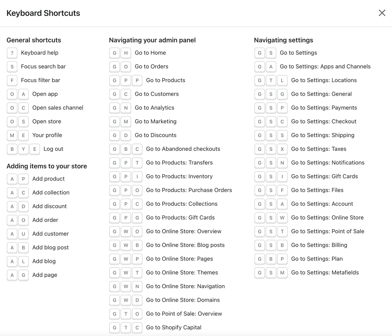
Create Cheat Sheets for Expert Users
A last resort is to create a list of all shortcuts, accessible within the Help or Support documentation. Such a list is not very discoverable, as most users don’t seek this type of information out but can be helpful for expert users who want to see everything available to them quickly.
Accelerator-Design Best Practices
Not all actions within a system need an accelerator. Focus on those features that many people tend to use repeatedly. Ask yourself: What are the core actions within the system? Increasing efficiency and productivity really matters only for repeat tasks; thus, these routine actions are good candidates for adding an accelerator. Learning requires repetition, so people will learn a shortcut better if it is an action they repeat often.
Keep in mind that an accelerator is not a new feature — it is merely an additional way of completing an existing action. Those users who never discover the accelerator should be able to complete the same task in another way.
Prioritize Efficiency Without Overwhelming Users
Accelerators should be designed for tasks that users perform frequently. For example, keyboard shortcuts for common actions — such as copy, paste, and save — improve efficiency and reduce repetition.
However, too many accelerators in an interface can overwhelm users, especially those new to an application. Start with the most used actions and introduce additional accelerators gradually as users become more familiar with the interface. Expert users may even benefit from customized accelerators to fit their specific workflows.
Maintain Consistency Across Platforms
When designing cross-platform applications (web, mobile, desktop), make sure that common shortcuts and gestures are consistent across platforms. For example, a double-tap-to-react feature should work the same in a mobile app as it does on a responsive website to avoid confusing users who switch interaction channels.

Do not override commonly known shortcuts, such as those for copy, paste, select all, and print, to prevent errors and accelerate learning of the interface. You can also take advantage of platform-specific gestures, such as long press, swipe, or double tap on mobile devices.
Provide Visual Cues and Feedback
Tooltips, hover states, or contextual hints are great ways to teach users about accelerators without overwhelming them. For example, hovering over a button can reveal its corresponding keyboard shortcut, while a tooltip can introduce touch gestures or complex commands.
Regardless of how you introduce an accelerator, always provide feedback to users that the action has been successfully completed. You can do this with an animation, highlight, or confirmation message.
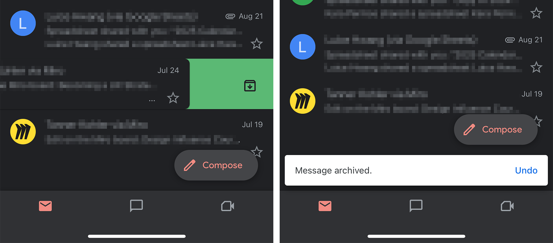
Design for Error Prevention and Recovery
Provide a safety net for users to undo actions performed via accelerators on the off chance that they triggered them accidentally. A confirmation dialog not only reassures the user that their action was correct (as shown above) but also serves to prevent unintended actions that could lead to data loss or significant changes.
Conclusion
Repeat users who are already familiar with an interface want to be efficient, whereas novice users need the interface to be as explicit as possible so they can find their way around. Accelerators help balance the needs of both types of users and enhance an interface by giving them control over completing an action. This is what makes a system highly flexible — and ultimately widely usable.