That’s right—it turns out we can animate some of the CSS Grid properties! Today, we’ll see this behavior in action by building a responsive image grid with hover effects. Taking this opportunity, we’ll also utilize the powerful :has() CSS selector.
Let’s get started!
Our Image Grid
Here’s what we’re going to create—be sure to view the full screen demo on a large screen (≥900px) and hover over the cards:
1. The Markup
We’ll start by placing six cards inside a container. We’ll wrap the first three and the last two within nested containers, as you can see from the markup below:
1 |
<div class="grid"> |
2 |
<div class="sub-grid sub-grid-1"> |
3 |
<article class="card">...</article> |
4 |
<article class="card">...</article> |
5 |
<article class="card">...</article> |
6 |
</div>
|
7 |
<article class="card">...</article> |
8 |
<div class="sub-grid sub-grid-2"> |
9 |
<article class="card">...</article> |
10 |
<article class="card">...</article> |
11 |
</div>
|
12 |
</div>
|
Now, each card will have the following structure:
1 |
<article class="card"> |
2 |
<figure>
|
3 |
<img width="IMG_WIDTH" height="IMG_HEIGHT" src="IMG_URL" alt=""> |
4 |
<figcaption>
|
5 |
<div>
|
6 |
... |
7 |
<span>
|
8 |
by <a href="UNSPLASH_URL" target="_blank">...</a> |
9 |
</span>
|
10 |
</div>
|
11 |
</figcaption>
|
12 |
</figure>
|
13 |
</article>
|
2. The Styles
On small screens (<900px), all cards will be stacked and their info will be visible.


On larger screens, we’ll have a three-column layout.
Here, there will be two scenarios that will be checked with the help of the hover media query:
- If we see the page from a device that doesn’t support hover, our gallery will look like this.


- If we see the page from a desktop browser or a device with a hover, the gallery layout will change to this:


In that case, we’ll grayscale all cards and hide their details. When the user hovers a card, we’ll increase its size and show its info. More on that in a moment.
Three-Column Layout
Let’s discuss our three-column layout a bit more thoroughly.

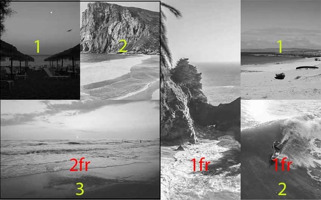
- We’ll set it up using CSS Grid.
- The first column will be twice the size of the other two.
- Inside the first column, we’ll have a nested grid where the third column will be twice the size of the other two and sit below them. The rows’ height will be 40vh and customizable through the
--half-heightCSS variable. - The height of the first column will be twice the height of the other two (80vh). Again, we can customize it through the
--heightCSS variable. - Inside the third column, we’ll have a nested grid where the columns will be stacked, and the rows’ height will be also 40vh.
Here are the related styles:
1 |
:root { |
2 |
--height: 80vh; |
3 |
--half-height: calc(var(--height) / 2); |
4 |
}
|
5 |
|
6 |
@media (min-width: 900px) { |
7 |
.grid, |
8 |
.sub-grid { |
9 |
display: grid; |
10 |
}
|
11 |
|
12 |
.grid { |
13 |
grid-template-columns: 2fr 1fr 1fr; |
14 |
}
|
15 |
|
16 |
.sub-grid { |
17 |
grid-template-rows: var(--half-height) var(--half-height); |
18 |
}
|
19 |
|
20 |
.sub-grid-1 { |
21 |
grid-template-columns: 1fr 1fr auto; |
22 |
}
|
23 |
|
24 |
.sub-grid-1 .card:last-child { |
25 |
grid-column: 1/-1; |
26 |
}
|
27 |
|
28 |
/*.sub-grid-2 {
|
29 |
grid-template-columns: 1fr;
|
30 |
}*/
|
31 |
}
|
Hover Effect
Each time we hover a card/column, we’ll expand its width or height to produce a zoom effect. As we’ve used CSS Grid to structure the layout, we’ve to update the values of the grid-template-rows and grid-template-columns properties on hover.
But, here’s the thing: these properties are set on the ancestor element and not on the card itself. Normally, we would use JavaScript to update them, but thankfully, the :has() relational selector makes it possible.
Animation #1
Let’s see how this selector works in action.
Consider the second column of our grid.


Initially, we have this rule:
1 |
.grid { |
2 |
grid-template-columns: 2fr 1fr 1fr; |
3 |
transition: all 1s; |
4 |
}
|
As soon as we hover over that card, it’ll expand to cover the whole grid width.


The CSS rule that will do the magic is this one:
1 |
.grid:has(> .card:hover) { |
2 |
grid-template-columns: 0fr 1fr 0fr; |
3 |
}
|
The rule above will check if an immediate grid column is being hovered. If that condition is fulfilled, it’ll update the value of the grid-template-columns property so that the first and third columns become hidden while the first one expands to occupy their space.
Use 0fr instead of 0 to make the animation work!
Animation #2
Let’s see another example.
Consider the first nested column of the first column.

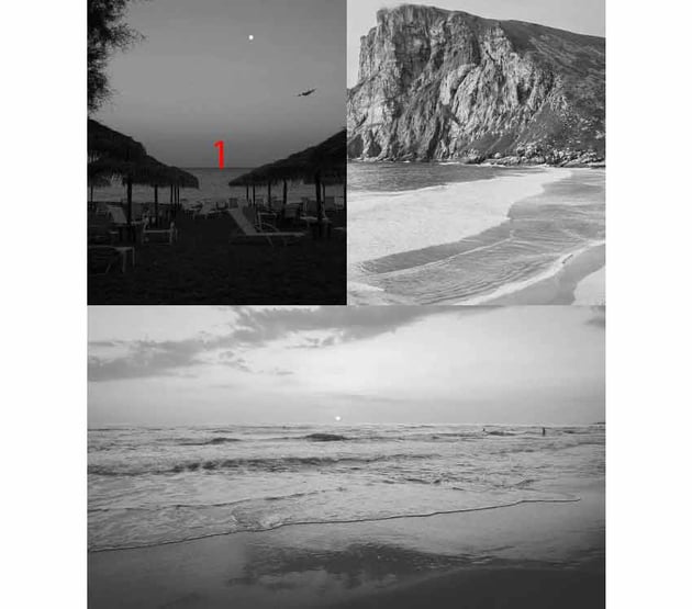

Initially, we have this rule:
1 |
.sub-grid-1 { |
2 |
grid-template-columns: 1fr 1fr auto; |
3 |
transition: all 1s; |
4 |
}
|
As soon as we hover over that card, it’ll double its size and hide the second card like this:


The CSS rule that will do the magic is this one:
1 |
.grid:has(.sub-grid-1 .card:first-of-type:hover) .sub-grid-1 { |
2 |
grid-template-columns: 1fr 0fr auto; |
3 |
}
|
The rule above will check if the first nested column of the first grid column (which acts as a grid container) is being hovered. If that condition is fulfilled, it will update the value of the grid-template-columns property so that the second nested column becomes hidden while the first one expands to occupy its space.
Use 0fr instead of 0 to make the animation work!
Animation #3
Let’s finish with another example.
Consider the first nested column of the third column.

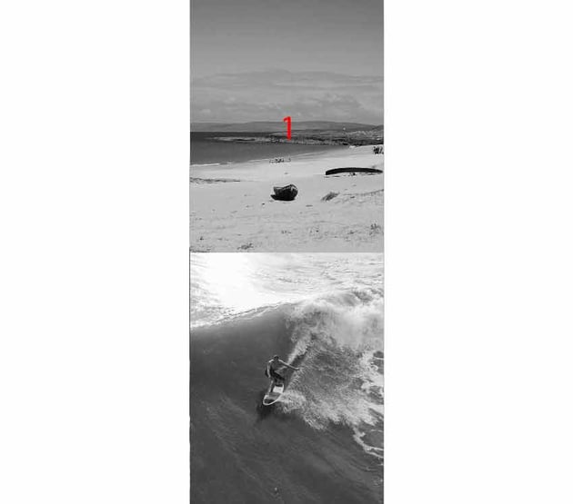
Initially, we have this rule:
1 |
.sub-grid-2 { |
2 |
grid-template-rows: 40vh 40vh; |
3 |
transition: all 1s; |
4 |
}
|
As soon as we hover over that card, it’ll double its height and hide the second card like this:


The CSS rule that will do the magic is this one:
1 |
.grid:has(.sub-grid-2 .card:first-of-type:hover) .sub-grid-2 { |
2 |
grid-template-rows: 80vh 0; |
3 |
}
|
The rule above will check if the first nested column of the third grid column (which acts as a grid container) is being hovered. If that condition is fulfilled, it will update the value of the grid-template-rows property so that the second nested column becomes hidden while the first one expands vertically to occupy its space.
You can see the rest of the styles by clicking on the CSS tab of the demo—I’ve used CSS nesting for the card styles.
Conclusion
Done! During this tutorial, we learned how to animate CSS Grid layouts with the help of the powerful :has() CSS pseudo-class. Hopefully, you enjoyed our project and gained some new knowledge.
Again, here’s what we built today:
As always, thanks a lot for reading!