Summary:
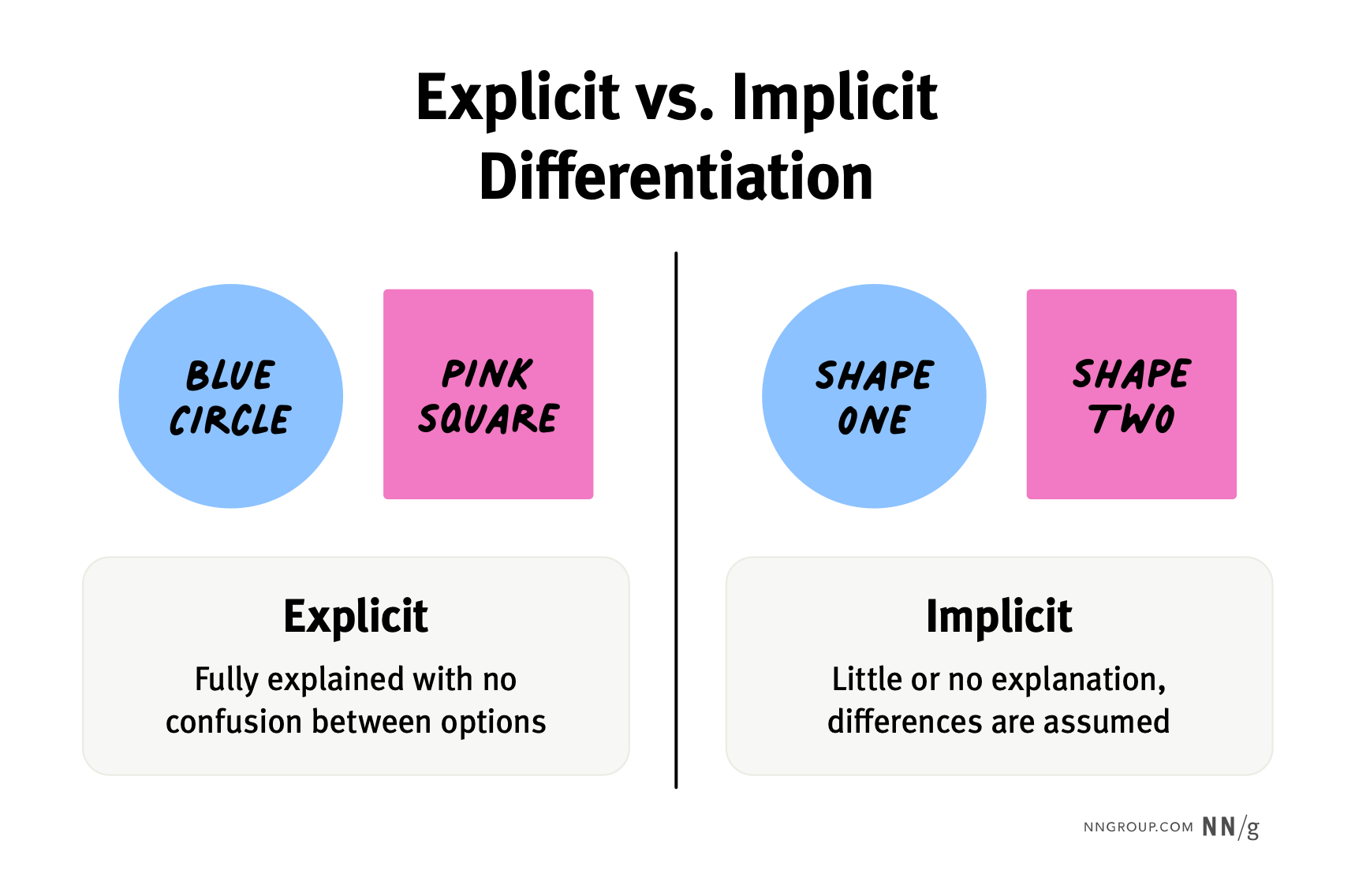
When the key differences between choices are implied or buried, users often select the wrong option or misunderstand the features.
This is an updated version of an article written by Jakob Nielsen in 2013.
Users are bombarded with choices on the internet. That’s why the best websites make it easy for users to analyze options and make informed, low-stress decisions.
One easy and effective way to improve decision making on your website is to distinguish between choice options clearly. Emphasizing the attributes that differ in choices with minimal distinction and noting the key differences in choices with many dissimilarities will greatly improve users’ confidence in making choices on your site.
For more information on improving the decision-making experience, check out our new report: Helping Users Make Decisions: Reduce Choice Overload and Avoid Overwhelming Users.
Explicitness Guidelines
Don’t assume that your users can figure out and prioritize options on your site by themselves. Without explicit differences, users are likely to assume all choices are the same or fret over the smallest distinctions. The decision-making process will be slowed down and needlessly complicated.
Instead, help users make the right decisions by following two key guidelines.
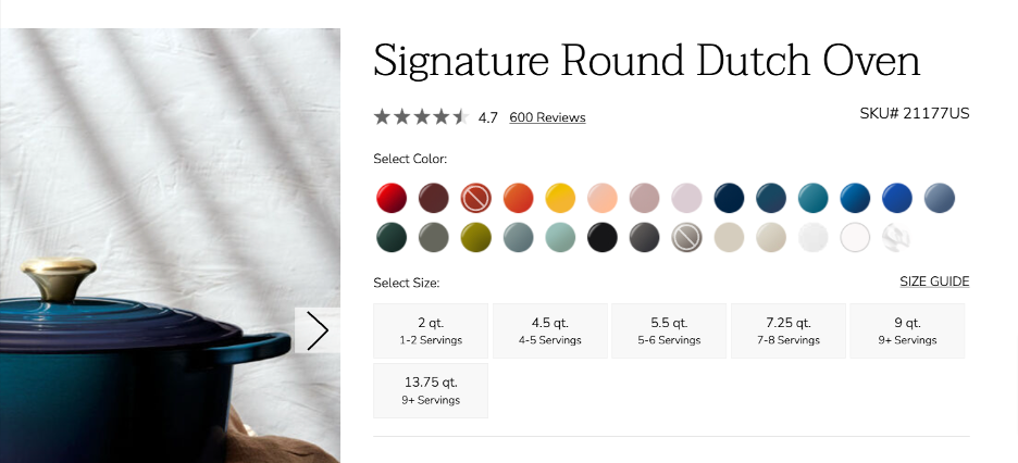
Highlight the Differences
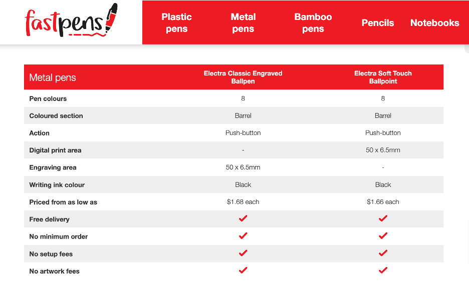
If options differ on only a few attributes, highlight those features in a comparison table or move them to the top of the list. Sometimes, you can achieve additional clarity by merging cells across columns for attributes that are the same for all products.
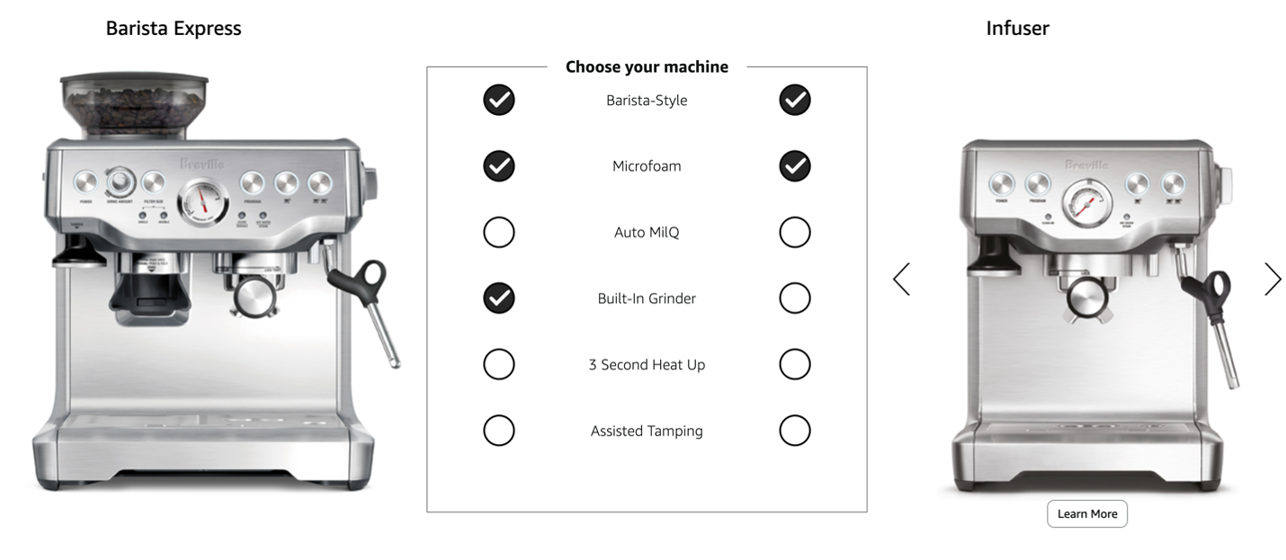
Highlight What’s Important
If there are many differences but only a few are truly important, highlight these key differences to focus users’ attention on the things that matter. You can also use progressive disclosure to give details on minor issues to the people who need them — and avoid overloading everyone else with extraneous information.
Explicit Copy
Even if options have only a few simple distinctions, users might overlook or misunderstand their choices if the copy leaves exact differences to the imagination.
For example, in past studies of university-website usability, NN/g tested different ways of explaining tuition rates for university students. Confusing wording, paired with teenagers’ developing research and attention skills, made it unlikely that they could distinguish between resident (or in-state) and non-resident (or out-of-state) tuition.
Take this example from the University of West Virginia. Here, the difference between in-state and out-of-state students was implied but not explained. It would be easy for someone unfamiliar with this term (like a teenager exploring colleges for the first time) to mistake its meaning.
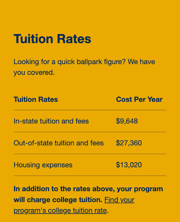
In addition, Housing expenses could also be confusing, as some readers might have assumed that it covered any type of living arrangement (including living with parents), even though this cost likely applied only to those who live on campus.
A better option would be On-campus housing expenses or Dormitory expenses, to explicitly state the charge and fully inform prospective students of the cost of attendance.
Finally, the table did not even state all the key differences. Users had to navigate to another page to determine the additional costs associated with specific majors. When users need to make an expensive decision like which university to enroll in, designers must explicitly lay out all the differences and fees to create a positive decision-making environment.
In contrast, the University of California (UC) San Diego explicitly showed the difference in options. By including the state before resident, the table reduced ambiguity around the term. The table also clearly broke down the differences in tuition by cost and even clarified potential housing expenses by listing the estimated cost for all housing options.
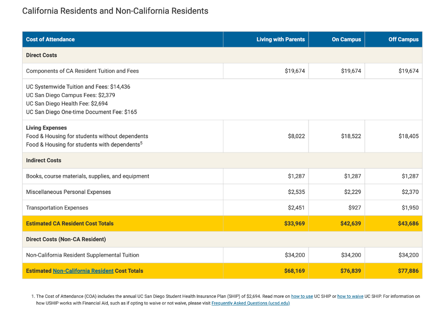
Best of all, UC San Diego (literally) highlighted the key differences, allowing users to quickly and clearly see the difference in tuition prices.
By being explicit about all the different tuition options, UC San Diego created trust with prospective students, allowing students to feel more confident in selecting it as their university.
Explicit Search-Engine Results
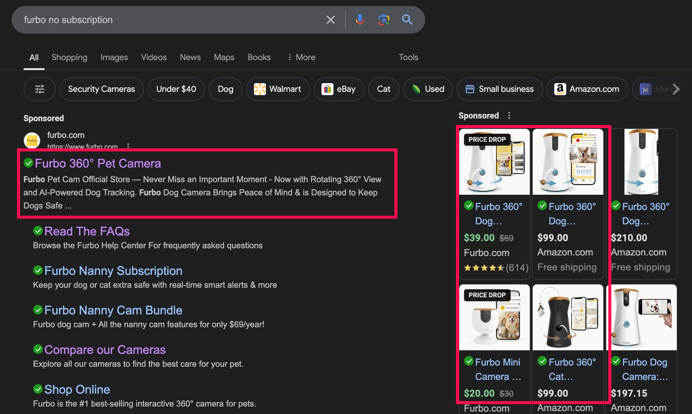
Being explicit matters as much on search-engine results pages (SERPs) as on your website. Your users should be able to make the right choice, no matter where they make it.
SERP titles and descriptions should clearly state the product or service offered by the link. If your company offers two similar items, take special care to make them stand out from each other. There should be no ambiguity as to what the search result refers to. Clear copy is even more important on SERPs, as users have less detailed visuals to provide differentiation. The lack of visuals can become especially frustrating for the user if two options are not visually distinct. Good differentiation in copy can ease these frustrations and distinguish between the listings.
Finally, ensure you have strong SEO, as users rarely look beneath the first few options. The choice they’re looking for should appear early so they don’t spend needless time searching or choosing the wrong option.
Why Does It Matter?
Good UX ensures that users make the correct choice the first time or, if they do make a mistake, that they don’t feel it’s the website’s fault. Presenting the difference in options explicitly is the first step in guaranteeing that users make the right choice.
When the differences between options remain implicit, you increase the likelihood that users will select the wrong option. When they do, you cost them time, frustration, and sometimes money. If they catch the mistake, they suffer the interaction cost of returning and finding the right selection.
Each mistake made on your website costs your company goodwill, resulting in a negative halo effect.
Guaranteeing Explicitness
As we always say — you are not the user. And you are likely not the person making these important decisions on your website.
The distinction between implicit and explicit differentiating criteria is one of the key usability determinants for any system that offers multiple options. Unfortunately, it’s a design issue easily overlooked by people who know too much about the system — a.k.a. anybody on the design team.
In our tuition example, anyone in a university-admissions department probably thinks that in-state tuition is a highly explicit description of that option. Such distinctions are obvious to people with well-formed mental models of the domain. However, new users approach your design with a fuzzy mental model.
So, anytime you hear design-meeting participants say “X is obvious,” remember that it might not be so obvious to people outside your organization.
The clearer and more explicit you can be — especially about distinctions — the more successful your site will be.