Tabs, Used Right


Summary: 
Tabs are everywhere, but do you use them properly? Distinguish between types of tabs, design them for visual clarity, and structure their content for usability.

Tabs are a fundamental and frequently used control in interface design. For decades, the humble tab has enabled designers to organize and facilitate content navigation. In that time, tabs subtly evolved from the classic file-folder paradigm that initially inspired them. These essential best practices will ensure your tabs do not introduce usability issues for your users.

(This article discusses tabs found within the user interface and not those that allow users to keep multiple pages open in the browser chrome.)

What Are Tabs?

Tabs allow users to selectively view a single panel of content from among a list of options.

From a user experience perspective, a tab-based design includes the following elements:

  • List: A (traditionally horizontal) list of the available tabs
  • Label: A concise description of the content found on that tab
  • Panel: A panel displaying the selected tab’s content
  • Selection indicators: A visual signifier that marks which tab is displaying content

Clicking or tapping on the label selects the tab.
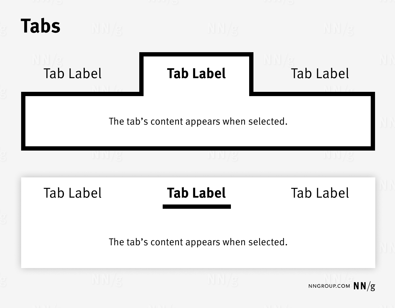
Tabs simplify interfaces by organizing and concealing content until requested by the user. Classic tab styling (top) evokes physical folders in a filing cabinet. Modern approaches (bottom) attempt to make tabs easier to integrate into layouts by reducing or eliminating the border strokes on the selected tab and its panel.
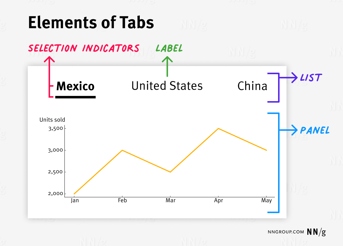
Illustrates the components of a tabbed interface using a graph. The interface has three tabs labeled “Mexico,” “United States,” and “China.” The “Mexico” tab is selected, indicated by bold text and an underline. The graph below the tabs displays units sold from January to May, with a line showing sales trends. The image highlights four elements: “Selection Indicators” (in red), pointing to the bold and underlined “Mexico” tab; “Label” (in green), pointing to the “United States” tab; “List” (in purple), denoting the group of all tabs; and “Panel” (in blue), pointing to the area where the graph is displayed.
A tab control contains a list of available tabs, short labels describing the tabs’ content, one or more indicators marking the selected tab, and a panel displaying only the selected tab’s content.

In addition to these common elements, complex applications may contain other supplemental features to help users. These include:

  • Icons (ideally the icon should be accompanied by a label)
  • Adding, closing, renaming, or copying tabs
  • Reordering tabs via drag and drop
  • Scrolling through the set of tabs if not all are visible on the screen (i.e., carousel-like tabs)

When to Use Tabs

When lengthy content has clear groupings. Tabs minimize cognitive load by chunking content into scannable pieces instead of showing it all at once.

When there are few content groupings. When the number of tabs overflows the tab list, the tab bar often becomes a carousel. As a result, the hidden tabs become less discoverable, and the interaction cost needed to access them increases, as users need to manipulate secondary controls to reveal those tabs. The fewer tabs, the better.
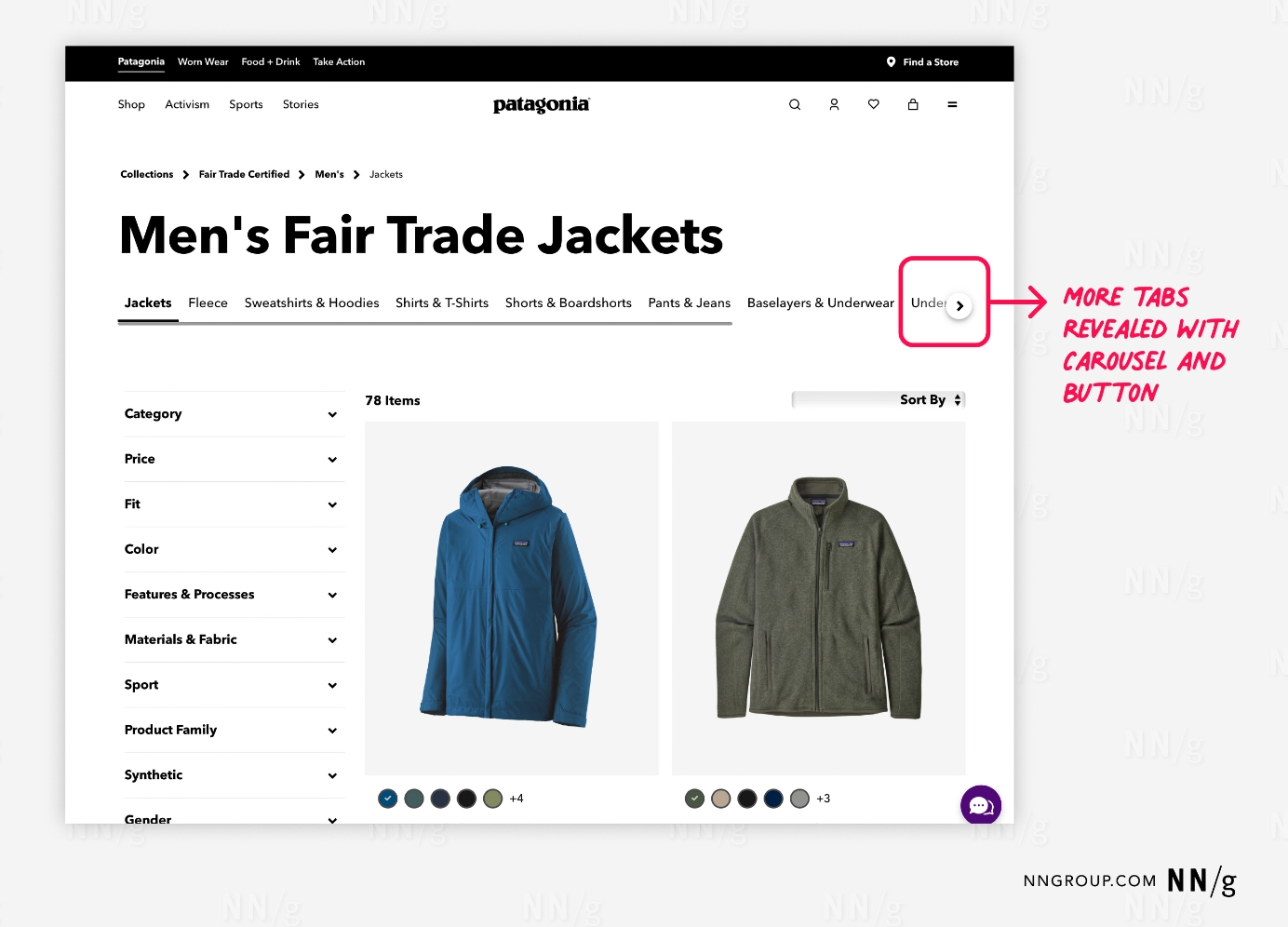
A webpage from Patagonia’s online store, showcasing “Men’s Fair Trade Jackets.” The interface includes multiple horizontal tabs such as “Jackets,” “Fleece,” “Sweatshirts & Hoodies,” “Shirts & T-Shirts,” “Shorts & Boardshorts,” “Pants & Jeans,” and “Baselayers & Underwear.” The “Jackets” tab is selected, indicated by an underline. A red annotation on the right highlights that more tabs can be revealed using a carousel and button, which is circled and labeled “More tabs revealed with carousel and button.” Below the tabs, product filters like “Category,” “Price,” “Fit,” “Color,” and others are listed on the left side, with product images displayed on the right.
Patagonia: A button appeared when the viewport was smaller than the tab list. Clicking the button horizontally scrolled the tab list to reveal additional tabs.

When content has unequal importance. Tab controls select and display a tab by default. This default tab receives more attention from users, while the other tabs may be ignored. Ensure that the content within nondefault tabs is supplemental rather than critical for a successful user experience.

When content can be labeled concisely. Short tab labels work best, as they conserve horizontal space in the tab list and avoid horizontal scrolling.

When users don’t need to simultaneously see information presented under different tabs. Otherwise, users must repeatedly switch between tabs to compare or reference information. In that situation, a tab-based design taxes users’ short-term memory, increases cognitive load and interaction cost, and lowers usability compared to a design that puts everything on one big page.
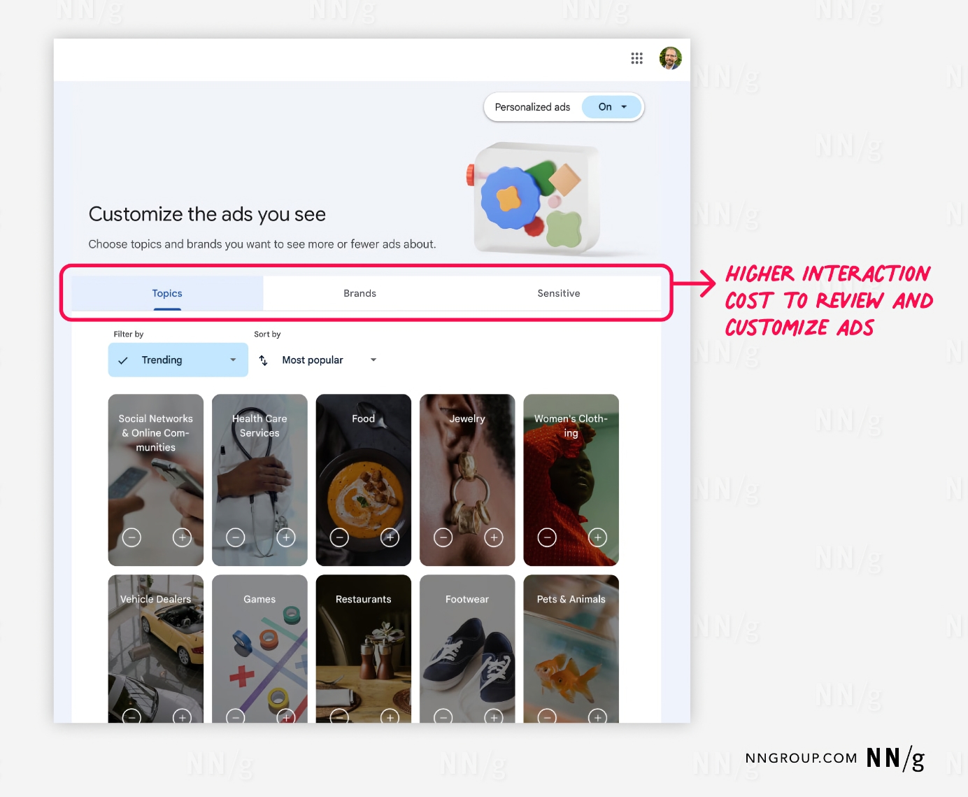
A Google Ads webpage interface for customizing ads, with the title “Customize the ads you see” and options to toggle personalized ads on or off. Below this are three tabs labeled “Topics,” “Brands,” and “Sensitive,” with “Topics” selected. The content below the tabs displays various categories users can choose from, such as “Social Networks & Online Communities,” “Health Care Services,” “Food,” “Jewelry,” “Women’s Clothing,” and others. Each category is represented by an image and a plus icon to add or select it. A red annotation on the right highlights that navigating these tabs to review and customize ads incurs a “Higher interaction cost,” indicating the complexity and effort required to manage these settings.
Google’s ad-management site uses tabs to organize topics or brands used in advertising. The tabbed approach makes it hard for users to get a comprehensive view of ad content they may encounter and to set their preferences.

Tabs Versus Accordions

Like tabs, accordions are another effective method for collapsing content. Accordions are particularly useful on mobile devices, where they work better than tabs due to the limited screen space. Accordions can utilize longer labels and work well to organize short pieces of content such as FAQs. On desktop, tabs may be preferable as accordions can make the page seem too empty when closed. Moreover, tabs can handle longer content and accommodate more complex layouts than accordions.

Types of Tabs

In-page tabs organize and present related content within a single page. These tabs are not for navigation but enable users to alter the content displayed in the panel. In-page tabs are the originator of the tab-design pattern.

Navigation tabs enable users to navigate to different pages. Because navigation usability improves when the user’s location is clearly marked, designers started using the visual presentation of tabs (in particular, selection indicators) for navigation controls. Over time, this tab styling became a common visual approach to navigation.

Although navigation and in-page tabs look alike, understanding the subtle differences between them is essential to implementing each effectively.

  Navigation Tabs In-page Tabs
Content

Broad scope

Unrelated

Different

Narrow scope

Related

Similar

Location

Top or sometimes left of the viewport

Frequently bottom on mobile

Varies since they are embedded within the page layout
Scrolling Position Sometimes fixed to the top (or bottom) of the viewport Rarely fixed
User Expectations

Navigating to a new view

Slight loading delay

Remaining in the current view

Instantaneous loading

Default Selected Tab Usually one tab selected by default, but if the current page is not organized under any tab and was accessed elsewhere (like through a footer), then no tab may be selected Always one tab selected by default
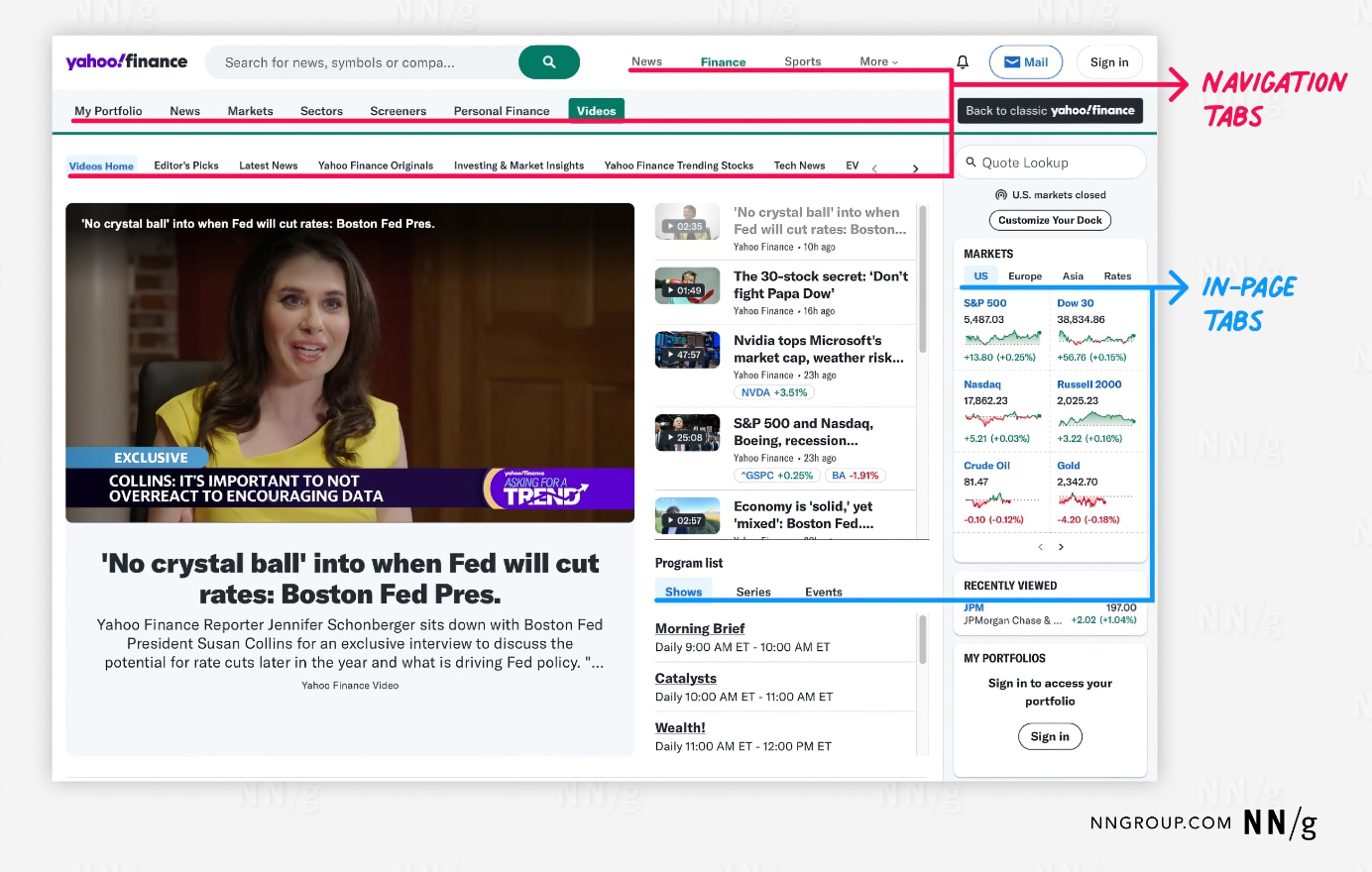
A Yahoo Finance webpage with various navigation elements highlighted. At the top, there are primary navigation tabs for sections like “My Portfolio,” “News,” “Markets,” “Screener,” “Personal Finance,” and “Videos,” indicated by a red annotation labeled “Navigation Tabs.” Below this, the page content includes a video section with a news headline and a video player. On the right side, there are secondary tabs within the page, such as “US,” “Europe,” “Asia,” and “Rates,” for market information. This section is highlighted by a blue annotation labeled “In-Page Tabs.” The page offers multiple layers of tabbed navigation to organize content and provide easy access to different sections and information.
Yahoo Finance: 3 layers of navigation tabs exposed several tiers of information architecture (Finance, Videos, and Videos subcategories). The in-page tabs in the Markets and Program list containers enabled users to view types of content while remaining in place.

Don’t Mix and Match Tab Types

Mixing in-page and navigation tabs within one tab control will disorient users. In-page tabs should have similar content and keep users where they are. Navigation tabs should have dissimilar content and navigate users away from the current page.
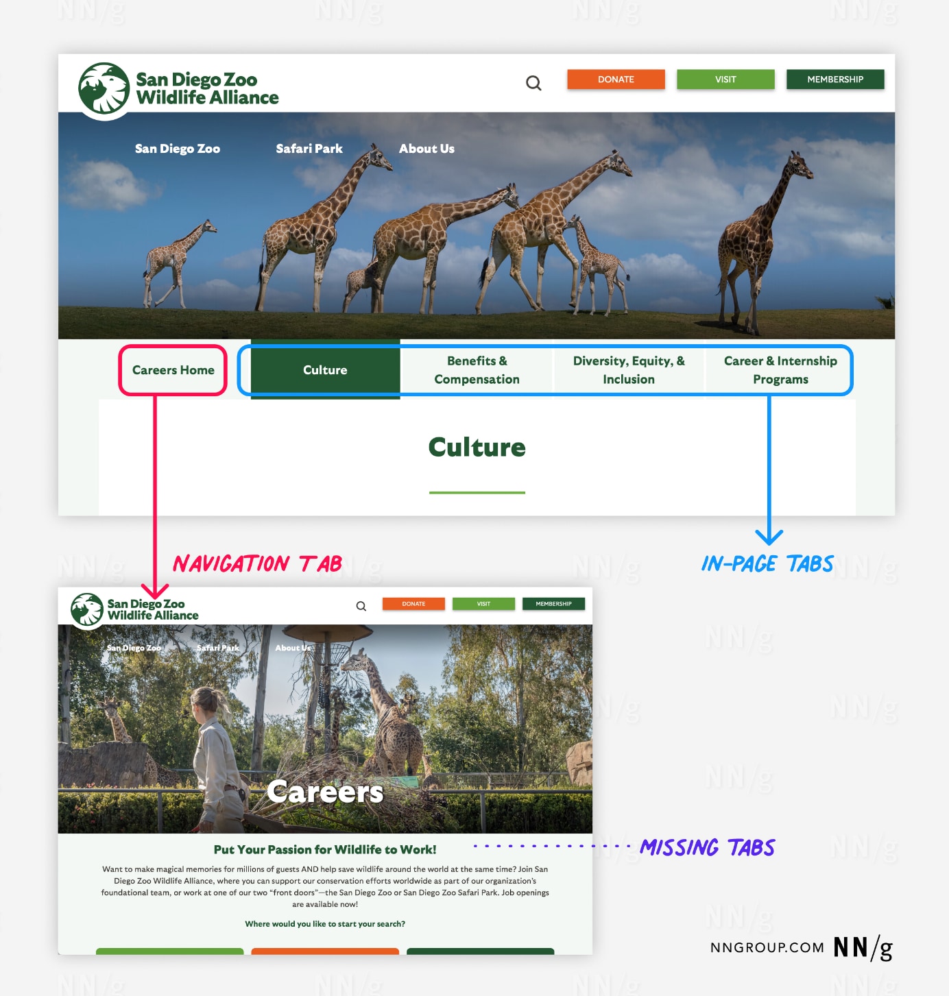
Navigation and in-page tabs on the San Diego Zoo Wildlife Alliance website, specifically on the Careers page. The top part of the image shows a webpage with a main navigation tab highlighted in red, labeled “Careers Home,” along with in-page tabs like “Culture,” “Benefits & Compensation,” “Diversity, Equity, & Inclusion,” and “Career & Internship Programs,” highlighted in blue. The selected in-page tab is “Culture,” which displays related content below it. The bottom part of the image shows the same webpage without the in-page tabs, marked by a purple annotation labeled “Missing Tabs,” indicating the absence of these in-page navigation options. This highlights the importance of consistent tab visibility for user navigation.
Unfortunately, this tab control found on a career-information page for the San Diego Wildlife Alliance mixed navigation and in-page tabs. Most of these tabs kept users on visually consistent pages that showcased different career details. The Careers Home tab, however, was an outlier. Clicking it led to a different page without the tabs. This design was unpredictable and likely prevented users from learning the site’s organization.

In-page tabs are supposed to keep users on the same page while alternating between related views. The intent is to reduce users’ cognitive load by chunking content and progressively disclosing it upon selection. Strictly speaking, each in-page tab should have the same layout but with different data.
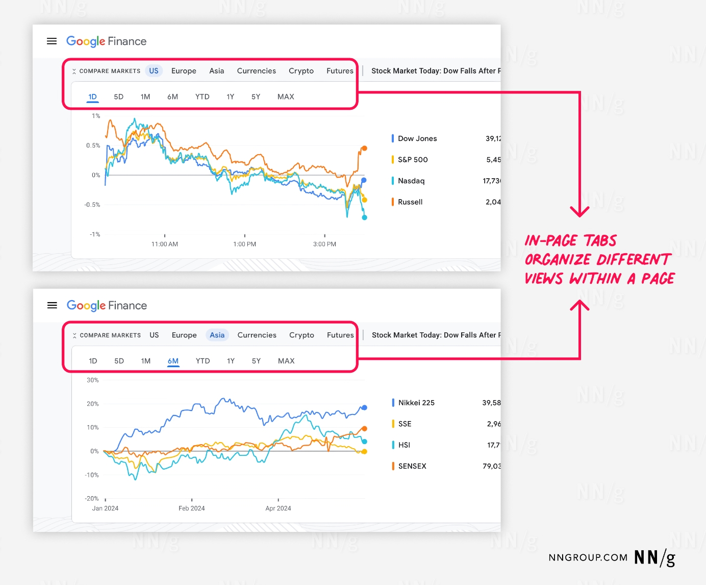
The use of in-page tabs on the Google Finance website to organize different views within a page. The top section shows tabs labeled “Compare Markets,” “US,” “Europe,” “Asia,” “Currencies,” “Crypto,” and “Futures,” with “US” selected. Below this is another set of tabs for different time frames: “1D,” “5D,” “1M,” “6M,” “YTD,” “1Y,” “5Y,” and “MAX,” with “1D” selected. The graph displays stock performance for the Dow Jones, S&P 500, Nasdaq, and Russell indices.  The bottom section shows the same interface, but with the “Asia” tab selected and the “6M” time frame highlighted. The graph now displays performance for the Nikkei 225, SSE, HSI, and SENSEX indices. A red annotation highlights that these in-page tabs effectively organize different views within the page.
Google Finance: This page demonstrated a classic implementation of in-page tabs. It used two in-page tab lists for a line chart visualizing financial-market performance. The first in-page tab list displayed specific market categories (in this case, US is selected), and the second tab list displayed a time scale (with the selected one being 1D — 1 day). The various tabs displayed different data consistently (as line charts) and users remained on the same page as they switched tabs.

Tabs Should All Look and Work the Same

In-page tabs and navigation tabs should be internally consistent (consistency is a usability heuristic; it builds the user’s feeling of mastery over the interface). For a given tab control, clicking on any of the tabs should change its panel, and they should use the same unselected and selected styling. Use a design system to promote this behavioral and visual consistency with your tab controls.

When using in-page tabs and navigation tabs in the same experience, visually differentiate between these tab types to convey to users that they behave differently.
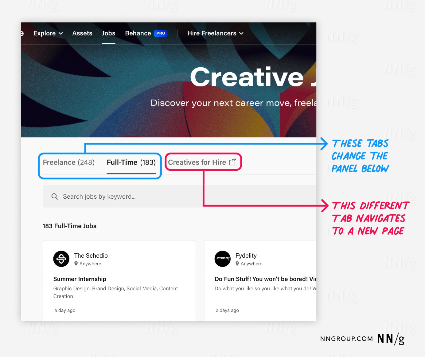
The “Creative Jobs” section of the Behance website, emphasizing the navigation functionality of different tabs. At the top, a colorful banner with the text “Creative Jobs” invites users to explore career opportunities. Below, there are three tabs: “Freelance (248),” “Full-Time (183),” and “Creatives for Hire.” The “Full-Time” tab is selected, indicated by an underline.  A blue annotation highlights that the “Freelance” and “Full-Time” tabs change the content displayed in the panel below when selected. A red annotation points out that the “Creatives for Hire” tab navigates to a new page rather than changing the panel content. Below the tabs, there is a search bar and listings for full-time jobs, including positions like “Summer Internship” and “Website Manager.”
Behance.com: This in-page tab had a Creatives for Hire tab that did not look or function like the other tabs; clicking it opened a different site in a new browser tab. The added icon attempted to convey this functionality difference, but this control is a link masquerading as a tab and should not be part of the tab control.

Tab Visual Design: Best Practices

Indicate the Selected Tab

Prominently highlight the selected tab. There are a variety of selection indicators to convey this status:

  • Common region. This classic method for indicating the selected tab involves using the same background fills for the selected tab and the displayed panel. This tab fill should contrast with the background fill used for the other, unselected tabs. Today, designers and developers rarely use this technique as it introduces complexity in coordinating background fills across controls and page layouts.
  • Lines. Include a horizontal line to underline the selected tab. Lines have become a popular choice because their layout is flexible. Do not use thin, single-pixel strokes or poor-contrast colors.
  • Font styling. Change the text label of the selected tab to be bolded or to a different, darker color.
  • Size. Resize the selected tab so it appears larger than the other tabs.
  • Icon. Give the selected tab a distinct icon indicator not found on unselected tabs.

Use at least two selection indicators to enhance the visual salience of the selected tab. Multiple indicators are critical to distinguish the selected tab when there are only two tabs, as there are fewer unselected tabs to compare against.
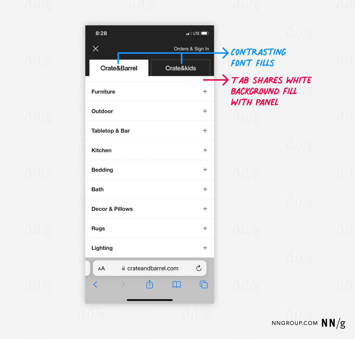
A mobile view of the Crate & Barrel website, featuring a navigation menu with two tabs at the top: “Crate&Barrel” and “Crate&kids.” The “Crate&Barrel” tab is selected and blends seamlessly with the white background of the panel below it. A blue annotation points out the contrasting font fills between the two tabs, with the selected tab in black text on a white background and the unselected tab in white text on a black background. The red annotation highlights that the selected tab shares its white background fill with the main content panel. Below the tabs, a list of categories such as “Furniture,” “Outdoor,” “Tabletop & Bar,” “Kitchen,” “Bedding,” and others is displayed, each with a plus icon to expand the category.
Crateandbarrel.com: The selected tab was differentiated from the unselected tab using a common region and font styling.
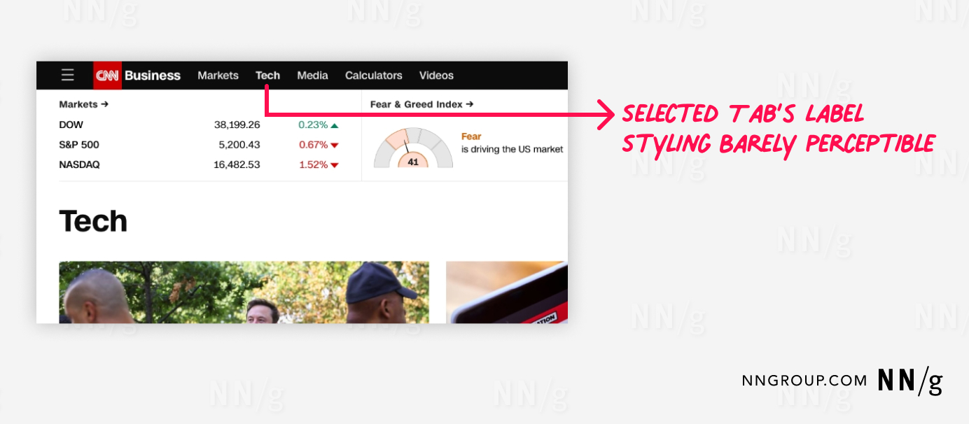
A section of the CNN Business website, highlighting the navigation tabs. The tabs include “Markets,” “Tech,” “Media,” “Calculators,” and “Videos.” The “Tech” tab is selected, but its styling is barely perceptible, as indicated by the red annotation pointing out this issue. Below the tabs, there is a market summary displaying indices such as the DOW, S&P 500, and NASDAQ, with their current values and percentage changes. The “Fear & Greed Index” is also shown, indicating the current market sentiment. Below this section, the content related to the “Tech” tab is visible.
CNN: The selected navigation tab (in this case, Tech) was bolded, but the effect was so subtle that it was nearly indistinguishable from the other tabs.

Make Unselected Tabs Clearly Visible and Readable

Unselected tabs should be visible to remind users of the additional options. Unselected tabs that are too faded into the background may not be noticeable, so users may never discover their content.­­­

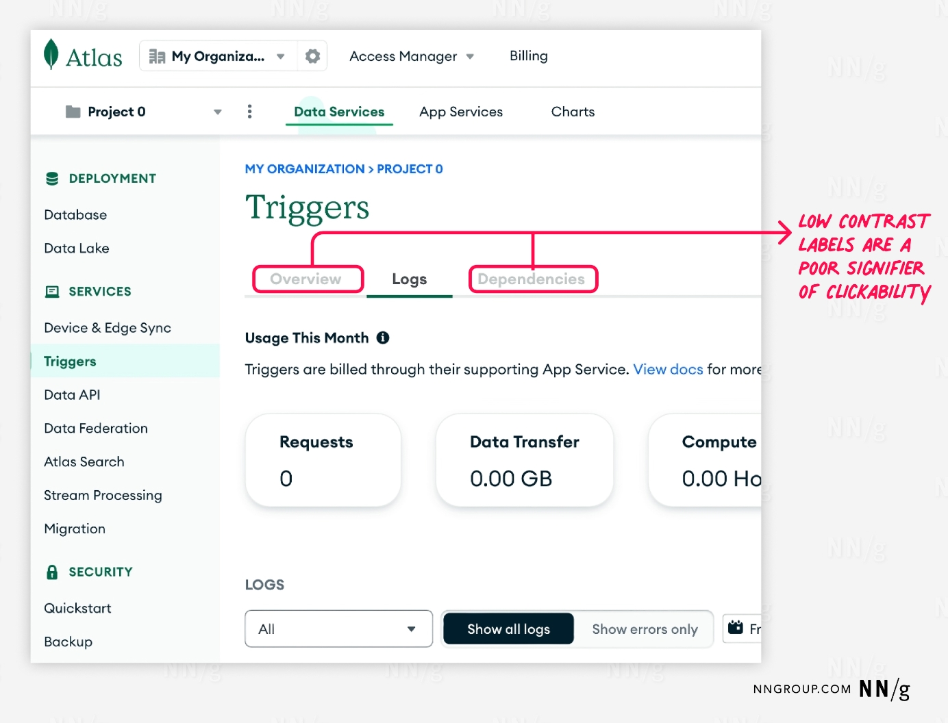
A section of the Mongo DB Atlas user interface, specifically the “Triggers” page within the “Services” category. The navigation tabs include “Overview,” “Logs,” and “Dependencies.” The “Overview” tab is currently selected, indicated by an underline. A red annotation points out that the labels of these tabs have low contrast, making them poor indicators of clickability. On the left, there is a sidebar menu with other categories such as “Deployment,” “Database,” “Data Lake,” and more. Below the tabs, there are usage metrics for “Requests,” “Data Transfer,” and “Compute,” along with a section to filter and view logs.
MongoDB: Several navigation-tab controls were used to organize complex technical content. Unfortunately, the font styling of the unselected tabs, such as Overview and Dependencies, had poor color contrast with the white background and could be mistaken for unselectable features.

Connect the Selected Tab to Its Panel

Using a common region as a selection indicator is a visually powerful way to signal that the tab and its content are part of the same group. However, as mentioned above, this method is less used today.

Another way to convey the connection between the tab label and the tab panel is to use proximity. This approach is useful when the selected tab is highlighted using a different fill from its panel.
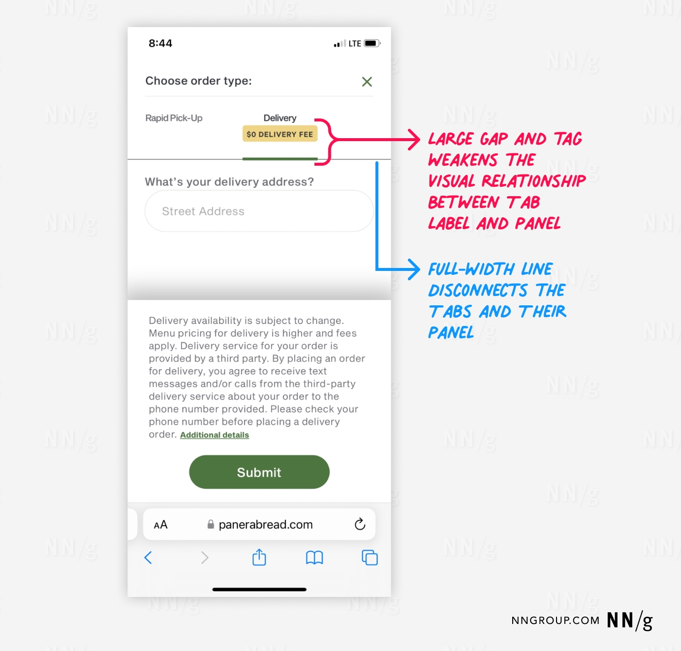
A mobile interface from Panera Bread’s website, where users choose an order type. There are two tabs at the top: “Rapid Pick-Up” and “Delivery.” The “Delivery” tab is selected, indicated by an underline and a tag showing “$0 Delivery Fee.”  A red annotation highlights that the large gap and the tag between the tab label and the panel weaken their visual relationship. A blue annotation points out that a full-width line further disconnects the tabs from their respective panels. Below the tabs, the interface prompts users to enter their delivery address and includes a “Submit” button, with additional delivery information and terms displayed further down.
PaneraBread.com: This tab found in the ordering flow was poorly connected to its panel. The yellow delivery tag, large amounts of padding, and the full-width line all separated and disassociated the Delivery label from its panel.
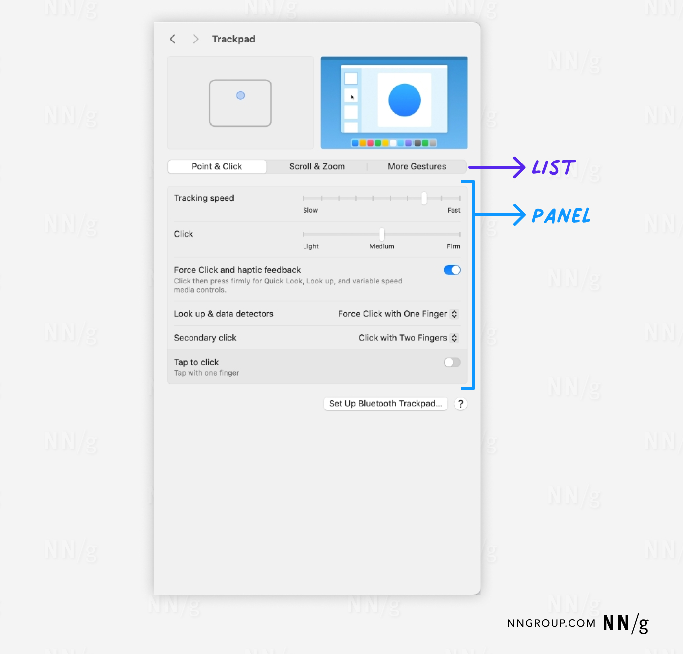
The Trackpad settings interface on a Mac. The interface has three main tabs at the top: “Point & Click,” “Scroll & Zoom,” and “More Gestures,” with “Point & Click” selected. Below the tabs, there is a detailed panel displaying various settings related to the selected tab, such as “Tracking speed,” “Click,” and options for “Force Click and haptic feedback,” “Look up & data detectors,” “Secondary click,” and “Tap to click.”  Blue annotations highlight the “List” (the tabs at the top) and the “Panel” (the detailed settings below), emphasizing their roles in the interface.
macOS: These in-page tabs organizing trackpad behavior didn’t share a common region with their panel, but still maintained proximity despite their different background fills.

Use Only One Row of Tabs

Websites and simple apps should avoid stacking tab lists within one tab control. Stacking arrangements increases the risk that a selection indicator (such as a line) is ambiguously positioned between several tab labels.

Stacking is also ineffective for tab styling that relies on a common region, as it requires repositioning the selected tab to be adjacent to its panel. This destroys spatial memory and makes it impossible for users to remember which tabs they have already visited.

the header section of an older version of the Amazon.com website. The header features a logo on the left, a help icon and “Your Account” button on the right. Below this are several navigation tabs organized into two rows. The top row includes tabs like “Welcome,” “Books,” “Music,” “DVD,” “Video,” “Auctions,” “Art & Collectibles,” “zShops,” “Kitchen,” “Lawn & Patio,” “Tools & Hardware,” “Electronics,” “Software,” “Toys & Video Games,” “Health & Beauty,” and “Home Living.” The “Welcome” tab is highlighted in yellow. The second row features tabs such as “How to Order,” “Gift Ideas,” “Top Sellers,” “Friends & Favorites,” and “Free E-Cards.”
Amazon: These navigation tabs that were on Amazon’s website from 2000 are a classic example illustrating the problems with stacking tabs. Clicking a tab in the back row (such as Kitchen) forced a difficult design tradeoff: highlight the tab in its back-row position but leave it disconnected from its panel, or move the tab to the front row to improve its proximity but rearrange the tab list ordering? Both options are undesirable from a usability perspective.

Position the Tab List Above the Panel

Vertical and bottom list arrangements will cause users to overlook the tabs. The visual design for in-page tabs should make the panel evident.
Okta: These overdesigned in-page tabs violated multiple best practices. The tabs were positioned to the right of the content panel and not at the top. The selected tab was differentiated only by a subtle shift in text color. There was no clear panel, as both the image and text were far apart. The tab labels were long. The blue line was equally spaced between different tabs, making distinguishing the selected tab difficult. Even worse — the blue line was animated and automatically selected the next tab after a few seconds!
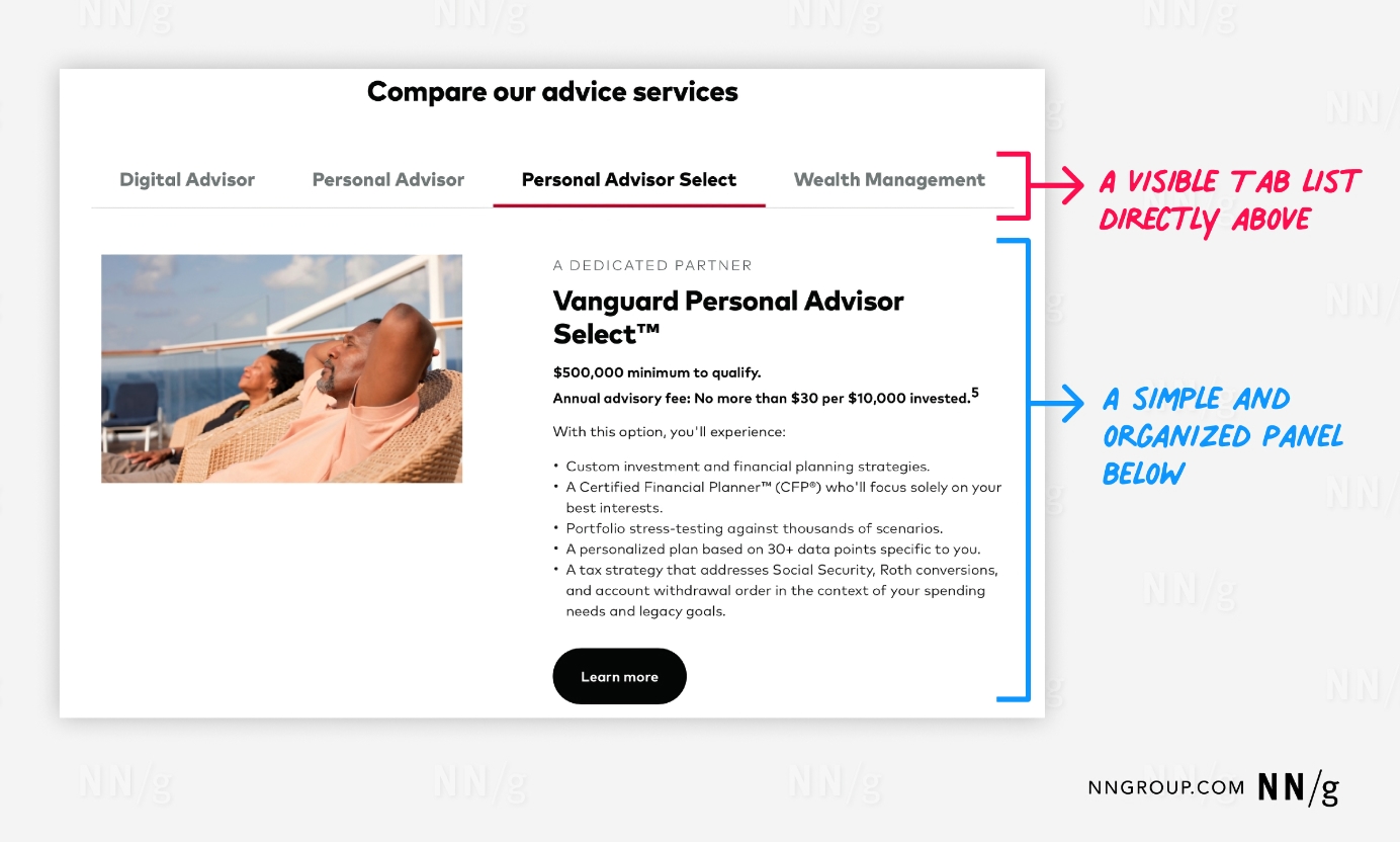
Tabs for Vanguard financial advice services. At the top, a title “Compare our advice services” is displayed. Below it, there are four tabs: “Digital Advisor,” “Personal Advisor,” “Personal Advisor Select,” and “Wealth Management,” with the “Personal Advisor Select” tab selected, indicated by an underline.  A red annotation highlights the visible tab list directly above the content panel. The content panel below is simple and organized, featuring a photo of two relaxed individuals on the left and detailed information about the “Vanguard Personal Advisor Select™” service on the right. This includes minimum qualification details, advisory fees, and a list of benefits such as custom investment strategies, certified financial planner access, portfolio stress-testing, personalized plans, and tax strategy advice. A blue annotation emphasizes the simplicity and organization of the content panel.
Vanguard: These simply executed in-page tabs are positioned directly above their panel.

Tab Content: Best Practices

Arrange Tabs for Efficient Usage

Arrange tab content so high-use content is first in the list and selected by default. This maximizes visibility of frequently accessed content and lowers its interaction cost.
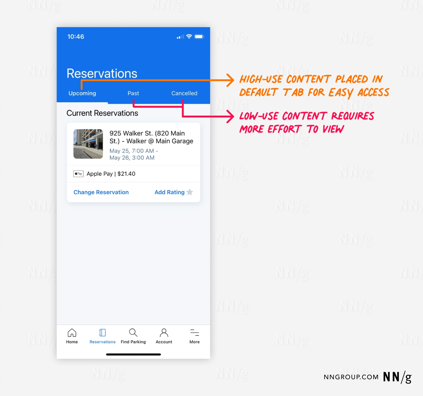
The SpotHero mobile app interface for viewing reservations. The screen title is “Reservations,” with three tabs below it: “Upcoming,” “Past,” and “Cancelled.” The “Upcoming” tab is selected, displaying the current reservation details below it.  An orange annotation highlights that high-use content is placed in the default tab for easy access. This default tab, “Upcoming,” shows a reservation with the date and time, payment method, and options.  A red annotation indicates that low-use content, such as past and cancelled reservations, requires more effort to view as it is placed in the non-default tabs.
SpotHero mobile app: This in-page tab organized parking-spot reservations by status. The Upcoming reservation tab was appropriately arranged first and selected by default, as users would likely be most interested in upcoming parking reservations interact. Past or cancelled reservations were available for reference.

Logically Group Tab-Panel Content

How the content is perceived and used by users should inform how it is grouped. Card sorting is one option for researching this mini-IA problem. If you don’t find distinct groupings, tabs are likely the wrong interface control for managing your content. In such a case a single-page layout with subheadings would be more appropriate.

Use Descriptive Tab Labels

Users should be able to predict what they’ll find when selecting a tab. Since unselected tabs conceal their content, labels with strong information scent are crucial for users to engage with them. Use plain language rather than made-up marketing terms.
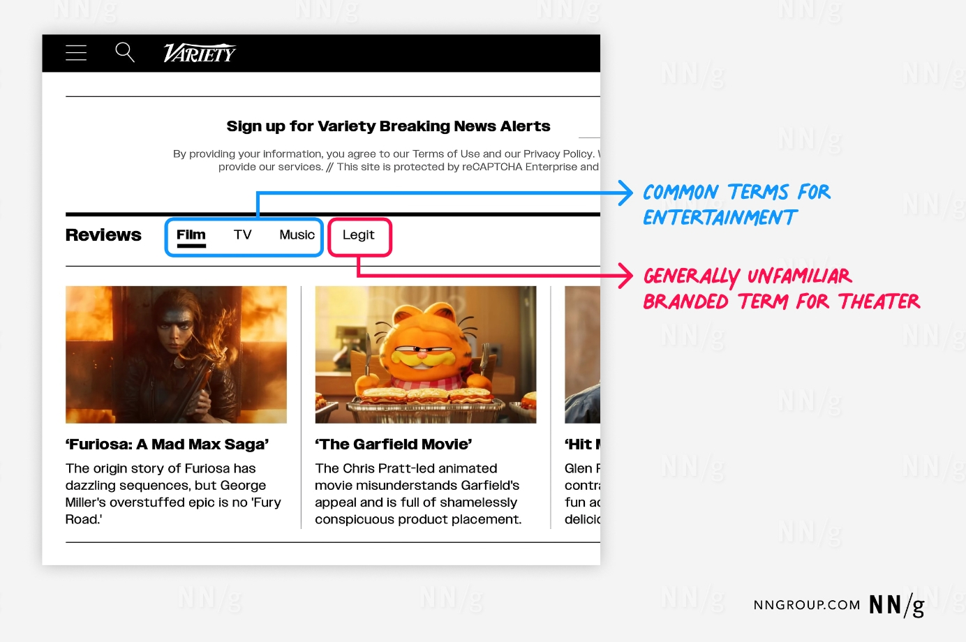
A section of the Variety website featuring entertainment reviews. The header prompts users to sign up for Variety Breaking News Alerts. Below this, there are navigation tabs for different types of reviews: “Film,” “TV,” “Music,” and “Legit,” with the “Legit” tab selected.  A blue annotation highlights that the terms “Film,” “TV,” and “Music” are common terms for entertainment categories. A red annotation points out that “Legit” is a generally unfamiliar branded term used by Variety for theater reviews.  Below the tabs, the reviews for different media are displayed.
Variety: An in-page tab list organized and previewed recent reviews. Film, TV, and Music were short and apparent labels, but only an existing reader of Variety would recognize that the label Legit represented reviews of theater productions. This branded word has weaker information scent and probably less user engagement.

Write Short Tab Labels

Tab labels should usually be 1-2 words. Short labels are more scannable; if you need longer labels, it’s a sign that the choices are too complicated for tabs.

Do Not Use ALL CAPS for Tab Labels

All caps negatively impacts legibility. Although typography research suggests that all-caps text may offer some glanceability improvements at small font sizes, this is more of a mitigation for smallness than a wise visual-design tactic to use broadly.

Because most text we interact with in daily life is mixed case, people are unaccustomed to scanning or reading all-caps text (and ephemeral design trends aren’t going to change this). Better to pick one capitalization style (sentence- or title-case) and stick to it.
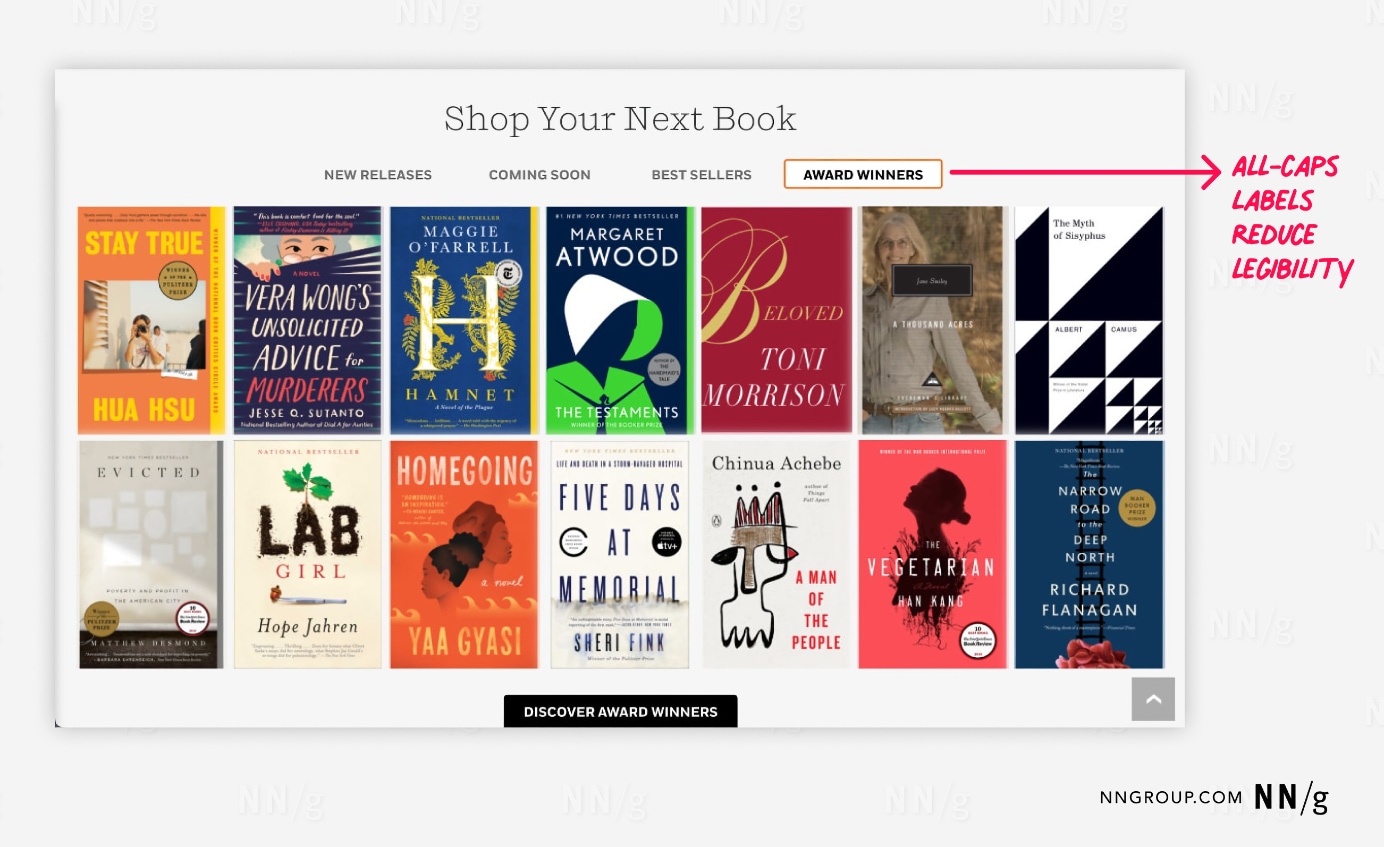
A Penguin Random House webpage with the title “Shop Your Next Book.” Below the title, there are tabs labeled “New Releases,” “Coming Soon,” “Best Sellers,” and “Award Winners,” with the “Award Winners” tab selected.  A red annotation points out that the use of all-caps labels for the tabs reduces legibility.
Penguin Random House: These in-page tabs would have been more legible if their labels were not in all caps.

Make Tab Features Findable

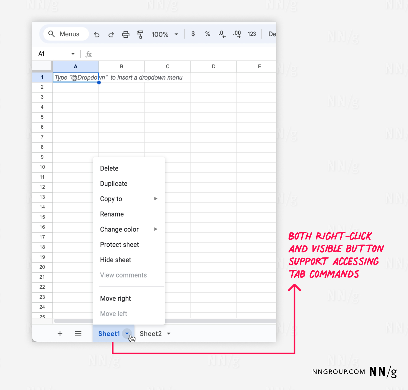
Complex apps where users must manage their information space may need tab-management features (e.g., adding, copying, or deleting tabs). Indicate the presence of these features by embedding controls within the tab (but beware of questionable icons). Monitor these features during usability testing, as they will not be familiar or findable to many users.
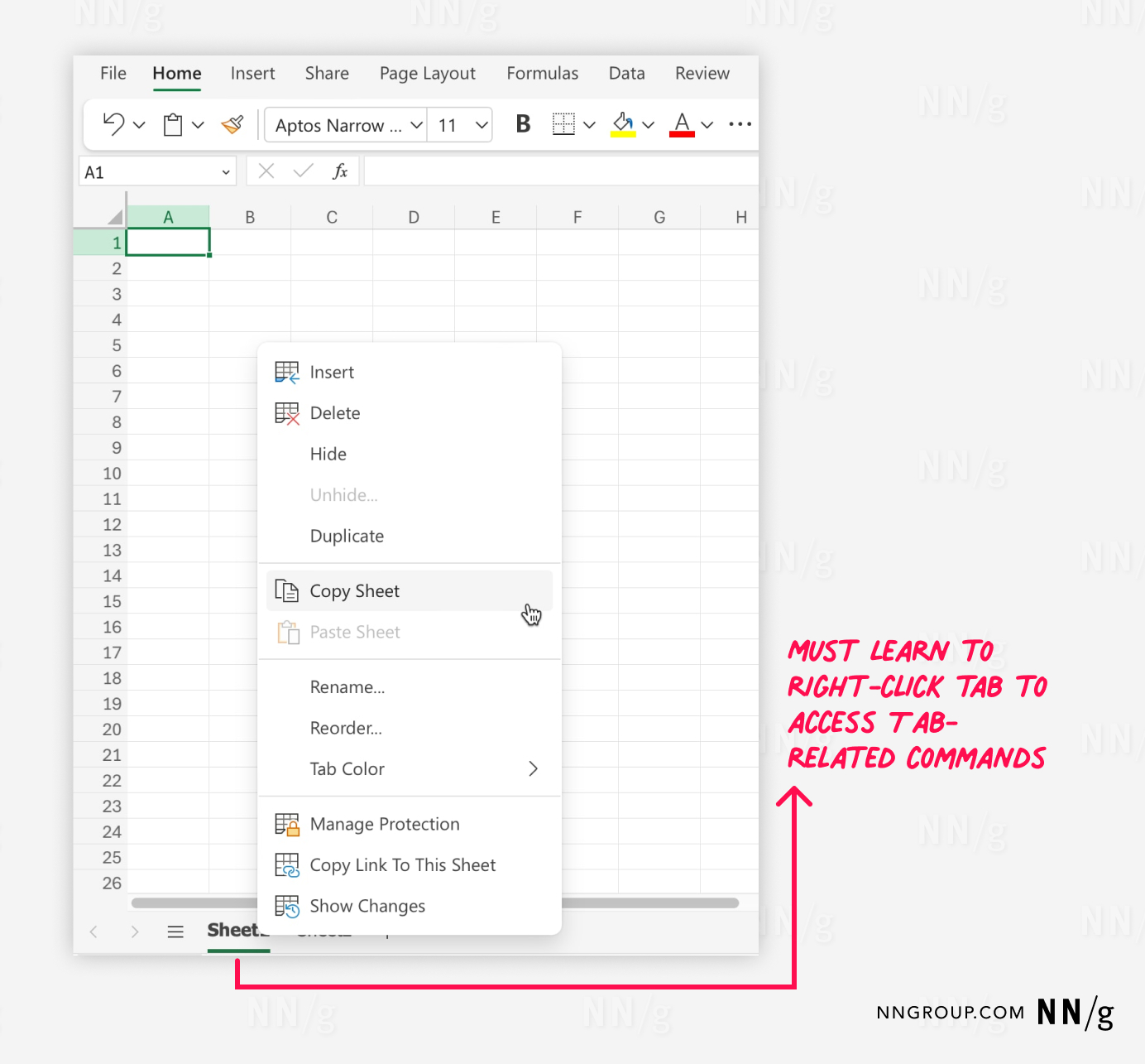
Office 365 version of Excel with a context menu open, highlighting various sheet-related commands. The context menu appears after right-clicking on a sheet tab labeled “Sheet1” at the bottom of the screen. A red annotation indicates that users must learn to right-click the tab to access these tab-related commands, emphasizing the reliance on this action for managing sheets within the application.
Microsoft Excel for Microsoft 365: Accessing tab-related commands such as renaming or deleting a worksheet (i.e., tab) required knowledge that right-clicking the tab would present these options in a menu, which could be challenging for novice users to find.
Google Sheets interface with a context menu open, displaying options for managing sheets. The context menu is accessed by clicking on a small arrow next to the “Sheet1” tab at the bottom of the screen. A red annotation highlights that both right-clicking the tab and using the visible button (the small arrow) support accessing tab commands, indicating dual methods for users to manage their sheets within the application.
Google Sheets: Split buttons for the tabs hinted that additional commands were available. Clicking the tab’s arrow button revealed tab-related commands (unfortunately, this arrow button lacked a clear visual signifier: the button border displayed only when the cursor hovered over it). Right clicking the tab was an alternate way of opening this menu.

Diagnosing Design Problems with Tabs

Tab-design problems are a common finding if you are using analytics for a UX-health check. If you’re tracking within-page actions, you may find users rarely use tabs on certain pages.

Check if you’re violating any of this article’s best practices. If yes, redesign your tabs and do a quick A/B test to check whether your redesign is better.

Remember to check these accessibility considerations as well:

  • Keyboard navigation: Ensure that tabs can be navigated and selected using the keyboard. Use Enter or Space to select a tab.
  • Focus: Tabs should have high-contrast focus highlighting.
  • ARIA roles: Check with your developers whether appropriate ARIA (Accessible Rich Internet Applications) roles and properties are used to communicate tab structure to assistive technologies.

Conclusion

If you follow this article’s best practices, users will know how to use your tabs without further exploration or error-prone guessing. Then, they can devote more time and energy to understanding the content and features available under these tabs. Tabs seem boring, but when done right, they exemplify good UX design: users don’t consciously think about the tabs themselves — they just work.