In this new tutorial, we’ll learn how to create a JavaScript dropdown filter component where each filtering option will have a unique shareable URL. Once we filter for a specific option, the page URL will change. Then, if we grab that URL and open it in another browser/window, only the associated boxes will appear.


What We’re Going to Build
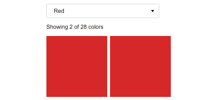
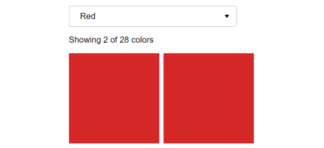
Here’s our dropdown filter component—be sure to view the demo in debug mode and check how the page URL changes upon filtering!
1. Begin With the HTML Markup
Inside a container, we’ll place:
- The dropdown wrapper and
- the elements (boxes) we want to filter.
The dropdown wrapper will include:
- The dropdown trigger
- The dropdown itself with the available filtering options (colors) and
- a counter of the visible colors.
To group the boxes under a specific color, each one will receive the data-type attribute with a value that matches the ID value (we can also use a custom attribute instead) of an associated filtering option.
By default, all boxes will appear; to indicate the corresponding selected option in the dropdown menu, we’ll give its parent item the active class.
Normally, for example with a WordPress website, all these data will come from the backend.
Consider the required structure:
1 |
<div class="container"> |
2 |
<div class="dropdown-wrapper"> |
3 |
<button class="dropdown-toggle" aria-expanded="false"> |
4 |
<span>Filter Colors</span> |
5 |
<svg width="24" height="24" clip-rule="evenodd" fill-rule="evenodd" stroke-linejoin="round" stroke-miterlimit="2" viewBox="0 0 24 24" xmlns="https://www.w3.org/2000/svg"> |
6 |
<path d="m16.843 10.211c.108-.141.157-.3.157-.456 0-.389-.306-.755-.749-.755h-8.501c-.445 0-.75.367-.75.755 0 .157.05.316.159.457 1.203 1.554 3.252 4.199 4.258 5.498.142.184.36.29.592.29.23 0 .449-.107.591-.291 1.002-1.299 3.044-3.945 4.243-5.498z" /> |
7 |
</svg>
|
8 |
</button>
|
9 |
<div class="dropdown"> |
10 |
<ul>
|
11 |
<li class="active"> |
12 |
<a id="all" href="">All Colors</a> |
13 |
</li>
|
14 |
<li>
|
15 |
<a id="red" href="">Red</a> |
16 |
</li>
|
17 |
<li>
|
18 |
<a id="blue" href="">Blue</a> |
19 |
</li>
|
20 |
<!-- more filtering options here -->
|
21 |
</ul>
|
22 |
</div>
|
23 |
<p class="count">Showing <span>28</span> of 28 colors</p> |
24 |
</div>
|
25 |
<ul class="boxes"> |
26 |
<li class="red" data-type="red"></li> |
27 |
<li class="gray" data-type="gray"></li> |
28 |
<!-- more boxes here -->
|
29 |
</ul>
|
30 |
</div>
|
Here I only used the aria-expanded ARIA attribute, but you can build on that and make the component more accessible!
2. Add the CSS
Let’s now concentrate on the key styles—I’ll leave the introductory ones for now.
Dropdown Styles
Regarding the dropdown styles:
- Both the dropdown toggle and the dropdown will have a maximum width of 400px.
- The dropdown will be hidden by default, absolutely positioned inside its container, and sit below the dropdown trigger.
- The dropdown menu will have a fixed height of 300px, so by default, a styled scrollbar will appear.
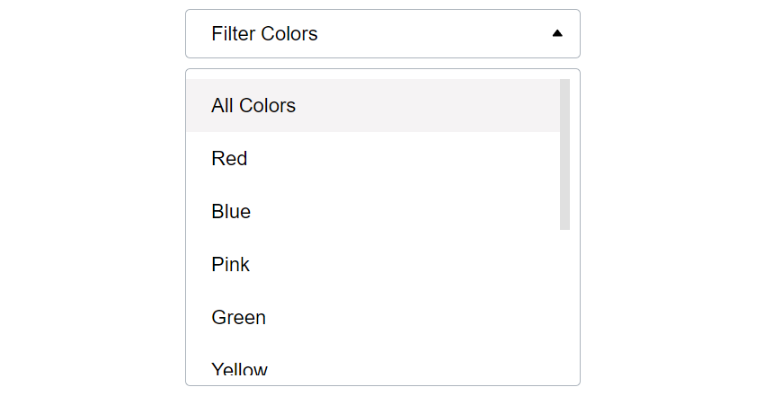
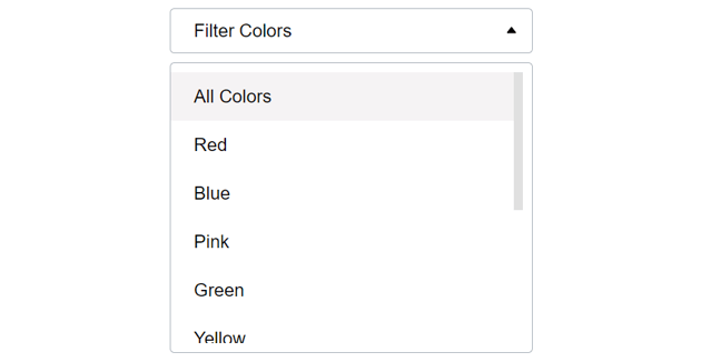
Here’s how the dropdown will look in its closed and open states:


The related styles:
1 |
/*CUSTOM VARIABLES HERE*/
|
2 |
|
3 |
.dropdown-wrapper { |
4 |
position: relative; |
5 |
}
|
6 |
|
7 |
.dropdown-wrapper .dropdown-toggle, |
8 |
.dropdown-wrapper .dropdown { |
9 |
width: 100%; |
10 |
max-width: 400px; |
11 |
border-radius: 5px; |
12 |
border: 1px solid #adb5bd; |
13 |
background: var(--white); |
14 |
}
|
15 |
|
16 |
.dropdown-wrapper .dropdown-toggle { |
17 |
display: flex; |
18 |
align-items: center; |
19 |
justify-content: space-between; |
20 |
padding: 0 10px 0 26px; |
21 |
text-align: left; |
22 |
cursor: pointer; |
23 |
font-size: 100%; |
24 |
height: 50px; |
25 |
}
|
26 |
|
27 |
.dropdown-wrapper .dropdown-toggle svg { |
28 |
transition: transform 0.3s; |
29 |
}
|
30 |
|
31 |
.dropdown-wrapper .dropdown { |
32 |
display: none; |
33 |
position: absolute; |
34 |
top: 60px; |
35 |
left: 0; |
36 |
padding: 10px 10px 10px 0; |
37 |
z-index: 1; |
38 |
}
|
39 |
|
40 |
.dropdown-wrapper .dropdown ul { |
41 |
padding: 0; |
42 |
margin: 0; |
43 |
list-style: none; |
44 |
height: 300px; |
45 |
overflow-y: auto; |
46 |
}
|
47 |
|
48 |
.dropdown-wrapper .dropdown ul::-webkit-scrollbar { |
49 |
width: 10px; |
50 |
}
|
51 |
|
52 |
.dropdown-wrapper .dropdown ul::-webkit-scrollbar-thumb { |
53 |
background: #e0e0e0; |
54 |
}
|
55 |
|
56 |
.dropdown-wrapper .dropdown li a { |
57 |
display: block; |
58 |
padding: 15px 26px; |
59 |
color: inherit; |
60 |
text-decoration: none; |
61 |
transition: background 0.1s; |
62 |
}
|
63 |
|
64 |
.dropdown-wrapper .dropdown li.active a, |
65 |
.dropdown-wrapper .dropdown li a:hover { |
66 |
background: var(--light-gray); |
67 |
}
|
Boxes Styles
We’ll use CSS Grid and its powerful minmax() function to create a responsive multi-column layout without using any media query where each box will be at least 200px x 200px.
Here’s how the layout will look:


The related styles:
1 |
.boxes { |
2 |
display: grid; |
3 |
grid-gap: 10px; |
4 |
grid-template-columns: repeat(auto-fill, minmax(200px, 1fr)); |
5 |
}
|
6 |
|
7 |
.boxes li { |
8 |
aspect-ratio: 1; |
9 |
}
|
3. Apply the JavaScript
Moving forward, we’ll now focus on the interactivity part!
Toggle Dropdown’s State
As said, initially, the dropdown won’t appear.
Once we click the trigger button, we’ll toggle the open class of the dropdown wrapper which will produce the following behavior:
- Toggle the dropdown visibility.
- Manipulate the
aria-expandedattribute value of the trigger as well as the look and feel of its SVG icon.
Here’s the required JavaScript code:
1 |
const dropdownWrapper =document.querySelector(".dropdown-wrapper"); |
2 |
const dropdownToggle = dropdownWrapper.querySelector(".dropdown-toggle"); |
3 |
const OPEN_CLASS = "open"; |
4 |
|
5 |
dropdownToggle.addEventListener("click", function () { |
6 |
if (this.getAttribute("aria-expanded") == "true") { |
7 |
this.setAttribute("aria-expanded", "false"); |
8 |
} else { |
9 |
this.setAttribute("aria-expanded", "true"); |
10 |
}
|
11 |
dropdownWrapper.classList.toggle(OPEN_CLASS); |
12 |
});
|
And the relevant styles:
1 |
.dropdown-wrapper .dropdown-toggle svg { |
2 |
transition: transform 0.3s; |
3 |
}
|
4 |
|
5 |
.dropdown-wrapper.open .dropdown-toggle svg { |
6 |
transform: rotate(180deg); |
7 |
}
|
8 |
|
9 |
.dropdown-wrapper.open .dropdown { |
10 |
display: block; |
11 |
}
|
Filtering
The filtering will occur each time we click on a dropdown menu link.

At that point, we’ll take care of the following things:
- Remove the
activeclass from the existing dropdown menu item. - Add the
activeclass to the parent item of the clicked link. - Hide the dropdown by removing the
openclass from the dropdown wrapper. - Apply
aria-expanded="false"to the dropdown toggle button. - Replace the dropdown trigger’s text with the link’s text.
- Grab and evaluate the link ID. If it contains the
allkeyword, we remove thehiddenclass from all boxes and restore the default value for the dropdown trigger’s text. Otherwise, we add thehiddenclass to the boxes whosedata-typevalue doesn’t match the link ID value. At the same time, we also remove thehiddenclass from the boxes whosedata-typevalue matches the link ID value. - Update the counter’s text with the number of the visible boxes.
Here’s the required JavaScript code:
1 |
...
|
2 |
|
3 |
dropdownLinks.forEach(function (link) { |
4 |
link.addEventListener("click", function (e) { |
5 |
e.preventDefault(); |
6 |
const parent = this.parentElement; |
7 |
const color = this.getAttribute("id"); |
8 |
// 1
|
9 |
dropdown.querySelector("li.active").classList.remove(ACTIVE_CLASS); |
10 |
// 2
|
11 |
parent.classList.add(ACTIVE_CLASS); |
12 |
// 3
|
13 |
dropdownWrapper.classList.remove(OPEN_CLASS); |
14 |
// 4
|
15 |
dropdownToggle.setAttribute("aria-expanded", false); |
16 |
// 5
|
17 |
dropdownToggleSpan.innerText = this.innerText; |
18 |
|
19 |
// 6
|
20 |
if (color == "all") { |
21 |
boxes.forEach((box) => box.classList.remove(HIDDEN_CLASS)); |
22 |
dropdownToggleSpan.innerText = 'Filter Colors'; |
23 |
// 7
|
24 |
total.innerText = boxes.length; |
25 |
} else { |
26 |
const includedBoxes = boxesList.querySelectorAll( |
27 |
`[data-type="${color}"]` |
28 |
);
|
29 |
const excludedBoxes = boxesList.querySelectorAll( |
30 |
`li:not([data-type="${color}"])` |
31 |
);
|
32 |
excludedBoxes.forEach((box) => box.classList.add(HIDDEN_CLASS)); |
33 |
includedBoxes.forEach((box) => box.classList.remove(HIDDEN_CLASS)); |
34 |
// 7
|
35 |
total.innerText = includedBoxes.length; |
36 |
}
|
37 |
});
|
38 |
});
|
🎁 Bonus: Unique Shareable URLs
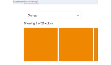
So far, our filter JavaScript component looks great! However, let’s move on and make each filter have a unique shareable URL.
This behavior is pretty useful in case we want to send users to the page that contains the filter component but with prefiltered content. Think how beneficial it would be from the marketing perspective for running campaigns. Imagine, for example, that on a real e-shop page, the filters are the product categories while the boxes are the products.
To accomplish this, as a first step, we’ll update the page URL without forcing a page to reload via the pushState() method upon dropdown menu clicking based on the user selection.
Again, to test it, view the demo in debug mode. When the user selects a color, the page URL receives an extra parameter that disappears if users opt for all colors.


Here are the two extra lines that we have to embed within the previous JavaScript code:
1 |
dropdownLinks.forEach(function (link) { |
2 |
link.addEventListener("click", function (e) { |
3 |
if (color == "all") { |
4 |
/*extra*/
|
5 |
history.pushState(null, "", location.href.split("?")[0]); |
6 |
} else { |
7 |
/*extra*/
|
8 |
history.pushState(null, "", `?color=${color}`); |
9 |
}
|
10 |
});
|
11 |
});
|
With this extra code, our URL changes. But, does the right content appear after we reload the page? Well, not yet; we’ll still see all the boxes. To bring only the correct boxes in view, we should add some additional code.
To be more specific, we’ll take care of the following things:
- Check to see whether the URL contains the
colorparameter. - If that’s the case, we’ll grab its value and thus the target filter option link.
- Remove the
activeclass from the existing dropdown menu item. - Add the
activeclass to the parent item of the link. - Replace the dropdown trigger’s text with the link’s text.
- Add the
hiddenclass to the boxes whosedata-typevalue doesn’t match the link. At the same time, we also remove thehiddenclass from the boxes whosedata-typevalue matches the link. - Update the counter’s text with the number of the visible boxes.
Here’s the required JavaScript code:
1 |
...
|
2 |
|
3 |
// 1
|
4 |
const params = new URLSearchParams(location.search); |
5 |
if (params.has("color")) { |
6 |
// 2
|
7 |
const color = params.get("color"); |
8 |
const link = document.getElementById(color); |
9 |
|
10 |
// 3
|
11 |
dropdown.querySelector("li.active").classList.remove(ACTIVE_CLASS); |
12 |
// 4
|
13 |
link.parentElement.classList.add(ACTIVE_CLASS); |
14 |
// 5
|
15 |
dropdownToggleSpan.innerText = link.innerText; |
16 |
const includedBoxes = boxesList.querySelectorAll(`[data-type="${color}"]`); |
17 |
const excludedBoxes = boxesList.querySelectorAll( |
18 |
`li:not([data-type="${color}"])` |
19 |
);
|
20 |
excludedBoxes.forEach((box) => box.classList.add(HIDDEN_CLASS)); |
21 |
includedBoxes.forEach((box) => box.classList.remove(HIDDEN_CLASS)); |
22 |
// 6
|
23 |
total.innerText = includedBoxes.length; |
24 |
}
|
Conclusion
Congrats, folks! During this journey, we developed a solid JavaScript dropdown filter component that handles filtering on the browser side and provides identifiable URLs.
Go ahead, optimize the code if you want, and try it in your upcoming projects!
Before closing, let’s once again remind ourselves of today’s creation:
If you’d like to see an equivalent implementation where data are filtered on the server before being ready to the browser this time, let me know in the demo comments!
As always, thanks a lot for reading!
Discover More Filtering Tutorials
Want to master client-side filtering with CSS and JavaScript? If so, have also a look at these tutorials: