In this article, we’ll cover the history of Arial, the Helvetica substitute. We’ll give you an overview of the font and some amazing fonts similar to the Arial font.
Arial has become the synonym for Helvetica since its beginnings. There are no two fonts with more history, critique, and comparison than these two. Arial is Microsoft’s star font that has come to replace Helvetica on the platform. It’s probably the font that you and I used to turn in papers at school, it’s used in plenty of presentations and standard documents. So let’s take a look at its history and impact. If you’re wondering what font is similar to the Arial font, we have an amazing list of alternatives.
The History of Arial
The Arial font style is one of the most popular typefaces in the world. Initially created for IBM back in 1982 by Robin Nicholas and Patricia Saunders, the font became one of the most widely known through Microsoft. The Windows operating system included Arial as one of the system fonts, and it’s now also part of macOS and in all PostScript-based laser printers.
Arial was intended to be a competitor to Helvetica, the most influential typefaces in our time. This is where the never-ending Helvetica vs. Arial argument comes from. Arial prides itself in its legibility at large and small point sizes. It’s a popular choice for everything from school work to advertising, book design, and even logos.
Initially, IBM named the font Sonoran Sans Serif due to licensing restrictions. The font was released in 1989 with 14 point sizes, four style and weight combinations, and in 11 languages.
When desktop publishing became a phenomenon in the early 80s, Helvetica was important enough to be included in Adobe’s font package. Therefore, they obtained the license from the original foundries and ensured complete dominance over digital fonts, to the extent that designers could only access certain typefaces through Adobe products. During that era, there were different type qualifications: Type 1 fonts were published by the best foundries, while Type 3 fonts were an inferior format.
Microsoft didn’t want to pay a licensing fee for Helvetica, so they made a typeface that functionally is the same as Helvetica. An outline of Arial as a Type 1 font wasn’t available until 1991. Here’s when font file formats were born as it became a challenge using fonts cross-platform. TrueType and TrueImage were compatible with both systems.
In 1992, a TrueType format of Arial was developed and licensed to Microsoft. This is when the company chose for Arial to be one of its four core TrueType fonts in Windows 3.1. This was officially announced as Arial being an alternative to Helvetica.
In later years, Microsoft would fund the development of Arial to support more font styles, weights, and even more languages. Arial became just as large a family as Helvetica, having just as many options and styles for non-Apple users. As of now, there are several Arial variants: Arial Regular, Arial Black, Arial Narrow, Arial Rounded, Arial Special, Arial Light, Arial Medium, Arial Extra Bold, Arial Light Condensed, Arial Condensed, Arial Medium Condensed, Arial Bold Condensed, and Arial Monospaced.
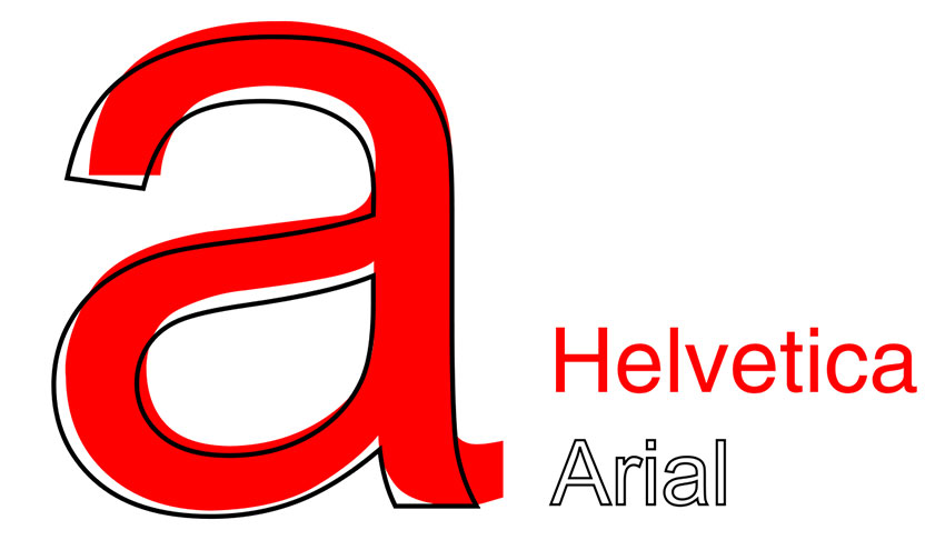
When it comes to the Helvetica vs. Arial argument, it’s true Arial owes much of its success to the coveted Helvetica. It was designed based on Helvetica’s characters and inspired by its form after all. While Arial is a great substitute for Helvetica, it certainly isn’t Helvetica. It communicates something slightly different—it’s more relaxed, but perhaps just as ubiquitous.
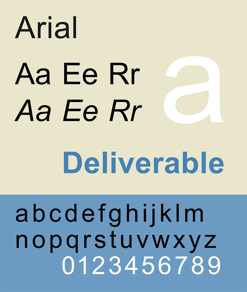
If you’ve ever wondered what the Arial font looks like, here are some pointers: Arial has a more humanist style in comparison to Helvetica. The curves are fuller and softer. The end terminals and strokes are cut on a diagonal, making the font look less mechanical.
Fonts Similar to Arial
Wondering what font is similar to Arial? In this list, we’ll show alternatives similar to the Arial font. We’re looking for sans serif fonts that have a humanistic style.
If you’re looking for more than just Arial alternatives, there are thousands of other fonts over at Envato Elements. For a small fee, you can have access to an always evolving library of fonts and a lot more!
Let’s take a look at some fonts that are similar to Arial:
1. Syabil
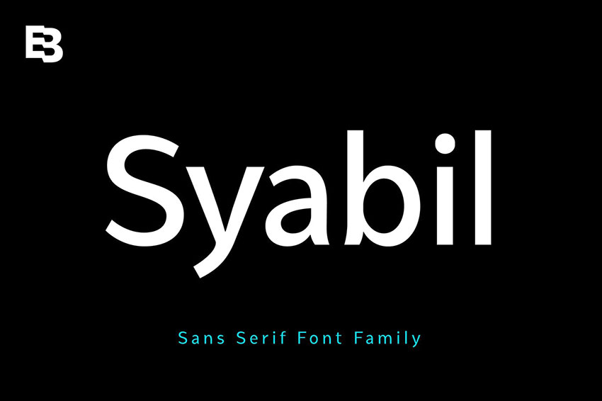
Syabil falls into the humanistic category, very similar to the Arial font. This font was created with the intention to look clean, be legible at all sizes, and be used for screen and print purposes. The font contains a big family. Syabil is also a great substitute if you’re looking for fonts similar to Arial Black or an Arial bold font style.
2. Oliviar
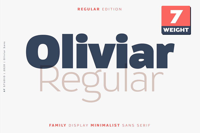
Oliviar is a beautiful grotesque font similar to Arial and Helvetica. It’s inspired by humanist sans serifs, exactly like the Arial font style anatomy. The package includes weights that range from thin to bold. It’s a perfect substitute for the Arial bold font. It supports multiple languages and is perfect for any of your projects.
3. Groteska
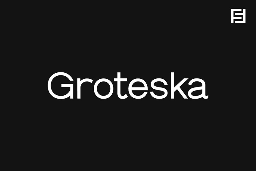
Groteska is a sans serif font that’s clean and minimalist. It’s a toned-down version of the Arial font style. The font contains seven different weights that come in regular and italics, for a total of 14 individual typefaces. The font also includes extended language support, and it’s suitable for anything from branding to editorial design.
4. Arthura
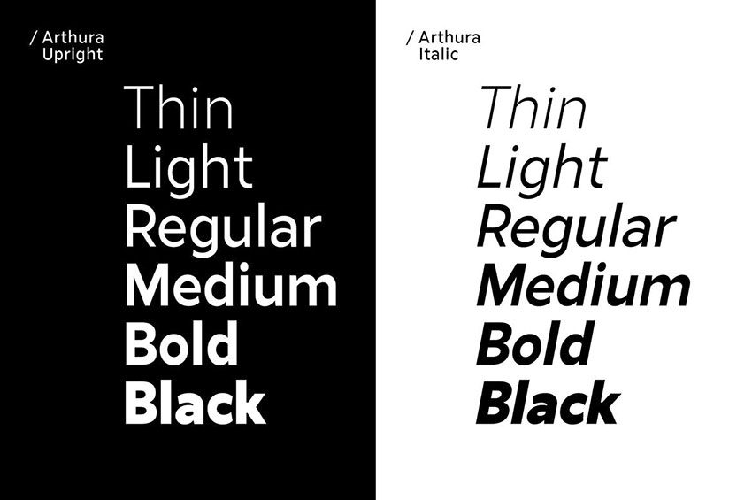
Arthura is a humanist sans serif font with simple geometric features. The humanist style is what makes great fonts like Arial and Arthura. It also includes subtle contrast in the ultra bold black style. The font is a perfect option for branding, advertising, and printed or web projects.
5. Proda Sans
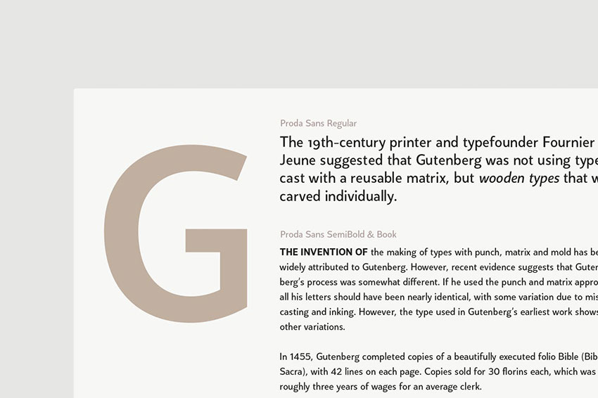
Proda Sans is a similar Arial font. The humanist typeface mixes with geometric forms from the mid-20th century. Humanist fonts like Arial are usually influenced by calligraphy to add more personality to the font. This family contains nine weights in regular and italic versions. The wide range of weights makes it possible to use Proda either for headlines or as body copy.
6. Aurel
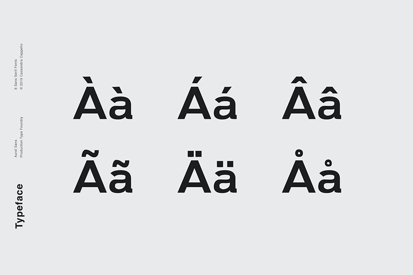
Aurel is a beautiful sans serif typeface that has hints of a humanistic style like the Arial font. It has just enough personality to not appear super minimal. It’s suitable for both headlines and long-form copy, as well as web and printed materials. The family comes with four different weights with their respective regular and italic styles.
7. Bergen Text
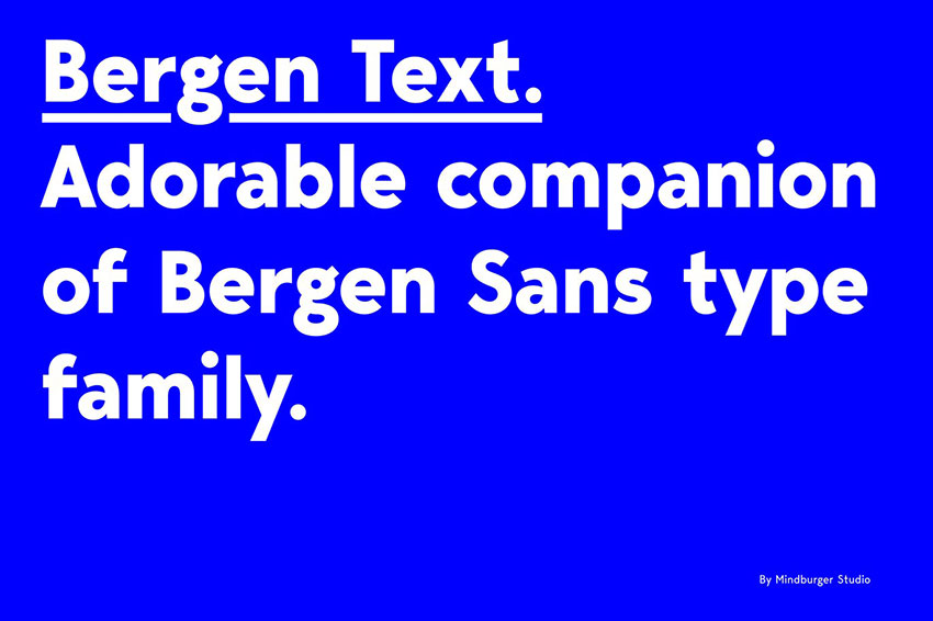
This carefully crafted font is highly legible at smaller point sizes, just like the Arial font. This contemporary sans serif font has clean geometric lines with a quirky personality. It’s a great alternative to Arial when it comes to choosing highly legible fonts for smaller copy. This font family consists of six fonts with italics and an extensive character list.
8. RNS Sanz
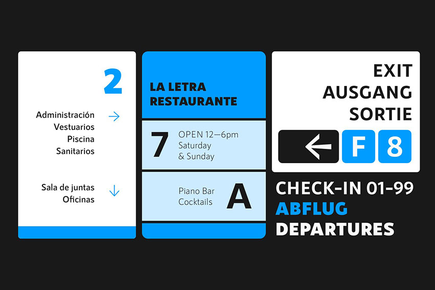
If you’re looking for a font similar to Arial Black, RNS Sanz is a great substitute. While the font is more neutral, it’s just as modern and clean as Arial Black. There are seven different weights to choose from. Here you’ll find anything from light to black, and the font is perfectly suitable for display purposes. The files are also suitable for web use.
9. RNS Sisma
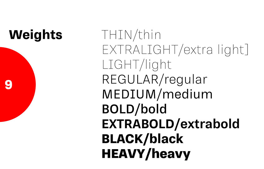
RNS Sisma includes seven weights, from which you can find fonts similar to Arial Black and Arial bold fonts. The typeface is neutral, with just a touch of grotesk and humanistic style lines. It’s perfect for screen use and is highly legible at smaller point sizes.
10. Magdelin
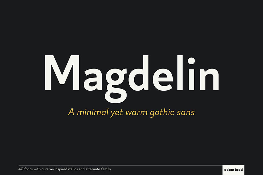
Magdelin features clean lines and low contrast between the strokes. Yet the contrast that exists is enhanced by the humanistic lines similar to the Arial font. It’s inspired by calligraphy and cursive details, giving it a bit of a vintage feel with a modern twist. The clean design makes it versatile and suitable for a range of design projects, whether it’s on screen or printed.
11. Normal
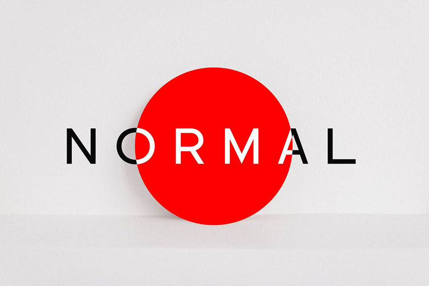
This super minimal font is similar to Arial. Normal is the perfect sans serif for display purposes. The clean lines will make sure your message gets across successfully and clearly. The package comes in five different weights, making it suitable also for multiple hierarchy projects like editorial design.
12. Barton
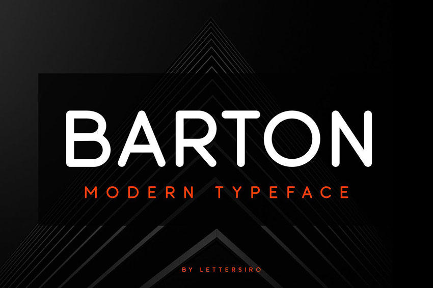
If you’re looking for fonts similar to Arial rounded, Barton is a perfect duplicate. Featuring clean lines and rounded edges, the font is beautifully designed. Its modern personality makes it suitable for any project, regardless of theme or topic, and it’s highly adaptable to your message. The font includes multiple language support.
13. Enrique Sans
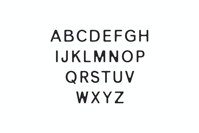
Enrique Sans is a beautiful, clean, and slightly rounded typeface. It’s one of the fonts similar to Arial rounded, and it looks amazing typeset in all capitals. Add some letter spacing in between, and you’ll have a classic, timeless look. The font comes in three weights, supports multiple languages, and includes an extensive character library.
14. Vengeance
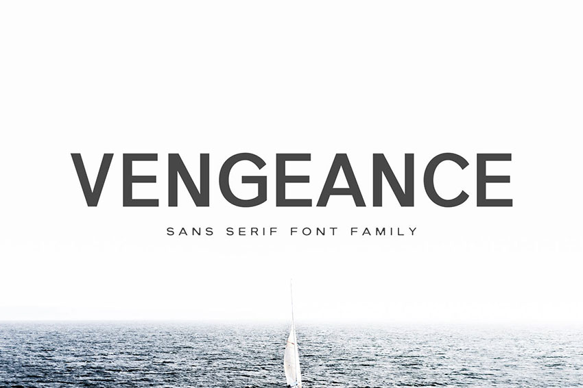
This unique sans serif is best suited for display purposes. Use it anywhere from headlines to logos, advertising, and packing design. The font comes in seven different weights, has an extensive character library, and is ready for web use.
15. Articulat CF
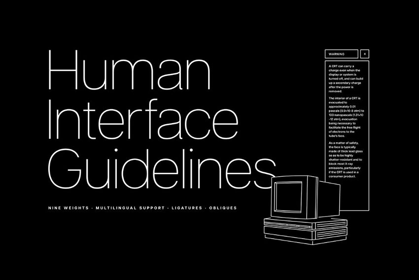
Articulat is a strong sans serif featuring sharp end strokes. The font has that timeless feel similar to the Arial font. Clarity is its strength, making it versatile for a wide range of projects. It’s highly legible at smaller point sizes and packs a punch when used as display. The pack comes with ten weights and their respective italics, supports multiple languages, and offers many alternate characters.
16. Neohead
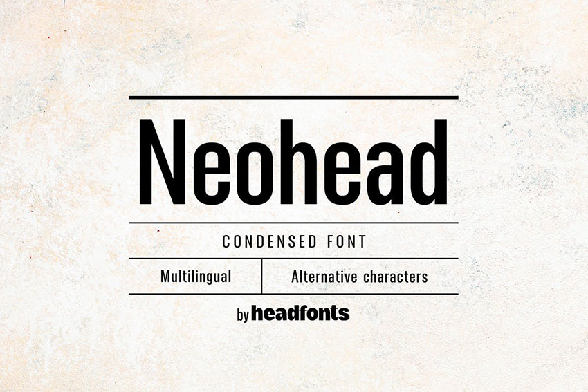
Neohead is one of the fonts similar to Arial Narrow. This font features minimal strokes and is supported by fine decorative elements. Its condensed nature makes it efficient in saving space while providing legibility to your design. The pack includes upper and lower-case characters, multiple character glyphs, and extensive Latin language support.
17. Config Complete Font
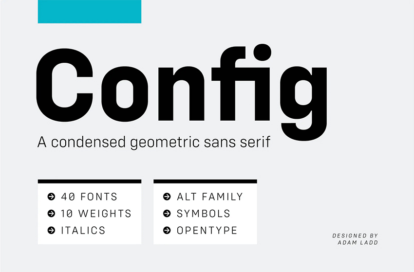
Another of the fonts similar to Arial narrow is Config. This font is highly functional and efficient. Its super clean features make it highly readable when used as body copy or display. The font features clean lines with subtle details, and it has an overall minimal appearance. It’s best suited for editorial design and web.
Do You Have a Favorite Font?
Did you find any new or new favorite fonts from this list? Now that we’ve walked you through the history of Arial, you’ll know that it is closely inspired by Helvetica. We also talked about what an Arial font looks like, so you know what to look for when looking at alternatives. We’ve also gone through a long list of fonts similar to Arial.
If you’re looking for awesome modern sans serif fonts that are super versatile for any project, make sure to check out Envato Elements. With a subscription, you can have access to an extensive font library, photos, video, and much more! It’s an awesome resource to have in your arsenal.
If you liked this article, you might like these:
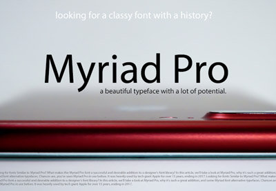
 TypographyFonts Similar to Myriad Pro & Best Font Pairings
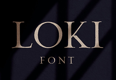
 FontsFonts Similar to Trajan You Can Use in Your Designs
 FontsFonts Similar to Futura & What Font Pairs Well With Futura
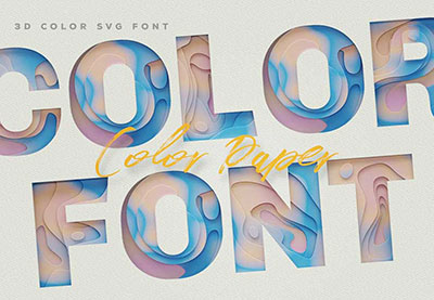
 SVGWhat Is an SVG Font? All About SVG Fonts
 Fonts19 Best Small Fonts (Pixel & Tiny Fonts to Download Now)
 Fonts30+ Beautiful Modern Script Fonts (Typefaces for 2021)

