
The web development community has come up with endless solutions, best practices, and tools for coding a responsive design with ease. While the vast majority of websites can be made responsive now, it’s time to push the envelope further. It’s easy to pay attention to great coding best practices, but sometimes the best design practices… Continue reading UI Design Guidelines for Responsive Design
Day: January 21, 2013
The Secrets of Photoshop’s Retouching Tools (Part 2)

In the second part of this mini series on Photoshop’s retouching tools, Martin Perhiniak will talk about the differences between Photoshop’s suite of retouching tools. Let’s get started!
Viewport Bookmarklet
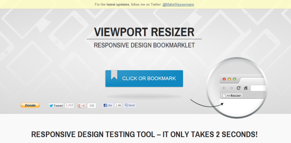
Today with all the different devices we can use on the internet it is very important that your website is responsive and can be viewed in any browser on any device. The different devices we can use are all quite different with different screen sizes, you can use your mobile phone, tablet, laptop, desktop or… Continue reading Viewport Bookmarklet