The web development community has come up with endless solutions, best practices, and tools for coding a responsive design with ease. While the vast majority of websites can be made responsive now, it’s time to push the envelope further. It’s easy to pay attention to great coding best practices, but sometimes the best design practices for various screen sizes get pushed aside.
Many resources on responsive design cover the basics — make use of excess space on desktop, make things simpler on mobile. Yet, many don’t go beyond this basic knowledge. With various screen sizes coming out each day, and even the big players like Apple switching things up with the new iPad mini, we need to evolve the way we think about design and the user experience as well.
Desktop
We see most of the attention for user interface principles when it comes to desktop websites. With extra space on-screen and the likelihood that a user is using a keyboard and mouse/touchpad, there are far more design possibilities while still maintaining a positive user experience. Yet, we must still abide by some guidelines, and if planning for a responsive design in the future, we can make sure that design can flow seamlessly between different screen sizes.
Points to Consider
With the possibilities of desktop design, we can get away with, and take advantage of:
- Extensive grid-like layouts, which allow the user to easily scan for content they may be interested in or tying to find.
- Horizontal navigation, sub-menus, mega-dropdowns, and more, all for easy-to-filter content.
- More pages for a more interactive and extensive experience on a desktop site.
- Places for advertisements, side content, additional blurbs, or call to action elements.
- Clickable areas that can help guide the user, like breadcrumbs, which would not otherwise be usable on smaller touchscreens.
- Access to more technology, including those that could influence design and the user experience.
- Fat footers, asides, and much more.
Websites should take advantage of the extra capabilities of a desktop site to give the users more options. Users should be tempted to come to a desktop version of a site after checking it out on mobile or a tablet, giving the user more possibilities to interact and gain from the website.
From a user experience perspective, be sure to still create desktop designs that are flexible, and down to a particular size, are still easily usable with keyboards and traditional desktop usage. Netbooks, while not as common as they used to be, are still around, and users will try to interact with a website just as they would with a typical computer – keyboard, mouse, touchscreen-less, and all – only smaller.
Tablets
Tablets are becoming more popular everyday, and as prices go down and more brands come about, there is a strong possibility that their popularity will only continue to grow. Many do not believe this is a short-lived trend, but a new permanent way of interacting with the web. Because of this, we must learn to not treat websites optimized for tablets as “second best” to their desktop counterparts, but instead, as a separate and equally important web experience for users.
One of the biggest features of tablets that we must accommodate for is that fact that they are touchscreen. This requires a whole new approach to the way we design, because it is an entire to approach to how users interact with websites. When tablets first came about, many users only went to view websites in a static way, and sacrificed the same amount of interaction they could get with a desktop. While it still may make more sense to provide full interaction only on desktop sites, we now have a responsibility to design user experiences where a user can interact with websites on tablets more easily, because that’s what they’ll be expecting.
Points to Consider
So how to we accomplish this goal? A new trend for responsive design that’s coming about is making responsive designs more app-like in interface, design, as well as functionality. When designing for tablets, take interface design inspiration from native tablet applications. Many of the features include:
- Larger touch areas, especially for navigation. Without the precision of a mouse or touchpad, larger areas that one can touch with a finger are essential.
- Tabs, accordions, and more can be particularly helpful in touchscreen design, and to save space on the smaller screen area. Don’t just think of how one would use these features on a desktop, such as in a sidebar area, but rather for interaction with the entire website. For example, allow users to move between entire sections of the website with the ease of tabs, much like they would on an app.
- Tablet design used to mean simply taking the same, or very similar layout of the desktop site, and squishing it together so it fits on the screen. This isn’t the way to go though. While you can easily do this and still make a website look presentable, you could be sacrificing far too much in usability.
- Use buttons or button-like design for simple actions, main links, etc.
- Additional button-like navigation, such as back and forward buttons can be useful for those navigating with a touchscreen, and especially with a device that may have a less than user-friendly browser. (Don’t assume your user has the exact same brand of tablet you have.)
- Designs should be optimized for retina display. While it’s only iPads that have retina display for tablets at this point, we can expect to see the technology grow. Nonetheless, with the majority of tablet users being iPad users, this should be taken into consideration anyway.
Smartphones, Mobile
Saving space is the most important thing to consider here, as well as creating a user experience that isn’t sacrificed because of that lack of space. When designing for mobile, like with any user experience planning, it’s important to know why people visit websites on the devices they do. While a desktop user may be going to a website for a more extensive search and interactivity, a mobile user tends to just want content, or do very simple actions — and quickly too.

Points to Consider
Along with the same touchscreen considerations as tablets (think larger touchable buttons/icons, app-like design), mobile can benefit from some other useful design patterns:
- Keep interaction in its simplest form. Cut out any extra capabilities, and allow the user to focus on the most important actions.
- For website with excessive content, make it easy to sort through and filter. Users don’t always like typing in search items on mobile, and while a search form can be helpful, also offer useful categories or a search filter sort of navigation.
- Use minimal design, enough to brand the website but not take over the usability of the website.
- Bigger fonts and better type display. Don’t force the average user to zoom in!
- Add text summaries to bigger pieces of content to save space, allowing the user to easily ignore content they don’t want.
- Get creative with tabs, accordions, navigation, and other forms of space saving methods.
- Make sure popups, notifications, ads, and more are either non-existent on mobile, or user-friendly to deal with if they are absolutely needed.
- If possible, make sure there are a minimal number of pages on a mobile site. This is not always possible depending on the type of website, but if it is, use javascript to swap out content (e.x. tabs) to avoid lengthy page loads.
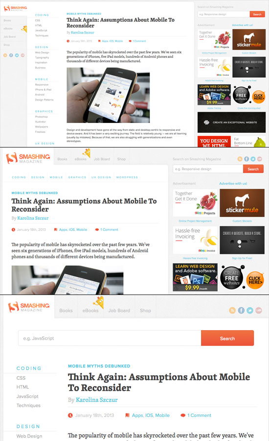
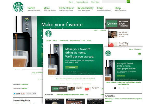
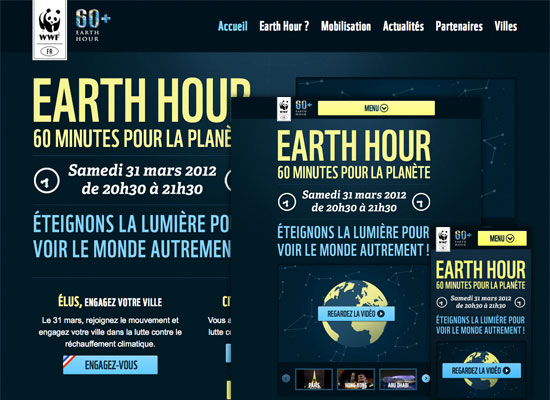
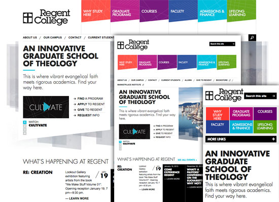
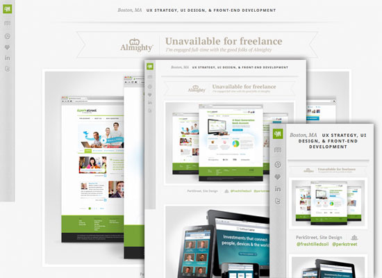
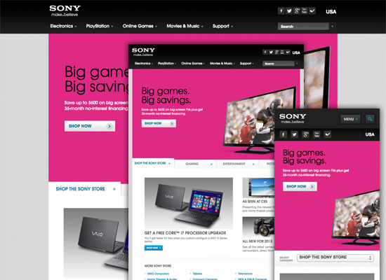
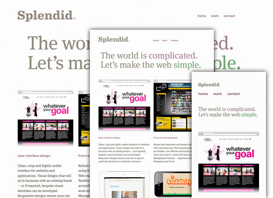
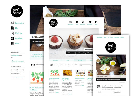
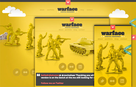
Showcase

Conclusion
It is estimated that tablet and mobile use will outweigh desktop use by as early as 2015. Considering this, we need to not only learn the best practices for coding responsive design, but also designing for them. It can be helpful to treat each experience as a separate design concept, while still maintaining unity in design among the three different stages: desktop, tablet, and mobile. Always remember to keep images retina-friendly, in particular for mobile and tablet use, touch-friendly, and content display appropriate where needed. The biggest problem to tackle among various screen sizes, though, will be organizing content and it’s relative navigation for the best user experience possible.
Do you have any more tips when designing the differences for each of these scenarios? How does your design easily transfer between various screen sizes, while still maintaining best practices for each?
Credits: Printable iPhone 5 Template used in main image by Matthew Stephens.