As technology advances, the cut-throat nature of online marketing gets increasingly brutal. The demand for transparent, conveniently communicated information, both visually captivating and instantly rewarding, is uncompromising. Don’t despair, parallax scrolling is about to become your knight in shining armor. It offers the dynamic of 3D illusions, creating depth by layering images, then scrolling the background and foreground at varying paces. Your website gains the attractive and engaging edge it needs to thrive with parallax scrolling on your side.
Here are 15 inspiring examples of this dynamic new design.
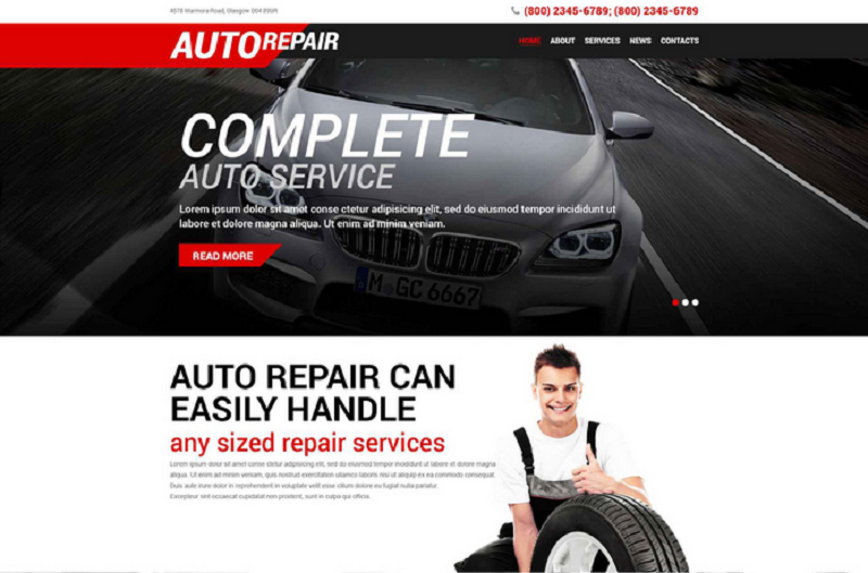
1. Service and Repair Theme
Ideal for the auto repair industry, this parallax enabled design comes stocked with powerful visuals to inspire customer confidence. The template comes with ample room for detailed information and the aforementioned confidence is solidified by well-placed and infinitely navigable user flows.
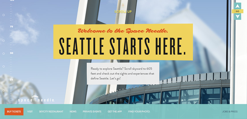
2. Welcome to the Space Needle
Parallax scrolling can convey a sense of movement, making the user feel like a journey is underway. Seattle’s Space Needle site takes you skyward as you scroll, climbing through breath-taking views towards the pinnacle of this famous building. The need to experience this thrill first-hand takes over, and once again, parallax scrolling works its magic.
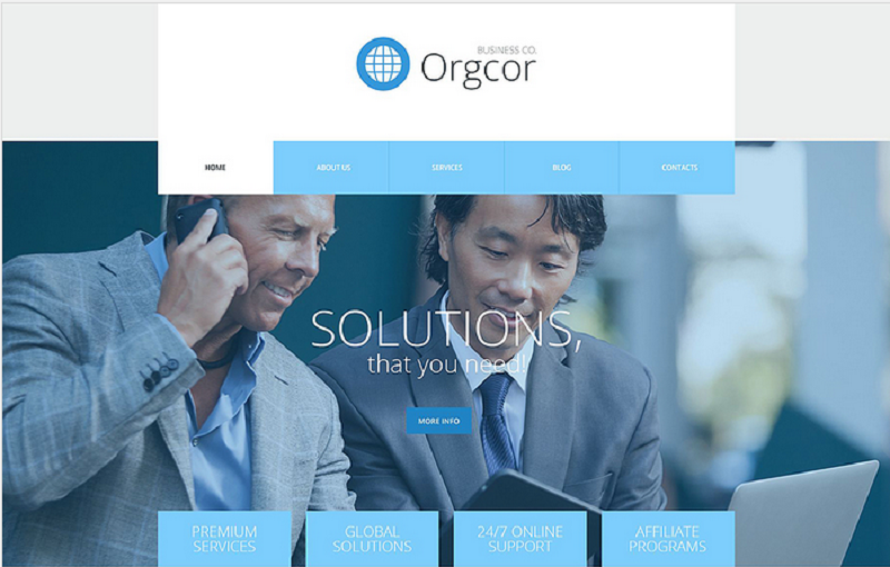
3. Corporate Solutions Theme
With its responsive design and internationalized multilingual capacity, this template provides every opportunity to connect and impress. The parallax animationlends itself to a sense of innovation while varying text effects suggest a feeling of success and professionalism.
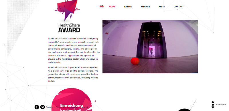
4. HealthShare Award
The HealthShare Award site reveals the dramatic potential of parallax scrolling. Hot pink and purple shards wobble over a stark white background. Meanwhile, side-scrolling options allow information to remain concise and organized, and its multilingual element make it internationally accessible.
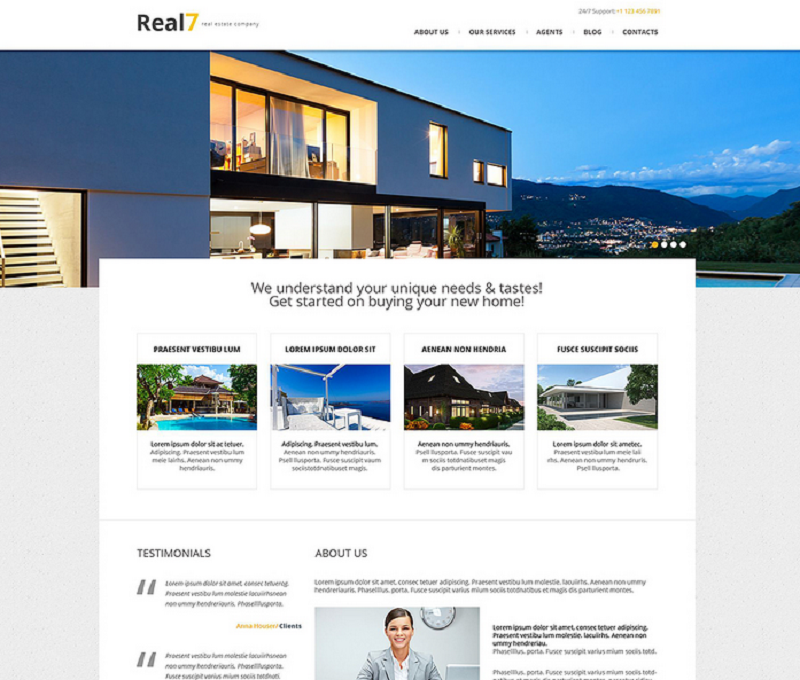
5. Responsive Real Estate Agency Theme
Here, simple yet effective parallax scrolling provides a powerfully enticing impression. With a prominent slideshow of luxurious spaces, it offers access to a dreamlike motif. Layered images and information are emphasized by a clean, white background and the text springs eagerly into place as you scroll.
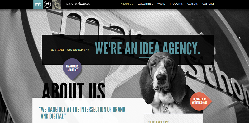
6. Marcus Thomas LLC
This idea agency keeps parallax scrolling relatively light yet manages to create an intriguing and engagingly understated visual effect. Sparing use of transparent images and easy navigation make this site an informative and creative treat.
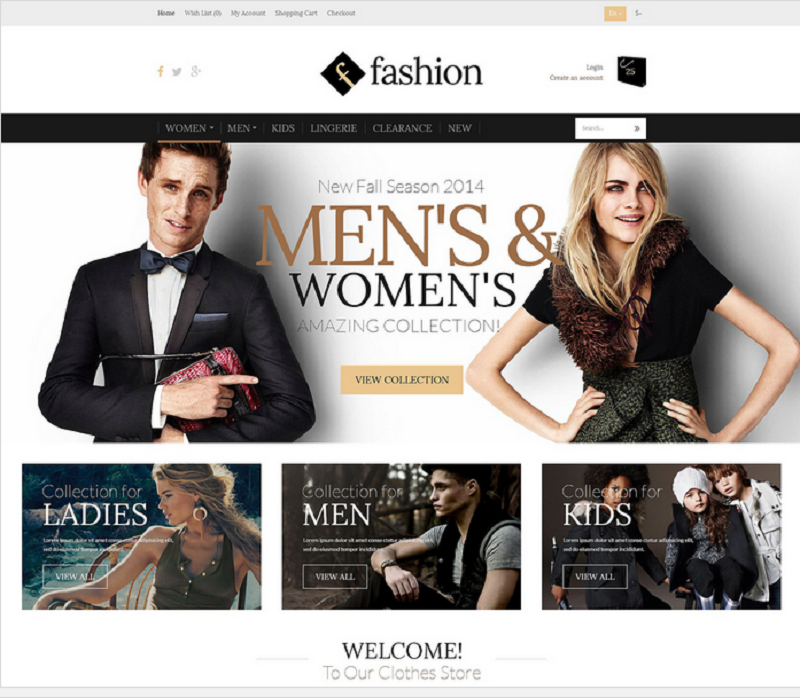
7. OpenCart Fashion Template
With fashion marketing as its focus, this lively template features a seductive slideshow of enjoyment wrapped in specific brands. With a variety of catchy dissolving effects, this parallax design is more aggressive than many others, creating an aura of energy and happiness sure to make your customers giddy and eager.
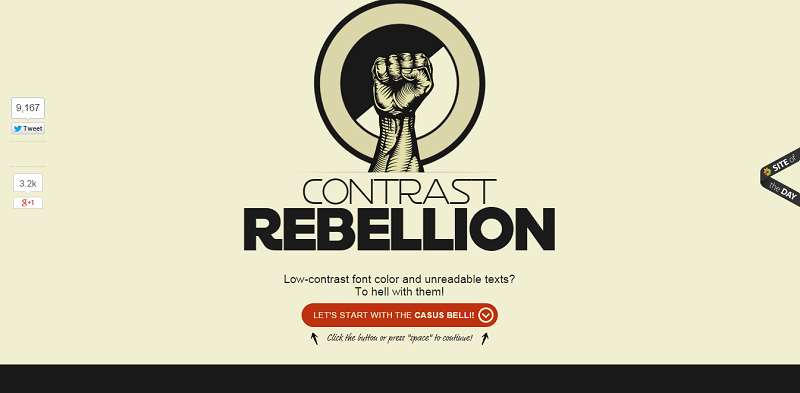
8. Contrast Rebellion
This edgy site demands font solutions for more effective marketing. Earthy colors combine with a raised fist and catchy words like “rebellion” in a parallax format to inspire viewers to make the change to more aggressive fonts. The front page even features an obvious homage to the famous typography used in the Star Wars logo. Super relevant now that the new teaser is out.
9. Responsive Architectural Firm Theme
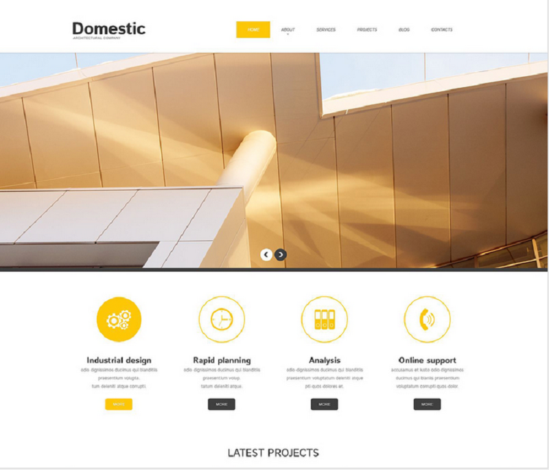
Perfect for Architectural firms, this template exhibits a parallax design while retaining a sense of structure befitting the industry. With pleasing animated effects and convenient dropdown menus, beautiful images showcase the company’s potential, and yellow and white splashes conjuring illusions of sunlight and space. Tasteful yet compelling, this design breathes the promise of convenience and success.
10. Whiteboard
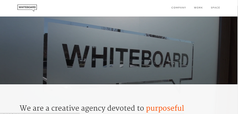
For this site, the experts at Whiteboard skillfully apply parallax scrolling to their marketing needs. With ambient video slides behind compelling copy, transparent image components, and a continuously muted color scheme contrasting with bright orange accents, the design applauds competence and creativity.
11. Responsive Farming Template
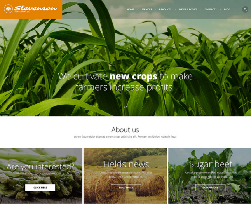
Striking, monocolored agricultural photographs dominate this page, complimenting simple headings encased in bold topography. Text enters from left to right, giving the page sensible continuity. Overall, this template offers hope to struggling farmers and its simplicity combined with the effects of parallax scrolling make this hope seem all the more tangible.
12. Sony
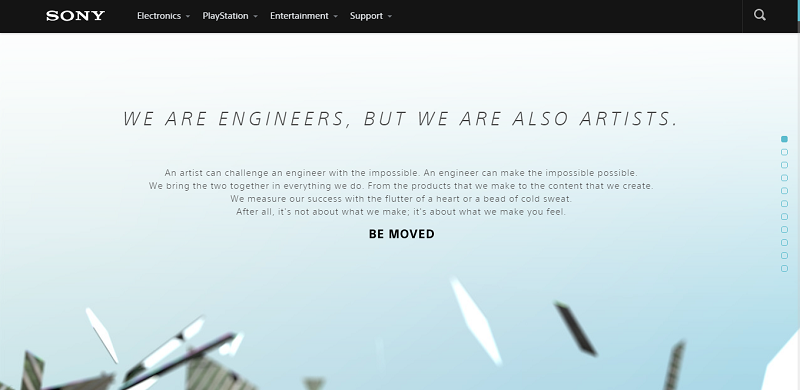
Sony takes parallax web design to a whole new level. Their design captures its stunning potential with full-on, TV quality 3D effects. I guarantee you will be riveted by their vivid animations.
13. Responsive Home Design Theme
This template accentuates the impact of the text by combining understated parallax effects, artistic color choices, and bold use of negative space. With this expressive design, a company gains access to the kind of poignant and pointed marketing that sticks.
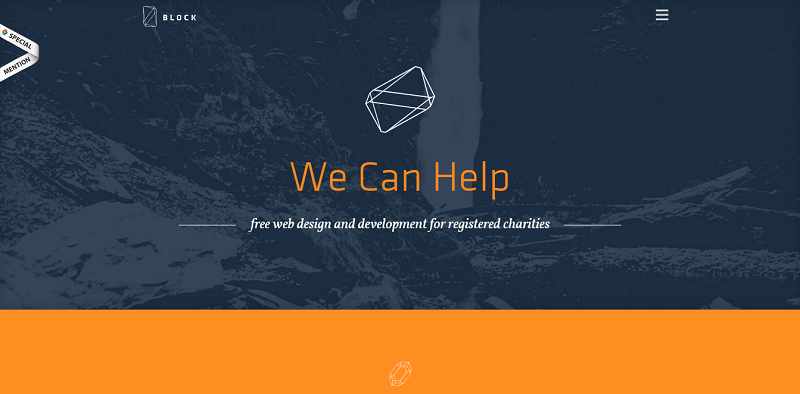
14. Block Web Design and Developement
This straightforward, tri-colored site is enhanced by a parallax design. Offering help to charities with their web designs, this parallax site featureswell-placed animations and a zig-zagging graph keep viewers engaged and moving down the page toward the CTA.
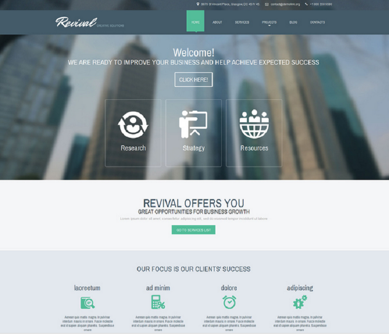
15. Responsive Corporate Drupal Template
Fusing soothing teals and slate blues with subtly animated buttons, this design represents a company dedicated to creative business solutions. Responsive, infinitely customizable, and easy to navigate; no matter what your niche, this design will compliment your efforts.
Well, that completes the list. There can be no doubt that parallax scrolling is a dynamic and versatile design tool. Whether you sell food, market ideas, offer a platform for hope, or simply wish to share your ideas with the world, adapt this tool to your needs and watch your website transform into an explosive, profit-producing asset!
What are some of your favorite parallax sites? Let us know in the comments.

