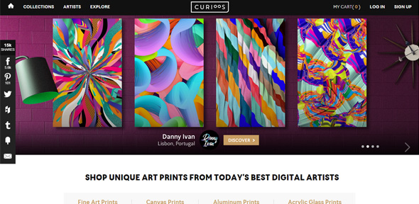
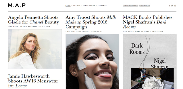
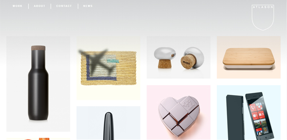
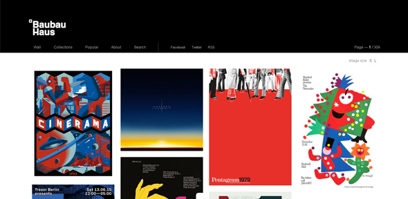
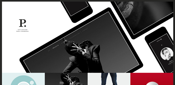
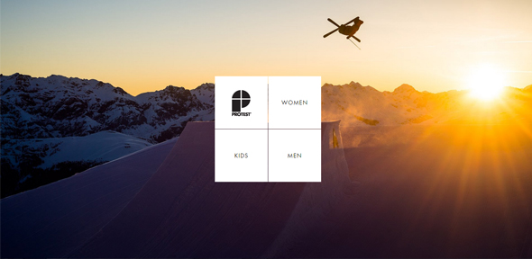
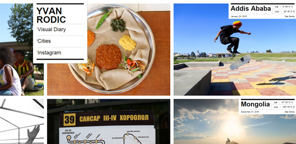
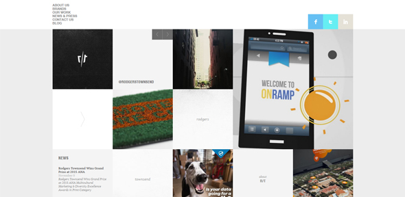
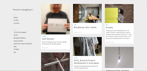
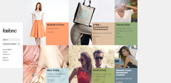
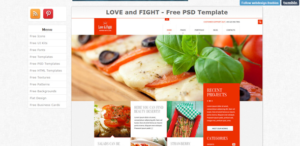
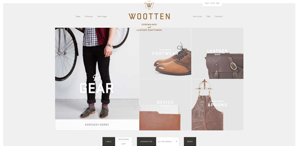
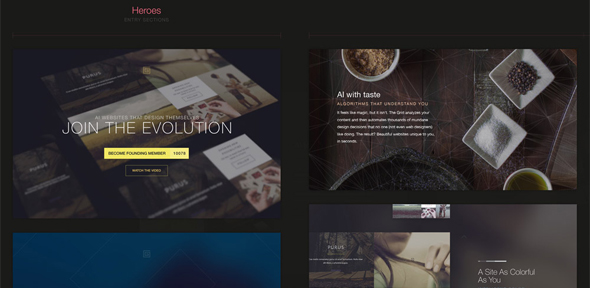
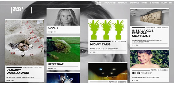
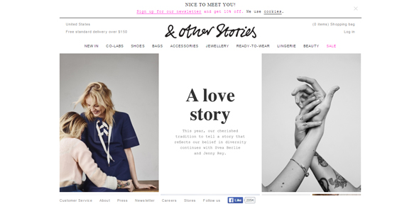
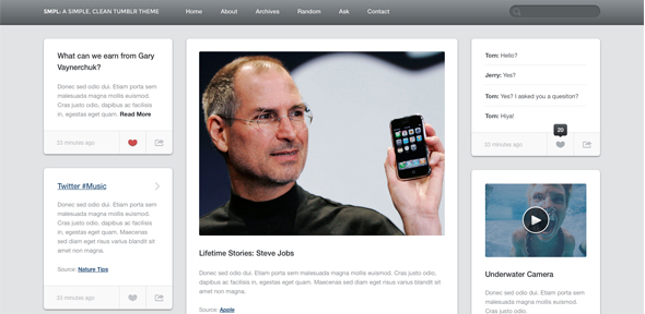
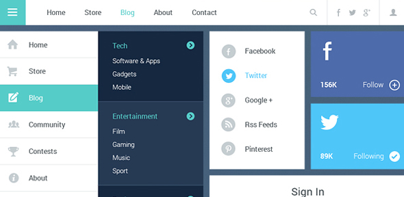
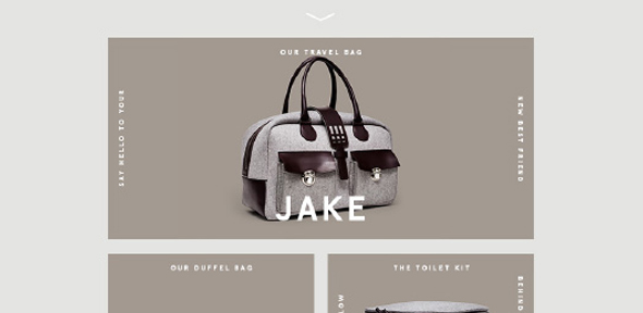
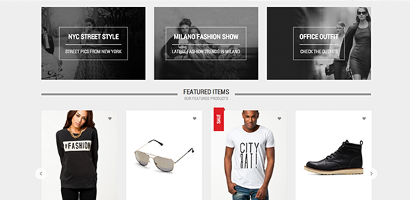
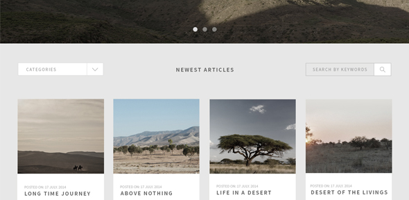
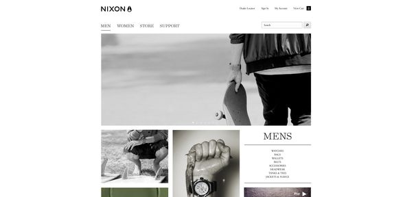
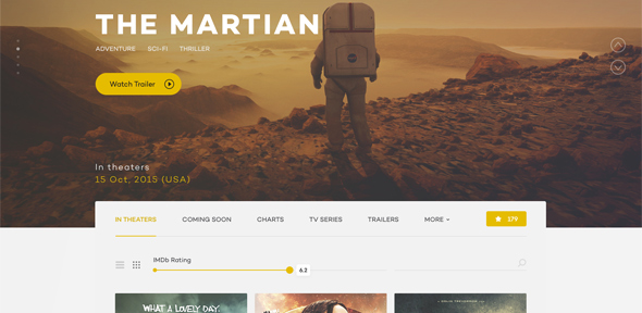
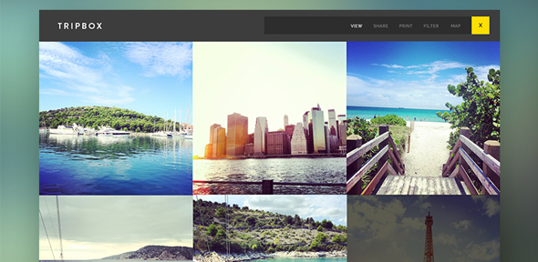
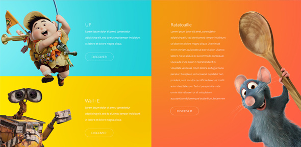
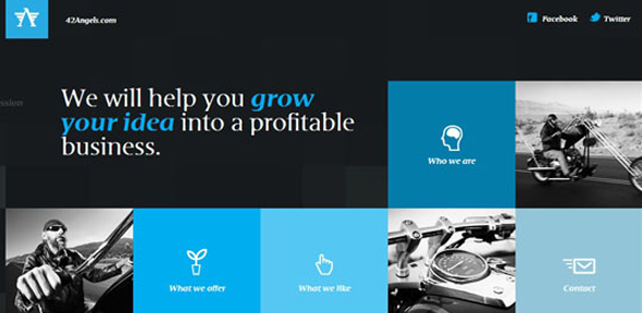
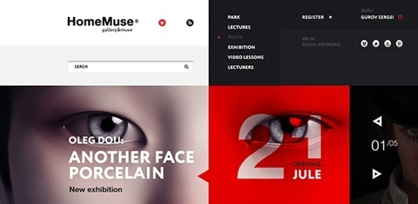
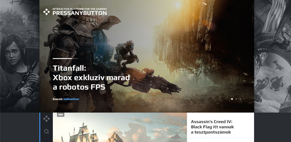
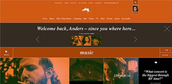
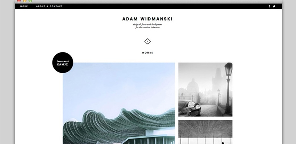
Card grid layouts, made popular by Pintrest, Facebook, and Twitter, are becoming a fast-growing trend in web design, and have almost turned into the go-to format for nearly every website. They organize information in neat, little boxes, and they give any website a clean, minimalistic look. However, card grids are not just aesthetically pleasing, but also very useful as they work beautifully on any type of device.
Card grid layouts are used in a variety of different mediums, as they are perfect for organizing large amounts of content. Used in flat design, pin-style design, and in print, they separate images, text, and headlines so that the information is presented in a clear and simple manner. Each block of information is like a separate thought bubble that helps the reader organize their own thoughts as they scan through a website or magazine. This trend falls under the “container-style design,” and it is highly responsive, as it can easily adjust to any changes that are made.
Furthermore, card grid layouts are incredibly popular due to their compatibility with responsive frameworks and mobile devices. This way, a website won’t look any different on a phone than on a desktop, which creates consistency that’s is highly important and desirable in the web design world. Additionally, card-based layouts require little or no restructuring because of their ability to easily adapt to changes in screen size.
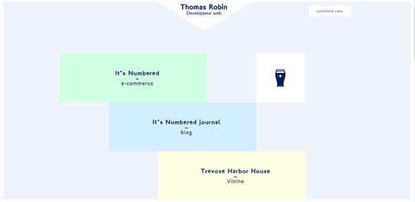
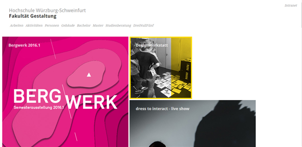
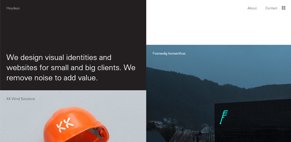
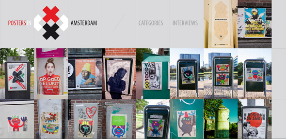
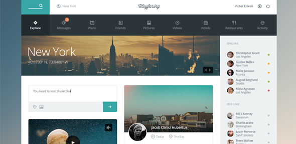
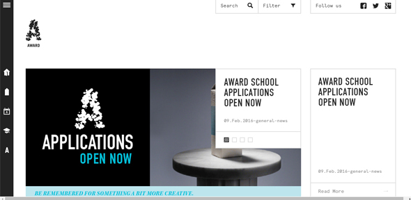
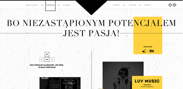
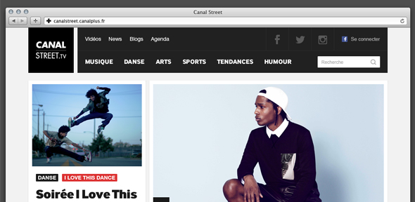
In this article, we’re presenting 40 beautiful websites with card grid layouts that we find absolutely stunning. Card grids are truly the web design trend of the future, and will continue to grow in popularity for years to come. If you’re a designer, we highly encourage you to adopt this framework, as it will facilitate your work and organize all the elements of your website in a beautiful and neat way, and it will give you free rein over the flow of information, as you’ll be able to organize everything in whichever order makes more sense to you. Enjoy and let us know what you think in the comment section below!

